Posted on

How Callendar House Can Add Local Character to a Study or Library

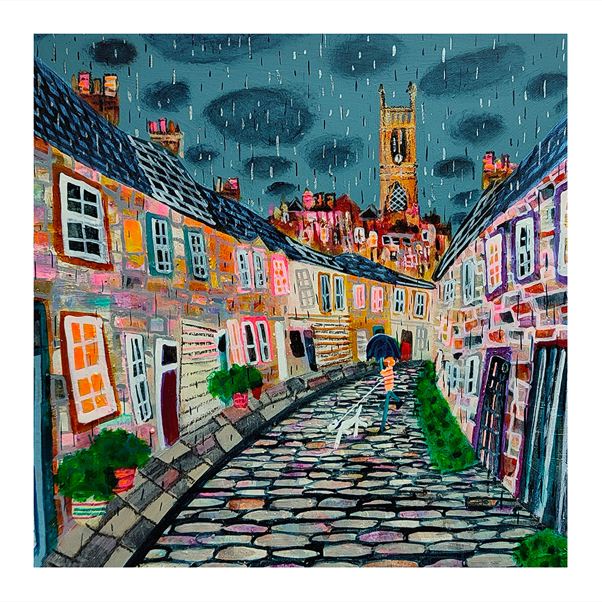
Image of Callendar House by Nikki Monaghan

Choosing Falkirk wall art for a study or library is often about finding something with meaning as well as visual appeal. In a quieter room, artwork has more space to be noticed, so it helps when the piece carries a genuine sense of place. Callendar House is a particularly strong choice, especially for anyone who wants a local connection reflected in the room.

Why local landmark art suits a thoughtful room

A study, library, or quiet home office usually benefits from artwork that feels grounded. Rather than demanding attention through sheer scale or brightness, it should reward closer looking. A local landmark print does exactly that. It gives the room character, invites conversation, and often feels more personal than a purely decorative image.

Callendar House has that quality. It connects the space to Falkirk’s heritage while still feeling warm, artistic, and easy to live with. That balance makes it especially useful in rooms where people read, think, or work.

Good places to hang it

  • Above a writing desk where you want a local point of reference.
  • On a library wall among bookshelves and timber finishes.
  • In a quiet sitting room where heritage and place matter more than trend.

If the room already includes rich wood, muted paint colours, or traditional furniture, the artwork can sit naturally within the scheme. It brings colour and story without making the room feel busy.

Why the framed finish matters

At First 4 Frames, all work is completed in-house in Falkirk, which gives the final piece a more bespoke and hand-finished feel. A framed Giclée print offers better presence and a more resolved look than a loose print, which is especially important in a study or library where details tend to stand out.

Nikki Monaghan brings a distinctive Scottish style to the subject, making this piece feel both expressive and rooted in place. You can see the product itself here.

For anyone looking for Falkirk wall art that feels personal, locally meaningful, and properly finished, Callendar House is well worth considering.

Posted on

Why Talisker Distillery, Isle of Skye Works So Well as Whisky Room Wall Art

If you are choosing whisky room wall art, it helps to look for a piece that does more than simply match the colour of the room. The artwork should add atmosphere, reinforce the purpose of the space, and feel as if it belongs there. Talisker Distillery, Isle of Skye does that beautifully, bringing a recognisable Scottish subject into a room built for conversation, collecting, and slowing down.

Why distillery artwork suits a whisky space

A home bar, whisky corner, or dedicated tasting room often benefits from artwork with a clear sense of place. Distillery imagery gives the room identity. It feels more considered than a generic print, and it connects naturally with the bottles, glassware, timber, and warm finishes that often shape the space.

  • It adds a strong Scottish link without feeling novelty-led.
  • It suits darker woods, leather seating, and brass or black accents.
  • It gives a whisky room a focal point that still feels refined.

Where it works best in the room

This piece would work especially well above a drinks cabinet, beside open shelving, or on the main wall of a snug used for evening entertaining. If you have created a space around Scottish whisky, travel memories, or a love of west coast scenery, the subject matter helps the room feel more personal and complete.

Because the image has place, mood, and story behind it, it can stand up well in a room that already contains plenty of objects. Instead of being lost, it helps bring everything together.

A hand-finished framed piece makes the difference

At First 4 Frames, every framed print is produced in-house in Falkirk with craftsmanship, colour-managed Giclée quality, and a professional finish in mind. That matters in a room where detail and presentation are part of the enjoyment. A bespoke framed print feels far more at home in a whisky room than an unframed poster or a mass-produced canvas.

This artwork is by Jean Feeney, whose work is known for strong colour and atmosphere. You can view the framed product itself here.

If you want whisky room wall art with real Scottish character and a more thoughtful framed finish, this is a very strong option.

Posted on

How Perthshire Fields Can Soften a Crisp Open-Plan Interior

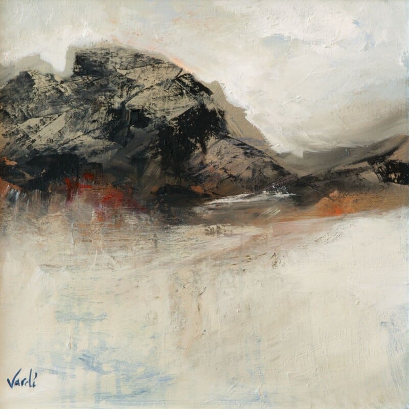
Open-plan rooms can be practical and bright, but they can also feel a little stark if every surface is crisp and every finish is hard. That is where the right open plan wall art can make a real difference. Perthshire Fields brings calm landscape colour into a modern interior and helps the space feel more grounded.

Why this kind of landscape works in open-plan spaces

When a kitchen, dining area, and sitting space all flow together, the artwork has to do more than fill one wall. It often needs to connect different parts of the room and soften the transition between them. Perthshire Fields does this well because the composition feels steady rather than busy, and the palette has enough movement to add interest without creating distraction.

In a large shared room, a calm landscape can do the work of several smaller decorative pieces.

Good placement ideas

This piece would work especially well on the main wall visible from several parts of the room, above a sideboard, or in the dining section of an open-plan layout where you want a focal point that still feels restful. It is a strong option for homes with pale walls, soft grey tones, oak, stone, or muted textiles.

  1. Use it where the room needs visual balance rather than extra colour noise.
  2. Let it echo natural tones already used in flooring, wood, or upholstery.
  3. Choose framed presentation so the piece feels intentional in a larger space.

Why the framed finish matters

Open-plan interiors benefit from artwork that feels resolved and well made. First 4 Frames produces framed Giclée prints in-house using colour-managed printing and hand-finished presentation, which gives the final piece a more bespoke and settled look. That extra craftsmanship helps the artwork hold its own in a larger room.

Arie Vardi is known for atmospheric landscape work that captures mood without overcomplicating the scene. If you would like to see the exact framed print, you can view Perthshire Fields here.

If your open-plan space feels a little too sharp or unfinished, Perthshire Fields is a thoughtful way to introduce warmth, balance, and a clear focal point.

Posted on

Why Brys Blossom Works Beautifully in a Sunroom or Garden Room

Bright spaces often need artwork that feels alive in changing daylight. If you are looking for sunroom wall art that adds warmth without feeling heavy, Brys Blossom is an easy piece to live with. Its floral character and expressive colour make it especially well suited to a garden room, conservatory, or any corner of the home that is used for relaxing.

Why floral artwork suits these lighter spaces

Sunrooms and garden rooms often sit between indoors and outdoors. Because of that, artwork with a natural subject usually feels more connected and more convincing than something overly formal. Brys Blossom has that sense of ease. It echoes the mood of the space instead of fighting against it.

  • It brings colour into a room that may already be full of soft neutrals and natural textures.
  • It feels uplifting in morning and afternoon light.
  • It helps a sitting area feel finished without making it look crowded.

Where it can work best

This framed print would sit well above a cane chair, a slim console table, or a painted bench in a garden room. It can also work in a conservatory that needs one visual anchor to stop the glazing and pale walls from feeling a little bare. If the room already includes plants, linen, or light timber, the artwork can tie those elements together beautifully.

A softer finish with proper craftsmanship

At First 4 Frames, each framed print is finished in-house in Falkirk. That matters in a bright room where poor presentation quickly shows. A hand-finished Giclée print gives you cleaner colour, a more refined surface, and a superior quality result that feels considered from the start.

This artwork is by Bryony Hamilton, The Wee Deaf Artist, whose work often carries warmth, symbolism, and a strong connection to nature. You can view the framed piece itself here.

For anyone choosing artwork for a sunroom or garden room, Brys Blossom offers colour, character, and a relaxed floral presence that feels right at home.

Posted on

Why White Sands of Arisaig Suits a Holiday Cottage or Coastal Guest Space

Good holiday cottage wall art should help a space feel settled the moment guests arrive. It needs character, but it also has to support a calm, easy atmosphere that people want to return to after a day out. White Sands of Arisaig is a particularly good fit for that kind of setting, thanks to its bright coastal feel and its sense of quiet space.

Why coastal artwork works well in guest accommodation

In a holiday cottage, guest bedroom, or relaxed lounge, the artwork often helps set the mood before anyone notices the smaller details. A Scottish coastal scene can make the room feel lighter, more open, and more rooted in place. That is especially useful when you want the interior to feel thoughtful rather than generic.

  • It gives guests an immediate sense of calm.
  • It suits neutral schemes, soft blues, sandy tones, and natural timber.
  • It reflects the kind of scenery many visitors hope to enjoy while they are away.

Where White Sands of Arisaig can work best

This framed print would sit comfortably in a guest bedroom above a chest of drawers, in a hallway that introduces the property, or in a sitting room where you want something airy and welcoming. Because the image feels open rather than heavy, it can help smaller rooms feel less closed in.

It is also a good option for owners who want their décor to nod to Scotland without becoming overly themed. The result feels refined, local, and easy to live with.

Why the framed finish matters

Guest spaces benefit from presentation that looks complete and cared for. A hand-finished framed Giclée print has far more presence than an unframed poster, and it helps the room feel properly finished. First 4 Frames produces work in-house in Falkirk with colour-managed printing and craftsmanship that suits quality-led interiors.

This piece is by Arie Vardi. If you would like to see the exact framed product, you can view White Sands of Arisaig here.

For anyone choosing holiday cottage wall art that feels welcoming, coastal, and professionally presented, this is a strong piece to consider.

Posted on

How Evening Gloaming, Easdale Island Can Warm a Snug or Reading Room

A snug or reading room needs artwork that adds warmth without making the space feel crowded. That is why snug wall art often works best when it brings atmosphere as well as colour. Evening Gloaming, Easdale Island does that beautifully, giving a cosy room a focal point with real depth and a distinctly Scottish sense of place.

Why this kind of piece suits a cosy room

Snugs, reading rooms, and quiet corners are meant to feel enclosed in a good way. The best artwork for those spaces supports that mood rather than fighting it. Rich evening colour, a recognisable cottage form, and a softer painted atmosphere can all help the room feel more layered and inviting.

In a cosy room, artwork does not need to shout. It needs to glow.

Best ways to place it

This artwork would work especially well above a small sofa, near a bookcase, or on the main wall of a snug where you want an instant sense of warmth. It pairs naturally with deeper paint colours, timber furniture, soft lamplight, and rooms that already have texture through rugs or upholstery.

It can also suit a traditional home where you want colour and character, but still want the finish to feel tasteful and settled.

Why a framed Giclée print elevates the room

In smaller rooms, quality matters because every object is noticed more closely. A framed Giclée print gives the artwork clarity, permanence, and a more bespoke presence. First 4 Frames completes the printing and framing in-house, combining colour-managed production with hand-finished craftsmanship for a superior result.

This piece is by John Lowrie Morrison OBE. You can view the exact framed artwork at Evening Gloaming, Easdale Island.

If you are looking for snug wall art that brings warmth, colour, and a properly finished focal point, this piece is well worth a closer look.

Posted on

Why A Poppy Melody Is a Strong Choice for Dining Room Wall Art

Good dining room wall art should do more than fill a blank wall. It should help the room feel more welcoming, more finished, and a little more memorable when people gather around the table. A Poppy Melody is a strong example of that, using bold floral colour to bring energy and warmth without losing its sense of craftsmanship.

Why floral artwork suits a dining space

Dining rooms often benefit from artwork that feels sociable and expressive. Poppies have a natural liveliness to them, and that makes them a good match for rooms used for conversation, family meals, and entertaining. This piece feels confident rather than formal, which helps the room stay approachable.

If your dining area includes painted walls, timber furniture, or soft neutral finishes, a floral piece like this can introduce colour in a way that still feels balanced and grown-up.

How to use it in the room

A Poppy Melody would work well above a sideboard, on the main wall beside the table, or in an open-plan dining area that needs a visual anchor. Because the subject is expressive, it can help a newer or simpler room feel more personal without the need for lots of extra decorative pieces.

The best dining room art gives people something to enjoy before the first course arrives.

A framed finish that feels considered

At First 4 Frames, each piece is produced with a superior quality framed finish in mind. A hand-finished Giclée print has more depth, better colour stability, and a more polished look than a mass-produced print, which matters in a room where presentation carries so much weight. The in-house Falkirk workshop approach keeps the result bespoke and carefully made.

This artwork is by Bryony Hamilton, The Wee Deaf Artist. If you would like to see the exact framed piece, you can view A Poppy Melody here.

For anyone looking for dining room wall art with colour, character, and a genuine sense of craftsmanship, this piece makes a memorable choice.

Posted on

Why Sunart Blue Works Beautifully as Bedroom Wall Art

Choosing bedroom wall art is rarely about making the biggest statement in the house. More often, it is about creating a room that feels settled, restful, and personal. Sunart Blue is a particularly good fit for that kind of space, thanks to its calm coastal palette and atmospheric sense of distance.

A better choice for a room meant for rest

Bedrooms tend to suit artwork that gives the eye somewhere gentle to land. This piece has enough depth to hold attention, but it does not feel busy or demanding. Blue tones can help a room feel cooler, quieter, and more composed, which is exactly why they work so well in spaces designed for winding down.

  • It complements soft neutrals, pale timber, and layered bedding.
  • It adds atmosphere without making the room feel heavy.
  • It suits both modern and more traditional bedroom schemes.

Where Sunart Blue can sit best

This artwork works especially well above a chest of drawers, opposite the bed, or on a wall that needs quiet character rather than loud colour. If your bedroom already includes creams, stone shades, faded blues, or natural textures, the print can settle into the room with ease while still giving it a more considered finish.

It is also a good option for guest bedrooms where you want the space to feel welcoming and complete without becoming overly decorative.

Why framed Giclée quality matters here

In a bedroom, subtle presentation often makes the difference. A hand-finished framed Giclée print brings clarity, depth, and a more refined presence than a loose print or standard poster. First 4 Frames completes the work in-house in Falkirk, using colour-managed printing and careful craftsmanship so the finished piece feels bespoke from the start.

This artwork is by Jill McIntosh, whose Scottish scenes are known for mood and atmosphere. You can view the exact framed product here.

If you are looking for bedroom wall art with a calm, coastal feel and a superior quality framed finish, Sunart Blue is well worth considering.

Posted on

How Sweeping Through Can Anchor a Living Room Without Feeling Heavy

When choosing living room wall art, one of the hardest things is finding a piece with enough character to anchor the room without making it feel dark or overdone. Sweeping Through strikes that balance beautifully. It has movement, atmosphere, and depth, but it still feels calm enough for everyday living.

Why movement matters in a sitting room

A living room can easily feel static when the furniture, shelving, and layout are all quite structured. Artwork with a sense of sweep or weather can soften that. It draws the eye, gives the room a focal point, and introduces energy without needing loud colour or busy detail.

That is part of what makes Sweeping Through so useful. It works well in spaces that already have texture from fabrics, rugs, and upholstery, because it adds atmosphere rather than visual clutter.

Where it can have the strongest impact

This piece would suit the main wall above a sofa, a chimney breast, or a quieter corner of the room where you want a statement that still feels restful. If your décor includes layered neutrals, muted blues, stone tones, or natural timber, the artwork can sit into the scheme with real ease.

The best focal pieces do not just match a room. They steady it.

Why framed quality changes the result

In a living room, presentation is everything. A hand-finished framed Giclée print gives the artwork weight, clarity, and a more resolved presence. First 4 Frames completes the work in-house in Falkirk, using colour-managed printing and craftsmanship that helps the final piece feel bespoke rather than off-the-shelf.

Jill McIntosh is well known for atmospheric Scottish scenes, which makes this a particularly good option if you want artwork with a local feel and a strong sense of place. You can view the framed product itself here.

If you want living room wall art that brings movement and mood while still feeling balanced, Sweeping Through is well worth considering.

Posted on

Why Tulips Standing Tall Is Such a Good Fit for Kitchen Wall Art

Choosing the right kitchen wall art is often about more than filling a blank space. In a room used every day, the artwork needs to feel fresh, welcoming, and easy to live with. Tulips Standing Tall does exactly that, bringing lively floral colour into the heart of the home without feeling fussy.

Why this artwork works so well in a kitchen

Tulip imagery naturally suits bright, sociable spaces, and this piece has enough presence to lift a breakfast nook, dining corner, or family kitchen wall. The colour brings warmth, while the floral subject keeps the overall feel relaxed and approachable. That matters in a room where you want personality, but not something that feels too formal.

  • It adds colour without making the room feel crowded.
  • It suits spaces where natural light changes throughout the day.
  • It gives a softer, more personal finish than purely graphic kitchen prints.

Best places to hang it

This kind of floral artwork works especially well above a sideboard, on a wall near a breakfast table, or in a dining space that connects to the kitchen. If your cabinets and surfaces are quite clean-lined, a framed print like this can stop the room from feeling too hard or purely functional.

If your kitchen already includes natural wood, painted cabinetry, or soft neutral tones, Tulips Standing Tall can help tie the room together in a way that feels considered rather than over-styled.

A floral piece with proper framed finish

At First 4 Frames, presentation matters just as much as the image itself. A framed Giclée print offers a more polished and lasting finish than a loose poster, especially in a room that gets daily use. The in-house approach, colour-managed print quality, and hand-finished framing all help the artwork feel like part of the home rather than a last-minute extra.

This piece is by Bryony Hamilton, The Wee Deaf Artist, whose work is known for expressive colour and warmth. If you would like to see the exact framed piece, you can view Tulips Standing Tall here.

For anyone looking for kitchen wall art that feels uplifting, personal, and professionally finished, this is a strong choice.