Posted on

4 room-by-room ideas for artwork in UK holiday lets

4 room-by-room ideas for artwork in UK holiday lets

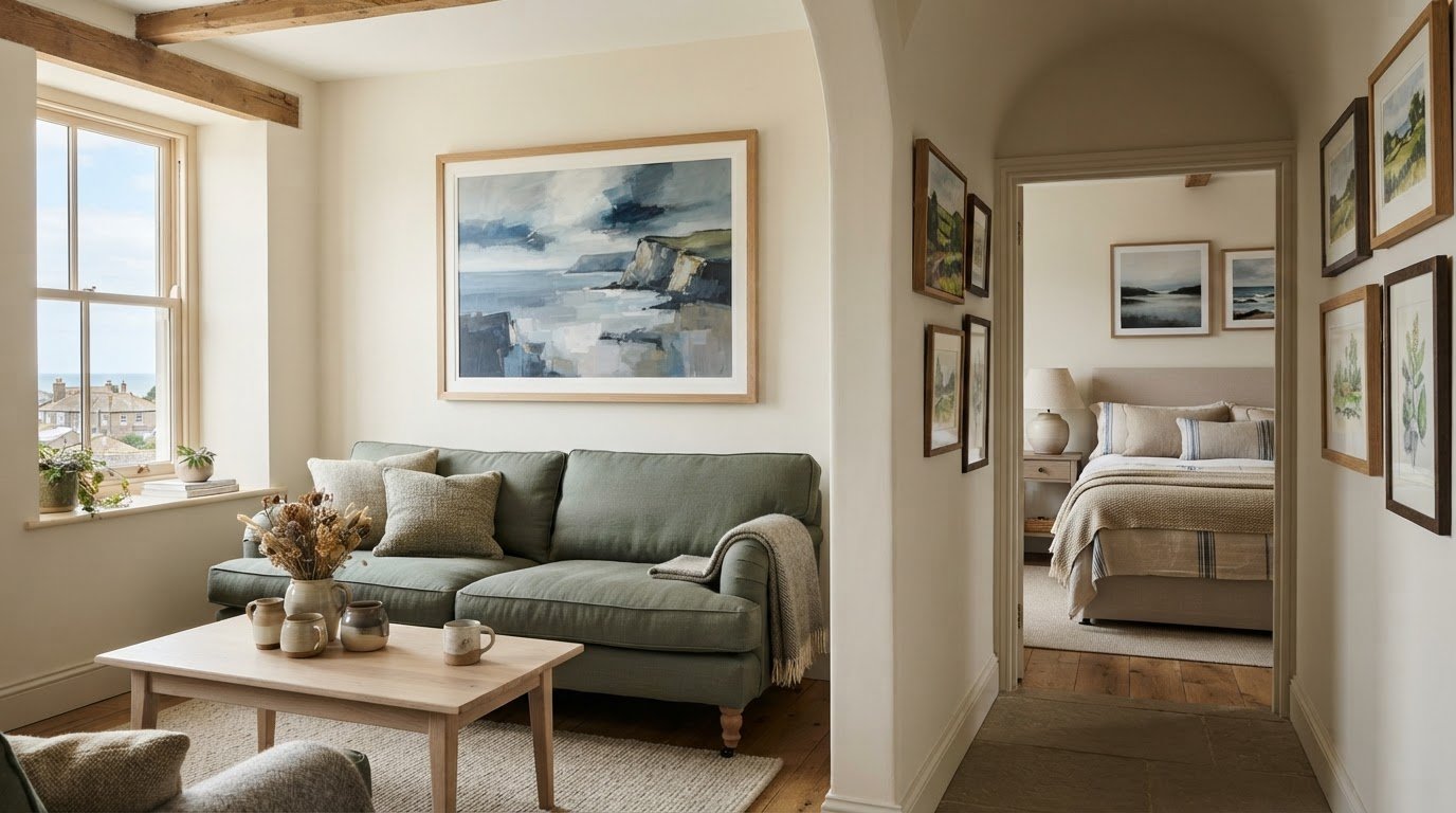
Artwork can do more than decorate a holiday let: it can create a welcoming atmosphere and connect guests with the character of the area. A thoughtful mix of local prints, photographs and one or two statement pieces gives a home a distinctive feel without overwhelming it. That’s the value of choosing artwork for holiday lets in the UK with both the guest experience and each room in mind.

Practical furnishings and a comfortable layout may come first, but art helps a property feel personal rather than simply furnished. The right pieces can draw attention to a feature, bring colour to a quiet corner and leave guests with a visual reminder of their stay. This guide shares room-by-room ideas, from a sitting-room focal point to prints for busy spaces, along with pointers on choosing artwork that suits your home’s style, setting and everyday use.

Key Takeaways

  • Choose artwork that adds character while standing up to the practical demands of guest accommodation.
  • Use coastal or countryside subjects to give your interiors a stronger connection to their surroundings.
  • Match the artwork to each room, from prints in busy spaces to a focal piece in the sitting room.
  • Thoughtful local imagery can help guests carry fond memories of their stay home with them.

1. What are the benefits of having art in a holiday home?

Artwork gives a holiday home personality, helping it feel welcoming rather than merely furnished. Local landscapes and photographs can connect guests with the place they’ve come to explore. A considered display also adds visual interest to listing photographs and gives guests details to remember after their stay. Keep statement artwork to one or two pieces, then let smaller works complement the room.

Originals, prints and locally made pieces can all suit guest accommodation. One practical approach is to pair a distinctive local artwork with prints that are easier to replace if damaged. A coastal print, for example, can echo the setting without making every wall compete for attention. Choose images and frames that work with the property’s colour scheme and furnishings.

When choosing artwork for a holiday let, consider how each room is used. Prints can bring colour to frequently used spaces, while a distinctive piece can anchor a quieter sitting area. Choose robust frames and avoid placing unglazed artwork in direct sunlight. Set a replacement budget before selecting especially valuable or delicate originals.

When choosing artwork, consider whether you have permission to display it. Don’t reproduce an artist’s image or use a downloaded photograph as a print without the appropriate permission. For locally made work, agree how the piece may be displayed and photographed before installing it in the let.

To hang a frame securely, identify the wall surface and consider the frame’s weight. Use fixings suited to both, and avoid placing artwork where guests or luggage could knock it. Hanging is easier as a two-person job: one person holds the frame while the other checks its height and position from a distance.

Yes, well-placed artwork can make listing photographs feel more considered and help a room look finished. It can support a positive guest impression, though reviews also reflect the wider stay. For damage and insurance records, keep an inventory of each piece, including the artist, purchase details and photographs. Avoid fragile or irreplaceable works in high-traffic areas, especially where children may handle them.

2. How do I start the process of choosing art for my holiday home?

Start with the location and the landscape guests encounter nearby. A cottage beside the Northumberland coast might suit sea, harbour or beach scenes. A rural stay in the Scottish Borders could feature rolling hills, woodland or Scottish landscape art. Choose images that suggest the area without making every room feel themed.

Build a shortlist by exploring local galleries, auction houses, antique stores, art society exhibitions and artists’ open studios. These places can introduce you to working artists and subjects tied to the area. A print of a nearby headland, for example, may feel more personal than a generic seascape. Note the artist, subject and colours of each piece you like.

Next, compare the artwork with the property’s existing palette and furnishings. A blue-grey coastal print can echo slate, linen or painted wood, while warm countryside colours may complement timber and natural fabrics. Decide whether the picture should blend in or provide contrast. Check its scale against the wall, furniture and viewing distance before choosing a format.

Plan the room before choosing where each frame will hang. It’s generally easier to arrange artwork and furnishings once the colour scheme is decided and furniture is in place. Still, consider lighting and hanging locations before the electrician leaves. A planned picture light or wall position can shape the display without forcing later changes to the room.

For a cohesive look, repeat a colour or subject across different rooms, rather than buying matching pictures throughout. A harbour print in the hall and a softer coastal view in the bedroom can create a gentle thread. Browse coastal and countryside artwork to explore subjects that could suit your property’s setting. Choose pieces that reflect what guests can actually see or experience nearby.

3. Artwork choices for different rooms

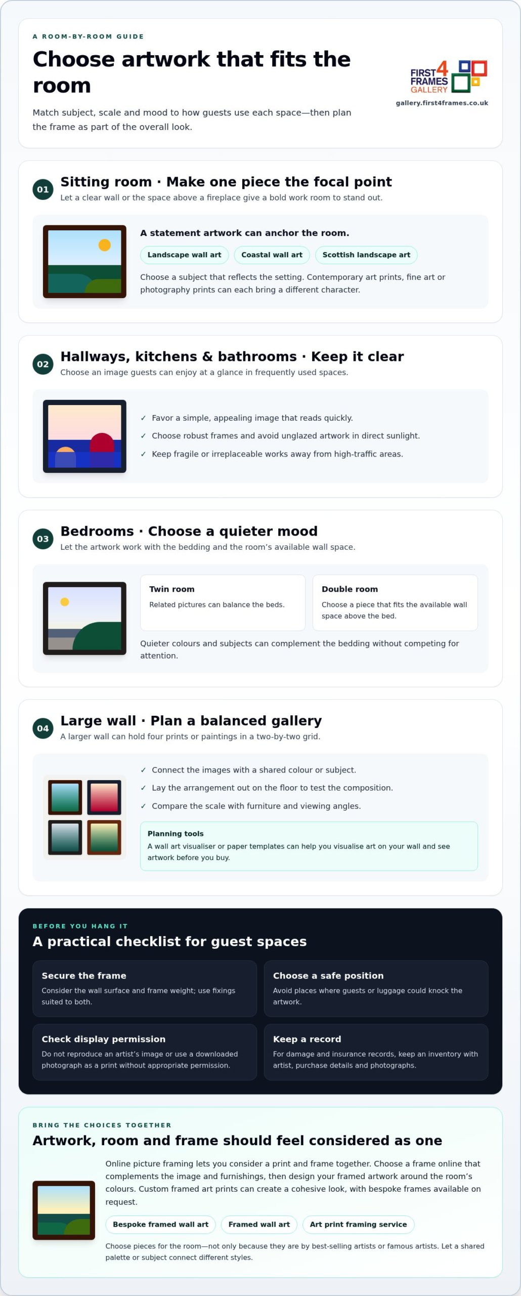
Prints, paintings and photography prints can all suit a UK holiday let. In the sitting room, let one bold work become a focal point above the fireplace or on a clear wall. Landscape wall art can create a restful centrepiece, while coastal wall art may echo nearby scenery. Scottish landscape art, contemporary art prints or work by famous artists can each bring a different character.

Corridors and frequently used rooms, including kitchens and bathrooms, suit prints. Choose a clear, appealing image that guests can enjoy at a glance. For bedrooms, consider quieter colours and subjects that work with the bedding. In a twin room, related pictures can balance the beds; above a double bed, choose a piece that fits the available wall space.

A larger wall can hold four prints or paintings arranged in a two-by-two grid. Select images with a shared colour or subject, then lay them out on the floor to test the arrangement. A wall art visualiser can support planning, while paper templates offer a simple way to judge scale. Compare the layout with the furniture and viewing angles to picture how the art will look on your wall.

Choose pieces for the room, not just because they’re by best-selling artists. Fine art, illustrations and photographs can sit together when a shared palette or subject connects them. Use framed wall art to give a dining area definition, or keep a landing simpler so it doesn’t feel crowded.

If you’re selecting a print and frame together, online picture framing lets you consider how each element works as a whole. Choose a frame online that complements the image and furnishings, then plan the framed artwork around the room’s colours. Custom-framed art prints can create a cohesive look, while bespoke frames are available on request.

4. Benefits of artwork in holiday homes

Artwork for holiday lets in the UK can give a property a distinctive sense of place. Guests often choose a stay partly for its surroundings, so artwork can bring that setting indoors. A print showing a nearby landmark, for example, connects the room with somewhere visitors may explore. The image becomes part of the property’s character, not simply a finishing touch.

Local scenes can also help guests remember their visit. A painting of a familiar bay may recall an afternoon walk, while a countryside view can evoke a quiet route through nearby fields. Choose artwork for holiday lets in the UK that reflects genuine local features rather than generic images that could belong anywhere. A strong connection to the location can make a display feel more personal.

Artwork gives hosts a way to shape a recognisable interior identity. A converted farmhouse might feature botanical studies and rural details; a coastal flat could bring together maritime subjects and gentle colours. These choices can make the property feel thoughtfully assembled, while giving guests small details to notice and enjoy during their stay.

In shared accommodation, artwork can prompt conversation without demanding attention. A local map-inspired print or a scene of a nearby attraction may encourage guests to plan an outing. Keep the subject easy to appreciate and relevant to the experience offered. This makes the display useful as well as decorative, especially in a dining area or lounge where guests gather.

For hosts furnishing several properties, choose a guiding idea, then adapt it to each home. A consistent preference for regional artists, natural subjects or restrained colours can provide continuity without making every interior identical. Explore artwork inspired by landscapes and local places to develop a visual direction. Thoughtful artwork for holiday lets in the UK can help each property feel rooted in its setting.

First4Frames Gallery can help holiday-let owners turn a considered artwork choice into a finished display. Ready-to-Hang Framed Art suits hosts seeking a complete piece, while Custom Picture Framing lets you select a frame for artwork already chosen. Each frame is handmade to order from quality materials and glazed with 2 mm float glass.

For a property with a clear local theme, Giclée Fine Art Prints offer images to complement coastal or countryside interiors. Commercial Artwork Curation can help property owners bring a coherent look to guest accommodation. These options are useful when furnishing a new let or refreshing rooms with artwork that reflects the area.

Visit gallery.first4frames.co.uk to explore artwork for your holiday home.

Make your holiday let feel unmistakably yours

Choosing artwork for holiday lets in the UK is an opportunity to shape the character guests remember. Let the property’s setting guide your choices, then select pieces that feel at home with its furnishings and welcome guests into the space. A thoughtful display can feel personal without being precious, and distinctive without overwhelming the rooms.

As you plan your next refresh, consider which walls would benefit most from a carefully chosen piece. First4Frames Gallery offers Ready-to-Hang Framed Art, Custom Picture Framing and Giclée Fine Art Prints, giving you different ways to bring your chosen look together. Explore artwork with your property’s setting and guest experience in mind.

Explore artwork at First4Frames Gallery and take the next step towards a more memorable guest space.

Frequently Asked Questions

What are the benefits of having art in a holiday home?

Art can make a holiday home feel distinctive and give guests a personal connection to their stay. A locally meaningful image may remind visitors of a walk, view or landmark they enjoyed. Artwork can also help a room feel complete, especially when plain walls make the furnishings seem disconnected. Choose pieces that suit the property’s character and the experiences guests come to enjoy.

Would you recommend different types of art for different rooms?

Yes. Match the artwork’s mood and format to how guests use each room. A calm abstract print can suit a bedroom, while a lively illustration may bring energy to a dining space. In a narrow hall, a vertical composition can make better use of the wall. Consider viewing distance, furniture placement and the atmosphere you want each room to create.

Are there common mistakes people make when choosing art that you can recommend avoiding?

Common mistakes include choosing a piece before measuring the wall, filling every available space or selecting artwork that clashes with the furnishings. Before buying, mark the intended frame dimensions on paper and temporarily tape the outline to the wall. View it from the doorway and nearby seating. This simple test can reveal scale problems before you commit.

For those with a furnished property, how can you use art to enhance existing interior furnishings?

Use colours already present in cushions, rugs or curtains as a starting point. For example, artwork with a small accent of the sofa’s rust-red tone can connect the room without matching every furnishing. If the room has patterned fabrics, choose a simpler image; if the furnishings are plain, a more detailed work can add visual texture. Let the existing pieces guide your choice.

How do I start the process of choosing art for my holiday home?

Begin with a short room-by-room inventory: note each available wall, its light, nearby furniture and the view guests see from the entrance. Then collect references from the property’s surroundings, such as a local landmark or distinctive shoreline. Compare those ideas with your furnishings and decide which rooms need a focal point. This gives you a clear brief before you browse.

How would you mix different medias in a property to create an inviting space?

Mix media by giving the collection a shared thread, such as subject, colour or frame finish. A landscape painting can sit alongside a photographic print and a small illustration if their tones feel connected. Sculpture can add interest away from the walls; choose robust pieces where children may handle them. Vary textures thoughtfully, keeping the overall display balanced rather than crowded.

Posted on

Scottish Art Prints for a Railway Enthusiast: Choose a Real Local Engine

Scottish art prints works best when the subject solves a real decorating or buying question. LNER D49 No 246 approaching Manuel on the Bo ness and Kinneil Railway offers a useful example because the named locomotive, orange passenger cars, white steam and Bo’ness heritage setting offer a real connection rather than generic transport nostalgia.

Choose Scottish art prints from the recipient’s railway story

Begin with what the recipient actually knows and enjoys. Have they visited the Bo’ness and Kinneil Railway, volunteered on a heritage line or followed LNER history? A named locomotive on a recognisable route has more gift value when it connects to a real memory or specialist interest.

What should you check before choosing a railway print?

Confirm that the engine, railway and period fit the person’s interest. Then ask where the finished piece could hang. A useful gift respects both technical enthusiasm and the recipient’s actual home.

  1. Ask a family member for a likely wall and furniture width.
  2. Template the complete framed outline, not only the printed sheet.
  3. Choose a moulding that suits the room instead of imitating railway timber or metal.
  4. Add a handwritten note explaining the personal connection.

The composition contains its own movement: the locomotive approaches through greenery, orange carriages follow and white steam rises into blue sky. It does not need model trains, station signs and vintage luggage arranged around it. One accurate subject can express the interest with greater confidence.

If the gift will hang in a study, place it where details can be viewed closely without sitting behind a monitor. In a hall or living room, preserve enough distance for the full train and landscape to read as one scene.

Present Scottish art prints as lasting specialist gifts

Rod Harrison’s locomotive subject depends on recognisable engineering detail as well as colour and movement. Colour-managed Giclée production and precise in-house framing give the image a substantial, ready-to-hang finish without turning it into novelty memorabilia.

For current visitor information and the heritage route behind the subject, see the Bo’ness and Kinneil Railway’s official website. Browse the Rod Harrison collection, or view the exact framed product and its options.

Scottish art prints make memorable gifts when their subject is specific. LNER D49 No 246 approaching Manuel connects railway history, place and personal enthusiasm in a form designed to remain part of the home.

Posted on

Bedroom Wall Art With a Softer Wildlife Mood: Live With Hares

bedroom wall art works best when the subject solves a real decorating or buying question. Hares offers a useful example because two expressive hares sit among grass in a dreamlike forest of soft pink, blue and green rather than a hard-edged sporting scene.

Place bedroom wall art where the day slows down

The wall opposite the bed is often more valuable than the space above the headboard. It can be seen while settling at night and again on waking. Place the pair at a comfortable resting eye line, then check whether a tall chest, television or open door interrupts the scene.

Work with the paired subject

Two hares create quiet companionship. Give them one generous position instead of splitting the mood across several small wildlife pictures.

Use colour sparingly

Lift one faded pink, blue or green into bedding. Neutral layers can carry the rest of the room without copying the whole forest palette.

Test the proposed wall under the bedside lamps, not only at midday. A low, warm light should reveal the animals without producing a bright reflected patch. Keep the area beneath free from piles of clothing or high decorative objects that would disturb the quieter lower edge.

  • Avoid a full woodland theme of branches, mushrooms and animal motifs.
  • Keep direct morning sun away from the finished artwork.
  • Include the mount and moulding when making a paper template.
  • Judge the picture from both sides of the bed.

Let bedroom wall art retain its gentle colour

Soft washes and expressive animal detail need careful reproduction. Colour-managed Giclée printing supports the pastel transitions, while accurate mounting and bespoke in-house framing keep the dreamlike image composed rather than faint.

For natural-history context about the animal, read the Scottish Wildlife Trust’s brown hare profile. Browse the Lee Scammacca collection, or view the exact framed product and its options.

Bedroom wall art should reward a slower look. Hares brings companionship and wildlife character to the room, while gentle light and edited styling preserve the restful mood.

Posted on

Colourful Wall Art for a Family Room: Give Nessie One Clear Stage

colourful wall art works best when the subject solves a real decorating or buying question. Nessie Goes for a Swim offers a useful example because its flower-crowned sea serpent, rainbow, birds and island castle give adults and children several details to discover together.

Give colourful wall art one calm family-room wall

A family room already changes throughout the day. Toys appear, books move and screens brighten. The artwork needs a protected zone if its colour and story are to remain enjoyable. Choose a wall above a low closed cabinet or beside the main reading area rather than behind open toy shelves.

Busy elementCalming response
Rainbow and glowing skyKeep the wall colour simple and avoid repeating every hue.
Birds and castleLeave clear wall so smaller details can be found from close range.
Toys and gamesUse closed storage directly beneath or move open bins to another wall.
Family trafficHang the full frame above reach and outside door or bag movement.

The picture can prompt storytelling without turning the room into a themed Loch Ness attraction. Ask children which detail they noticed first, or use the landscape as a starting point for learning about the real loch. Avoid adding monster cushions, rainbow signs and castle ornaments around it.

One imaginative picture has more room to work when the practical parts of the family room are visually settled.

Frame colourful wall art for close looking

The image combines saturated colour with smaller narrative details. Colour-managed Giclée production helps the rainbow, creature, birds and landscape stay distinct. A secure, hand-finished frame gives the lively composition a dependable edge in a room used every day.

For real-world context behind Scotland’s most famous loch and its legend, visit VisitScotland’s Loch Ness guide. Browse the Esther Cohen collection, or view the exact framed product and its options.

Colourful wall art can make a family room feel joyful without making it chaotic. Nessie Goes for a Swim provides the story; one clear wall and disciplined storage give that story space to unfold.

Posted on

Floral Wall Art for a Blue Dining Room: Let Poppies Create the Contrast

floral wall art works best when the subject solves a real decorating or buying question. Poppies offers a useful example because vivid red flowers and green stems sit against blue water and distant mountains, creating contrast as well as a clear sense of depth.

Use floral wall art to interrupt an all-blue scheme

A blue dining room can become flat when the artwork, upholstery and tableware all stay within the same narrow range. Red poppies provide a deliberate interruption. Their green stems bridge back to nature, while the lake and mountains keep the picture connected to the wall colour.

Build the room in three measured steps

  1. View a product image beside the actual paint in daylight and evening light.
  2. Choose a frame that separates the blue background from the blue wall.
  3. Repeat one poppy red in a small table detail, then stop.

Do not add floral curtains, patterned chair pads and flowered china simply because the subject is botanical. One painted arrangement has more impact when the surrounding surfaces are calm. Plain linen, timber and simple glassware let the colour remain lively without making meals feel visually busy.

Where should a floral picture sit in a dining room?

A sideboard wall often gives the best combination of viewing distance and protection. Keep the complete frame clear of serving dishes, candles and chair movement, and check reflections from the main evening light.

Preserve the movement in floral wall art

Watercolour depends on transparent colour and lively edges. Controlled Giclée production helps the red flowers, green stems and blue landscape retain their relationships. In-house mounting and framing provide a steady boundary that does not flatten Clare Arbuthnott’s movement.

For practical botanical context about the flower itself, explore the Royal Horticultural Society’s poppy guide. Browse the Clare Arbuthnott collection, or view the exact framed product and its options.

Floral wall art can do more than soften a room. Poppies gives a blue dining space useful contrast and depth, while restrained repetition keeps the result confident rather than overly matched.

Posted on

Stag Wall Art Without the Lodge Look: Arrange Stag Party With Restraint

stag wall art works best when the subject solves a real decorating or buying question. Stag Party offers a useful example because three stags among rocks and purple heather create a sociable wildlife group rather than a solitary trophy-like pose.

Let stag wall art shape a contemporary snug

The three animals already form a group, making the print a natural choice for a snug where people gather. Place it above low seating or on the wall seen from two facing chairs. Keep the centre connected to seated eye level so the deer feel present rather than displayed high like emblems.

Draw from the landscape

Use one heather, stone or hill tone in a throw or cushion. Natural colour makes the connection without creating a costume set.

Edit the wildlife references

Avoid antlers, tartan stacks and dark leather chosen solely for theme. The animals already carry the Highland character.

  • Leave visual space in front of the animals’ sightlines.
  • Check lamp reflections across the detailed coats and rocks.
  • Choose a frame that relates to one room finish, not an imagined hunting lodge.
  • Keep other pictures quieter if they share the same wall.

Chris Sharp’s attention to wildlife detail rewards closer viewing. A side wall near the seating can therefore work better than a distant position above a television. Template the complete framed shape and sit in every usual chair before fixing the final height.

Give detailed stag wall art a clean boundary

The deer, heather, rock and distant hills need separation without a harsh finish. Colour-managed Giclée output supports that fine detail, while precise mounting and a hand-finished frame allow the subject to feel polished rather than rustic by default.

For factual background on Scotland’s largest land mammal, read NatureScot’s guide to red deer. Browse the Chris Sharp collection, or view the exact framed product and its options.

Stag wall art does not need to dictate a lodge-style room. Stag Party works through its alert group and layered hillside; contemporary framing and edited materials let those qualities lead.

Posted on

Large Coastal Wall Art: Give White Sands of Arisaig Room to Breathe

large coastal wall art works best when the subject solves a real decorating or buying question. White Sands of Arisaig offers a useful example because its expansive sand, open horizon and gentle coastal light can hold a broad living zone without making the wall feel heavy.

Scale large coastal wall art from the whole living zone

In an open-plan room, the nearest sofa is not the only reference point. Stand at the kitchen, dining table and main entrance before deciding where the picture belongs. A broad coastal composition can connect those areas, but only when the framed outline relates to the complete furniture group.

Planning checkWhat to look for
Furniture widthJudge the artwork against the occupied seating group, not one chair.
Viewing distanceMake sure the horizon still reads from the furthest everyday position.
Clear wallLeave enough space around the frame for the pale shore and sky to feel open.
Room paletteRepeat one sand, blue or grey note rather than every coastal colour.

Resist building a seaside display around the painting. Rope, shells and several nautical objects would make the location too literal. Linen, pale timber and one textured ceramic can acknowledge the shore while allowing Arie Vardi’s atmospheric treatment to remain the main event.

A large coastal picture should create distance in the room, not simply occupy more plaster.

Frame large coastal wall art without closing the horizon

Soft tonal changes can disappear if printing and framing are treated as afterthoughts. Colour-managed Giclée production helps the land, sea and sky remain distinct. Bespoke in-house framing then gives the open image a clear edge while preserving its sense of breadth.

For geographical context behind the beach and surrounding west-coast landscape, see VisitScotland’s introduction to Arisaig. Browse the Arie Vardi collection, or view the exact framed product and its options.

Large coastal wall art can make an open-plan room feel calmer and more connected. White Sands of Arisaig succeeds through light and breathing space, so thoughtful scale and restrained styling matter more than coastal decoration.

Posted on

Traigh Iar, North Uist: Coastal Wall Art for a Room With a Limited Outlook

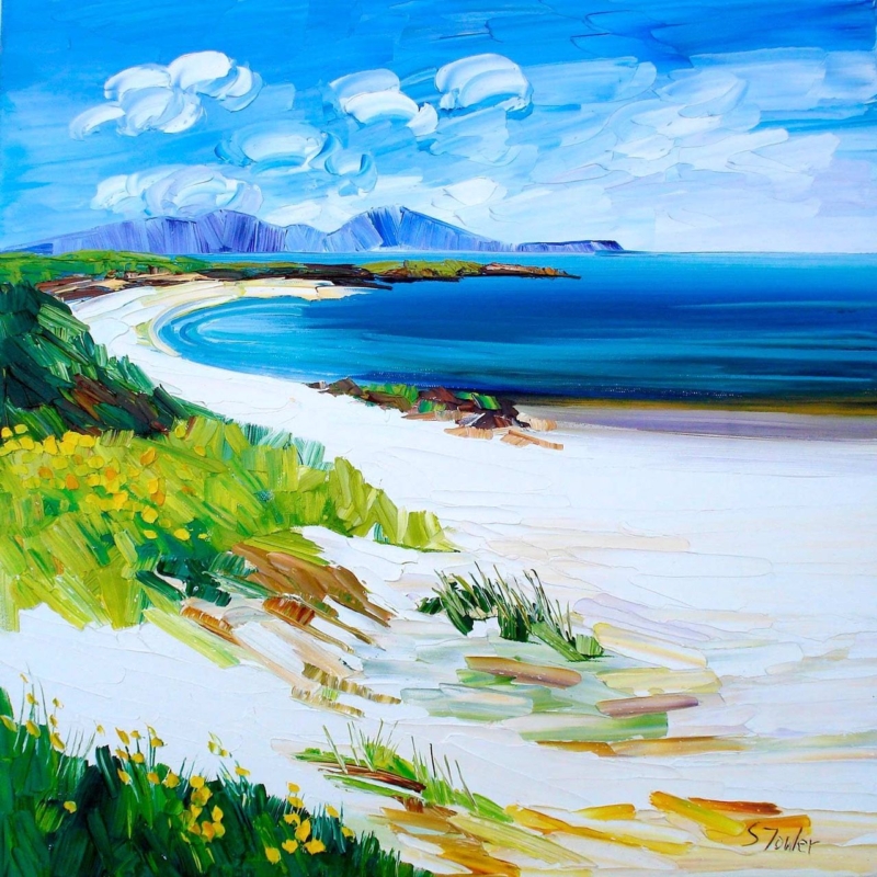
coastal wall art for a room with a limited outlook can give the eye somewhere to travel when the real window faces a wall, neighbouring building or narrow side return. Traigh Iar, North Uist by Sheila Fowler creates that sense of distance through a sweeping white beach, deep blue water and low island horizon. It does not need to imitate a window. Instead, the square painting offers a distinct, colourful destination within the room.

How coastal wall art for a room with a limited outlook creates depth

Rooms with small windows can feel visually compressed even when their floor area is generous. A landscape helps because it contains foreground, middle distance and horizon. In Traigh Iar, grasses and pale sand begin close to the viewer. The bay curves away, while distant headlands sit under a broad sky. Those layers encourage the eye to move through the image rather than stopping at the wall surface.

The square format prevents the scene from behaving like a false panoramic window. It remains clearly an artwork, with expressive palette-knife marks and saturated colour. This distinction matters. The aim is to add openness and interest, not disguise the architecture or promise a view that is not there.

Start with the sightline that needs relief

Stand where the room is used most. In a dining room, that may be a chair facing a blank wall. In a study, it could be the view beyond the monitor. In a basement sitting room, it may be the first wall seen from the stairs. Place the picture where it can interrupt the most enclosed sightline, not automatically above the largest item of furniture.

  1. Identify the longest seated view. Mark the wall that receives the most attention during daily use.
  2. Test the finished size. Make square paper templates for both available print sizes, including an allowance for mount and frame.
  3. Check the horizon height. It should feel comfortable from the main chair, rather than hanging close to the ceiling.
  4. Review natural light. Make sure the glazing does not simply reflect the limited window opposite.
  5. Clear the lower edge. Remove tall ornaments that block the pale beach and break the scene’s depth.

A larger version can give a substantial wall more presence, but bigger is not always more expansive. If the frame almost touches shelving or a door, the scene will feel boxed in. A smaller print with a generous area of clear wall can create a calmer pause.

Use the bright beach without making the room nautical

The painting contains turquoise shallows, cobalt water, white sand, green grasses and small yellow flowers. These colours can lift a room whose real outlook is grey or shaded. They do not require striped fabrics, shells or seaside signs. One or two connections will make the artwork feel settled while preserving its ability to open the view.

Room elementColour to borrowReason
Plain cushion or chairDeep sea blueAnchors the brighter turquoise
Natural timberWarm sand and ochre marksStops the palette feeling cold
Small ceramic or lampSoft yellowConnects with the foreground flowers
Wall colourWarm off-whiteSupports the beach without copying it exactly

Keep patterns quiet near the frame. The brushwork already provides texture in the clouds, dunes and grassy bank. Plain upholstery and simple storage let those marks supply the room’s movement without turning a smaller space into a collection of competing surfaces.

Balance blue with warmth and solid edges

Blue can make a shaded room feel fresher, but too much cool colour may leave it feeling less welcoming. Traigh Iar avoids this through yellow-green vegetation, ochre sand strokes and dark rocky edges. Repeat one of those warmer notes in timber, woven material or a small textile. The contrast makes the water look clearer and gives the whole scheme more depth.

The dark green bank on the left also performs an important job. It forms a strong near edge before the beach opens out. A frame with enough definition can echo that boundary and separate the luminous scene from the wall. Very pale framing against a pale wall may lose the crisp edge that helps the image read as a deliberate focal point.

Manage reflections in a room with awkward daylight

A limited outlook does not always mean low light. A close neighbouring wall can reflect a bright patch directly into glazing, while a small high window can produce strong glare at one time of day. Tape the paper template in place and observe it through morning, afternoon and evening. A move of only a few centimetres, or choosing the adjacent wall, may keep the horizon visible.

Artificial lighting should reveal the picture rather than flatten it. A lamp positioned to one side can bring out the variation in blue and the expressive cloud shapes. Avoid a bare spotlight directly opposite the glass. The goal is an inviting visual pause during both daylight and evening use.

Preserve the separation between sand, sea and sky

Sheila Fowler paints Scottish landscapes and coastlines with expressive brushwork, palette knife and rich colour. Traigh Iar depends on subtle separation as well as bold blue: pale sand shifts into shallow water, deeper sea meets a narrow headland, and white cloud marks move across the sky. Explore more of her work at Sheila Fowler’s official website, or compare the Sheila Fowler collection at First 4 Frames.

First 4 Frames uses colour-managed Giclée production and completes bespoke framing in-house at its Falkirk workshop. That process helps the pale beach remain distinct from the cloud whites, while retaining the turquoise transitions and darker blue water. A hand-finished frame then gives the open landscape a calm, precise edge within the room.

Well-placed coastal wall art for a room with a limited outlook can make an enclosed sightline feel more generous without pretending the artwork is a substitute for a real window. View the framed Traigh Iar, North Uist print for a North Uist scene that brings light, colour and convincing visual distance to the wall.

Posted on

Lang May Yer Lum Reek: Scottish New Home Blessing Wall Art

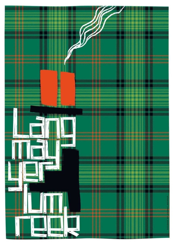
Scottish new home blessing wall art can say more than a card that disappears after the move. The traditional phrase wishes a household lasting warmth, life and prosperity. In Lang May Yer Lum Reek, Stewart Bremner gives that generous sentiment a bold graphic form. A black chimney, curling white smoke and hand-drawn lettering sit against green tartan. The result feels rooted in Scotland, but it is confident enough for a contemporary home.

Why Scottish new home blessing wall art carries real meaning

“Lang may yer lum reek” is a wish that the chimney may smoke for a long time. Behind the humour is a practical image of a home that remains occupied, warm and well provided for. That makes the phrase especially fitting for a first home, a move back to Scotland or a household beginning a new chapter.

The artwork makes the meaning easy to live with. It does not spell out a formal blessing or attach itself to one date. Instead, the chimney and smoke turn the words into an image. The owners can enjoy the graphic design every day, while the story behind the phrase remains part of the gift.

Match the gift to the household, not only the occasion

A successful new-home gift should suit the people after the boxes are unpacked. This print is particularly appropriate for someone who uses Scots, values Scottish culture or enjoys graphic artwork. It can also mark a move abroad, where a familiar phrase brings a warm connection to home without relying on a conventional landscape.

  • For first-time buyers, the phrase recognises the achievement without being overly formal.
  • For newlyweds moving home, it offers a shared wish that is not tied only to the wedding day.
  • For a Scottish family overseas, it brings language and identity into an everyday room.
  • For hosts in a new house, it works as a thoughtful alternative to wine, flowers or another kitchen accessory.

Before ordering, check that the recipient enjoys typography and the assertive green, black, orange and white palette. A personal gift does not need to match every cushion, but it should belong comfortably with the owner’s taste.

Give the tall composition a useful wall

The portrait format makes the print useful on walls that cannot take a wide landscape. It can sit beside a kitchen doorway, above a narrow console, at the end of a hall or on a chimney breast. The artwork is available in substantial portrait print sizes, so it should be measured as a finished framed piece rather than treated like a small sign.

Use paper to mark the proposed outer dimensions. View the template from the main entrance and from the nearest seating area. The words should be readable without the frame crowding a door architrave, light switch or mantel. If the picture is intended as a surprise, a photograph and measurements of the likely wall can help First 4 Frames advise on presentation.

Let tartan act as pattern, not a decorating theme

The green tartan background gives the print energy and Scottish identity. It does not require tartan upholstery, antlers or a room full of heritage references. In fact, the artwork is often stronger against a plain wall where the crossing lines can be seen clearly.

Nearby finishConnection to the printKeep restrained
Warm timberThe orange chimney pots and fine warm linesExtra tartan accessories
Black metalThe chimney silhouette and dark gridHeavy black furniture on every side
Off-white wallsThe smoke and hand-drawn letteringSmall competing word signs
Deep green paintThe dominant tartan fieldA frame that disappears into the wall

The lettering is deliberately irregular, while the tartan provides structure. That contrast lets the piece work with simple modern furniture as well as older architectural details. One nearby orange or rust accent can acknowledge the chimney pots, but repeating every colour would weaken the main image.

Choose framing that makes the blessing last

A framed print has a different presence from a paper card or unmounted poster. First 4 Frames uses colour-managed Giclée production and completes bespoke framing in-house at its Falkirk workshop. Careful presentation keeps the fine tartan lines crisp, protects the pale lettering and gives the strong graphic design a clean boundary.

A dark moulding can connect with the chimney, while a lighter timber can make the piece feel more relaxed. The correct option depends on the wall and nearby furniture. If the gift is being ordered before the recipient has decorated, choose a versatile frame rather than trying to predict a precise future colour scheme.

Include the story with the present

Write the meaning of the phrase in the card and explain why it made you think of the household. That small note turns an eye-catching design into a considered blessing. It also helps anyone unfamiliar with Scots understand that the smoke represents continuity, warmth and a home in active use.

Stewart Bremner is an Edinburgh-based artist, illustrator and graphic designer whose work celebrates Scottish language, culture and place through bold compositions. See more of his approach at Stewart Bremner’s official website, or browse the Stewart Bremner collection at First 4 Frames.

Thoughtful Scottish new home blessing wall art combines a generous traditional wish with something the household can keep and display. View the framed Lang May Yer Lum Reek print for a colourful way to wish warmth, happiness and a long life to a new home.

Posted on

How to Verify a Print’s Authenticity with Artist-Specific Checks

A certificate of authenticity can be useful evidence, but its details should match the print and fit a consistent record of the edition and provenance. To understand how to verify the authenticity of a print, compare the artist, title, medium and edition details with the certificate. Then check the artist’s authentication methods and the work’s ownership history.

It’s natural to look first for a signature or certificate, but neither proves authenticity on its own. This guide explains what a certificate can establish, how edition numbers and provenance support an assessment, and why the right checks vary by artist. Use these steps to weigh the evidence before deciding what claims about a print’s authenticity mean.

Key Takeaways

  • Compare a print’s edition details with its certificate, and look for consistency across the artwork and its records.
  • Assess a certificate by how specifically it identifies the print, its edition and its issuer.
  • Use invoices and earlier sale records to build a clearer picture of a print’s ownership history.
  • Research the authentication practices relevant to the individual artist, as methods and records can differ.

Signed prints compared with documented editions

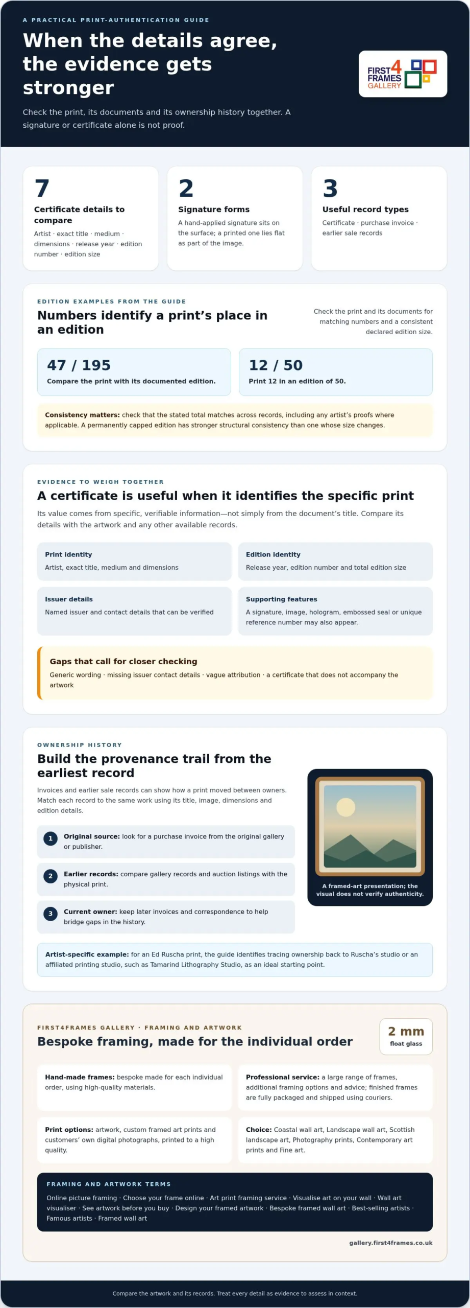
A signature can support an attribution, but edition records give it context. Compare the print with its documented edition, such as 47/195.

An original print is created as an artwork through a printmaking process; a reproduction copies an existing image. Compare the print’s production details and edition records with information about that specific work.

There is no single UK authentication or appraisal fee. The cost depends on the work and the assessment required, including whether it involves examining the print or tracing its records.

Compare the artist’s signature, edition number and printer’s mark with the certificate or edition documentation. A hand-applied signature sits on the surface and may show variations in pressure; a printed signature is part of the image and lies flat.

Paper, ink and printing technique can help when they match the edition’s recorded specifications. A difference may call for closer comparison, but materials alone cannot establish authenticity.

Signature and Edition Number Checks

A signature and edition number identify a print’s claimed place in an artist’s edition. Check the number, title and date against supporting documents rather than treating a signature as proof. A hand-applied signature shows surface variation, unlike one printed as part of the image. This distinction helps clarify what the signature actually demonstrates.

Declared Edition Size and Numbering

The declared edition size sets the total number of prints in a limited edition, while each number identifies an individual impression. Compare the print and certificate: 12/50 means print 12 in an edition of 50. Check that the stated total matches across records, including any artist’s proofs where applicable. A permanently capped edition has stronger structural consistency than an edition whose size changes.

Paper, Ink, and Printing Techniques

Compare the paper, ink and printing method with the specifications recorded for that edition. Check documents for details such as print method, ink and substrate, then see whether the physical work aligns. A printer’s mark may help identify how the print was produced, but it needs context from edition records. Differences can guide further scrutiny; appearance alone cannot settle authenticity.

What is a Certificate of Authenticity?

A certificate of authenticity records details linking a print to an artist and often to a particular edition. Its value lies in specific, verifiable information, not simply in the document’s title.

What a Certificate Confirms

A certificate identifies a print and its claimed place in an edition, allowing you to compare its details with the artwork. Look for the artist, exact title, medium, dimensions, release year, edition number and total edition size. The document should name its issuer and include contact details you can verify. It may also include a signature, image, hologram, embossed seal or unique reference number.

For a limited edition, the publisher usually issues a certificate for a specific print. Compare its details with the artwork and any accompanying records instead of treating the certificate alone as conclusive.

Documents that may accompany an authenticated print include its certificate, purchase invoice and earlier sale records. Together, these can help connect the artwork with its seller and ownership history.

These records can support provenance, the documented history of ownership and issue. A certificate can strengthen the paper trail, but it does not guarantee future market appreciation. The integrity of the edition matters more than the certificate alone.

Warning Signs in Questionable Certificates

A questionable certificate may use generic wording, omit the issuer’s contact details, give vague attribution or not accompany the artwork. These gaps make it harder to connect the document to a specific print. If a UK seller may have misrepresented a work, keep the listing, messages, invoice and photographs, then raise the discrepancy with the seller in writing.

When contacting the named publisher or gallery, provide the print’s title, edition number and a photograph of the certificate. Compare the response with the print and sales records before deciding what the paperwork establishes.

Keep the certificate flat, dry and out of direct sunlight. Store it in a folder with the invoice so the records stay together if the print changes hands.

If you’re choosing a separate artwork, explore Giclée fine art prints; a new purchase is distinct from authenticating a print you already own.

Checking artwork provenance

Provenance is the traceable history of a print’s ownership and movement between sellers. It can connect the physical work to its original source, publisher and later sales. A signature or edition number identifies a claim; invoices and sale records show how the print changed hands. To assess the history, build a timeline from the earliest available record to the present owner.

Start with the purchase invoice from the original gallery or publisher. Check that it names the artist and artwork, then compare those details with the print. An invoice that identifies only a broad category provides less context than one that names the specific work. Keep later invoices and correspondence too, as each can help bridge a gap between owners.

Earlier gallery records and auction listings can add further points to the timeline. Compare the title, image, dimensions and edition details in each record. A listing for the same artist is not enough if it describes a different work. Matching details help show that separate documents refer to the same print, rather than to a similar edition or image.

For an Ed Ruscha print, tracing ownership back to the original source is the first authentication step. Ideally, the history leads to Ruscha’s studio or an affiliated printing studio, such as Tamarind Lithography Studio. This example shows why provenance checks must be artist-specific: the relevant starting point depends on the artist and the work’s production history.

Look for unexplained gaps in ownership, but assess them alongside the records that do exist. A missing invoice does not tell the whole story; identifiable gallery documents, earlier sale records and consistent print details can still provide context. Record each owner or transaction in order, noting the document that supports each link.

To understand how to verify the authenticity of a print, compare its provenance with the publisher’s edition records and the artwork itself. Consistent dates, titles and numbering strengthen the account; conflicting details call for closer scrutiny. A clear ownership trail supports attribution, but should be considered alongside physical and edition evidence, not treated as proof on its own.

Artist-specific authentication methods

Authentication routes differ by artist, and some once-used processes no longer operate. Match your research to the artist’s estate, publisher and catalogue records.

Artist, Publisher, and Catalogue Checks

Artist-specific checks use records connected to the maker or edition, rather than relying on generic authentication advice. Contact the artist’s studio or publisher with the print’s title, edition details and photographs. Then compare their information with a relevant catalogue raisonné, a scholarly record of an artist’s works.

For Jean-Michel Basquiat, the estate stopped authenticating artworks in 2012. Its posthumous editions were authorised through Flatiron Editions and Pace Prints, so publisher records can offer a relevant line of enquiry. Enrico Navarra’s survey was first published in 1996 and updated in 2000. These records serve different purposes and should not be treated as interchangeable.

Authentication by Art Experts and Print Specialists

An art expert or print specialist can assess a work using its physical features and available documentation. In the UK, look for someone familiar with the specific artist and printmaking method, and ask for a written assessment explaining the evidence considered. An expert opinion can add context, but it is not automatically an authentication by the artist’s estate or publisher.

Past procedures matter. The Andy Warhol Foundation for the Visual Arts ceased operating its authentication board in 2012 and does not issue certificates or appraisals. The latest catalogue raisonné volume mentioned here was published in 2024 and covers 1977-1980. For Keith Haring, the foundation managed print authentication until its dissolution in 2012. A former route may no longer be available.

Francis Bacon’s estate stamped some print editions after his death in 1992; its catalogue raisonné appeared in 2016. Compare the print against the relevant catalogue and estate records, while distinguishing documented marks from later claims. For an unrelated purchase, browse fine art prints by artist.

Ed Ruscha’s artist’s proofs comprise roughly 10% of the total edition, so proof status alone should be checked against the edition record rather than treated as a guarantee. Francis Bacon reproduced roughly 36 of his paintings as print editions, making comparison with the relevant catalogue especially useful when assessing a claimed relationship to a particular painting.

First4Frames Gallery offers Ready-to-Hang Framed Art and Custom Picture Framing. Its online picture framing gives you a large range of frames to choose from, with each frame handmade to order using high-quality materials. Choose your frame online to create custom framed art prints and bespoke framed wall art, made to suit the individual artwork. Frames come glazed with 2 mm float glass.

Whether you’re looking for framed wall art or need an art print framing service for a piece you already own, professional framing can bring the artwork and its presentation together. Explore fine art prints and framing options at the First4Frames Gallery.

Choose the Next Step for Your Artwork

Knowing how to verify the authenticity of a print helps you decide what to do next. As you explore art for your space, consider whether coastal wall art, landscape wall art or Scottish landscape art suits the room. Browse contemporary art prints and photography prints, and consider work by best-selling artists as you choose a direction.

View the artwork before you buy, then consider how it will look on your wall. A wall art visualiser can help you picture its scale and placement; you can also mark out a simple outline on the wall. Once you’ve found a print, choose a frame that complements its colours and setting.

Explore the First4Frames Gallery artwork and find a piece that feels right for your home.

Frequently Asked Questions

How can I check a print’s provenance and exhibition or sales history?

Build a dated record of the print’s ownership, exhibitions and sales, keeping each type of evidence distinct. Match exhibition catalogue entries or labels to the specific artwork, not just the artist’s name. Record seller names and transaction dates from available paperwork, then compare them with the print’s title and edition details. An exhibition record shows display history, while invoices and sale records trace changes in ownership.

What are common signs of forged signatures, edition numbers or certificates?

Look for visible alterations, such as overwritten edition numbers, inconsistent handwriting or a signature that appears unusually uniform across separate copies. Check whether the certificate and print show conflicting titles, dates or numbering formats. A mark in an unexpected position may also warrant comparison with documented examples of that artist’s prints. Treat these clues as reasons for further investigation, not proof of forgery on their own.