Posted on

Why Bay of A Thousand Names Works Beautifully as Conservatory Wall Art

Image of Bay of A Thousand Names by Noel Fenech Photography

Finding the right conservatory wall art can be surprisingly important in a room with so much glass and shifting daylight. Bay of A Thousand Names is a strong choice when you want that brighter space to feel softer, warmer, and more grounded.

Why a conservatory still needs a focal point

Conservatories and garden rooms often have generous light, but that can leave the walls feeling a little underworked if the room has no visual anchor. Bay of A Thousand Names helps solve that by adding atmosphere and enough presence to keep the room feeling designed rather than simply sunlit.

  • It adds interest without fighting with outdoor views.
  • It suits rooms used for coffee, reading, or quieter afternoon time.
  • It helps a bright space feel more complete without making it heavier.

This matters especially in conservatories where wicker, painted timber, stone floors, or pale upholstery already set a relaxed tone. Artwork needs to support that ease rather than interrupt it, and Bay of A Thousand Names does that very naturally.

Why the framed finish matters in strong daylight

First 4 Frames completes each piece in-house in Falkirk with bespoke framing, colour-managed Giclee printing, and hand-finished craftsmanship. In a room with so much natural light, that superior quality matters because weaker presentation tends to look thin very quickly.

You can browse more from Noel Fenech Photography and view the exact framed piece here.

If you are comparing conservatory wall art, Bay of A Thousand Names is a very appealing way to add calm structure and colour to a brighter room.


Posted on

Walk on the Waves and the Difference Custom Framing for Art Prints Can Make

People usually look into custom framing for art prints when they want the artwork to feel properly finished rather than simply bought and hung. That difference matters most with atmospheric pieces, where the image needs the frame to give it structure as well as protection. Walk on the Waves shows that especially clearly.

Why custom framing changes the feel of the print

A coastal image built on tone, weather, and movement can lose impact if the presentation feels generic. The right frame helps define the picture, supports the palette, and gives the artwork enough authority to sit confidently within the room.

  1. It creates a stronger visual boundary around the image.
  2. It helps the print suit the specific room rather than an imagined average interior.
  3. It improves the sense of permanence and care once the piece is on the wall.

Why the service matters as much as the materials

First 4 Frames completes every piece in-house in Falkirk with bespoke framing, colour-managed Giclee printing, and hand-finished craftsmanship. That combination matters because custom framing is not only about choosing a moulding. It is about making the whole presentation feel right for the artwork and for the customer's space.

You can explore more from Colin Robertson and see the exact framed print here.

If you are weighing up custom framing for art prints, Walk on the Waves is a very clear example of how better framing improves both atmosphere and everyday livability.

Posted on

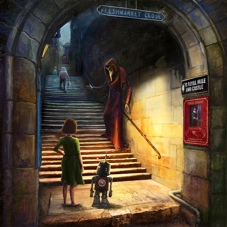
Why The Invitation Makes an Online Frame Designer More Useful

An online frame designer is most useful when the frame genuinely changes how the artwork feels, not just how it is finished. The Invitation is a very good example because the image already carries story and atmosphere. Different frame directions can push it towards something softer, darker, or more contemporary without losing that intrigue.

Why frame choice matters more with narrative artwork

Story-led prints ask the viewer to spend time with them. That means the frame has a bigger role to play. It can make the work feel more elegant, more dramatic, or more open, depending on what the room needs around it.

  • A cleaner frame can sharpen the image for a more contemporary setting.
  • A warmer frame can soften the mood and make the piece feel more intimate.
  • A stronger contrast can help the artwork read from further across the room.

Using a designer tool before buying helps avoid guessing. Instead of imagining the result in the abstract, you can compare options and decide which presentation best suits the room you actually have.

First 4 Frames completes each piece in-house in Falkirk with bespoke framing, colour-managed Giclee printing, and hand-finished craftsmanship. That makes the frame-selection step worth taking seriously, because the finished result is not a token extra. It is central to how the artwork will live in the space.

You can browse more from Matylda Konecka and view the exact framed print here.

If you are trying an online frame designer, The Invitation is an excellent example of why the right frame can alter the whole character of the final piece.

Posted on

Whispering Woods and the Real Value of a Wall Art Visualiser

A good wall art visualiser is not only for bold statement pieces. It can be even more helpful with subtler work, where the question is whether the image will still carry enough presence once it is framed and placed in a real room. Whispering Woods is exactly the kind of piece that benefits from that preview step.

Why quieter artwork often needs context

Some prints reveal their value immediately. Others are more atmospheric, and that can make them harder to judge on a plain product page. Seeing Whispering Woods against your own wall helps answer practical questions that matter more than impulse alone.

  • Will the artwork look too faint against a pale wall?
  • Does the chosen size give it enough authority?
  • Will the framed finish add the structure the image needs?

That kind of preview is useful because subtle artwork can be wonderful in a room once the scale and framing are right. Without that context, buyers sometimes underestimate how much calm atmosphere a piece can bring.

First 4 Frames produces every piece in-house in Falkirk with bespoke framing, colour-managed Giclee printing, and hand-finished craftsmanship. A visualiser helps you judge placement, but the final quality still matters because the frame is what gives a softer image its finished authority on the wall.

You can browse more from Noel Fenech Photography and see the exact framed print here.

If you are exploring a wall art visualiser, Whispering Woods is a strong reminder that previewing placement can make quieter artwork much easier to choose with confidence.

Posted on

The Pier Walk, St Andrews as Large Framed Prints for a Longer Wall

People often search for large framed prints because the wall they need to dress simply asks for more. A small piece can look hesitant on a longer run of plaster, above a sideboard, or across a room where furniture already has visual weight. The Pier Walk, St Andrews is a strong example of how scale can feel generous without becoming overpowering.

What a larger framed piece solves

Size is not only about filling space. It is about getting the proportion right so the room feels intentional. The Pier Walk, St Andrews works well when the aim is to carry the eye along a wider wall while still keeping a light, open feel.

  1. A larger format gives the wall enough visual confidence.
  2. The framed finish stops the piece feeling like an enlarged poster.
  3. The subject keeps the scale airy rather than heavy.

This matters in dining spaces, living rooms, and hallways where furniture can easily dwarf a smaller print. A larger framed piece helps the room feel designed rather than patched together.

Large framed prints work best when scale and breathing space are considered together, not as separate decisions.

First 4 Frames completes each framed print in-house in Falkirk with bespoke framing, colour-managed Giclee printing, and hand-finished craftsmanship. That superior finish is especially important at a larger scale, where weak materials or flimsy presentation become more obvious.

You can browse more from Rob Hain and view the exact framed work here.

If you are comparing large framed prints, The Pier Walk, St Andrews shows how a broader piece can feel spacious, polished, and very easy to live with.

Posted on

Harbour Street, Tarbert and the Warmth Good Kitchen Wall Art Can Bring

Useful kitchen wall art should make the room feel more human, not more cluttered. Kitchens are often full of cabinetry, appliances, and practical surfaces, so the right print has to bring warmth and personality without turning the space into a themed set. Harbour Street, Tarbert handles that balance very well.

Why kitchens respond well to artwork with movement and place

Many kitchens benefit from artwork that feels lively and rooted rather than stiff. A scene with colour, movement, or a recognisable setting can make the room feel more sociable, especially when the kitchen also doubles as a place to chat, perch, or share a quick meal. Harbour Street, Tarbert brings exactly that kind of lift.

It works particularly well in kitchens that already rely on painted units, open shelving, wood accents, or a breakfast spot that needs a little more character. The image adds warmth, but the framed finish keeps it looking resolved.

  • It softens a practical room without making it feel busier.
  • It adds a welcoming note where cabinetry can otherwise dominate.
  • It gives a kitchen more local personality and visual rhythm.

First 4 Frames produces every piece in-house in Falkirk with bespoke framing, colour-managed Giclee printing, and hand-finished craftsmanship. That quality-led finish matters in kitchens because details are always close at hand and weaker presentation tends to show very quickly.

You can explore more from Rob Hain and see the exact framed print here.

If you are reviewing kitchen wall art, Harbour Street, Tarbert is a strong way to make the room feel warmer, more sociable, and better finished.

Posted on

Why Tree on the Loch Works Beautifully as Living Room Wall Art

Good living room wall art does more than fill a gap. It helps the seating area feel settled, gives the eye somewhere to rest, and adds enough presence that the room feels complete rather than still in progress. Tree on the Loch does that especially well because it has quiet atmosphere without becoming flat or forgettable.

Why the main wall in a living room needs balance

Living rooms are full of competing demands. They need comfort, conversation, and a little visual structure. Artwork often has the job of tying those things together. Tree on the Loch suits that role because it feels calm enough for everyday use, but still has enough clarity to anchor the wall behind or near a sofa.

  • It gives the room a focal point without shouting for attention.
  • It works well in spaces that already use softer neutrals, timber, or textured fabrics.
  • It adds atmosphere while keeping the overall mood restful.

Why presentation matters in a room you use every day

First 4 Frames completes each piece in-house in Falkirk with bespoke framing, colour-managed Giclee printing, and hand-finished craftsmanship. In a living room, that standard matters because the artwork is always in view. A stronger framed finish helps the piece feel intentional rather than like a temporary placeholder.

You can browse more from Noel Fenech Photography and view the exact framed print here.

If you are comparing living room wall art, Tree on the Loch is a very appealing option for bringing calm definition to the room without making the scheme feel heavy.

Posted on

Choose Your Frame Online? Bell Rock Shows Why the Finish Matters

If you want to choose your frame online, one of the most helpful things is using an artwork that responds clearly to different finishes. Bell Rock is exactly that sort of piece. The lighthouse subject gives it enough structure and atmosphere to suit a range of rooms, but the frame choice changes the final mood more than many customers expect.

How the frame changes the same artwork

With coastal or architectural imagery, the frame can push the result in different directions. A darker or cleaner finish may make Bell Rock feel sharper and more contemporary, while a softer tone can make it feel warmer and more classic. The image remains the same, but the room reads it differently.

  • A crisper frame can emphasise line and contrast.
  • A softer finish can help the print sit more gently with traditional interiors.
  • The right option depends on the room, not just the picture in isolation.

This is especially useful in hallways, offices, and living spaces where customers already know the wall needs a Scottish coastal focal point, but are still deciding whether the room should lean more modern or more classic.

The frame is often what turns a print you like into a piece that genuinely belongs in the room.

First 4 Frames completes each piece in-house in Falkirk with bespoke framing, colour-managed Giclee printing, and hand-finished craftsmanship. That personal service is exactly why frame choice matters so much here. A well judged finish helps the artwork feel made for the room rather than simply added to it.

You can browse more from Raymond Murray and view the exact framed product here.

If you want to choose your frame online with a clearer sense of what the finish will change, Bell Rock is a very helpful place to start.

Posted on

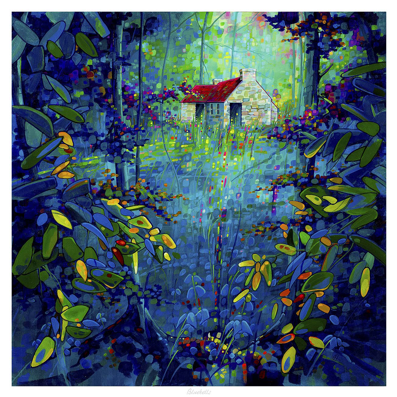
Why Bluebells Is Useful When You Want to Preview Artwork Before Buying

Being able to preview artwork before buying is often what stops a good choice becoming an uncertain one. Customers may like the image itself, but still wonder whether the colour, scale, or framed weight will actually suit the room. Bluebells is a useful example because softer floral landscape work can look very different depending on the wall, the light, and the framing around it.

Why previewing matters with gentler colour palettes

Artwork with softer blues, greens, and woodland tones often succeeds through balance rather than sheer impact. That means the customer usually needs to judge more carefully how the piece will sit with daylight, paint colour, and nearby furnishings. Bluebells makes that easy to understand because it can either feel beautifully calming or slightly too quiet depending on where it goes.

  • Previewing helps you judge whether the colours will lift the room enough.
  • It shows whether the framed piece has the right visual weight for the wall.
  • It reduces the risk of choosing something lovely that still feels undersized or too gentle once hung.

This is particularly valuable in bedrooms, garden rooms, and lighter living spaces where daylight changes the artwork throughout the day. Seeing the likely effect in advance helps the final choice feel more assured.

Why framing is part of the preview, not an afterthought

First 4 Frames completes each piece in-house in Falkirk with bespoke framing, colour-managed Giclee printing, and hand-finished craftsmanship. That matters because previewing the artwork properly is not only about the image. The frame changes the visual weight and often decides whether the piece feels just decorative or properly finished.

You can explore more from Chris Sharp and view the exact framed print here.

If you want to preview artwork before buying with more confidence, Bluebells is a strong example of why colour, scale, and framing should all be judged together.

Posted on

Zebra Glass and the Lasting Appeal of Black and White Wall Art

Strong black and white wall art can do something colour-led pieces sometimes cannot. It can make a room feel sharper, calmer, and more deliberate all at once. Zebra Glass is a good example because its monochrome character brings clarity and contrast without asking the rest of the room to compete.

Why monochrome artwork can feel more architectural

In interiors with cleaner lines, quieter palettes, or stronger materials, colour is not always what the wall needs. Sometimes the better choice is definition. Zebra Glass works well because the black and white treatment encourages the eye to focus on form, light, and pattern rather than distraction.

  • It adds contrast without complicating the palette.
  • It suits rooms that already rely on texture, line, or material detail.
  • It can make a simpler scheme feel more intentional very quickly.

This is often useful in bedrooms, offices, or living rooms where the furniture is restrained and the room needs a focal point that feels crisp rather than decorative for its own sake.

Black and white artwork often succeeds because it edits a room rather than adding to its noise.

First 4 Frames completes each piece in-house in Falkirk with bespoke framing, colour-managed Giclee printing, and hand-finished craftsmanship. With monochrome work especially, that controlled finish helps keep the result clean and confident on the wall.

You can browse more from Noel Fenech Photography and view the exact framed product here.

If you are looking for black and white wall art that feels graphic, balanced, and easy to place in a modern room, Zebra Glass is a smart choice.