Posted on

Choosing Art for Taupe Walls, Why Soul in Shadow Feels So Well Judged

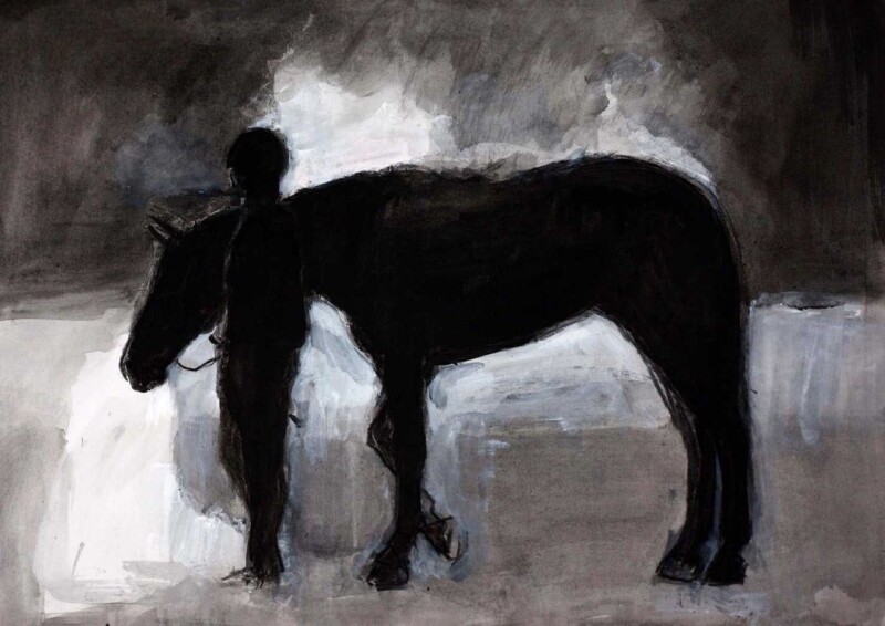
Image of Soul in Shadow by Diana Hand

Choosing art for taupe walls is often about introducing depth without losing the calm that makes taupe so useful. Softer neutral rooms can feel elegant and easy to live with, but they still need something that gives the eye a little more definition. Soul in Shadow works beautifully in that role.

Why taupe schemes benefit from artwork with poise

Taupe is at its best when the room feels layered rather than flat. That usually means artwork with enough contrast and character to create a focal point, but not so much that the restful quality disappears. This piece adds exactly that sort of balance.

  • It deepens a softer palette without hardening it.
  • It feels elegant rather than overly decorative.
  • It suits bedrooms, sitting rooms, and dressing spaces especially well.

Why the subject feels so natural in a neutral room

Artwork with composure often works best against taupe because the wall colour already does some of the calming. Soul in Shadow brings presence and grace, which helps the room feel more intentional while still leaving space for fabrics, lighting, and furniture to breathe.

It can work especially well above a bed, over a console, or on the wall that needs one stronger statement in an otherwise restrained scheme.

Why a bespoke framed finish helps

At First 4 Frames, every piece is completed in-house in Falkirk with bespoke framing, colour-managed Giclée printing, and hand-finished craftsmanship. That superior finish is particularly valuable in neutral interiors, where cheaper details tend to stand out quickly.

This artwork is by Diana Hand, and you can view the exact framed product here.

If you are looking for art for taupe walls that feels elegant, balanced, and professionally finished, Soul in Shadow is a very strong option.

Posted on

How A Path Unseen Can Bring Focus to a Meditation Room

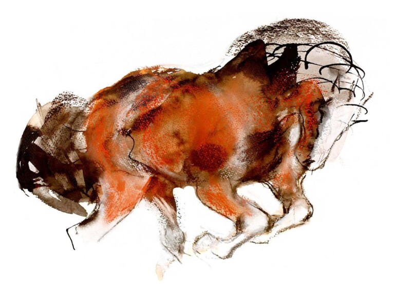
Choosing meditation room wall art is not about filling a blank wall for the sake of it. The right piece should help the room feel more settled, more focused, and easier to be in. A Path Unseen by Diana Hand does that beautifully, because it has movement without agitation and presence without heaviness.

Why this piece suits a reflective space

A Path Unseen is an equestrian artwork, but it does not feel literal or decorative in a busy way. The expressive lines and sense of motion give it life, while the overall feel remains thoughtful and inward-looking. That balance works well in a room designed for breathing, stretching, journalling, or quiet thought.

  • It introduces focus without becoming visually loud.
  • It brings warmth and emotion into a pared-back room.
  • It suits spaces where calm matters more than trend-driven styling.

Where it can work best

This piece would sit especially well on the main wall you face during seated practice, beside a reading chair, or above a low console with candles or objects that already support a slower routine. If the room includes natural textures, muted paint, timber, or soft stone tones, the artwork can help tie everything together.

Why the framed finish matters

First 4 Frames produces the work in-house in Falkirk using colour-managed Giclée printing and hand-finished bespoke framing. That matters in a meditation room because small details stand out more in quieter spaces. A properly framed piece feels deliberate, lasting, and in keeping with a room built around care and attention.

The artwork is by Diana Hand, and you can view the exact framed product here.

If you want meditation room wall art that feels calm, expressive, and professionally finished, A Path Unseen is a very strong option.