


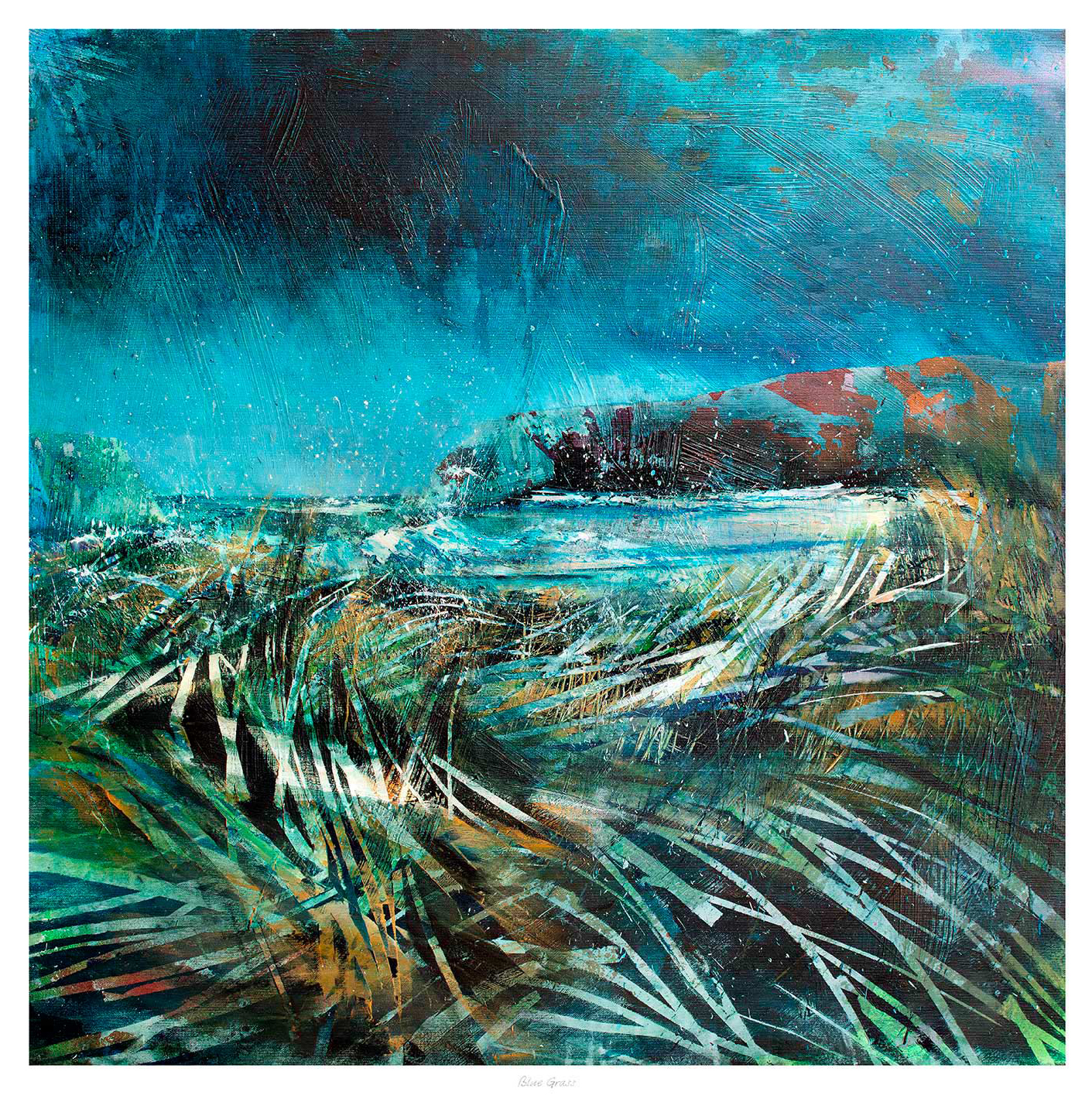
abstract wall art for a blue and green living room can keep a coordinated palette from feeling too careful. When upholstery, paint and textiles already sit within blue and green, the artwork should add variation, energy and depth rather than repeat one flat shade. Blue Grass by Fiona Matheson does this through sweeping blue, green and white marks. The image suggests wild grass, changing weather and open land without spelling out every detail.
Begin with contrast inside the palette
Blue and green are close neighbours in many natural settings, so they usually feel comfortable together. The risk is not a clash. It is a room in which every surface has the same visual weight. An expressive picture introduces pale passages, deeper marks and changes in direction. Those differences give the eye somewhere to pause.
Blue Grass includes enough white to separate it from a strongly coloured wall. It also contains darker movement that can hold its place above a paler sofa. This flexibility matters because the artwork can connect the room without disappearing into it.
Build abstract wall art into a blue and green living room
Choose one dominant room colour and let the other play a supporting role. For example, a soft green wall may carry the larger visual area, while navy upholstery provides weight. The artwork can then contain both colours in freer proportions. It becomes a bridge rather than a sample card that must match everything exactly.
If the walls are green
Use the picture’s blue and white movement to create separation. A mount or restrained frame can add a clean boundary where needed.
If the walls are blue
Let the greener brushwork and pale sky-like areas lift the wall. Avoid choosing a frame that repeats the paint too precisely.
Use texture to stop the scheme feeling flat
A limited palette becomes richer when materials change. Wool, linen, timber and glazed ceramics each reflect light differently. These surfaces support the layered marks in the picture without requiring more colours. They also make the room feel collected over time rather than assembled from one coordinated range.
- Place the largest blue or green surface first. This might be the wall, sofa or rug.
- Add the second colour at a different scale. Use an armchair, curtain or smaller textile rather than an equal block.
- Introduce the artwork. Check that its lightest and darkest passages remain visible from the doorway.
- Add one warm neutral. Natural timber, oatmeal or a muted clay tone will keep the palette from feeling cold.
- Remove exact repeats. If several accessories match the picture too closely, keep only the strongest one.
Choose scale from the furniture, not the paint area
A colourful wall can make the available space seem larger than the furniture beneath it. Base the framed width on the sofa, sideboard or console that visually supports the picture. A useful composition should feel connected to that furniture while retaining clear space around the frame. Avoid filling every gap simply because the wall colour continues beyond it.
The near-square composition of Blue Grass is helpful above a compact sofa or between tall elements such as windows and shelving. It can also give a long sideboard a deliberate off-centre arrangement when balanced by a lamp or sculptural object. Test the framed dimensions with paper before deciding.
Frame the movement without containing it too heavily
A simple moulding allows the brushwork to remain the main event. Dark framing can sharpen the deeper marks, while pale timber supports a softer natural scheme. A mount may create useful breathing room, especially on a coloured wall. The best choice depends on the actual paint and textiles, not a screen preview.
First 4 Frames produces colour-managed Giclée prints and completes bespoke framing in-house in Falkirk. That process helps the quieter shifts between blue, green and white remain distinct, then gives the finished piece a hand-finished presentation suited to everyday living.
Explore Fiona Matheson’s expressive landscapes
Fiona Matheson uses energetic marks and layered colour to move between landscape reference and abstraction. Visit Fiona Matheson Studio for more about her work, or browse the Fiona Matheson collection at First 4 Frames. Seeing the wider practice helps explain why this image feels rooted in landscape even when the details stay open to interpretation.
The best abstract wall art for a blue and green living room adds variation rather than another exact match. View the framed Blue Grass print for layered colour, open movement and a flexible focal point that can bring a related palette to life.