


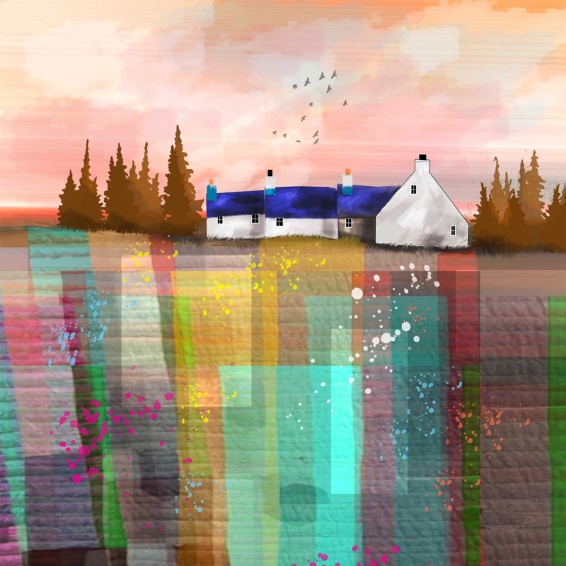
Art for plum walls does not have to avoid purple. The key is to create separation so related colours feel layered rather than lost. Purple Cottage by Rikki O’Neill offers a compact square focal point whose cottage subject can bring imagination and structure to a deep painted wall.
Give art for plum walls enough tonal separation
- Hold the print against the wall in daylight and lamplight before settling on a frame.
- Use a pale mount or a lighter inner edge if the image boundary disappears into the paint.
- Keep nearby purple accessories to a minimum so the artwork remains the deliberate focal point.
- Add one natural material, such as oak, linen, or wool, to soften the depth of the scheme.
The 265 mm square print suits a bedside wall, compact landing, alcove, or the space above a narrow table. Centre it to the furniture or architectural feature below. On a large empty wall, the piece may need a lamp, small chair, or console to give its compact scale a clear visual anchor.
By day
Check whether cool daylight makes the plum paint appear bluer. A warm frame note can prevent the arrangement from becoming too cold.
After dark
Use a soft lamp from the side. Direct glare can flatten both the wall colour and the detail within a small image.
Let a compact image remain clear on a deep wall
Rikki O’Neill’s imaginative digital illustration needs clean colour boundaries and fine detail at a modest scale. Colour-managed Giclée production protects that clarity. Precise in-house framing then creates the contrast required for a small square image to hold its own against saturated paint.
For background on a distinctive Scottish domestic building tradition related to the cottage subject, read the National Trust for Scotland’s history of island blackhouses. Browse more work by Rikki O’Neill, or view the exact Purple Cottage framed print.
When choosing art for plum walls, Purple Cottage shows that colour harmony can be effective when pale space, frame contrast, and disciplined placement stop the composition blending into its background.