Posted on

White Cottages: Art for a Room With White Slipcovered Furniture

Image of White Cottages by Rikki O'Neill

art for a room with white slipcovered furniture has to provide enough definition for a very pale scheme without losing the room’s easy, washable character. White Cottages by Rikki O’Neill makes that contrast gently. The white buildings echo the upholstery, while the surrounding colour gives the wall a stronger focal point and prevents the whole interior from feeling bleached or unfinished.

How art for a room with white slipcovered furniture adds depth

White covers are popular because they make a room feel informal and bright. They can also be removed for cleaning, which suits busy homes, holiday cottages, and family sitting rooms. The challenge is visual rather than practical. When pale seating, walls, and curtains sit together, their edges can disappear and leave the space looking flatter than intended.

A compact, colourful picture creates a point of focus without changing the basic palette. In this image, the cottages repeat the room’s lightest note. The richer landscape around them provides the missing contrast. This makes the artwork feel connected rather than added simply to introduce colour.

Use contrast in small, deliberate amounts

  • Keep most textiles quiet. Let one cushion or throw echo a secondary colour instead of repeating the full image.
  • Add natural texture. Linen, timber, basketry, or wool can separate one pale surface from another.
  • Choose one clear frame edge. A defined moulding stops the picture fading into a white wall.
  • Leave breathing space. The square format benefits from a calm margin rather than a crowded gallery arrangement.

This measured approach preserves the appeal of slipcovers. The room remains fresh and adaptable, but it gains enough colour to feel inhabited throughout the year. Accessories can change seasonally without requiring the artwork to be replaced.

Match the 265 mm square to the right wall

The available print size is 265 by 265 millimetres before framing. That compact square is better treated as a deliberate detail than stretched across a large empty wall. It can sit above a side table, beside a reading chair, between two narrow windows, or on a short return near the sofa. A mount and moulding increase the final dimensions, so measure using the complete framed size.

Before ordering, tape a paper square to the proposed position. View it from the doorway and from the main seat. If it looks isolated, move it closer to a lamp or small piece of furniture rather than surrounding it with unrelated prints. If it feels too busy, remove nearby accessories and let the artwork carry the colour.

Check pale interiors in changing light

A white room can look cool in northern daylight and warmer under evening lamps. Examine the wall at both times. The frame should maintain a clear boundary, while the print’s colourful details should remain visible without strong glare. A thoughtful mount can add separation and keep the image from feeling pressed against the wall colour.

First 4 Frames uses colour-managed Giclée production and completes bespoke framing by hand in Falkirk. That in-house process supports the bright detail in the artwork and makes the modest square feel properly resolved rather than like a temporary decorative print.

Colourful illustration by Rikki O’Neill

Rikki O’Neill is a self-taught illustrator, cartoonist, photographer, and digital artist whose work is known for colour and imaginative character. See more on Rikki O’Neill’s official website, or browse the wider Rikki O’Neill collection at First 4 Frames.

The right art for a room with white slipcovered furniture can keep a light interior relaxed while giving it a memorable centre. View the framed White Cottages print for a small-scale focal point with bright personality and bespoke, ready-to-hang presentation.

Posted on

Troon Harbour: Coastal Wall Art for a Sailing Club Lounge

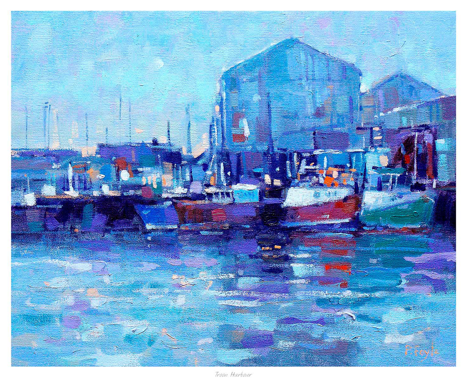
coastal wall art for a sailing club lounge should recognise the life of the water without turning a shared room into a collection of anchors, ropes, and nautical signs. Troon Harbour by Peter Foyle offers a more grounded approach. Its boats, harbour buildings, and coloured reflections describe a real working place, giving members and visitors a subject they can discuss as well as enjoy.

Why coastal wall art for a sailing club lounge needs authenticity

A club lounge has several jobs. It may welcome visiting crews, host committee conversations, serve post-race refreshments, and provide a quieter place to watch changing weather. Generic seaside decoration rarely connects those uses. A recognisable harbour scene feels more credible because it reflects boats as part of daily coastal life rather than as a decorative motif.

The industrial forms in Troon Harbour are important. They keep the view from becoming sentimental, while the blue water and lively reflections retain warmth. That balance suits a club that values seamanship and local history but still wants its public rooms to feel bright, current, and professionally maintained.

Place the picture where people naturally pause

Choose a wall that allows the long composition to be read from several seats. Above a low sideboard, the picture can anchor a refreshment area without taking space from trophies or practical notices. On a wall opposite the windows, it can offer a second view when weather hides the real horizon. Avoid positioning it among race instructions, safety information, or densely arranged photographs.

Club-room checkWhy it matters
View from the entranceThe harbour should read clearly as visitors arrive
Check seated sightlinesTables and high-backed chairs should not cut through the composition
Test daytime glareReflected windows should not hide the painted reflections
Keep notices separateOperational information stays legible and the artwork keeps its presence

Build a restrained coastal palette around it

There is no need to match every blue in the image. Let the print supply varied water colour, then use practical upholstery and simple timber finishes around it. One or two warm accents can pick up the harbour buildings or boat details. This creates connection without making the lounge feel overly coordinated.

A darker moulding can give the scene definition on a pale wall. A natural timber may suit a room with traditional joinery. The mount and frame should also provide enough separation from patterned wallpaper, honours boards, or timber panelling. First 4 Frames can advise on those choices and completes the colour-managed Giclée printing and bespoke framing in-house at its Falkirk workshop.

A harbour painter with a feel for light

Peter Foyle paints Scottish coasts, harbours, cities, and still life with particular attention to atmosphere and reflected light. Explore more of his work on Peter Foyle’s official website, or compare other coastal subjects in the Peter Foyle collection at First 4 Frames.

Well-chosen coastal wall art for a sailing club lounge can express a club’s relationship with its surroundings while remaining useful interior design. View the framed Troon Harbour print for an Ayrshire harbour scene finished with lasting, hand-completed craftsmanship.

Posted on

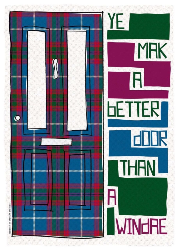
Ye Mak a Better Door Than a Windae: Scottish Wall Art for a Flatshare

Scottish wall art for a flatshare has to do more than suit one person’s taste. A shared living room may contain inherited chairs, temporary shelving, several colour preferences, and housemates who change over time. Ye Mak a Better Door Than a Windae by Stewart Bremner meets that challenge with a familiar joke, a strong graphic layout, and tartan-inspired colour. It gives everyone a talking point without pretending the room has one perfectly coordinated style.

What Scottish wall art for a flatshare should contribute

Communal artwork works best when it creates recognition rather than claiming ownership of the whole room. This phrase is likely to raise a smile for anyone who has blocked a television, window, or kitchen cupboard without noticing. The humour comes from ordinary shared life, so it feels more inclusive than a personal slogan or a highly specific hobby print.

The design has enough visual substance even before the words are read. A tall tartan-covered door occupies one side. Blocks of green, magenta, blue, and white turn the phrase into a lively vertical rhythm on the other. That balance allows the print to work as graphic art from across the room and reveal the joke at closer range.

Agree on a position before debating every colour

A shared decision becomes easier when housemates start with the wall rather than the frame finish. Look for a place seen by everyone: above a low sideboard, beside the dining table, or on the main route between kitchen and sitting area. Avoid the narrow strip behind an actual open door, where both the artwork and the joke would spend much of the day hidden.

  • Use the common sightline. Check the view from the sofa, dining seats, and doorway.
  • Keep notices separate. Do not crowd the frame with calendars, keys, or a household chore board.
  • Allow for changing furniture. A strong wall position should still work if a borrowed bookcase or table is replaced.
  • Choose one colour connection. Repeat a green, blue, or magenta note if it already exists, but do not force the entire room to match.

Use the generous format as a shared focal point

The available print sizes are 420 by 594 millimetres and 594 by 840 millimetres before framing. Both are substantial enough to avoid looking like a temporary sign. The larger size can anchor a broad communal wall, while the smaller option may suit a dining corner or the end of a galley-style living space.

Measure the complete framed dimensions rather than the print alone. A mount and moulding add presence. Use paper templates to compare the two options, then make sure doors, cupboard fronts, and tall lamps have clear movement around the proposed position.

Can bold Scots language art still look polished?

Yes, provided the presentation treats it as artwork rather than a poster pinned up for a season. A simple dark moulding can echo the black outlines and sharpen the blocks of colour. A quiet natural timber may soften the graphic quality in a room with older furniture. In either case, the frame should contain the energy rather than compete with it.

First 4 Frames uses colour-managed Giclée production and hand-finishes its bespoke framing in-house in Falkirk. That level of craftsmanship supports the fine tartan pattern, clean lettering, and saturated colour. It also gives a shared home one properly finished piece that can move with its owner later, instead of becoming disposable flat decor.

A familiar phrase with confident graphic design

Stewart Bremner is an Edinburgh-based artist, illustrator, and graphic designer whose work celebrates Scottish language, landscape, and culture. His bold shapes and poster-like compositions make familiar subjects feel contemporary. See the wider range on Stewart Bremner’s official website, or browse the Stewart Bremner collection at First 4 Frames.

The best Scottish wall art for a flatshare gives several people a reason to enjoy the same wall. View the framed Ye Mak a Better Door Than a Windae print for a colourful piece whose humour, scale, and distinctly Scottish voice can hold together an otherwise mixed communal room.

Posted on

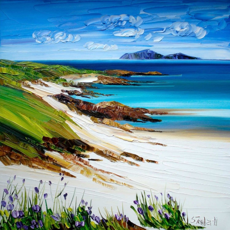
White Sands and Wildflowers, Iona: Coastal Wall Art Above a Navy Sofa

coastal wall art above a navy sofa needs enough light, contrast, and visual breadth to avoid disappearing into the upholstery. White Sands and Wildflowers, Iona by Sheila Fowler offers all three. Its deep blue sea relates naturally to navy fabric, while white sand, turquoise water, green slopes, and small purple flowers keep the arrangement from becoming one continuous block of dark blue.

Why coastal wall art above a navy sofa needs contrast

A navy sofa already carries considerable visual weight. Hanging another uniformly dark image above it can make the seating and frame merge, especially on a wall with modest daylight. The answer is not necessarily a warmer picture. A coastal composition can stay within the room’s blue family if it also contains clear pale areas and changes in depth.

White Sands and Wildflowers, Iona moves from flowers and bright sand in the foreground to turquoise shallows, darker water, and distant islands. That sequence draws the eye through the picture rather than holding it on one flat colour. Thick, expressive marks also provide a tactile counterpoint to smooth or tightly woven upholstery.

Let the sand and sky form a visual break

The most useful colours here are not only the blues. Broad white sand and a bright horizon create separation from the sofa below. When assessing the position, sit in the main chair and check that these lighter passages remain visible rather than being lost behind cushions, lamps, or tall side-table objects.

Colour in the artworkWhat it contributes to the room
White sand and cloudCreates a clean interval above dark upholstery
Turquoise shallowsAdds freshness without abandoning the blue palette
Green headlandConnects naturally with plants, timber, and garden views
Purple wildflowersIntroduces a small accent that does not need repeating everywhere

A cushion or throw may echo one minor colour, but avoid matching every shade. The composition should broaden the palette, not become an instruction to add turquoise and purple accessories throughout the room.

Choose a scale that belongs to the sofa

This square print is available in 265 by 265 millimetres and 500 by 500 millimetres before framing. Above a full-size sofa, the larger option is usually the more convincing starting point. The mount and moulding will increase the final dimensions, so mark the complete proposed frame on the wall with low-tack tape before deciding.

  1. Centre on the seating group. Use the sofa and nearby table or lamp as the composition, rather than measuring the entire wall.
  2. Keep a clear gap. Leave enough space above the sofa for the frame to feel separate, but not so much that the picture appears disconnected.
  3. Check head clearance. Consider how people sit, stand, and reach behind the sofa before fixing the height.
  4. View it after dusk. Make sure room lighting reveals the turquoise, green, and foreground flowers instead of flattening everything into blue.

Frame the colour without making it heavier

A dark moulding can repeat the navy sofa and give the lively painted surface a crisp edge. However, a very broad dark frame may add too much weight. A restrained pale or natural timber can relate to the sand and bring warmth into the arrangement. The right choice depends on the wall colour, sofa fabric, and other wood finishes in the room.

First 4 Frames produces colour-managed Giclée prints and completes bespoke framing by hand at its Falkirk workshop. That in-house process helps the white sand remain distinct from the clouds, while the turquoise water, darker sea, grass, and flowers keep their separate character. It also makes the finished piece ready to hang with a presentation chosen for the actual room.

An Iona view with colour as well as calm

Sheila Fowler is known for expressive Scottish landscapes, coastlines, and wildflowers painted with rich colour and texture. This scene feels open and restorative, yet the foreground prevents it from becoming an anonymous blue seascape. Discover more on Sheila Fowler’s official website, or compare other work in the Sheila Fowler collection at First 4 Frames.

Well-judged coastal wall art above a navy sofa should lift the seating area while still respecting its strongest colour. View the framed White Sands and Wildflowers, Iona print for an Iona landscape that combines clear distance, vivid water, pale sand, and just enough wildflower detail.

Posted on

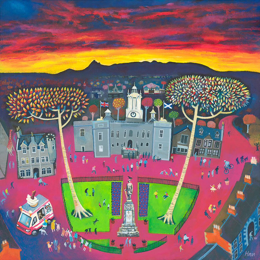
The Ice Cream Lady: Wall Art for a Community Café

wall art for a community café should make the room feel connected to people rather than decorated by formula. The Ice Cream Lady by Rob Hain is centred on an ordinary pleasure shared in public. An ice cream van, walkers, cyclists, trees, colourful buildings, and a glowing evening sky turn the square into a lively neighbourhood scene with many small stories.

Why wall art for a community café needs real social energy

A community café may host a quick morning coffee, a parent meeting, a volunteer shift, an informal class, or a quiet lunch. Its artwork therefore has to welcome many kinds of visitor. Generic coffee slogans can make the room feel interchangeable. A scene of people moving through shared space says something broader: this is a place where everyday life happens.

In The Ice Cream Lady, the figures are not posed around a formal occasion. They walk, cycle, stop, and gather beneath a dramatic orange-red sky. The ice cream van gives the scene a clear centre, but streets, trees, and varied buildings keep it from feeling like product advertising. That mix suits a café built around local connection.

Place the picture where it supports the room

Choose a wall that is visible during natural pauses: opposite the queue, beside a communal table, or in a quieter seating zone. Avoid using the artwork as a background for mandatory notices, menus, and fire-safety information. Those items need clarity. The framed print needs enough separation to create atmosphere without weakening operational messages.

  1. Map the busiest route. Keep the frame away from chair backs, carried trays, and places where queues tighten.
  2. Check every main seat. Look for glare from windows and ceiling lights at morning, lunchtime, and late afternoon.
  3. Mark the outer dimensions. Include the mount and moulding rather than measuring only the print.
  4. Keep signs in their own zone. Let instructions remain legible and allow the art to provide warmth.
  5. Use secure fixings. Match them to the wall construction and the demands of a public space.

The print is offered in square sizes of 250, 500, and 700 millimetres before framing. The smaller option can suit an intimate seating corner. A larger version has the presence needed for a communal table or open wall, but the full framed size should be tested in the room before ordering.

Use colour to organise, not overwhelm

The orange-red sky provides warmth from a distance. Greens, blues, and building colours then reward closer viewing. In a café with several chairs, signs, shelves, and serving equipment, repeat only a small part of that palette. A muted green bench, warm timber tabletop, or terracotta planter can create a link without turning the room into a replica of the print.

Existing café finishPossible framing responseEffect
Warm timber tablesSimple wood mouldingConnects the town scene to natural furniture
Painted dark joinerySlim dark frame with a clear mountSharpens the square composition without adding bulk
Pale neutral wallsStronger outer edgeGives the colourful image a confident boundary
Several accent coloursQuiet frame and neutral mountPrevents the presentation from competing with the room

Make a public interior feel particular to its people

A café earns character through use, but its interior can prepare the ground. Figurative art signals that people matter. A busy square can also reflect the different rhythms of the day: arrivals, chance meetings, errands, children, older neighbours, and people passing through. Visitors do not need to identify the exact town to recognise the social pattern.

That narrative quality can help a new community space avoid feeling overly corporate. It also creates an easy conversation starter without demanding attention from someone who wants a quiet table. The picture works at two levels: a warm block of colour from across the room and a collection of small incidents up close.

People and place in Rob Hain’s work

Rob Hain works from the Scottish Borders and is known for paintings of cities, towns, and villages animated by their inhabitants. His buildings establish the setting, while people give each scene its life and rhythm. Explore more on Rob Hain’s official website, or browse the Rob Hain collection at First 4 Frames.

Finish the piece for repeated public use

First 4 Frames produces colour-managed Giclée prints and hand-finishes bespoke framing at its Falkirk workshop. That in-house approach helps the vivid sky, small figures, and varied architecture retain their separation. It also allows the presentation and hanging context to be considered together for a busy customer-facing interior.

Effective wall art for a community café should make visitors feel that the room belongs to a real place and a real group of people. View the framed The Ice Cream Lady print for a sociable town scene that brings colour, humour, and professionally finished character to a shared café.

Posted on

Twinkle Twinkle Over Stirling: Wall Art for a Family Story Corner

wall art for a family story corner needs to interest different ages without turning a shared part of the home into a nursery. Twinkle Twinkle Over Stirling by Nikki Monaghan offers a thoughtful balance. A colourful hillside town, Stirling Castle, mountains, a full moon, and a sky scattered with stars create a scene that children can explore while adults enjoy its strong sense of place.

What wall art for a family story corner should do

A useful story corner supports more than bedtime books. It may be where a younger child listens, an older child reads independently, or the whole family pauses after a busy day. The picture should help everyone settle, but it should also offer enough detail to reward a second or third look.

Twinkle Twinkle Over Stirling creates that gentle invitation through a recognisable place reimagined after dark. Rows of bright houses lead the eye up the hill. The castle gives the scene a clear destination, while the moon, mountain, and tiny stars leave room for questions. Who might live in each house? Which window is still glowing? What story begins beyond the rooftops?

Build the corner around shared attention

Start with the way the corner will be used. A comfortable chair for an adult, a floor cushion, and reachable book storage often work better than several themed decorations. Hang the art where both seated and standing viewers can see it. If a child uses the space, keep the frame clear of climbing routes and secure it with fixings suited to the wall.

Story-corner elementUseful choiceReason
ArtworkOne detailed square focal pointIt creates a shared place to look without crowding the wall
SeatingMixed heights or a chair with a floor cushionAdults and children can use the corner together
Book storageForward-facing favourites plus deeper storage nearbyCurrent choices stay visible without displaying every book
LightingA shielded warm lamp placed away from the printPages remain readable while glare on the glazing is reduced

The print is square and available at 200 by 200 millimetres before framing. That compact proportion works well above a low shelf or beside a chair. Measure the complete framed size rather than the paper alone. A mount and moulding add presence, so leave enough clear wall for the image to feel intentional.

Use colour without creating a children’s theme

The artwork already contains cheerful pink, orange, yellow, and blue. There is no need to copy every tone into the room. Choose one quiet connection, such as a blue cushion or warm ochre throw, then let timber, cream, or another calm neutral support it. This approach keeps the corner welcoming as reading tastes and ages change.

  • For a pale room: a darker frame can give the small image a clear edge and echo the night sky.
  • For warm timber: a restrained wood moulding can connect the rooftops to shelves and furniture.
  • For a colourful room: use a simple frame and generous neutral mount so the composition has breathing room.
  • For evening use: test the glass from the main seat before fixing the final lighting position.

Let Stirling become part of the conversation

Local art can prompt stories that reach beyond the book in hand. Families who know Stirling may recognise the castle and the shape of the town. Others can use the scene to talk about hills, old buildings, journeys, weather, or why towns look different after sunset. The picture becomes a starting point rather than a fixed lesson.

Nikki Monaghan is a Falkirk-based artist with a background in printed textile design. Her layered work uses lively colour and a memory-led approach to Scottish towns and landscapes. See more of her practice on Nikki Monaghan’s official website, or compare other scenes in the Nikki Monaghan collection at First 4 Frames.

Choose framing that can live with the family

First 4 Frames produces colour-managed Giclée prints and completes bespoke framing in-house at its Falkirk workshop. For a frequently used family corner, the presentation should be considered as a whole: print, mount, moulding, glazing, wall type, and safe hanging method. The result can feel polished without becoming too precious for everyday life.

Good wall art for a family story corner should encourage a pause, support shared imagination, and still belong in the room when younger tastes have moved on. View the framed Twinkle Twinkle Over Stirling print for a compact Scottish scene with enough detail and warmth to make reading together feel special.

Posted on

Garden Party: Wall Art for an Event Planner’s Studio

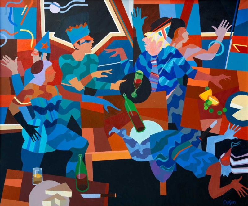
wall art for an event planner’s studio should express the energy of bringing people together without making a professional workspace resemble a permanent party set. Garden Party by Fred Carson offers a lively but structured alternative. Stylised figures talk, gesture, carry glasses, and move through a bold arrangement of blue, red, terracotta, black, and cream. The scene feels social, yet its strong geometry keeps the image composed.

What wall art for an event planner’s studio needs to communicate

Clients visit an event professional to imagine an experience that does not yet exist. The studio therefore needs to feel organised and dependable, but also alert to atmosphere, colour, and human behaviour. Generic office prints can make the room feel cautious. Literal balloons, champagne labels, or wedding slogans can narrow the business to one type of brief.

Garden Party focuses on people rather than decorations. Hands, faces, drinks, chairs, and tables overlap in a scene full of conversation. The painting suggests arrival, connection, and movement without defining whether the gathering is a wedding, launch, dinner, or private celebration. That openness makes it relevant to a varied events practice.

Use the picture to anchor a client conversation

The strongest position is one clients can see without turning away from the discussion. Behind a consultation table, beside a materials library, or on the first clear wall inside the studio may work well. Avoid placing it among mood boards that change every week. The artwork should supply continuity while project samples come and go.

Studio zoneWhat the artwork contributesPractical check
Consultation areaA relaxed social cue before the meeting beginsCheck that chairs do not hide the lower edge
Entrance wallAn immediate statement about people and atmosphereKeep reception signs and notices separate
Sample libraryA stable focal point beside changing colours and materialsLeave enough clear wall to prevent visual competition
Team workspaceEnergy and character beyond schedules and screensTest glare from task lighting and monitors

The print measures 360 by 300 millimetres before framing. Its near-square landscape shape has enough width for the group to read as a social scene while remaining suitable for a smaller client studio. Mark the full framed size above furniture and view it from both seated and standing positions.

Let the composition demonstrate visual coordination

Event work often involves many simultaneous details. In this image, different figures, gestures, colours, and table forms remain connected through repetition. Blue moves across clothing and background shapes. Warm red and orange passages establish rhythm. Pale curved lines travel through the darker upper area, while black sections hold the brighter elements together.

That balance can support a studio filled with swatches, stationery, flowers, floor plans, and screens. Keep active project material grouped in trays, drawers, or defined boards. Giving the framed picture a clean boundary shows that abundance can still be edited and controlled, which is a useful message for clients trusting someone with a complex occasion.

Choose colours that belong to the business all year

  • Neutral studio: allow the blue and terracotta to provide the main colour rather than adding several bright accessories.
  • Dark joinery: use the image’s black structure to connect with shelving or a consultation table.
  • Warm timber: let rust, brown, and cream bridge the furniture with the cooler blue figures.
  • Existing brand colour: echo one compatible tone in a folder or chair, but do not force the whole painting into the brand palette.

Because the scene is not tied to one season, it can remain in place while spring weddings, autumn dinners, corporate launches, and winter celebrations move through the calendar. The studio gains personality without needing to redecorate for each campaign.

Keep creative atmosphere separate from operational information

An attractive studio still needs clear working systems. Risk planning, supplier details, access notes, and production schedules should remain legible and current. the HSE event safety guidance provides practical background on responsibilities and planning. Place essential documents where the team can use them, while letting the artwork perform a different role: expressing why people gather in the first place.

This separation also helps during client meetings. The picture can establish mood without competing with the exact plan under discussion. When the team turns to timings, budgets, or logistics, the room remains visually engaging but does not blur decoration with instruction.

Frame bold figurative art for a professional setting

A slim dark moulding can reinforce the image’s graphic structure. A restrained warm timber may soften the scene and relate to tables or sample storage. A coloured frame is possible, but it should be compared against the full composition; choosing one bright tone in isolation could make the result look promotional rather than collected.

First 4 Frames produces colour-managed Giclée prints and completes bespoke framing by hand at its Falkirk workshop. That careful in-house process helps the closely related blues, reds, creams, and dark shapes remain separate. It also gives a creative business a polished, ready-to-hang piece suited to repeated client use.

A social scene by Edinburgh artist Fred Carson

Fred Carson is an Edinburgh-based artist whose contemporary work combines stylised figures, bold colour, and geometric form. His background spans painting, ceramics, sculpture, and architectural commissions. Browse the wider Fred Carson collection at First 4 Frames to compare how other compositions handle movement and groups.

Effective wall art for an event planner’s studio should make creativity visible while leaving the studio calm enough for decisions. View the framed Garden Party print for a sociable, carefully structured image finished with lasting in-house craftsmanship.

Posted on

Golden Cloud: Tall Narrow Abstract Wall Art for an Awkward Space

tall narrow abstract wall art can solve a part of the room that standard landscape and square pictures leave untouched. Golden Cloud by Emily Little is composed as a slim vertical stack of colour. Ochre, violet, rust, blue, and dark earth tones rise through the image in irregular bands, giving a narrow wall both height and visual depth without trying to disguise its proportions.

Why tall narrow abstract wall art suits difficult gaps

Many homes contain slim wall sections beside a doorway, at the end of a short corridor, between fitted furniture, or on a return beside a chimney breast. Leaving every one empty can make the room feel unfinished. Filling one with a picture designed for a wider wall usually creates the opposite problem: the frame looks squeezed and the wall feels even narrower.

A vertical image accepts the architecture instead of fighting it. In Golden Cloud, the eye moves upward through a sequence of layered forms. Some read like hills, fields, cloud, or distant horizons, while others remain purely textural. That uncertainty rewards a closer look and gives the compact position more interest than a simple decorative strip.

Measure the complete framed shape

The print is available at 120 by 280 millimetres and 240 by 560 millimetres before framing. Both versions are markedly taller than they are wide. The mount and moulding will increase those dimensions, so measure the finished presentation rather than treating the print size as the space required.

Wall positionWhat to measureWhat to protect
Beside a doorwayThe clear width with the door fully openEnough separation from handles and passing shoulders
Between cupboardsThe actual plaster width, not the furniture gapA balanced margin on both sides of the frame
Short corridor endThe view from the approach as well as close rangeClear circulation and freedom from door swing
Chimney-breast returnDepth, sightline, and any nearby heat sourceSafe conditions for paper, mount, and frame

Make a paper template for the expected outer dimensions. A margin that appears generous on a tape measure can feel tight when moulding and shadow are visible. The frame should look intentionally slim, not as though it only just fitted.

Use the vertical rhythm to guide hanging height

A tall picture can tempt people to hang its centre too high. Start from the usual sightline in the space, then account for how the wall is approached. In a corridor, the image should be comfortable to view while walking towards it. Beside furniture, it should relate to the top and side edges rather than floating independently.

  1. Mark the outer frame. Use low-tack tape or paper so the complete silhouette is visible.
  2. Stand at the main entrance. Check whether the picture draws the eye naturally or seems to climb towards the ceiling.
  3. Test the nearest route. Make sure the frame does not project into a place where bags, coats, or shoulders may catch it.
  4. Check the lower edge. It should remain clear of switches, radiators, and furniture corners.

Let layered colour connect the adjoining rooms

A narrow wall often sits at a transition. It may be visible from a hall and a sitting room, or link a kitchen to a dining space. The varied palette in Golden Cloud is helpful here. Warm gold and rust can relate to timber and brass, while blue and violet provide cooler counterpoints. Darker horizontal passages keep the brighter colours grounded.

Choose one or two connections rather than repeating every colour. An ochre chair seen from the next room or a blue ceramic on a nearby console may be enough. The picture should help the sightline feel joined, not turn the transition into a colour chart.

Frame a slim image without making it heavy

A wide or highly ornate moulding can consume the limited wall area and weaken the elegant ratio. A restrained dark frame may sharpen the deeper bands. A warm timber can respond to the gold and rust, while a pale neutral presentation can preserve breathing room on a compact wall. The actual print should lead the decision because several colours need to remain distinct.

First 4 Frames produces colour-managed Giclée prints and completes bespoke framing by hand at its Falkirk workshop. That in-house process is especially valuable with a narrow format. Mount width, moulding scale, glazing, and fixings can be considered as one finished object rather than added separately.

Layered landscape and memory from Emily Little

Emily Little creates expressive semi-abstract work shaped by colour, memory, emotion, and landscape. The stacked surfaces in this image suggest distance without fixing the viewer to one literal place. Explore more work on Emily Little’s official website, or browse the Emily Little collection at First 4 Frames.

Well-chosen tall narrow abstract wall art should make a difficult proportion feel intentional rather than merely occupied. View the framed Golden Cloud print for a slim composition that brings height, layered colour, and hand-finished craftsmanship to an often overlooked wall.

Posted on

Two Scottish Thistles: A Lasting Scottish Anniversary Gift for a Couple

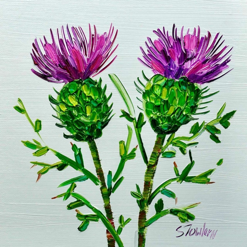
A Scottish anniversary gift for a couple can mark shared history without carrying names, dates, or a message that only makes sense on the day. Two Scottish Thistles by Sheila Fowler uses a pair of Scotland’s most recognisable wildflowers. The subject suggests two distinct forms held within one composition, making it a quiet symbol of partnership rather than a literal anniversary announcement.

What makes a Scottish anniversary gift for a couple last

Anniversary presents can become too dependent on a number. The couple may appreciate the thought, yet find it difficult to place a heavily personalised object in their home. Artwork offers another route. It can acknowledge the relationship through subject and composition while still earning its place as part of the room.

Two thistles are especially useful for that purpose. Each flower remains individual, but the pair reads together. The Scottish connection may reflect where the couple met, married, now lives, or simply loves to spend time. That meaning can be explained privately in a card rather than printed across the image.

Build the meaning around their story

The same artwork can carry different associations for different couples. Start with one genuine connection and let the picture hold it. Avoid trying to make the thistles represent every stage of the relationship.

ConnectionA simple note to include
They married in ScotlandMention the place or season, without turning the card into a full chronology
They share Scottish family rootsName the family connection that makes the national flower relevant
They love Scottish gardens and landscapesRecall one walk, island visit, or garden they enjoyed together
They have built a home togetherExplain why you chose something both can live with and display

This approach works for a first anniversary, a larger milestone, or an anniversary shared by parents and grandparents. The emotional detail sits in the giver’s note. The artwork remains open enough to belong to the couple.

Find a shared wall rather than one person’s room

An anniversary present should feel equally at home with both recipients. A sitting room, dining area, entrance hall, or landing is often more suitable than a private study. Look for a wall used and enjoyed by both people, then consider what else is visible around it.

  • Above a console: keep accessories low so the paired flower forms stay clear.
  • Beside a doorway: centre the square within the available wall rather than the whole room.
  • In a dining space: check the view from both sides of the table and under evening light.
  • Within a small grouping: give the thistles enough separation to remain the meaningful centre rather than another filler.

The print comes in 265 by 265 millimetres and 500 by 500 millimetres before framing. The smaller square can suit a compact shared corner. The larger option creates a stronger focal point above furniture. Mount and moulding increase the final size, so a paper template should represent the complete framed dimensions.

Let colour support the symbolism

Thistle art need not force a room into purple and green. Treat the flower colour as an accent. In a neutral scheme, one related textile or ceramic may be enough. In a room that already contains pattern, allow the square picture to provide a contained area of natural colour rather than repeating floral motifs throughout the space.

Check the picture in daylight and in the lamps the couple normally uses. A suitable position should preserve the distinction between flower heads, stems, and background without strong glare. Keeping the surrounding wall relatively calm will also help the two forms read as a deliberate pair.

Choose a frame for their home together

A light neutral moulding can give the botanical subject an airy edge. A restrained timber may connect it to natural furniture, while a darker frame can add definition on a pale wall. The decision should follow the couple’s interior rather than an anniversary colour convention.

First 4 Frames uses colour-managed Giclée production and completes bespoke framing by hand at its Falkirk workshop. That in-house process protects the relationship between expressive colour and fine botanical detail. It also turns the print into a finished, ready-to-hang present with the quality expected of a lasting milestone gift.

Scottish flowers through Sheila Fowler’s expressive colour

Sheila Fowler is a Scottish artist known for vibrant landscapes, coastlines, and wildflowers. Explore more work on Sheila Fowler’s official website, or browse the Sheila Fowler collection at First 4 Frames. The wider range provides useful context for the expressive colour and texture that give this compact botanical subject its presence.

The right Scottish anniversary gift for a couple can commemorate two people without turning their home into a display of dates and slogans. View the framed Two Scottish Thistles print for paired Scottish symbolism finished with personal, in-house craftsmanship.

Posted on

Ye Cannae Shove Yer Granny Aff a Bus: A Scottish Birthday Gift for a Granny

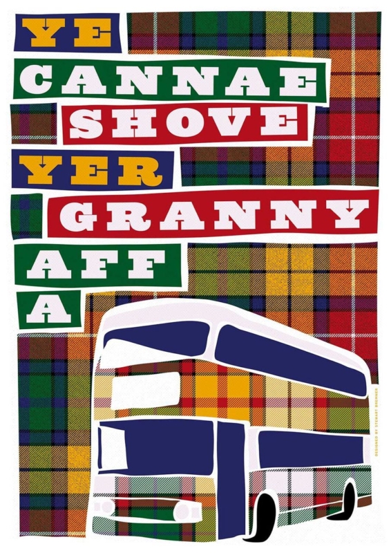
A Scottish birthday gift for a granny should feel connected to the person receiving it, not merely decorated with tartan or a generic birthday message. Ye Cannae Shove Yer Granny Aff a Bus by Stewart Bremner starts with a familiar Scottish children’s song. That shared reference can recall family singalongs, playground humour, and the particular warmth of a granny who knows the words before anyone reaches the chorus.

Why this Scottish birthday gift for a granny feels personal

The strongest family gifts carry a story that the recipient already owns. This title is affectionate because it depends on recognition. It can remind several generations of the same tune while giving them an easy reason to laugh together. That makes the artwork especially suitable when children or grandchildren want to choose one present as a family.

Humour still needs good presentation. A phrase printed on a disposable item may be amusing for an afternoon. A framed fine art print has a longer role. It can become part of a kitchen, hall, family room, or reading corner and keep prompting conversation after the birthday cards have gone.

Check that the joke belongs to her

Before buying, think about the recipient rather than the occasion alone. Does she know the song? Does she enjoy Scots language and playful family banter? Would she like the title displayed where visitors can see it? A confident yes matters more than matching the present to a milestone number.

  1. Ask a quiet family question. One relative may remember whether the song featured at home or school.
  2. Choose a message for her personality. The humour should feel affectionate, never like a comment about age or mobility.
  3. Add the shared memory. A short note can explain why the family chose this particular line.
  4. Plan the handover. Let grandchildren present it together if the song connects several generations.

This small amount of thought turns a witty title into a specific family gift. It also avoids the usual trap of buying something Scottish simply because the recipient lives in Scotland or has Scottish roots.

Choose the print size for the wall, not the birthday

The print is available in 420 by 594 millimetres and 594 by 840 millimetres before framing. Both are substantial portrait formats. The smaller size may suit a kitchen-dining wall, broad hallway, or family room. The larger option needs more viewing distance and a clear wall where the words can read comfortably without dominating nearby furniture.

Before orderingUseful check
Measure the full areaAllow for the mount and moulding as well as the printed sheet
Check the reading distanceView a paper template from the doorway and the main seat
Look for competitionAvoid crowding the words beside calendars, signs, or a busy photo wall
Consider deliveryMake sure the finished frame can move safely through doors and stairs

A larger size is not automatically more generous. A well-proportioned frame that fits her home is the more attentive gift. If the family is unsure, measuring a likely position or asking someone nearby to help is better than guessing.

Frame playful words with lasting quality

Typography benefits from a decisive edge and enough clear space around the design. A simple dark moulding can sharpen the graphic character. A restrained timber can make the piece feel warmer in a relaxed family room. The best choice will respond to the actual print and to finishes already present in the recipient’s home.

First 4 Frames produces colour-managed Giclée prints and completes bespoke framing in-house at its Falkirk workshop. The hand-finished presentation gives the humorous subject the care of a proper artwork. It also means the gift arrives ready to hang rather than becoming another project for the recipient.

Scottish graphic art by Stewart Bremner

Stewart Bremner is an Edinburgh-based artist, illustrator, and graphic designer whose work celebrates Scottish language, culture, landscapes, and heritage. See more of his work on Stewart Bremner’s official website, or compare other designs in the Stewart Bremner collection at First 4 Frames. Browsing the wider range can help a family decide whether this song is the most meaningful reference for their granny.

A thoughtful Scottish birthday gift for a granny can be funny and beautifully made at the same time. View the framed Ye Cannae Shove Yer Granny Aff a Bus print for a familiar line presented with bold character and lasting in-house craftsmanship.