Posted on

Warrior Princess: Empowering Wall Art for a Home Gym

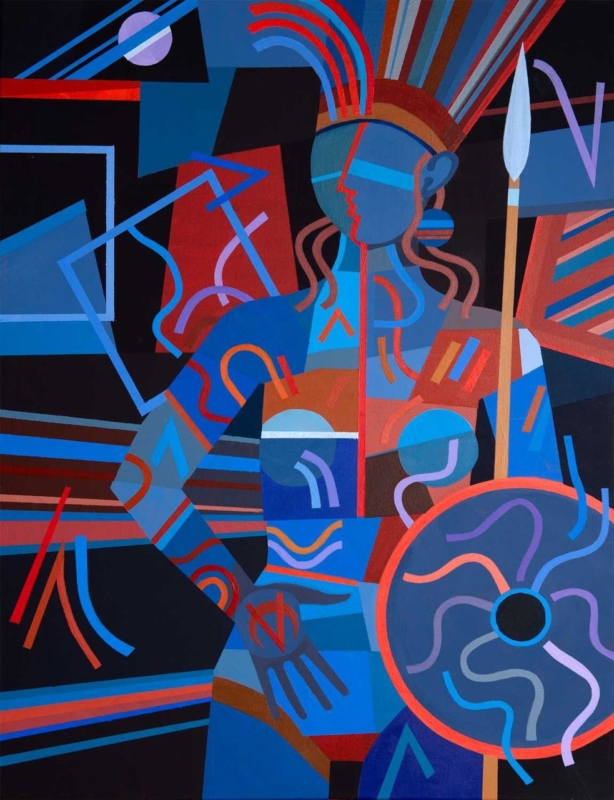
Image of Warrior Princess by Fred Carson

empowering wall art for a home gym can give an exercise space identity without covering it in instructions or slogans. Warrior Princess by Fred Carson centres a poised female figure holding a spear and shield. Red, blue, rust, violet, and black shapes interlock around her, creating strength through posture, rhythm, and composition rather than a printed command to work harder.

Why empowering wall art for a home gym need not use words

Home gyms often accumulate visual messages: app screens, exercise charts, equipment labels, timers, and personal targets. Adding another block of bold lettering can make the room feel like a noticeboard. Figurative art provides a different kind of motivation. It can suggest focus and capability while leaving the person training free to define those qualities for themselves.

The figure in Warrior Princess is still, yet the image is not static. Curved bands rise from the headdress. Diagonal lines cross behind the body. Circular forms in the shield, bracelets, and surrounding geometry establish a repeated beat. The upright spear gives the portrait a clear vertical axis, making the composition feel controlled amid all that movement.

Start with the activity zones, not an empty wall

A home gym must remain safe and functional. Identify the full movement area around each piece of equipment before choosing a position. Include space for raised arms, resistance bands, skipping ropes, benches, and doors. Artwork should never sit where a dropped weight, moving bar, or swinging attachment can reach it.

Possible positionPractical check
Beyond a cardio machineConfirm the frame remains outside the equipment’s moving parts and ventilation path
Opposite a training matView it from floor level and standing height without placing it behind a swing zone
Beside storageOpen racks, cupboards, and doors fully before marking the frame
Near a mirrorKeep enough separation for both elements to read clearly and check doubled reflections

The print size is 265 by 345 millimetres before framing. Its portrait format suits a narrower wall between functional areas, but the final mount and moulding will increase both width and height. Mark those complete dimensions. A compact piece can still have presence when the surrounding wall is kept clear.

Let the palette organise a practical room

Gym equipment can introduce unrelated colours through mats, bands, handles, screens, and storage. The artwork already combines several strong tones, so it can act as a visual anchor rather than another item that needs matching. Choose one dominant relationship and allow the smaller colours to remain within the picture.

  • Black equipment: the dark ground creates continuity while blue and red stop the room feeling severe.
  • Blue or grey walls: cooler shapes connect naturally, with rust and coral adding warmth.
  • White walls: the portrait becomes a concentrated focal point instead of requiring several accessories.
  • Timber details: brown and terracotta passages can link shelves or flooring to the cooler training equipment.

Avoid repeating every hue through colour-coded kit. The goal is a coherent space, not a complete theme. Closed storage for smaller items will also let the figure and shield remain readable when the room is at rest.

Choose an image that belongs to the person using the room

Motivation is personal. Some people respond to competition; others value consistency, recovery, confidence, or a few quiet minutes away from daily demands. A composed warrior figure can represent resolve without dictating a specific sport or body type. That openness makes the artwork suitable for strength work, mobility, yoga, indoor cycling, or mixed training.

It is also worth thinking beyond decoration. Research and practical guidance on sportscotland’s women and girls research discusses participation, barriers, and inclusion in physical activity. A well-designed personal space cannot solve those wider issues, but it can feel welcoming, individual, and free from the narrow imagery often used in fitness advertising.

Account for changing light and working conditions

Check the proposed wall with overhead lights on and off. Strong downlights may create glare in glazing, while coloured smart bulbs can distort the distinction between red, violet, and blue. Daylight from a nearby window can also reflect a bright rectangle across the darker background. A small change in height or angle may improve visibility.

Keep framed paper away from recurring condensation, direct heat, and damp external walls. Good ventilation matters in any exercise area. Wipe equipment with care so cleaning spray does not travel towards the frame, and do not hang the picture where towels or clothing will be placed over it.

Frame the graphic figure with a decisive edge

A slim black moulding can continue the dark background and keep attention on the figure. A deep blue frame may support the cooler geometry, while a restrained warm timber can soften a room dominated by metal and rubber. The moulding should clarify the portrait rather than compete with the shield and patterned bands.

First 4 Frames produces colour-managed Giclée prints and completes bespoke framing in-house at its Falkirk workshop. Careful production helps the closely related blues, reds, violets, and dark shapes remain distinct. Hand-finished presentation also gives a practical exercise room one crafted element designed to last beyond a passing fitness trend.

Bold geometry from an Edinburgh artist

Fred Carson is an Edinburgh-based artist whose work uses stylised figures, strong geometry, and vivid colour. Browse the wider Fred Carson collection at First 4 Frames to compare related compositions and formats. In this portrait, the quiet stance and energetic surface create a useful balance between focus and momentum.

The best empowering wall art for a home gym should support the room without trying to shout over every session. View the framed Warrior Princess print for a poised, colourful figure that brings strength, character, and hand-finished craftsmanship to a personal training space.

Posted on

Autumn, Loch Lomond: Wall Art for a Room With Low Daylight

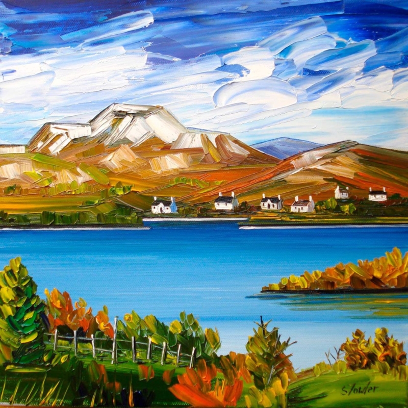
autumn wall art for a room with low daylight needs to bring warmth without absorbing the little natural light the space already receives. Autumn, Loch Lomond by Sheila Fowler offers a useful balance. Copper, orange, and yellow foliage establish the season, while vivid blue water and a broad, cloud-filled sky keep the square composition open. The result feels autumnal without turning the room brown, dim, or overly rustic.

Why autumn wall art for a room with low daylight needs contrast

A darker room does not automatically need pale, nearly colourless art. It needs an image with a readable structure and enough contrast to remain clear throughout the day. In this landscape, the bright horizontal band of the loch separates the deeper foreground from the hills. White cloud moves across the intense sky, while small cottages create crisp points on the far shore.

Those divisions help the scene retain depth when daylight is subdued. The darker greens and burnt orange leaves still provide richness, but they do not fill the entire picture. Open water and sky occupy generous areas, giving the eye somewhere to rest.

Work with the direction of the available light

Before choosing a wall, watch the room at three points: morning, the brightest part of the afternoon, and after the lamps come on. Low daylight may be caused by a northern aspect, a deep window reveal, nearby buildings, or heavy planting outside. Each condition affects the artwork differently.

  1. Find the clearest wall. A position facing the window may receive useful light, although reflections must be checked.
  2. Avoid the darkest recess. Rich foreground greens can lose definition if the frame is placed inside a permanently shadowed alcove.
  3. Check the view from the doorway. The blue loch should read as a bright horizontal pause before the smaller details become visible.
  4. Test evening lighting. A warm lamp can enrich the foliage, but it should not flatten the blue water or produce glare across the glazing.

Picture lighting is not always necessary. A nearby adjustable wall light or well-placed floor lamp may be enough. Keep bulbs and fittings at a safe distance from the finished frame, and aim the light so the picture is even rather than creating one bright spot.

Use seasonal colour without redecorating the whole room

The painting already carries several autumn notes: russet, ochre, olive, and a small amount of fresh green. Repeating all of them in cushions, throws, and accessories would make the scheme feel too literal. Choose one quieter connection instead. A rust wool cushion, an olive ceramic, or warm timber can relate to the foreground while the rest of the room stays calm.

Existing room paletteHow the artwork can help
Cool grey or off-whiteOrange foliage adds warmth while the blue water keeps continuity
Deep greenBright sky and loch prevent the scheme from becoming too enclosed
Warm neutralBlue provides a clean counterpoint to beige, oatmeal, or natural linen
Dark timberWhite cottages and cloud introduce small, useful areas of brightness

This approach also lets the picture remain on the wall beyond autumn. The clear water, mountain forms, and strong sky are not seasonal props. They carry the landscape throughout the year, while the foliage supplies an extra layer of warmth when the days shorten.

Choose the square size from the viewing distance

The print is available in 265 by 265 millimetres and 500 by 500 millimetres before framing. The smaller option can suit a compact landing, reading corner, or wall beside a doorway. The larger version gives the loch and hills enough presence for a living room or dining area. Mounting and moulding will increase the final dimensions, so map the complete framed size rather than the print alone.

Use a paper template or low-tack tape and view it in the room’s dullest daytime conditions. If the proposed size looks visually slight then, it is unlikely to gain authority after framing. Conversely, a square that crowds furniture or window trim will lose the open quality that makes the landscape helpful.

Frame for definition, not extra heaviness

A restrained dark moulding can sharpen the edges and relate to the deeper foreground. A light neutral frame may suit a smaller, dimmer room, while a carefully chosen warm timber can echo the landscape without adding a heavy brown border. Compare the options against the real print because the blue, white, green, and orange must remain balanced together.

First 4 Frames uses colour-managed Giclée production and completes bespoke framing by hand at its Falkirk workshop. That in-house process helps preserve the separation between bright water, textured cloud, cottages, and foliage. It also allows the mount, moulding, glazing, and final scale to be chosen for the actual light conditions.

Colour and place in Sheila Fowler’s landscape

Sheila Fowler is a Scottish artist known for expressive colour, texture, landscapes, coastlines, and flowers. Explore further work on Sheila Fowler’s official website, or browse the Sheila Fowler collection at First 4 Frames. The painting’s recognisable setting gives the colour a sense of place rather than using autumn as a decorative theme alone.

Effective autumn wall art for a room with low daylight should make limited light feel considered, not apologetic. View the framed Autumn, Loch Lomond print for a bright loch, open sky, and warm seasonal foreground presented with lasting, hand-finished quality.

Posted on

Upside Down II: Still Life Wall Art for a Handleless Kitchen

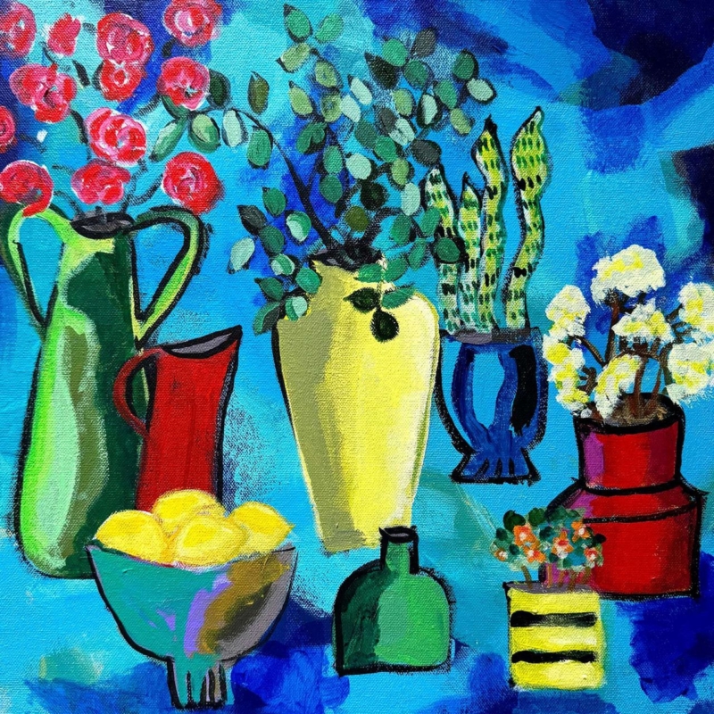
still life wall art for a handleless kitchen can give a sleek room the human irregularity it needs. Flat-front cabinets, integrated appliances, and uninterrupted worktops create welcome order, but the result may feel impersonal if every surface is equally controlled. Upside Down II by David Short introduces pitchers, plants, flowers, and lemons through loose black outlines and saturated colour. It brings everyday life into the scheme without weakening the architecture.

Why still life wall art for a handleless kitchen adds balance

Handleless cabinetry is effective because repeated doors read as calm planes rather than separate cupboards. The same discipline can make a kitchen feel spacious and easy to use. Yet a room built only from smooth rectangles may need one element with visible gesture, variation, and evidence of the hand.

Upside Down II provides that contrast. A tall green jug, red pitcher, yellow vessel, blue pot, lemons, and plants create a row of distinct silhouettes. Their outlines are intentionally lively rather than mechanically perfect. The square format keeps this abundance contained, so the image feels energetic without making the wider kitchen disorderly.

Use one strong colour relationship, not every colour

The picture includes intense blue, turquoise, red, green, yellow, and pink. Trying to repeat all of them around the kitchen would undermine the clarity of the cabinetry. Instead, identify one existing room colour and let the remaining hues belong to the artwork.

  • Dark blue or charcoal cabinets: the vivid blue ground feels related, while yellow and red add lift.
  • White or pale grey cabinets: the square becomes a clear block of colour against a quiet field.
  • Green cabinetry: the jugs and foliage make a connection without requiring an exact paint match.
  • Timber accents: warm red and yellow details stop natural wood from feeling detached from cooler surfaces.

A single bowl, tea towel, or pendant shade can repeat the chosen accent. Leave the worktop largely clear. The artwork already contains the visual equivalent of collected vessels and flowers, so it can supply personality without filling every shelf.

Find a safe wall away from heat, steam, and splashes

The obvious empty area is not always the correct place for framed art. Avoid the wall directly above a hob, kettle, sink, or high-steam appliance. Heat, grease, repeated moisture, and cleaning spray are poor conditions for paper and framing materials. A dining end, clear wall beside a pantry door, or seating area beyond the main work zone is usually more suitable.

The available square print sizes are 265, 500, and 800 millimetres before framing. This range allows the composition to work beside a compact table or across a more generous open-plan wall. Mark the complete intended dimensions, including mount and moulding, before ordering. Open every adjacent cupboard and door to check clearance.

Kitchen positionWhat to check
Dining endCentre the frame on the table or bench rather than on the entire room
Beside tall cabinetryLeave enough wall for the square to avoid looking wedged into a gap
Open-plan transitionMake sure the colours read well from both cooking and seating zones
Near a glazed doorWatch direct sun and reflections at different times of day

Frame expressive objects with a clean edge

A simple dark moulding can echo the black outlines and give the image a decisive boundary. A pale frame can sit quietly with lighter cabinets, while a restrained timber may connect the kitchen to an adjoining dining area. The frame should clarify the square composition rather than add a decorative flourish that competes with the objects.

First 4 Frames produces colour-managed Giclée prints and completes bespoke framing in-house in Falkirk. Careful production helps the blue field, green vessels, red accents, and smaller floral details remain distinct. The hand-finished presentation gives a modern kitchen a crafted counterpoint while retaining the precision the room already has.

Everyday objects made bold through colour

David Short makes contemporary work informed by familiar possessions, plants, pattern, and strong colour. His still lifes treat domestic objects as an expressive group rather than a formal inventory. See more on David Short’s official website, or explore the David Short collection at First 4 Frames.

Successful still life wall art for a handleless kitchen should complement clean cabinetry without making the room feel clinical or over-accessorised. View the framed Upside Down II print for a concentrated square of colour, plants, and useful objects brought together with confident hand-drawn energy.

Posted on

The Unexpected Visit: Abstract Wall Art for Mixed Wood Furniture

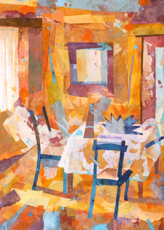
abstract wall art for mixed wood furniture can help a room containing several timber finishes feel collected rather than confused. The Unexpected Visit by Emily Little is especially useful for this task. Amber, ochre, russet, plum, pale cream, and flashes of blue overlap across the image. Those layered colours can relate to light oak, darker walnut, painted chairs, and older pieces without copying any one finish exactly.

How abstract wall art for mixed wood furniture creates unity

Matching every wooden item is rarely necessary. In fact, a room can feel flatter when the table, shelving, floor, and occasional furniture all share an identical stain. The challenge is giving different pieces a relationship. Artwork can provide that bridge by carrying several warm and cool notes in one composition.

The Unexpected Visit contains recognisable chairs and an interior, but neither is described literally. Blocks of translucent colour overlap like memories of paint, fabric, light, and timber. The near-black chair lines give the image structure. Pale areas keep it open, while burnt orange and gold connect naturally to the undertones found in many woods.

Identify undertones before trying to coordinate the room

Look past labels such as oak or walnut and notice whether each piece leans yellow, red, grey, or nearly black. Two woods with different grains can still sit comfortably together when they share a warm undertone. Conversely, furniture sold under the same broad name may look unrelated when one item is honey coloured and another is cool and washed.

Element in the roomConnection within the artwork
Honey oak or pineGolden and amber passages across the upper and lower image
Walnut or mahoganyPlum, brown, and deep red blocks that add weight
Black-stained timberDark chair outlines that repeat a sharper furniture edge
Painted furnitureSmall blue and cream areas that prevent an all-brown scheme

These are relationships, not colour-matching instructions. One print should not prompt a complete furniture replacement. Its role is to show that several tones can coexist within a considered whole.

Choose a position that lets the picture mediate between pieces

Placement matters when the furniture is varied. Above a console, the artwork may appear to belong only to that single item. On a wall visible between a dark dining table and a lighter cabinet, it can connect both. It may also work at the end of an open-plan room, where the portrait format provides a shared visual destination from several seating areas.

  1. Map the sightlines. Stand at the doorway and at the main seats to see which timber finishes appear beside the proposed wall.
  2. Test the full frame size. Use paper or low-tack tape, allowing for the mount and moulding as well as the print.
  3. Leave a quiet margin. Clear wall around the frame stops varied furniture and accessories from merging into one busy field.
  4. Check evening light. Warm bulbs can intensify orange, so make sure the cooler blue and pale details remain visible after dusk.

The print is available in 360 by 500 millimetres and 230 by 322 millimetres before framing. The larger option can hold a wall between substantial furniture. The smaller size can give a compact reading area or landing a layered focal point. Final dimensions will depend on the chosen mount and moulding.

Select a frame that joins the scheme without adding another mismatch

A frame does not need to imitate the nearest piece of furniture. A slim dark moulding can repeat the chair lines and provide a clean boundary. A restrained warm timber may suit a softer scheme, but it should be compared with the actual artwork and room finishes. Introducing an almost-matching wood without checking it can create more tension than a deliberate contrast.

First 4 Frames uses colour-managed Giclée production and completes bespoke framing by hand at its Falkirk workshop. That in-house approach allows the layered colour, darker linear marks, mount, and moulding to be considered together. It also turns the print into a polished, ready-to-hang piece rather than another loose element in an already varied room.

An interior image that rewards a second look

Emily Little creates paintings and mixed-media work shaped by colour, memory, landscape, and interior space. In this piece, chairs and openings emerge gradually from overlapping surfaces. Explore more at Emily Little’s official website, or browse the Emily Little collection at First 4 Frames.

Well-chosen abstract wall art for mixed wood furniture can turn difference into character. View the framed The Unexpected Visit print for a warm, layered composition that helps light, dark, old, and painted furniture share one confident visual language.

Posted on

Dance Till Dawn: A Distinctive Gift for a Contemporary Dancer

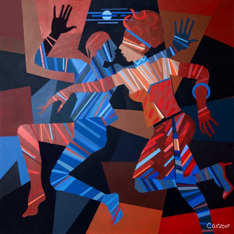
A meaningful gift for a contemporary dancer should recognise more than costume or performance night. It can celebrate discipline, physical conversation, creative risk, and the joy of moving with another person. Dance Till Dawn by Fred Carson captures those ideas through two interlocking figures, strong geometric shapes, and lines that behave almost like beats. It feels connected to dance without resorting to a slogan or a literal studio scene.

Why this works as a gift for a contemporary dancer

Dancers spend a great deal of time with objects chosen for function: shoes, warm layers, tape, bottles, and bags. Those things matter, but they rarely mark the imaginative side of the work. Framed art offers a different kind of recognition. It can live at home, remain useful after a production ends, and reflect the recipient’s creative identity without pretending to choose specialist equipment for them.

In Dance Till Dawn, the figures do not hold a fixed classical pose. Bent knees, open hands, crossed arms, and opposing diagonals imply motion between moments. Blue and red stripes travel across bodies and clothing, while the dark ground makes each gesture clearer. The pair feels coordinated but not symmetrical, which gives the composition the tension and responsiveness associated with contemporary performance.

Match the occasion to the message

The title makes the print celebratory, yet the image is not limited to one milestone. It can suit a dancer completing professional training, joining a company, returning after injury, making a first independent work, or finishing a demanding run. It may also be a thoughtful thank-you for someone who has created a duet or supported a partner through rehearsals.

  • For graduation: focus the card on persistence, growth, and the start of a creative career.
  • For a première: mention the courage required to bring new movement in front of an audience.
  • For a partnership: connect the two figures to trust, listening, and shared timing.
  • For a personal milestone: let the artwork carry the dance reference while the written message stays specific to the person.

A short personal note will do more than extra themed wrapping. Name the performance, teacher, company, or moment that prompted the gift. That detail makes the choice feel observed rather than selected simply because it contains dancers.

Look for movement, not a perfect likeness

Contemporary dance covers many practices and body languages. A picture does not need to reproduce the recipient’s exact technique or costume to feel relevant. Often, rhythm, weight, counterbalance, and spatial relationship are the stronger connection. The stylised figures here leave room for interpretation, so the artwork can suggest rehearsal, performance, social energy, or an improvised exchange.

The square shape reinforces that flexibility. It avoids the formal stage-like width of a theatre scene and keeps attention on the figures’ interaction. The moon and horizontal blue marks offer a small pause above them, while the angular background pushes the action forward.

Plan a home for the artwork before gifting

The available 265 by 265 millimetre print format can work in a bedroom, home practice corner, hallway, or living space without requiring a vast wall. Remember that mounting and framing will increase the finished dimensions. If possible, ask indirectly about the recipient’s wall colours and whether they prefer dark, light, or natural timber frames.

Possible settingWhy the print can work
Home practice areaStrong movement adds energy without giving technical instruction
Quiet bedroom wallThe compact square adds identity without dominating the room
Hall or landingBold colour reads clearly from a passing viewpoint
Living-room gallery groupThe geometric edges provide structure among looser pieces

Choose presentation that respects the strong colour

A slim black frame can sharpen the angular background and stage-like darkness. A deep blue moulding may connect to the cooler figure without copying every stripe. A warm wood can soften the graphic quality for a more relaxed home. The final choice should respond to the print in person and to the recipient’s interior, not to a generic idea of dance decor.

First 4 Frames uses colour-managed Giclée production and completes bespoke framing in-house in Falkirk. That care matters here because the red, rust, coral, and several blues need to remain distinct. A hand-finished frame also turns the gift into something ready to display rather than another task for the recipient after a busy performance period.

Contemporary energy from an Edinburgh artist

Fred Carson is an Edinburgh-based artist whose work combines bold colour, stylised figures, and geometric form. Explore the wider Fred Carson collection at First 4 Frames. For further connection to dance in Scotland, Scottish Ballet shares performances, films, classes, and insight into the art form.

The best gift for a contemporary dancer feels personal without becoming predictable. View the framed Dance Till Dawn print for an image that honours movement, partnership, and creative confidence through colour and lasting craftsmanship.

Posted on

Walkerburn Retreat: Scottish Landscape Wall Art Above a Dining Bench

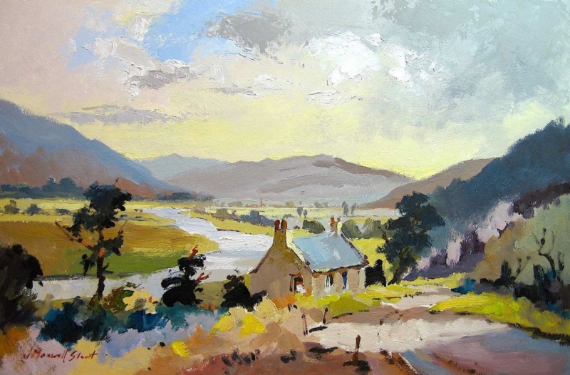
Scottish landscape wall art above a dining bench can make an informal eating area feel broader, calmer, and more connected to its setting. Walkerburn Retreat by Joseph Maxwell Stuart is especially well suited to the job. Its long valley, pale river, cottage roof, and open sky create a clear outward view. The landscape adds depth behind the seating without making the wall feel busy or heavily decorated.

Why Scottish landscape wall art above a dining bench works

A dining bench creates a strong horizontal line. Artwork that ignores that line can look detached, while a cluster of small frames may compete with people, cushions, tableware, and pendant lights. A single landscape gives the seating a visual destination. It also establishes a horizon that helps the whole arrangement feel settled.

Walkerburn Retreat has more than a distant view. The foreground path leads past the cottage and towards the River Tweed. Dark trees hold the two sides, while the brighter central valley keeps the composition open. Loose, expressive marks stop the scene from feeling photographic or overly formal. That balance suits a bench used every day rather than a dining room reserved for occasions.

Size the artwork to the bench, not the whole wall

Begin with the width of the bench or banquette. The finished frame should feel clearly related to the seating but should not extend beyond it. Mark the likely frame dimensions with low-tack tape or a paper template. Then sit down, stand at the table, and enter from the adjoining room. This reveals whether the picture feels properly centred from the viewpoints that matter.

  1. Check seated headroom. Leave a comfortable gap above the tallest regular user, including room for relaxed movement.
  2. Allow for cushions. Deep back cushions can change the usable wall and push people closer to the frame.
  3. Read the full composition. The cottage, river, and pale sky should remain visible above the table setting.
  4. Open nearby doors. Confirm that a door, blind, or cupboard does not cut across the finished frame.

The available print sizes include a broader 550 by 365 millimetre option and a compact 350 by 230 millimetre option. Finished dimensions will increase once the mount and moulding are added, so plan around the complete framed piece rather than the image size alone.

Use the valley colours without creating a country theme

The painting combines yellow-green fields, soft blue, chalky cloud, warm stone, and near-black trees. Those colours give several decorating routes, but they do not all need to be repeated. One warm timber table may connect to the cottage. A muted blue cushion can pick up the river and roof. Plain linen or wool adds texture without copying the landscape literally.

Dining-area featureHelpful response
Painted benchChoose one quieter blue, green, or stone tone from the image
Natural timber tableLet the wood echo the warm path and cottage without exact matching
Patterned cushionsKeep the frame and surrounding wall restrained
Open-plan kitchenRepeat one artwork colour in a small ceramic or textile only

This controlled approach keeps the room contemporary. The recognisable Scottish subject supplies place and character, while the furniture can remain simple. Avoid adding several tartan, stag, or thistle motifs around it. They would turn a nuanced landscape into part of a decorating theme.

Protect the picture from dining-area conditions

A bench near a kitchen may receive steam, grease, and rapid temperature changes. Keep framed work away from a hob, kettle station, radiator, or wall that regularly becomes damp. If the bench sits below a window, watch direct sun and check whether the blind hardware leaves enough clearance.

Pendant lighting can help the picture after dusk, but the bulb should not create a bright reflection in the glazing. View the proposed position from the opposite chair at the hour when the table is normally used. A small shift in hanging height or light angle often solves glare before any fixing is made.

Frame the open view with enough definition

A slim dark moulding can relate to the trees and give the pale sky a crisp edge. A warm timber frame may sit more softly with an oak table or built-in bench. A measured mount can add breathing space, especially when the surrounding wall carries shelves or strong paint colour.

First 4 Frames produces colour-managed Giclée prints and completes bespoke framing by hand at its Falkirk workshop. This in-house approach helps the subtle sky, bright valley, and darker foreground retain their balance. It also allows the moulding, mount, glazing, and final dimensions to be considered for the actual dining area.

A real Tweed Valley setting behind the view

Joseph Maxwell Stuart studied drawing at the Ruskin School and fine art at Edinburgh College of Art. His direct, energetic landscape painting gives this view atmosphere without losing its structure. Browse the wider Joseph Maxwell Stuart collection at First 4 Frames. For local context, the Walkerburn community website introduces the village, its history, and its Tweed Valley surroundings.

Well-placed Scottish landscape wall art above a dining bench can turn an everyday bench into a properly resolved part of the room. View the framed Walkerburn Retreat print for a broad, lively landscape that brings depth, Scottish character, and hand-finished quality to informal dining.

Posted on

Gie it Laldy: A Scottish Gift for a Choir Singer

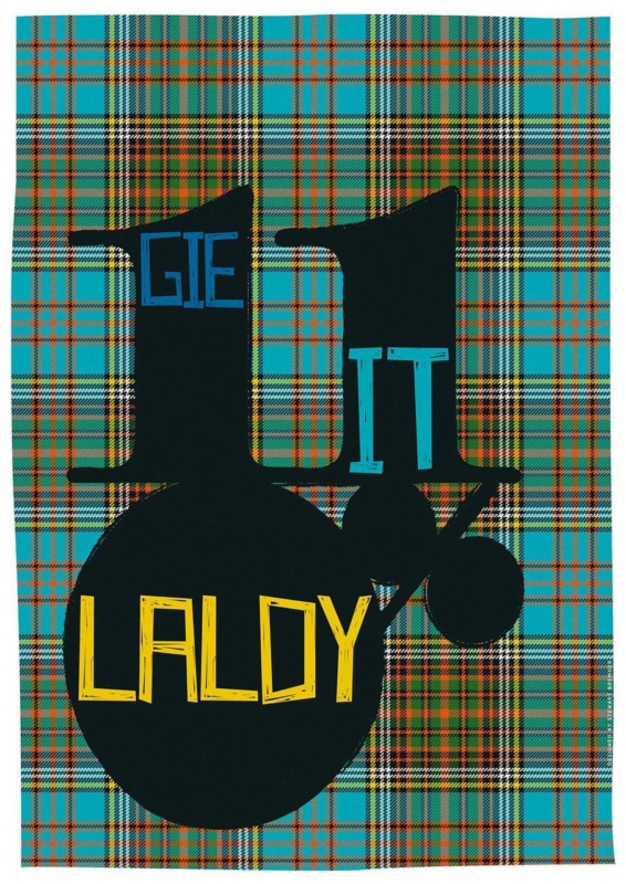
A Scottish gift for a choir singer should recognise the pleasure of singing together, not simply add another treble clef to a shelf. Gie it Laldy by Stewart Bremner takes a more personal route. The familiar Scots phrase means to do something with gusto, making it a fitting tribute to the singer who commits fully to rehearsals, concerts, and every final chorus.

Why Gie it Laldy suits a singer

The phrase is encouraging without being sentimental. It can recall a conductor asking for more energy, the lift of a full ensemble, or the confidence needed for a solo. Because the wording belongs to everyday Scots, it also carries a sense of home and shared humour that generic music gifts rarely achieve.

The design matters just as much as the saying. Strong typography gives the words presence from across a room, so the piece functions as graphic art rather than a printed slogan. That makes it suitable for an adult home, rehearsal space, or teaching room long after a particular concert has passed.

When a Scottish gift for a choir singer feels especially apt

  • After a first major performance: mark the confidence it took to step on stage and sing as part of the whole.
  • At the end of a choir season: thank a section leader, accompanist, or committed member without choosing a disposable token.
  • For a milestone birthday: connect the gift to the person’s musical life and Scottish voice at the same time.
  • When someone joins a new choir: offer encouragement that feels spirited rather than solemn.

Make the presentation personal without over-explaining it

Add a short card naming the concert, song, or rehearsal memory that made you think of the phrase. One specific reference will give the gift emotional weight. There is no need to cover the back with a long message or ask everyone to sign the artwork itself, which can make future conservation and reframing more difficult.

If the gift comes from the whole choir, collect messages in a separate card. The framed print then remains clean and easy to display, while the handwritten wishes can be kept safely. This approach is practical for a retirement, a move to another ensemble, or thanks to someone who has helped the group find its voice.

Find a wall where the words can be enjoyed

Typography works best where it can be read without visual competition. A hall, home practice corner, kitchen-dining area, or landing can all provide enough passing attention. Leave clear wall around the finished frame, particularly if nearby shelves already hold scores, photographs, and concert programmes.

A simple dark moulding can strengthen the graphic lines. A lighter timber may make the piece feel more relaxed in a home with warm natural finishes. First 4 Frames completes colour-managed Giclée production and bespoke framing in-house in Falkirk, so the final presentation feels like a considered artwork rather than a temporary performance souvenir.

Scots language given a bold visual voice

Stewart Bremner creates graphic prints that celebrate Scottish places, phrases, and identity through clear, contemporary design. Explore more at Stewart Bremner’s official website, or compare other work in the Stewart Bremner collection at First 4 Frames.

For a Scottish gift for a choir singer with humour, cultural character, and a genuine link to wholehearted performance, view the framed Gie it Laldy print. It is a compact way to say keep singing, give it everything, and enjoy the noise.

Posted on

Daisies and Campanula: Floral Wall Art for a Garden Designer’s Studio

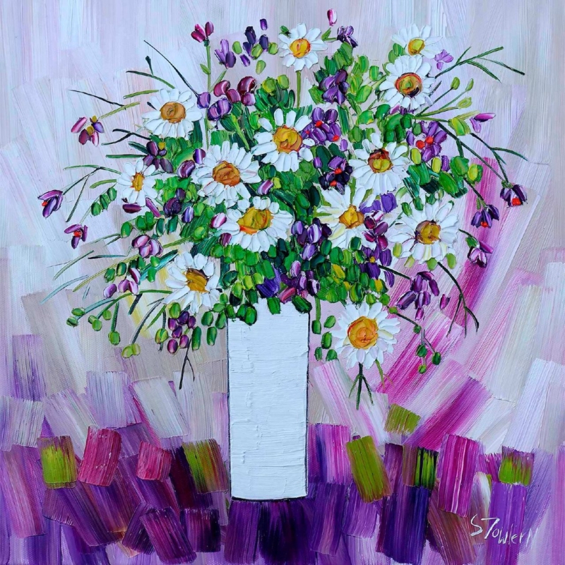
floral wall art for a garden designer’s studio should feel connected to plants without behaving like a specimen chart. A working studio needs inspiration, but it also needs enough visual calm for drawings, samples, and client plans. Daisies and Campanula by Sheila Fowler offers that balance. White daisies and blue-violet campanula emerge through lively green marks, creating the impression of a border in bloom rather than a rigid botanical record.

What floral wall art for a garden designer’s studio needs to contribute

A design workspace already contains visual information. Plant photographs, material samples, site plans, and colour swatches can quickly fill every surface. The artwork should therefore contribute atmosphere and observation rather than another layer of technical reference. An expressive flower painting works well because it recalls the movement and irregularity of a real garden.

Daisies and Campanula is especially useful in this setting. Its pale flower heads provide clear pauses among richer blues and greens. Looser marks suggest stems, foliage, and changing light without prescribing a particular planting scheme. That leaves room for a designer’s own ideas while keeping the studio rooted in the living material behind the work.

Use the painting as a conversation point, not a mood board

Place the print where a client can see it from the consultation table, but avoid surrounding it with pinned references. Clear wall around the frame lets the image read as a finished piece. It can then open useful conversations about looseness, seasonal change, or the balance between white flowers and saturated colour without implying that every garden should copy its palette.

Studio questionWhat the artwork can demonstrate
How can white planting avoid looking flat?Darker blue and green marks give the pale daisies definition and depth.
How much colour is enough?Blue-violet flowers create rhythm while the white blooms provide breathing space.
Can an informal border still feel composed?Repeated flower heads hold the energetic brushwork together.

Choose a position that supports the working layout

A wall beyond the main desk can give the eye a useful change of focus after close work. The print could also sit above a low sample cabinet, provided doors and tall display boards do not obscure it. Make a paper template using the finished framed size, then view it from both the designer’s chair and the client’s seat.

Daylight is helpful for a garden-led subject, but direct sun and strong reflections are not. Check the wall at different times before fixing the position. If task lighting dominates after dusk, use a soft, offset light that preserves the quieter white petals as well as the deeper campanula colour.

Frame the colour without making the studio feel themed

A light timber moulding may connect naturally with material samples and worktables. A restrained dark frame can instead sharpen the expressive marks and separate the print from a busy sample area. There is no need to repeat flower motifs elsewhere. One blue notebook, glazed pot, or fabric sample is enough to create a quiet relationship.

First 4 Frames produces colour-managed Giclée prints and completes bespoke framing in-house at its Falkirk workshop. That considered finish matters in a professional studio, where clients will notice clean presentation and the relationship between colour, paper, mount, and moulding.

Painterly flowers grounded in close observation

Sheila Fowler is known for expressive paintings of Scottish landscapes, coastlines, wildflowers, and still life. Her layered colour feels well suited to a creative practice concerned with growth and changing seasons. See more work at Sheila Fowler’s official website, or browse the Sheila Fowler collection at First 4 Frames.

Thoughtful floral wall art for a garden designer’s studio can make the workplace feel connected to its purpose while remaining polished for meetings. View the framed Daisies and Campanula print for a lively botanical focal point made with colour-managed printing and hand-finished craftsmanship.

Posted on

Blue Tea Set: Maximalist Kitchen Wall Art With a Clear Focal Point

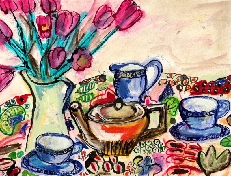
maximalist kitchen wall art can be exuberant without being chaotic. The strongest piece repeats colours and shapes already enjoyed in the room, then gathers them into one deliberate composition. Blue Tea Set by David Short does exactly that. Blue cups, a russet teapot, pink flowers, turquoise stems, and patterned fabric create plenty to discover, while the horizontal arrangement holds everything together.

Why maximalist kitchen wall art still needs visual order

A colourful kitchen may already contain glazed tiles, cookware, cookbooks, ceramics, and open storage. Adding a timid print can make the wall look incidental. Adding several unrelated pictures can make the room feel fragmented. One confident still life is often the better answer because it reflects the room’s abundance while establishing a clear centre.

In Blue Tea Set, the blue tea pieces recur across the image and give the eye a sequence to follow. The central pot provides weight. Flowers rise on the left, balancing the lower row of cups without creating a rigid mirror image. Black outlines keep individual objects legible, while repeated pink, red, green, and turquoise marks connect the patterned areas.

Let the artwork organise the kitchen palette

Colour from the printUseful room connectionKeep it controlled by
Deep and powder blueCabinetry, crockery, or a small applianceChoosing one main blue rather than matching every shade
Pink and redFlowers, a blind, or seat fabricRepeating it in one or two compact accents
Turquoise and leaf greenPainted chair, plant pot, or glasswareLeaving larger worktops and walls quieter
Rust and ochreTimber, terracotta, or warm metalUsing natural texture instead of more printed pattern

The aim is relationship, not exact matching. Pulling one blue and one warm accent from the picture is enough. The remaining colours can stay within the artwork, where they add richness without requiring a new purchase for every shelf.

Give the horizontal composition room to spread

The landscape format can work above a low dresser, a dining bench, or a clear stretch of wall near the table. It can also bridge the visual gap between tall cabinets and a doorway. Avoid hanging it directly above a hob, kettle, or sink, where heat, steam, and splashes make the location unsuitable for framed work.

Measure the usable wall after doors and cupboards are open. A paper template helps confirm that the frame will not be crowded by shelves or pendant lights. From a distance, the flowers and tea set should read as one broad arrangement. At closer range, the patterned cloth and energetic drawn marks provide the detail that maximalist interiors thrive on.

Pair pattern with areas of calm

Maximalism works through editing as much as collecting. If the wall art sits near patterned tiles, keep the space between them uncluttered. If open shelves hold many ceramics, group them by colour or scale rather than spreading every piece evenly. A clear edge around the frame allows the composition to feel intentional instead of absorbed into the background.

The pale ground within the picture is useful here. It gives the flowers, cups, and tablecloth breathing space and can connect to a light wall without making the whole scheme quiet. A slim blue or dark frame could reinforce the drawn outlines, while a lighter moulding may give a busier wall a cleaner boundary.

Everyday objects treated with colour and humour

David Short creates contemporary work informed by colour, pattern, memory, and familiar possessions. That viewpoint makes a tea set feel less like formal still life and more like a lively record of hospitality. Visit David Short’s official website for more of the artist’s practice, or explore the David Short collection at First 4 Frames.

First 4 Frames produces colour-managed Giclée prints and completes bespoke framing in-house in Falkirk. That careful finish is especially important for maximalist kitchen wall art, where crisp colour relationships and a considered frame distinguish joyful layering from visual muddle. View the framed Blue Tea Set print and use its palette as a confident starting point.

Posted on

Forest Path: Biophilic Wall Art for a Creative Workspace

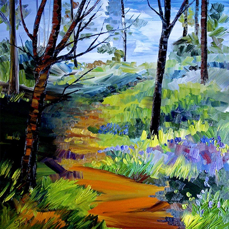
biophilic wall art for a creative workspace should offer more than a token leaf motif. It needs to give the eye somewhere restorative to travel while keeping enough colour and energy for work that depends on ideas. Forest Path by Sheila Fowler does that through a warm path, dark vertical trunks, bright grasses, and blue-violet flowers. The scene suggests movement into open air, yet its square composition remains steady enough for a working room.

What biophilic wall art for a creative workspace should actually do

Biophilic design connects an interior to forms, colours, light, and rhythms found in nature. In a workspace, that connection can be practical as well as decorative. A landscape with a clear route and varied marks gives tired eyes a visual change from screens, grids, and close-up tasks. It can also soften the hard edges of desks, shelving, and equipment.

Forest Path has useful contrasts for this role. The near-black trunks provide structure. Fresh yellow-green and blue passages lift the middle distance. An ochre path bends through the foreground instead of stopping at the frame, creating a sense of onward space. Expressive brushwork keeps the woodland lively without turning it into a detailed scene that demands constant attention.

Place the view where it can interrupt screen fatigue

Do not automatically hang the picture directly behind the monitor. A side wall or the wall beyond the desk can be more useful because it gives you a different focal distance. When you pause, the winding path becomes a natural place for the eye to rest before returning to close work.

The square format suits a compact wall between shelving, above a low cabinet, or beside a reading chair used for reviewing ideas. Use a paper template based on the finished frame size. Check it from the doorway and from the working position, making sure a monitor, lamp, or open door will not obscure the lower path.

Build a natural scheme without filling the office with green

  1. Start with one quiet base. Soft white, pale grey, or a muted clay wall lets the saturated landscape remain clear.
  2. Repeat one secondary colour. A blue-violet notebook, pinboard fabric, or ceramic is enough to connect the woodland flowers to the desk area.
  3. Add real texture. Timber, cork, linen, or a single healthy plant can support the natural feeling without turning every accessory into a botanical reference.
  4. Keep the route visible. Leave clear wall around the frame so the warm path retains its depth and direction.

This measured approach is especially useful in a design studio, sewing room, writing space, or home office where materials already provide colour. The artwork can bring those elements together rather than adding another layer of visual clutter.

Choose lighting and framing for bold woodland colour

Strong side light can create reflections across glazing, so test the position during the brightest part of the working day. If the room is used after dusk, a soft wall light can preserve the dark tree detail without flattening the lighter blue sky and grasses. Keep the light source offset rather than aimed straight at the glass.

A dark slim moulding can echo the tree trunks and sharpen the square shape. A warm timber may connect more gently to the ochre path and natural desk finishes. First 4 Frames uses colour-managed Giclée production and completes bespoke framing by hand at its Falkirk workshop, helping the vivid marks remain balanced in a polished, ready-to-hang piece.

Expressive Scottish painting with a restorative direction

Sheila Fowler is known for colourful, textured landscapes, coastlines, wildflowers, and still-life painting. Her bold marks suit a woodland subject because they communicate changing light and growth without reducing every leaf to literal detail. Learn more at Sheila Fowler’s official website, or browse the Sheila Fowler collection at First 4 Frames.

Well-chosen biophilic wall art for a creative workspace can support both concentration and the pauses that help ideas develop. View the framed Forest Path print for a woodland route that brings depth, colour, and hand-finished craftsmanship into the working day.