Posted on

Choosing Art for Exposed Brick Walls, Why Lost in Time Feels So Balanced

Image of Lost in Time by Arie Vardi

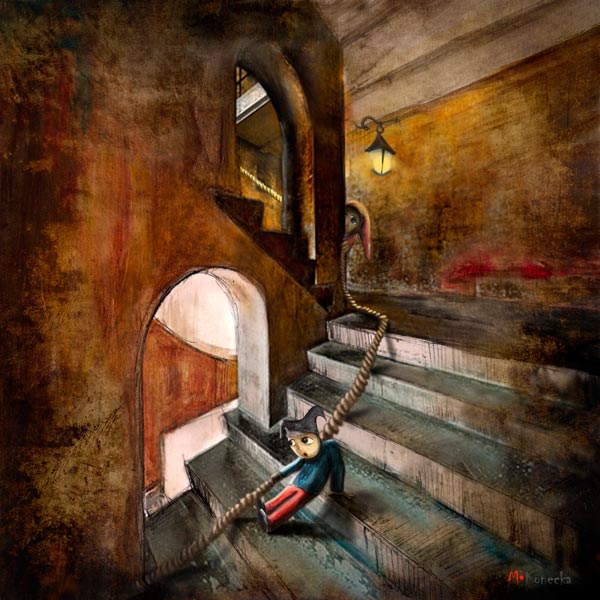
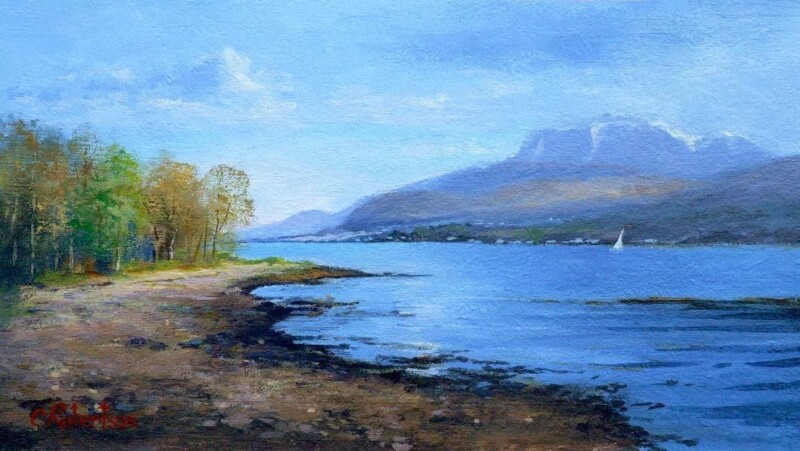
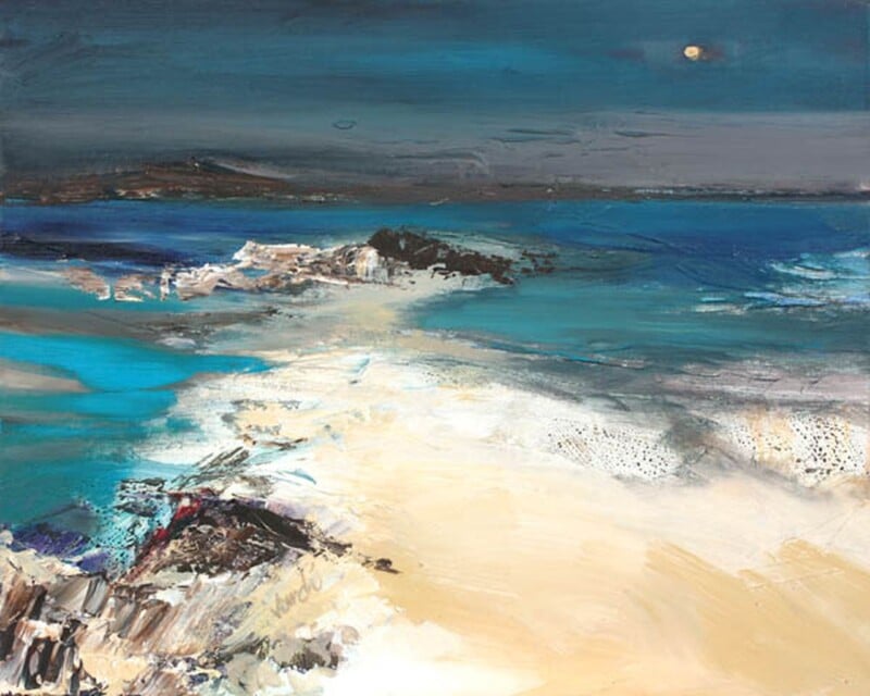
Choosing art for exposed brick walls is often a question of balance. Brick already brings texture, pattern, and a certain amount of visual weight, so the artwork needs to soften the effect rather than add more noise. Lost in Time does this particularly well, offering atmosphere and colour in a calm, measured way.

Why calmer artwork often works better on brick

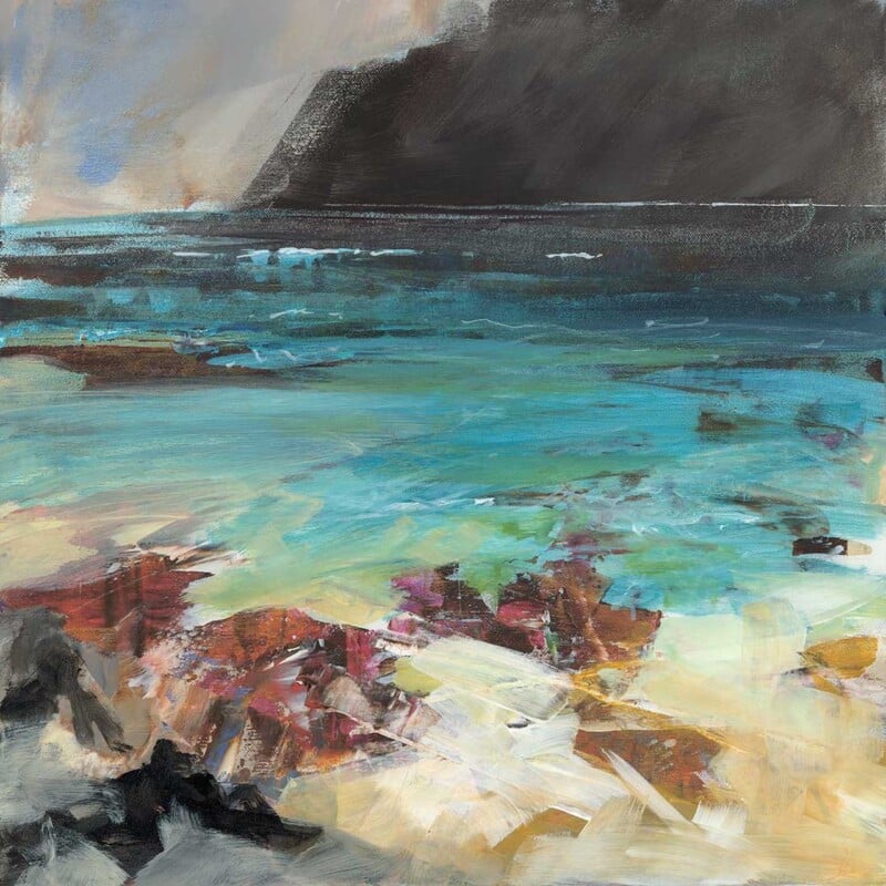
A heavily textured wall can make busy art feel crowded. This piece succeeds because it introduces mood and depth without fighting for attention. The room still keeps its character, but it feels less hard-edged and more complete.

It would suit dining spaces, garden rooms, studios, or open-plan corners where exposed brick is part of the architecture. Instead of trying to dominate the wall, the artwork works with it, which is usually the more lasting choice.

A useful way to bring polish to a more rugged backdrop

There is a real difference between preserving character and letting a room feel unfinished. One well-framed print can bridge that gap. This artwork adds a sense of intention, helping the wall feel styled while still allowing the brick to do its job.

  • It softens texture without making the scheme bland.
  • It suits interiors that mix older materials with cleaner furniture.
  • It brings calm colour to a wall that already has a lot going on.

Why the frame makes a difference

First 4 Frames completes the work in-house in Falkirk with colour-managed Giclée printing and hand-finished bespoke framing. That superior quality finish matters on exposed brick because the presentation needs enough clarity and structure to stand confidently against a textured backdrop.

The artwork is by Arie Vardi, and you can view the exact framed product here.

If you want art for exposed brick walls that feels calm, polished, and naturally well judged, Lost in Time is a strong choice.

Posted on

How Down the Stairs Can Lift the Wall Above a Console Table

Finding the right wall art above a console table can be surprisingly difficult. The space usually needs personality, but not so much visual weight that the area feels crowded. Down the Stairs works especially well because it brings shape, interest, and movement to a narrow wall without overpowering it.

Why this area needs more than a generic filler print

Console tables often sit in halls, landings, or transition spaces where every detail is more noticeable. A weak artwork can make the whole arrangement feel temporary. This piece has enough character to anchor the wall properly, so even a simple table, lamp, or bowl beneath it feels more intentional.

  • It suits hallways, upstairs landings, and apartment entrances.
  • It adds personality without needing a full gallery wall around it.
  • It works well when the furniture below is slim and understated.

A useful way to make a pass-through space feel finished

Not every part of a home needs lots of objects to feel considered. Sometimes one expressive framed print is enough. This artwork helps a circulation space feel designed rather than simply passed through, which is exactly what makes it so useful above a console table.

Why the presentation matters in a small area

First 4 Frames produces the piece in-house in Falkirk with colour-managed Giclée printing and hand-finished bespoke framing. In a smaller wall area, that cleaner finish matters because the eye takes in the whole arrangement at once. A superior quality frame helps the artwork look settled and complete.

The artwork is by Matylda Konecka, and you can view the exact framed product here.

If you want wall art above a console table that feels lively, polished, and easy to place, Down the Stairs is a very good option.

Posted on

Beached Clinker at Croig and the Appeal of Scottish Wall Art for a Second Home

Good Scottish wall art for a second home should do more than fill an empty wall. It should help the property feel settled, personal, and meaningfully connected to its setting. Beached Clinker at Croig is a strong example because it brings colour, local character, and a clear sense of atmosphere.

Why place matters more in a retreat setting

A second home often benefits from artwork that makes the space feel distinct from everyday life. This piece does that beautifully. The coastal subject and island character give the room a stronger identity, which helps even a simple interior feel more established and welcoming.

It works especially well in sitting rooms, guest bedrooms, and entrance areas where you want visitors to feel a connection to Scotland straight away. Rather than relying on generic nautical décor, it gives the home a more grounded and collected feel.

A better fit than purely decorative filler

Second homes can easily end up with practical but forgettable décor choices. One well-chosen framed print is often more effective. This artwork brings warmth and personality while still feeling polished enough for a quality-led interior.

  • It adds colour without making the room feel busy.
  • It suits coastal properties and inland homes alike when you want a stronger Scottish connection.
  • It makes a temporary-feeling room seem more established.

Why quality presentation helps

First 4 Frames completes the work in-house in Falkirk with colour-managed Giclée printing and hand-finished bespoke framing. That craftsmanship matters in a second home because the room benefits from pieces that feel chosen to last, not simply bought to fill space quickly.

The artwork is by John Lowrie Morrison OBE, and you can view the exact framed product here.

If you are looking for Scottish wall art for a second home that feels warm, rooted, and memorable, Beached Clinker at Croig is a very strong choice.

Posted on

Why Atlantic Storm Approaching Works So Well When You Want Art for a Room With Black Accents

Choosing art for a room with black accents is often about balance. Black details can make a room feel crisp, tailored, and modern, but they can also harden the overall look if everything around them is too static. Atlantic Storm Approaching is a very good way to introduce movement and colour without losing that sense of control.

Why this kind of contrast works

The darker accents in a room already provide definition, so the artwork does not need to compete through heaviness. This piece works because it brings energy through weather, texture, and shifting tone. That keeps the room feeling alive rather than overly formal.

  • It suits living rooms, dining spaces, and home offices with darker metalwork or painted details.
  • It adds depth without forcing the room into a full coastal theme.
  • It helps black accents feel intentional rather than severe.

A useful choice when a scheme feels too sharp

Rooms with black picture rails, lighting, furniture, or window frames often benefit from one softer but still confident focal point. The atmosphere in this artwork does that job well. It gives the eye somewhere to settle while still keeping the space visually strong.

Why the framed finish matters

First 4 Frames produces each piece in-house in Falkirk using colour-managed Giclée printing and hand-finished bespoke framing. That superior quality presentation is especially important in a more design-led room, because details are noticed more quickly when the scheme is clean and deliberate.

The artwork is by Jill McIntosh, and you can view the exact framed product here.

If you want art for a room with black accents that feels dramatic but still easy to live with, Atlantic Storm Approaching is an excellent option.

Posted on

Why Fun in the Snow Works as Winter Wall Art You Can Enjoy All Year

The best winter wall art should not feel like something you only want to see for a few weeks in December. Fun in the Snow works because it captures seasonal charm in a way that still feels warm, friendly, and easy to live with all year round.

Why some winter artwork lasts beyond the season

Strong winter pieces usually succeed when they carry more than a festive reference. They need personality, movement, and enough visual warmth to keep the room inviting. This artwork has that quality, so it can continue to feel at home long after the darker months have passed.

It would suit a kitchen, family room, boot room, or casual sitting area where you want something cheerful and grounded. The seasonal setting adds freshness, but the overall character still feels generous and approachable rather than tied to one short moment in the calendar.

A more usable kind of seasonal artwork

There is real value in artwork that hints at winter without becoming novelty décor. This piece keeps enough of its own character to stay enjoyable in spring and autumn too, especially in homes that like a touch of Scottish countryside warmth.

  • It brings a lighter, more playful note to practical family spaces.
  • It suits interiors with timber, painted furniture, and natural textures.
  • It offers seasonal character without feeling temporary.

Why the framed finish helps it feel lasting

First 4 Frames produces the work in-house in Falkirk using colour-managed Giclée printing and hand-finished bespoke framing. That superior quality finish helps the artwork feel permanent and properly chosen, rather than like a seasonal decoration brought out for a short spell.

The artwork is by Hillary Barker, and you can view the exact framed product here.

If you want winter wall art that feels cheerful, well made, and genuinely usable throughout the year, Fun in the Snow is a lovely option.

Posted on

What Makes Soulful Silence a Refined Equestrian Wall Art Choice

A lot of people are drawn to equestrian wall art, but the right piece for the home is not always the loudest or most dramatic one. Soulful Silence stands out because it feels composed, thoughtful, and emotionally intelligent. It brings the subject into the room without making the room revolve around it.

Why restraint gives this piece its strength

Horse artwork can sometimes feel overly busy or too obviously sport-led for a quiet interior. This piece goes in a different direction. The mood is gentler, which makes it easier to place in a home where calm, texture, and atmosphere matter just as much as the subject itself.

  • It suits bedrooms, dressing areas, studies, and quieter sitting spaces.
  • It works well for horse lovers who want something more elegant than overtly thematic décor.
  • It adds presence through expression and tone rather than sheer visual noise.

A good fit for interiors that value calm

This is the kind of artwork that rewards a slower look. In rooms with soft neutrals, natural materials, or a more layered, reflective feel, it can add depth without unsettling the overall mood. That makes it especially useful for people who want equestrian art that feels grown-up and lasting.

Why quality presentation matters here

First 4 Frames completes the work in-house at the Falkirk workshop with colour-managed Giclée printing and hand-finished bespoke framing. That craftsmanship is part of what helps the finished piece feel so settled. A refined subject benefits from a refined presentation.

The artwork is by Diana Hand, and you can view the exact framed product here.

If you want equestrian wall art that feels poised, personal, and beautifully presented, Soulful Silence is a very compelling choice.

Posted on

Why Suitcase (Tobermory) Is Such a Good Travel Inspired Wall Art Choice

Good travel inspired wall art should suggest story and movement without making a room feel restless. Suitcase (Tobermory) is a lovely example of that balance. It has personality, colour, and a gentle sense of adventure, yet it still feels refined enough for a well-finished home.

Why narrative artwork can work so well

Some interiors need more than a decorative accent. They need one piece that gives the room a point of view. This artwork does that by hinting at travel, memory, and place, which makes it especially appealing in spaces that might otherwise feel neat but slightly anonymous.

It would work particularly well in a hallway, spare bedroom, or upstairs landing where you want visitors to notice something personal rather than purely decorative. Because the subject carries its own story, the room can feel more individual without needing extra objects or visual noise.

A more thoughtful alternative to obvious travel décor

Travel-themed interiors can easily tip into clichés. What makes this piece stronger is that it feels imaginative rather than literal. The Tobermory connection gives it a sense of place, while the artwork itself remains stylish and open-ended enough to suit different tastes.

  • It adds character without requiring a whole themed room.
  • It suits homes that value colour, narrative, and a slightly quirky focal point.
  • It can help a plain wall feel more memorable with just one framed piece.

Why framed presentation helps

First 4 Frames produces the work in-house in Falkirk with colour-managed Giclée printing and hand-finished bespoke framing. That clean, superior quality presentation matters here because it keeps a playful subject looking collected and intentional.

The artwork is by Matylda Konecka, and you can view the exact framed product here.

If you want travel inspired wall art that feels imaginative, polished, and easy to place, Suitcase (Tobermory) is an excellent choice.

Posted on

How A Passing Sail, Loch Linnhe Can Work Beautifully as Wall Art for Panelled Walls

Choosing wall art for panelled walls can be more complicated than it first appears. Panelling already gives a room rhythm and structure, so the artwork needs to complement that character rather than fight with it. A Passing Sail, Loch Linnhe does this especially well, bringing a sense of openness and movement to a more architectural backdrop.

Why it works against a structured backdrop

Panelled rooms often benefit from artwork that introduces flow. This piece has exactly that quality. The sail, water, and wider landscape help break up straight lines gently, so the room feels less rigid while still staying tidy and composed.

  • It suits dining rooms, sitting rooms, and hall spaces with timber or painted panelling.
  • It brings colour and depth without making the wall feel overcrowded.
  • It helps a more traditional interior feel fresher while still looking considered.

A good choice when the wall already has presence

When a wall has moulding, panelling, or shaker-style detailing, not every print will sit comfortably on it. This artwork works because it has enough presence to hold its own, but the composition still feels calm. That balance makes it easier to live with over time.

Why the finish matters

First 4 Frames completes each piece in-house in Falkirk using colour-managed Giclée printing and hand-finished bespoke framing. That superior quality finish is important in a room with panelled walls, because the presentation needs to feel every bit as deliberate as the interior itself.

The artwork is by Colin Robertson, and you can view the exact framed product here.

If you want wall art for panelled walls that feels calm, polished, and naturally well balanced, A Passing Sail, Loch Linnhe is a very strong option.

Posted on

What Makes Sleeping Island (St Kilda) Such a Good Storytelling Wall Art Choice

The best storytelling wall art does more than match the colour of a room. It gives the space a sense of imagination. Sleeping Island (St Kilda) is especially good for that because it invites curiosity straight away.

Why it works beyond early childhood décor

Some imaginative rooms need artwork that feels playful without looking too young. That is where this piece is particularly useful. It has dreamlike detail, but it also has enough mood and visual depth to keep its appeal as tastes grow and the room becomes more individual.

A strong choice for creative corners and bedrooms

This print would work well in an older child’s bedroom, a creative study corner, or any part of the home where you want the wall art to spark thought rather than simply fill space. It suits rooms with books, collected objects, layered textiles, and a little personality already in them.

  • It gives the room a talking point without relying on bright novelty colour.
  • It suits imaginative interiors that mix calm tones with personal details.
  • It can help a plain wall feel more expressive with one carefully chosen framed piece.

Why the presentation needs care

First 4 Frames completes the work in-house in Falkirk using colour-managed Giclée printing and hand-finished bespoke framing. That finish matters because detailed, story-led artwork can lose much of its character if it is presented casually. A well-made framed result keeps the piece feeling special.

The artwork is by Matylda Konecka, and you can view the exact framed product here.

If you want storytelling wall art that feels imaginative, distinctive, and properly finished, Sleeping Island (St Kilda) is an excellent choice.

Posted on

Why In Time With A Moment Is a Strong Choice for Art in a Room With Sea Views

Finding the right art for a room with sea views can be harder than it sounds. If the artwork is too loud, it competes with the window. If it is too bland, it disappears entirely. In Time With A Moment sits in that valuable middle ground.

Why this kind of room needs restraint

Rooms with a coastal outlook already have movement, light, and changing colour built into them. The artwork should echo that atmosphere rather than trying to overpower it. This piece works because it feels contemplative and spacious, with enough depth to hold attention when the blinds are closed and enough calm to live alongside a real view.

When it is especially effective

It is a particularly good choice for bedrooms, upstairs sitting rooms, and quieter corners where the view matters. The darker tones and shoreline mood can help tie the inside and outside together, especially when the room includes muted textiles, weathered timber, or cooler painted walls.

  • It supports a sea-facing room without turning the décor into a theme.
  • It brings atmosphere for evenings, when the view outside is less visible.
  • It suits people who prefer coastal art with depth and quiet drama.

Why the framed result matters

First 4 Frames produces the piece in-house in Falkirk using colour-managed Giclée printing and bespoke hand-finished framing. In a room with a strong natural outlook, the finish needs to feel every bit as considered as the architecture around it. That craftsmanship helps the print hold its own in a subtle, confident way.

The artwork is by Arie Vardi, and you can view the exact framed product here.

If you want art for a room with sea views that feels calm, atmospheric, and intelligently chosen, In Time With A Moment is a very strong fit.