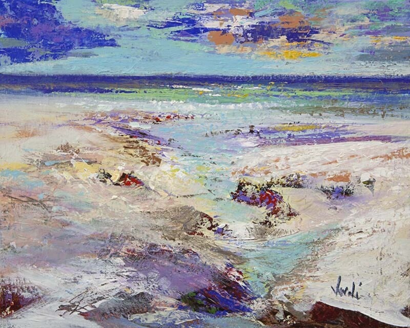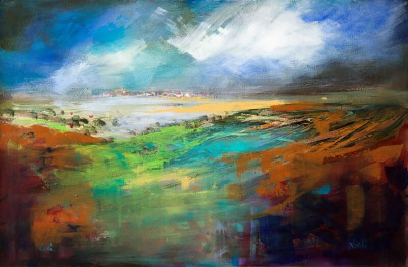
Choosing art for sandy beige walls is usually about protecting warmth while giving the room a clearer focal point. First Light 2 works beautifully because it brings light, movement, and enough cool contrast to stop a beige room from drifting into sameness.
That matters in spaces where the palette is intentionally soft. A warm neutral backdrop often looks best when the artwork introduces freshness without breaking the room’s quieter mood.
Why It Feels Balanced Against Warm Neutrals
This piece has brightness, but it is not harsh brightness. The coastal atmosphere keeps the image easy to live with, while the framed finish gives it enough structure to hold the wall properly.
- It adds definition to beige walls without making them feel colder.
- It keeps a neutral scheme airy rather than overly safe.
- It suits buyers who want calm with a little more visual lift.
Where It Can Work Best
It would sit particularly well in a living room, bedroom, guest room, or hallway where sandy beige paint, pale flooring, woven textures, or linen upholstery already shape the space. The artwork gives those finishes a stronger sense of direction without disturbing their calm.
Why The Finish Helps
First 4 Frames completes bespoke framing and colour-managed Giclee production in-house, which helps subtle tonal shifts land properly instead of disappearing into the wall colour.
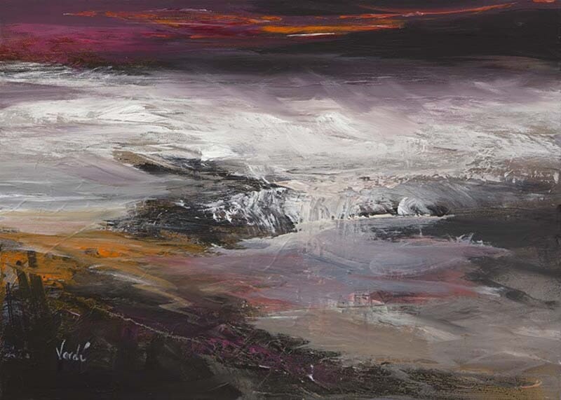
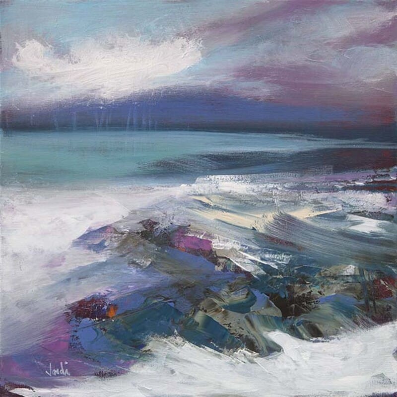
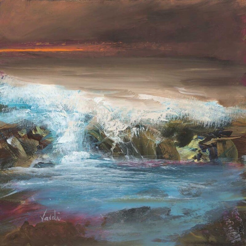
You can view the exact framed product here, and browse more from Arie Vardi if you enjoy coastal work with the same calm, light-led character.
For anyone comparing art for sandy beige walls, First Light 2 is a polished and very liveable choice.