Posted on

Commercial Wall Art Feels More Memorable With Bollywood at Holyrood

Bollywood at Holyrood is a vibrant, whimsical painting depicting castles, colorful buildings, rolling green hills, an ornate elephant with a rider near old stone ruins, and a lively park—capturing the spirit of Bollywood in Edinburgh.

Good commercial wall art should make a business space feel more distinctive without pushing it into novelty. Bollywood at Holyrood does that well, bringing colour, local reference, and movement into the room while still feeling professional enough for everyday use.

Why commercial wall art works best when it has personality

Reception spaces, meeting rooms, studios, and client lounges often need more than safe filler. They need artwork that helps the space feel thought through. Bollywood at Holyrood brings a recognisable Edinburgh energy that can make a room feel warmer and more memorable without becoming loud or over-designed.

That makes it especially useful where a business wants to signal place, confidence, and a more considered eye for detail. It feels welcoming, but it also feels specific, which is often what commercial rooms are missing.

Why Bollywood at Holyrood holds a shared space so well

First 4 Frames completes every piece in-house with bespoke framing and colour-managed Giclee production, so the final result feels polished rather than disposable. That craftsmanship matters in commercial settings, where the artwork becomes part of the overall impression clients and visitors take away.

For more context around the setting, Historic Environment Scotland on Holyrood Park is useful. You can also browse more work by Rob Hain and view the exact framed product here.

If you want commercial wall art that feels memorable, local, and properly finished, Bollywood at Holyrood is an excellent fit.

Posted on

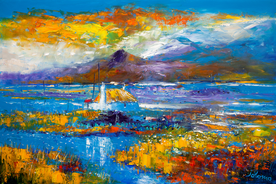
Why Acairseid Skye Stands Out Among Fine Art Prints UK Buyers Can Live With

The best fine art prints UK should hold your attention quietly rather than by force. Acairseid Skye is a strong example because it brings place, colour control, and a calmer sense of space that feels easy to live with day after day.

Why fine art prints UK buyers often choose calmer work

Many customers want something with enough presence to shape a room, but not so much insistence that it becomes tiring after a few weeks. Acairseid Skye works beautifully in that middle ground. The scene feels composed and spacious, which makes it especially useful in rooms where the artwork needs to add refinement rather than visual pressure.

  • It gives the wall atmosphere without overloading the room.
  • It suits buyers who want Scottish place and quiet confidence together.
  • It rewards a more careful framed presentation where tone and finish both matter.

Why Acairseid Skye feels settled rather than showy

That sense of balance matters in living rooms, bedrooms, and hallways where art has to earn its place over time. First 4 Frames completes the work in-house in Falkirk with bespoke framing and colour-managed Giclee production, helping the final piece feel superior quality, hand-finished, and properly resolved on the wall.

For more on the wider setting, VisitScotland on the Isle of Skye is worth exploring. You can also browse more work by John Bathgate and view the exact framed product here.

If you are comparing fine art prints UK and want something calm, rooted, and genuinely easy to live with, Acairseid Skye is a very strong option.

Posted on

Scottish Island Art for a Calm Bedroom Feels Softer With In the Sea Near Ulva Ferry Isle of Mull

The best Scottish island art for a calm bedroom should help the room slow down. In the Sea Near Ulva Ferry Isle of Mull is especially good for that because it brings place, softness, and open water without turning the bedroom into a themed coastal scheme.

Why Scottish island art for a calm bedroom should feel spacious

Bedrooms benefit from artwork that gives the eye somewhere to rest. Island scenes are often well suited to that because they suggest distance and quiet rather than visual pressure. In the Sea Near Ulva Ferry Isle of Mull has that quality, which is why it works well above a bed, chest, or dressing table without pushing the room too hard.

The piece is also useful when you want a bedroom to feel more personal and rooted in Scotland, but still understated enough for everyday rest.

Why In the Sea Near Ulva Ferry Isle of Mull feels restful on the wall

First 4 Frames completes every framed print in-house with bespoke craftsmanship and colour-managed Giclee production. That careful finish helps the artwork keep its gentler tonal shifts, giving the room a superior quality focal point that still feels calm and unforced.

For more on the place behind the image, Isle of Mull on Ulva Ferry is useful. You can also browse more work by Hillary Barker and view the exact framed product here.

If you are looking for Scottish island art for a calm bedroom that feels spacious, gentle, and easy to live with, In the Sea Near Ulva Ferry Isle of Mull is a very appealing option.

Posted on

Ready to Hang Harbour Art Feels More Considered With Yacht Club, Gourock

The appeal of ready to hang harbour art is obvious: it should arrive ready to give the room identity without leaving more decisions behind. Yacht Club, Gourock does that especially well because it brings maritime structure and calm without feeling generic.

Why ready to hang harbour art appeals in everyday rooms

Harbour scenes can be lively without being loud, which makes them useful in sitting rooms, studies, and hallways that need a little more focus. The best examples feel composed enough for daily life, not simply nautical for the sake of it. That is where Yacht Club, Gourock stands out.

  • It gives the wall shape and direction without feeling rigid.
  • It suits both classic and more contemporary interiors.
  • It feels polished quickly, which is exactly what ready-to-hang buyers want.

Why Yacht Club, Gourock feels finished from the start

First 4 Frames completes the print and framing in-house with bespoke craftsmanship and colour-managed Giclee production, so the convenience never comes at the expense of quality. The final result feels hand-finished, balanced, and easy to place with confidence.

For more on the setting, VisitScotland on Gourock is useful. You can also browse more work by Raymond Murray and view the exact framed product here.

If you want ready to hang harbour art that feels calm, capable, and genuinely crafted, Yacht Club, Gourock is an excellent choice.

Posted on

Large Framed Prints for a Living Room Feel Calmer With Lonely Sands, Harris

Good large framed prints for a living room should give a wider wall enough presence without making the room feel crowded. Lonely Sands, Harris is a strong example because the horizon, shoreline, and open light create scale through space rather than noise.

Why large framed prints for a living room need breathing space

When buyers look for a larger piece, they often want one artwork to do the work of several. The risk is choosing something with plenty of size but not enough calm. Lonely Sands, Harris avoids that problem by giving the wall air as well as structure, so the room feels broader and more composed rather than overfilled.

This is especially helpful above a sofa, sideboard, or chimney breast where the artwork needs confidence but also enough restraint to stay liveable in the long term.

Why Lonely Sands, Harris feels expansive rather than oversized

The image already carries width and clarity, but the craftsmanship still matters. First 4 Frames completes the work in-house in Falkirk with bespoke framing and colour-managed Giclee production, helping the final piece feel superior quality, balanced, and genuinely ready for everyday living.

For more on the Harris coastline, VisitScotland on Harris beaches is well worth a look. You can also browse more work by Robert Kelsey and view the exact framed product here.

If you are comparing large framed prints for a living room and want something spacious, calm, and quietly striking, Lonely Sands, Harris is a very strong option.

Posted on

Moody Nature Wall Art Feels More Layered With Drift in Fall

The strongest moody nature wall art does not simply make a room darker. It gives the space depth, texture, and a quieter kind of focus. Drift in Fall works well because the autumn tones feel atmospheric without becoming oppressive.

Why moody nature wall art suits calmer rooms

Reading rooms, snugs, and quieter corners often benefit from artwork that slows the eye a little. A nature-led image with darker tones can do that beautifully when it still keeps enough detail and breathing space. Drift in Fall manages that balance well, which is why it feels thoughtful rather than simply sombre.

  • It adds texture to neutral walls and timber furniture.
  • It suits rooms lit more for atmosphere than glare.
  • It creates calm depth without demanding constant attention.

Why Drift in Fall feels atmospheric rather than gloomy

The photograph already has strong pacing and tonal contrast, so the presentation matters. First 4 Frames completes the print and framing in-house with bespoke care and colour-managed Giclee production, helping the final piece feel clean, polished, and properly resolved on the wall.

For more on woodland settings and autumn atmosphere, Forestry and Land Scotland is useful. You can also browse more work by Noel Fenech Photography and view the exact framed product here.

If you want moody nature wall art that feels layered, restful, and refined, Drift in Fall is a very appealing choice.

Posted on

Beach Wall Art for a Dining Nook Feels More Sociable With Day Out, North Berwick

Choosing beach wall art for a dining nook is often about atmosphere rather than theme. In a smaller dining nook, the right piece should make the space feel brighter, more open, and easier to linger in. Day Out, North Berwick does exactly that.

Why beach wall art for a dining nook should feel relaxed, not themed

Dining nooks work best when they feel welcoming enough for coffee, conversation, and everyday meals. A coastal image can help, but only if it brings ease rather than obvious seaside styling. Day Out, North Berwick has enough lightness and movement to soften the area without making it feel overly decorative.

That makes it especially useful in kitchens, breakfast corners, and informal dining spots where you want the artwork to add warmth while still keeping the room practical and uncluttered.

Why Day Out, North Berwick gives a dining corner more lift

The scene already carries brightness and easy rhythm, while the framing gives it enough authority to hold the wall properly. First 4 Frames completes every piece in-house with bespoke framing and colour-managed Giclee production, helping the final artwork feel superior quality and ready to enjoy from the day it arrives.

For more on the setting, VisitScotland on North Berwick is useful. You can also browse more work by Rob Hain and view the exact framed product here.

If you are looking for beach wall art for a dining nook that feels bright, sociable, and properly finished, Day Out, North Berwick is an excellent fit.

Posted on

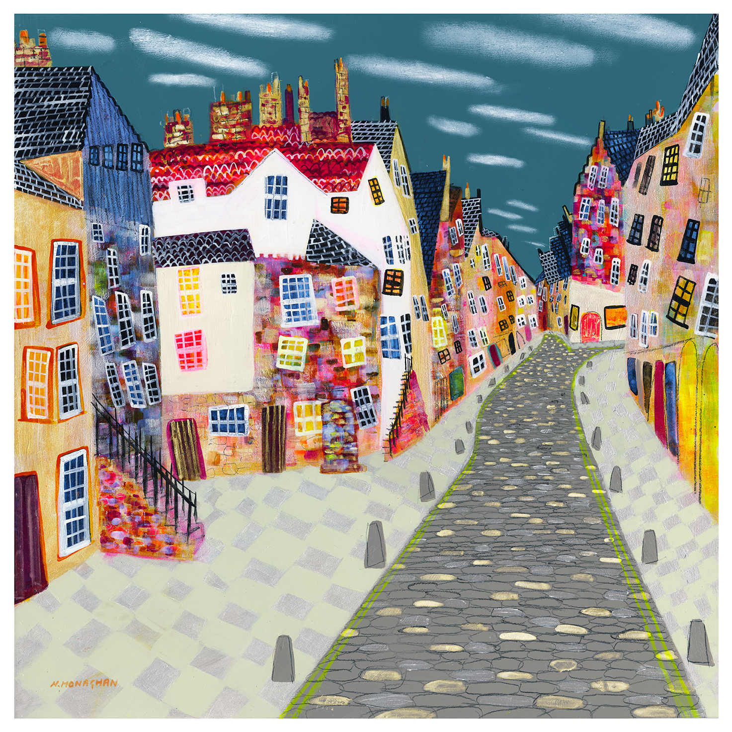
Colourful Edinburgh Wall Art Feels More Welcoming With Edinburgh, Rainbow Cobbles

The best colourful Edinburgh wall art does more than add colour. It helps the home feel friendlier from the moment you step through the door. Edinburgh, Rainbow Cobbles works beautifully for that because it brings city character, movement, and warmth without making the space feel crowded.

Why colourful Edinburgh wall art works so well in an entrance

Hallways and entry spaces often need lift more than they need more objects. A print like Edinburgh, Rainbow Cobbles gives the wall energy and local identity, while still feeling tidy enough for everyday living. That balance matters when you want a practical space to feel intentional rather than overlooked.

  • It adds colour without overwhelming a narrower wall.
  • It gives an entrance a more personal, local feel.
  • It helps a neutral hall feel warmer and less purely functional.

Why Edinburgh, Rainbow Cobbles feels lively rather than hectic

The subject already carries movement, but the finish keeps the piece composed. First 4 Frames produces and frames the work in-house in Falkirk with bespoke craftsmanship and colour-managed Giclee printing, so the final result feels hand-finished, superior quality, and properly settled on the wall.

For more context on the city itself, Edinburgh World Heritage is worth exploring. You can also browse more work by Nikki Monaghan and view the exact framed product here.

If you want colourful Edinburgh wall art that feels bright, rooted, and easy to live with, Edinburgh, Rainbow Cobbles is a very strong option.

Posted on

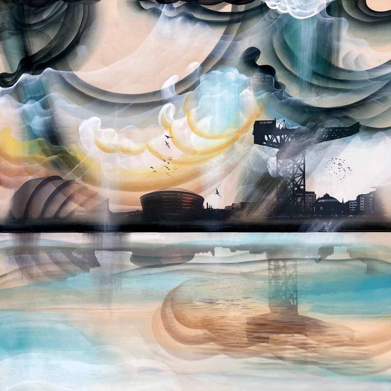
Gateway to the Mile Feels Fresh Among Contemporary Art Prints

The most convincing contemporary art prints tend to feel current without trying too hard. Gateway to the Mile does that very well. The image carries movement and city character, yet it still feels welcoming enough for a real home rather than like a design gesture that might date too quickly.

Why contemporary art prints work when they combine movement with place

Contemporary does not have to mean detached. Gateway to the Mile feels lively because it captures a recognisable route and a real urban rhythm. That gives the room energy, but it also gives the piece staying power because the image has more behind it than trend value alone.

This makes it a strong option for hallways, dining spaces, home offices, or sitting rooms that need a little more momentum without becoming visually hard.

Why Gateway to the Mile benefits from a careful final presentation

First 4 Frames handles the piece in-house with bespoke framing, colour-managed Giclee printing, and superior craftsmanship. That presentation helps the image feel polished and lasting, which is important when a more contemporary picture needs to look composed rather than merely busy.

You can browse more work by Rob Hain, visit Rob Hain, and view the exact framed product here.

If you are looking through contemporary art prints and want something lively, current, and easy to place, Gateway to the Mile stands out for the right reasons.

Posted on

Premium Wall Art Needs Restraint Too, Why Torridon Works

Good premium wall art does not always announce itself loudly. Torridon is a useful reminder that a more spacious image can feel every bit as considered and luxurious as something with greater visual drama, provided the print and framing are handled properly.

Why premium wall art often relies on restraint rather than noise

One of the clearest signs of a quality-led piece is that it does not need to over-explain itself. Torridon gives the room air, scale, and steadiness. That can be far more valuable than a louder picture when you want a living room, bedroom, or landing to feel settled, elevated, and easy to return to every day.

  • It creates space without looking empty.
  • It supports neutral and natural palettes especially well.
  • It gives a room depth without making it feel heavier.

Why Torridon suits a superior quality presentation

First 4 Frames finishes the work in-house in Falkirk using bespoke framing, colour-managed Giclee printing, and hand-finished craftsmanship. That level of care helps the final piece keep its subtle atmosphere and makes the artwork feel complete from the moment it is on the wall.

You can explore more from Kate Philp, visit Kate Philp, and view the exact framed product here.

If your idea of premium wall art is about calm confidence rather than excess, Torridon is a particularly good fit.