Posted on

Strathisla Whisky Distillery: Wall Art for a Home Whisky Room

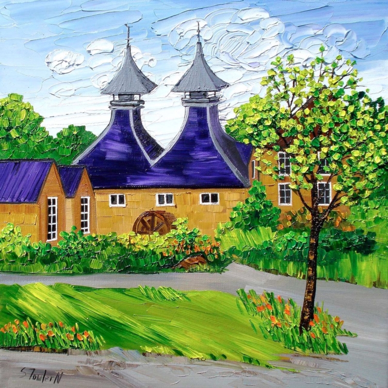
Image of Strathisla Whisky Distillery by Sheila Fowler

wall art for a home whisky room should add atmosphere and a sense of provenance without making the space resemble a themed pub. Strathisla Whisky Distillery by Sheila Fowler offers a more considered starting point. The historic Scottish subject gives the room identity, while the square composition can sit comfortably with bottle storage, timber furniture, and the smaller scale of many dedicated tasting spaces.

Why wall art for a home whisky room needs more than a logo

A whisky room is usually built around materials and rituals. Glass, wood, labels, and warm pools of light already provide detail. Large advertising graphics can compete with that collection and may make the room feel commercial. Artwork showing a real distillery introduces the subject in a quieter way. It connects the contents of the cabinet to landscape, buildings, and craft.

Strathisla Whisky Distillery is especially useful because its architecture gives the eye a clear destination. It can support conversation without requiring every visitor to recognise a particular bottle. The picture therefore suits both an enthusiastic collector’s room and a compact corner used for occasional tastings.

Choose a position clear of bottles and glass

Start with a wall that can be seen while people are seated. Above a low cabinet may work, provided the finished frame has space above the tallest bottle. A short wall beside the tasting table is another good option. Avoid hanging the print directly behind open shelves, where reflections and labels will interrupt the image.

Placement checkWhat to look for
Viewing distanceThe distillery should remain clear from the main tasting seats
Cabinet clearanceDoors, decanters, and bottle tops must not overlap the frame
Task lightingDownlights should illuminate the table without causing glare on the glass
Heat and moistureKeep the artwork away from radiators, sinks, and changing humidity

Work with the room’s warm materials

Whisky rooms often include oak, walnut, leather, brass, or deep paint colours. The frame does not need to copy those finishes. Instead, choose one that creates a clear edge between the artwork and the wall. A dark moulding can feel crisp against lighter plaster. A carefully selected timber may connect with cabinetry, but it should not look like an almost-match.

The print is available in 265 by 265 and 500 by 500 millimetre sizes before framing. The smaller option can define a tasting nook or narrow wall. The larger version gives a dedicated room a stronger anchor. Mark out the complete framed dimensions with low-tack tape before ordering, then check them from every seat.

Let the print supply colour without over-dressing the theme

Pick up one restrained colour from the artwork in a chair, tray, or textile if the room needs connection. Stop there. Barrels, tartan, maps, and whisky slogans used together can turn a calm room into a display set. One specific image, professionally framed, leaves the bottles and the experience of tasting to provide the remaining story.

First 4 Frames produces its Giclée prints through a colour-managed process and completes bespoke framing in-house in Falkirk. That hand-finished presentation gives the architectural detail a lasting, ready-to-hang finish. You can explore more landscape, coastal, and floral work on Sheila Fowler’s official website or browse the Sheila Fowler collection at First 4 Frames.

Well-chosen wall art for a home whisky room can celebrate the craft behind a collection while keeping the room personal and composed. View the framed Strathisla Whisky Distillery print and compare both available square sizes for your tasting space.
Posted on

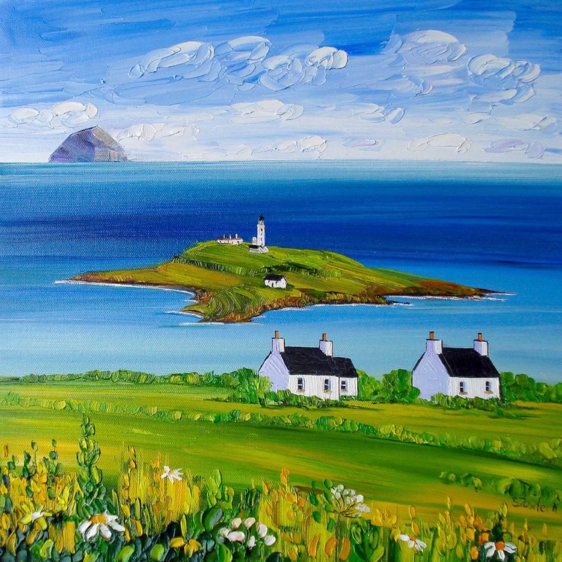
Art for Pale Blue Walls in a Coastal Living Room: Ailsa Craig from Kildonan

art for pale blue walls in a coastal living room should earn its place by answering a real question about the room or recipient. Ailsa Craig from Kildonan is a useful starting point because its square view gives the eye a named Scottish destination, while the island silhouette adds depth without asking every textile and accessory to repeat the coastal idea.

Choose art for pale blue walls in a coastal living room by contrast

Pale blue paint can be restful, yet a room becomes flat when the artwork, upholstery and accessories all sit at the same cool value. View the print from the main seat. Let the island and Kildonan setting provide the focal point, then use the frame to make a clear boundary between image and wall.

DecisionPractical check
265 mm square printTest it above a compact chair, console or short wall return.
500 mm square printUse it where a sofa or longer view needs more visual weight.
Frame toneCompare a natural or neutral edge instead of adding another coastal blue.
Room accentsRepeat one land or sky note, then stop before the scheme becomes literal.

Mark the full framed square with low-tack tape. Include the mount and moulding, because their width decides whether the image feels anchored. Check the template in daylight and under evening lamps; pale walls often change as the light cools.

A coastal room needs one convincing view, not a collection of anchors, ropes and matching blue objects.

Let the island bring distance while the frame brings definition

A square composition benefits from accurate mounting and an outer edge visible against the paint. Colour-managed Giclée production preserves tonal distinctions, while bespoke framing completed in-house in Falkirk gives the work a hand-finished, ready-to-hang presence.

For background on the island’s geography, history and place in the Firth of Clyde, read this geographical introduction to Ailsa Craig. You can also browse the Sheila Fowler collection or see the exact framed product.

Art for pale blue walls in a coastal living room works when the picture contributes a destination rather than another colour sample. Ailsa Craig from Kildonan offers Scottish place, measured scale and enough character to keep a cool room personal.

Posted on

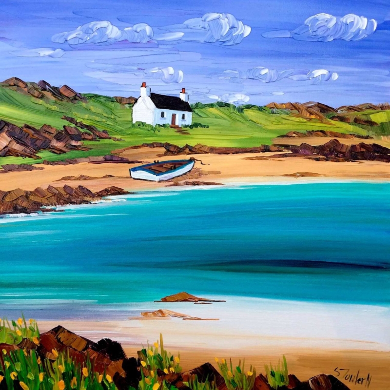
Coastal Wall Art for Tongue and Groove Walls: Cottage and Boat, Arisaig

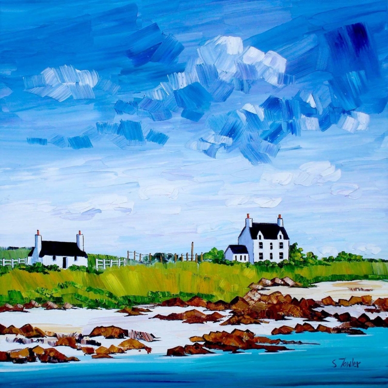
coastal wall art for tongue and groove walls should earn its place by answering a real question about the room or recipient. Cottage and Boat, Arisaig is a useful starting point because its square composition can interrupt repeated vertical or horizontal boards while its cottage-and-boat subject gives the room a specific west-coast destination.

Measure coastal wall art for tongue and groove walls from the frame

Panelling already creates rhythm, shadow and texture. Before choosing the print size, tape the complete framed square onto the boards. Centre it on the usable wall section rather than automatically aligning it with every groove. That lets the artwork read as one object instead of another part of the pattern.

Panelling directionUseful approach
Vertical boardsUse the square frame to slow the upward movement and create a visual pause.
Horizontal boardsLeave visible space around the frame so the long lines do not cut through the coastal view.
Half-height panellingMeasure from the top rail and keep the lower frame edge clearly separate.

The print is available in 265 mm and 500 mm square sizes. Include the mount and moulding when comparing them. The smaller option can finish a compact return; the larger can hold a dining or sitting-room wall where the boarding would otherwise dominate.

Avoid adding model boats, ropes or a row of coastal signs. The cottage, boat and Arisaig title already establish the place. Plain ceramics, wool and one timber tone will keep the setting tactile without turning it into a theme.

Let the frame separate coastal colour from panel texture

Tongue-and-groove walls need a frame with a decisive outer edge and secure hanging. Colour-managed Giclée production preserves the image’s distinctions, while bespoke framing completed in-house can give the square composition enough definition against the repeated boards.

For local context on the village, coast and surrounding landscape, read Visit Mallaig’s introduction to Arisaig. You can also browse the Sheila Fowler collection or see the exact framed product.

Coastal wall art for tongue and groove walls works when texture and image have separate jobs. Cottage and Boat, Arisaig supplies the view; measured spacing and a hand-finished frame bring calm to the panelling.

Posted on

White Sands and Wildflowers, Iona: Coastal Wall Art Above a Navy Sofa

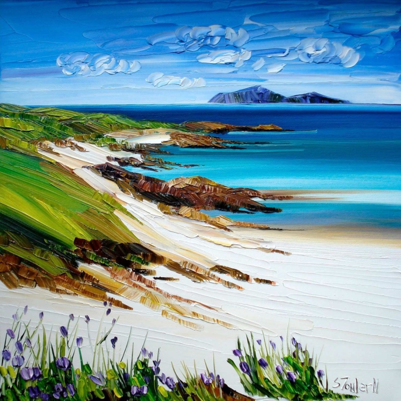
coastal wall art above a navy sofa needs enough light, contrast, and visual breadth to avoid disappearing into the upholstery. White Sands and Wildflowers, Iona by Sheila Fowler offers all three. Its deep blue sea relates naturally to navy fabric, while white sand, turquoise water, green slopes, and small purple flowers keep the arrangement from becoming one continuous block of dark blue.

Why coastal wall art above a navy sofa needs contrast

A navy sofa already carries considerable visual weight. Hanging another uniformly dark image above it can make the seating and frame merge, especially on a wall with modest daylight. The answer is not necessarily a warmer picture. A coastal composition can stay within the room’s blue family if it also contains clear pale areas and changes in depth.

White Sands and Wildflowers, Iona moves from flowers and bright sand in the foreground to turquoise shallows, darker water, and distant islands. That sequence draws the eye through the picture rather than holding it on one flat colour. Thick, expressive marks also provide a tactile counterpoint to smooth or tightly woven upholstery.

Let the sand and sky form a visual break

The most useful colours here are not only the blues. Broad white sand and a bright horizon create separation from the sofa below. When assessing the position, sit in the main chair and check that these lighter passages remain visible rather than being lost behind cushions, lamps, or tall side-table objects.

Colour in the artworkWhat it contributes to the room
White sand and cloudCreates a clean interval above dark upholstery
Turquoise shallowsAdds freshness without abandoning the blue palette
Green headlandConnects naturally with plants, timber, and garden views
Purple wildflowersIntroduces a small accent that does not need repeating everywhere

A cushion or throw may echo one minor colour, but avoid matching every shade. The composition should broaden the palette, not become an instruction to add turquoise and purple accessories throughout the room.

Choose a scale that belongs to the sofa

This square print is available in 265 by 265 millimetres and 500 by 500 millimetres before framing. Above a full-size sofa, the larger option is usually the more convincing starting point. The mount and moulding will increase the final dimensions, so mark the complete proposed frame on the wall with low-tack tape before deciding.

  1. Centre on the seating group. Use the sofa and nearby table or lamp as the composition, rather than measuring the entire wall.
  2. Keep a clear gap. Leave enough space above the sofa for the frame to feel separate, but not so much that the picture appears disconnected.
  3. Check head clearance. Consider how people sit, stand, and reach behind the sofa before fixing the height.
  4. View it after dusk. Make sure room lighting reveals the turquoise, green, and foreground flowers instead of flattening everything into blue.

Frame the colour without making it heavier

A dark moulding can repeat the navy sofa and give the lively painted surface a crisp edge. However, a very broad dark frame may add too much weight. A restrained pale or natural timber can relate to the sand and bring warmth into the arrangement. The right choice depends on the wall colour, sofa fabric, and other wood finishes in the room.

First 4 Frames produces colour-managed Giclée prints and completes bespoke framing by hand at its Falkirk workshop. That in-house process helps the white sand remain distinct from the clouds, while the turquoise water, darker sea, grass, and flowers keep their separate character. It also makes the finished piece ready to hang with a presentation chosen for the actual room.

An Iona view with colour as well as calm

Sheila Fowler is known for expressive Scottish landscapes, coastlines, and wildflowers painted with rich colour and texture. This scene feels open and restorative, yet the foreground prevents it from becoming an anonymous blue seascape. Discover more on Sheila Fowler’s official website, or compare other work in the Sheila Fowler collection at First 4 Frames.

Well-judged coastal wall art above a navy sofa should lift the seating area while still respecting its strongest colour. View the framed White Sands and Wildflowers, Iona print for an Iona landscape that combines clear distance, vivid water, pale sand, and just enough wildflower detail.

Posted on

Botanical Wall Art for a Breakfast Room: White Daisies With Gorse

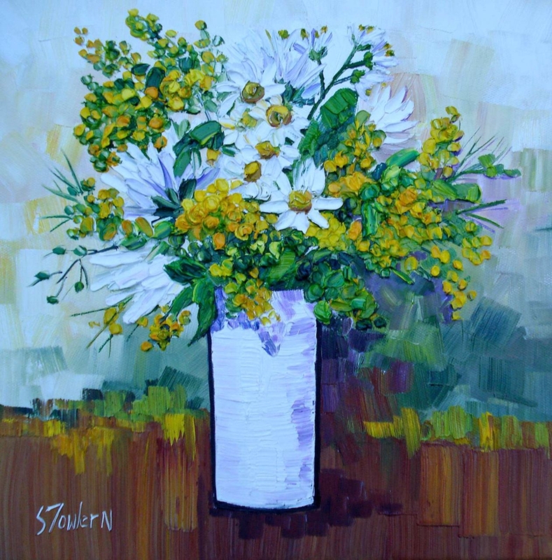
botanical wall art for a breakfast room should earn its place by answering a real question about the room or recipient. White Daisies with Gorse is a useful starting point because its white flowers, yellow gorse and square composition can bring the freshness of a wild margin into an everyday dining corner.

Keep botanical wall art for a breakfast room fresh

Morning rooms collect small practical items quickly. Before hanging the picture, clear the proposed sightline of calendars, keys and open shelves. A square artwork can then provide one concentrated area of natural colour without taking up table or windowsill space.

Choose between the two square print sizes

Use the 265 mm print where the wall sits beside a compact table or between architectural features. Consider the 500 mm print where the artwork must hold a broader wall. Always add the proposed mount and frame width when testing the finished outline.

White daisies and yellow gorse already give the scheme enough floral information. Plain linen, simple ceramics and natural timber can support it. Avoid flowered curtains, cushions and crockery competing at the same scale.

  • Check the square from every regular seat.
  • Keep steam and direct heat away from the frame.
  • Let daylight reach the wall without prolonged direct sun.
  • Repeat one yellow or green note, not the complete palette.

Hold light petals and stronger gorse in balance

White flowers can lose definition if highlights and surrounding colour are not controlled. Colour-managed Giclée production helps preserve those distinctions, while a bespoke frame completed in-house gives the compact composition enough authority for a frequently used room.

For wider information about native flowers and growing for wildlife, explore the Royal Horticultural Society’s wildflower guidance. You can also browse the Sheila Fowler collection or see the exact framed product.

Botanical wall art for a breakfast room should make the space feel awake, not fussy. White Daisies with Gorse offers morning colour and a neat square rhythm, while restrained styling keeps everyday dining easy.

Posted on

Two Scottish Thistles: A Lasting Scottish Anniversary Gift for a Couple

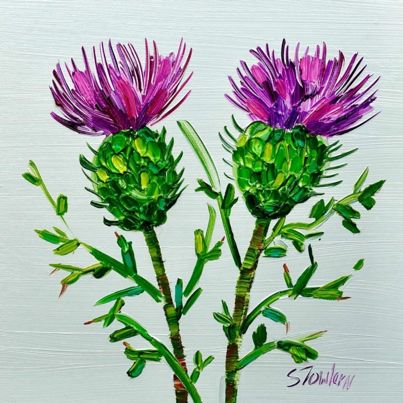
A Scottish anniversary gift for a couple can mark shared history without carrying names, dates, or a message that only makes sense on the day. Two Scottish Thistles by Sheila Fowler uses a pair of Scotland’s most recognisable wildflowers. The subject suggests two distinct forms held within one composition, making it a quiet symbol of partnership rather than a literal anniversary announcement.

What makes a Scottish anniversary gift for a couple last

Anniversary presents can become too dependent on a number. The couple may appreciate the thought, yet find it difficult to place a heavily personalised object in their home. Artwork offers another route. It can acknowledge the relationship through subject and composition while still earning its place as part of the room.

Two thistles are especially useful for that purpose. Each flower remains individual, but the pair reads together. The Scottish connection may reflect where the couple met, married, now lives, or simply loves to spend time. That meaning can be explained privately in a card rather than printed across the image.

Build the meaning around their story

The same artwork can carry different associations for different couples. Start with one genuine connection and let the picture hold it. Avoid trying to make the thistles represent every stage of the relationship.

ConnectionA simple note to include
They married in ScotlandMention the place or season, without turning the card into a full chronology
They share Scottish family rootsName the family connection that makes the national flower relevant
They love Scottish gardens and landscapesRecall one walk, island visit, or garden they enjoyed together
They have built a home togetherExplain why you chose something both can live with and display

This approach works for a first anniversary, a larger milestone, or an anniversary shared by parents and grandparents. The emotional detail sits in the giver’s note. The artwork remains open enough to belong to the couple.

Find a shared wall rather than one person’s room

An anniversary present should feel equally at home with both recipients. A sitting room, dining area, entrance hall, or landing is often more suitable than a private study. Look for a wall used and enjoyed by both people, then consider what else is visible around it.

  • Above a console: keep accessories low so the paired flower forms stay clear.
  • Beside a doorway: centre the square within the available wall rather than the whole room.
  • In a dining space: check the view from both sides of the table and under evening light.
  • Within a small grouping: give the thistles enough separation to remain the meaningful centre rather than another filler.

The print comes in 265 by 265 millimetres and 500 by 500 millimetres before framing. The smaller square can suit a compact shared corner. The larger option creates a stronger focal point above furniture. Mount and moulding increase the final size, so a paper template should represent the complete framed dimensions.

Let colour support the symbolism

Thistle art need not force a room into purple and green. Treat the flower colour as an accent. In a neutral scheme, one related textile or ceramic may be enough. In a room that already contains pattern, allow the square picture to provide a contained area of natural colour rather than repeating floral motifs throughout the space.

Check the picture in daylight and in the lamps the couple normally uses. A suitable position should preserve the distinction between flower heads, stems, and background without strong glare. Keeping the surrounding wall relatively calm will also help the two forms read as a deliberate pair.

Choose a frame for their home together

A light neutral moulding can give the botanical subject an airy edge. A restrained timber may connect it to natural furniture, while a darker frame can add definition on a pale wall. The decision should follow the couple’s interior rather than an anniversary colour convention.

First 4 Frames uses colour-managed Giclée production and completes bespoke framing by hand at its Falkirk workshop. That in-house process protects the relationship between expressive colour and fine botanical detail. It also turns the print into a finished, ready-to-hang present with the quality expected of a lasting milestone gift.

Scottish flowers through Sheila Fowler’s expressive colour

Sheila Fowler is a Scottish artist known for vibrant landscapes, coastlines, and wildflowers. Explore more work on Sheila Fowler’s official website, or browse the Sheila Fowler collection at First 4 Frames. The wider range provides useful context for the expressive colour and texture that give this compact botanical subject its presence.

The right Scottish anniversary gift for a couple can commemorate two people without turning their home into a display of dates and slogans. View the framed Two Scottish Thistles print for paired Scottish symbolism finished with personal, in-house craftsmanship.

Posted on

Coastal Art Beside Woven Blinds: Let Gott Bay Bring in the Light

coastal art beside woven blinds should earn its place by answering a real question about the room or recipient. Gott Bay, Tiree is a useful starting point because its square format and Tiree setting can answer the blinds’ natural texture while adding a distinct view beyond the room.

Balance coastal art beside woven blinds

Woven blinds already introduce pattern through their fibres and horizontal lines. Artwork does not need to imitate that texture. Instead, use the coastal subject to add distance and light, then allow the frame to create a clean boundary between the picture and window treatment.

  1. Lower the blind to its usual daytime position.
  2. Mark the complete framed square on the adjacent wall.
  3. Keep the frame clear of the window reveal.
  4. View the arrangement from the room’s main seat.
  5. Repeat only one quiet colour from the picture elsewhere.

Gott Bay is available in two square print sizes, so the choice should follow the wall rather than the size of the window. The smaller option can settle a compact corner. The larger version can hold its own beside a broad blind, provided there is still visible wall between both elements.

Natural materials work together through balance, not exact matching. Let the blind provide texture and the artwork provide the view.

Keep coastal colour separate from a seaside theme

Colour-managed Giclée production helps subtle island colour remain distinct in changing daylight. A bespoke frame made in-house can separate the coastal image from the tactile blind, giving each element enough definition.

For local context about the Hebridean island behind the picture, explore the Isle of Tiree community website. You can also browse the Sheila Fowler collection or see the exact framed product.

Coastal art beside woven blinds can feel relaxed without becoming rustic. Gott Bay brings Scottish island identity, while careful spacing keeps the relationship calm, natural and properly finished.

Posted on

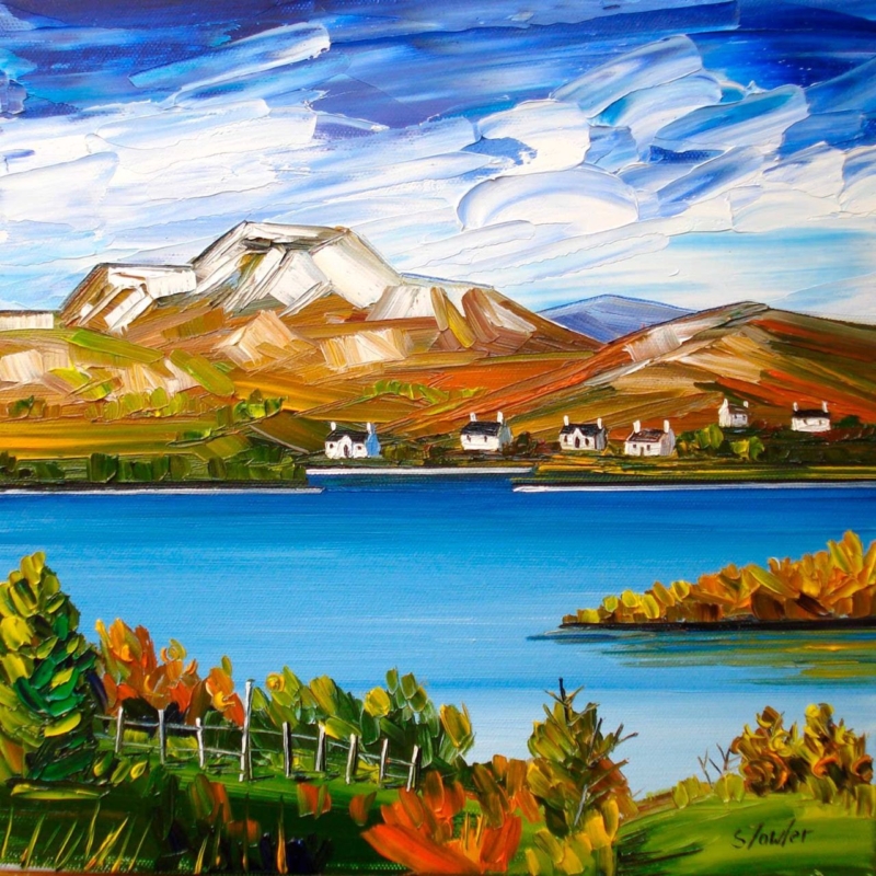
Autumn, Loch Lomond: Wall Art for a Room With Low Daylight

autumn wall art for a room with low daylight needs to bring warmth without absorbing the little natural light the space already receives. Autumn, Loch Lomond by Sheila Fowler offers a useful balance. Copper, orange, and yellow foliage establish the season, while vivid blue water and a broad, cloud-filled sky keep the square composition open. The result feels autumnal without turning the room brown, dim, or overly rustic.

Why autumn wall art for a room with low daylight needs contrast

A darker room does not automatically need pale, nearly colourless art. It needs an image with a readable structure and enough contrast to remain clear throughout the day. In this landscape, the bright horizontal band of the loch separates the deeper foreground from the hills. White cloud moves across the intense sky, while small cottages create crisp points on the far shore.

Those divisions help the scene retain depth when daylight is subdued. The darker greens and burnt orange leaves still provide richness, but they do not fill the entire picture. Open water and sky occupy generous areas, giving the eye somewhere to rest.

Work with the direction of the available light

Before choosing a wall, watch the room at three points: morning, the brightest part of the afternoon, and after the lamps come on. Low daylight may be caused by a northern aspect, a deep window reveal, nearby buildings, or heavy planting outside. Each condition affects the artwork differently.

  1. Find the clearest wall. A position facing the window may receive useful light, although reflections must be checked.
  2. Avoid the darkest recess. Rich foreground greens can lose definition if the frame is placed inside a permanently shadowed alcove.
  3. Check the view from the doorway. The blue loch should read as a bright horizontal pause before the smaller details become visible.
  4. Test evening lighting. A warm lamp can enrich the foliage, but it should not flatten the blue water or produce glare across the glazing.

Picture lighting is not always necessary. A nearby adjustable wall light or well-placed floor lamp may be enough. Keep bulbs and fittings at a safe distance from the finished frame, and aim the light so the picture is even rather than creating one bright spot.

Use seasonal colour without redecorating the whole room

The painting already carries several autumn notes: russet, ochre, olive, and a small amount of fresh green. Repeating all of them in cushions, throws, and accessories would make the scheme feel too literal. Choose one quieter connection instead. A rust wool cushion, an olive ceramic, or warm timber can relate to the foreground while the rest of the room stays calm.

Existing room paletteHow the artwork can help
Cool grey or off-whiteOrange foliage adds warmth while the blue water keeps continuity
Deep greenBright sky and loch prevent the scheme from becoming too enclosed
Warm neutralBlue provides a clean counterpoint to beige, oatmeal, or natural linen
Dark timberWhite cottages and cloud introduce small, useful areas of brightness

This approach also lets the picture remain on the wall beyond autumn. The clear water, mountain forms, and strong sky are not seasonal props. They carry the landscape throughout the year, while the foliage supplies an extra layer of warmth when the days shorten.

Choose the square size from the viewing distance

The print is available in 265 by 265 millimetres and 500 by 500 millimetres before framing. The smaller option can suit a compact landing, reading corner, or wall beside a doorway. The larger version gives the loch and hills enough presence for a living room or dining area. Mounting and moulding will increase the final dimensions, so map the complete framed size rather than the print alone.

Use a paper template or low-tack tape and view it in the room’s dullest daytime conditions. If the proposed size looks visually slight then, it is unlikely to gain authority after framing. Conversely, a square that crowds furniture or window trim will lose the open quality that makes the landscape helpful.

Frame for definition, not extra heaviness

A restrained dark moulding can sharpen the edges and relate to the deeper foreground. A light neutral frame may suit a smaller, dimmer room, while a carefully chosen warm timber can echo the landscape without adding a heavy brown border. Compare the options against the real print because the blue, white, green, and orange must remain balanced together.

First 4 Frames uses colour-managed Giclée production and completes bespoke framing by hand at its Falkirk workshop. That in-house process helps preserve the separation between bright water, textured cloud, cottages, and foliage. It also allows the mount, moulding, glazing, and final scale to be chosen for the actual light conditions.

Colour and place in Sheila Fowler’s landscape

Sheila Fowler is a Scottish artist known for expressive colour, texture, landscapes, coastlines, and flowers. Explore further work on Sheila Fowler’s official website, or browse the Sheila Fowler collection at First 4 Frames. The painting’s recognisable setting gives the colour a sense of place rather than using autumn as a decorative theme alone.

Effective autumn wall art for a room with low daylight should make limited light feel considered, not apologetic. View the framed Autumn, Loch Lomond print for a bright loch, open sky, and warm seasonal foreground presented with lasting, hand-finished quality.

Posted on

Art by Colour: Build a Room Palette Around Poppies and Thistles

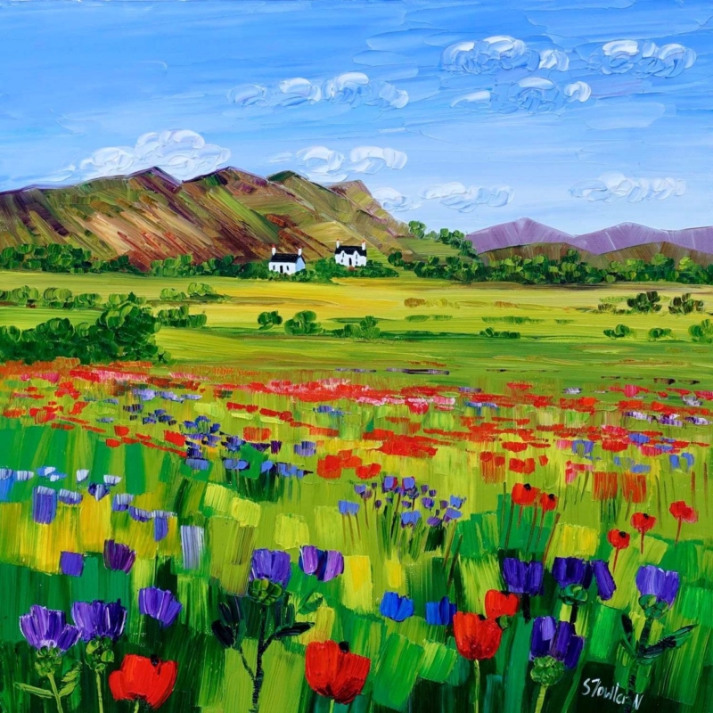
art by colour becomes more useful when the artwork answers a real feature of the room. Poppies and Thistles, Perthshire offers a clear example because its floral subject and rooted Perthshire identity make it possible to draw out colour without turning the whole interior into a matching botanical scheme.

Use art by colour as a starting point, not a formula

Start with the picture rather than a handful of paint cards. Identify the colour that catches your eye first, then decide whether it should lead the room or remain a small accent. With a floral work, repeating every petal and leaf tone can feel forced. One flower colour in a cushion or lamp base is often enough.

Choose a lead note

Let one poppy or thistle tone provide energy. Keep the repeat smaller than the framed work so the picture remains the source.

Add a quiet support

Use foliage, field or earth colours in timber, linen or ceramics. These supporting notes connect the artwork without obvious copying.

The square 265 × 265 mm and 500 × 500 mm print choices can serve different rooms. Mark the finished frame outline before deciding how much colour to repeat nearby.

Let framing give the palette a clean boundary

A considered frame separates concentrated floral colour from wall paint and furnishings. Colour-managed Giclée production helps retain distinctions between neighbouring tones, while bespoke in-house framing gives the square composition a calm edge.

For a useful explanation of colour relationships, see the V&A’s introduction to the colour wheel. You can also browse the Sheila Fowler collection or view the exact framed product.

Art by colour should create connection rather than perfect coordination. Poppies and Thistles, Perthshire can lead a layered interior while still keeping its own visual identity.

Posted on

Daisies and Campanula: Floral Wall Art for a Garden Designer’s Studio

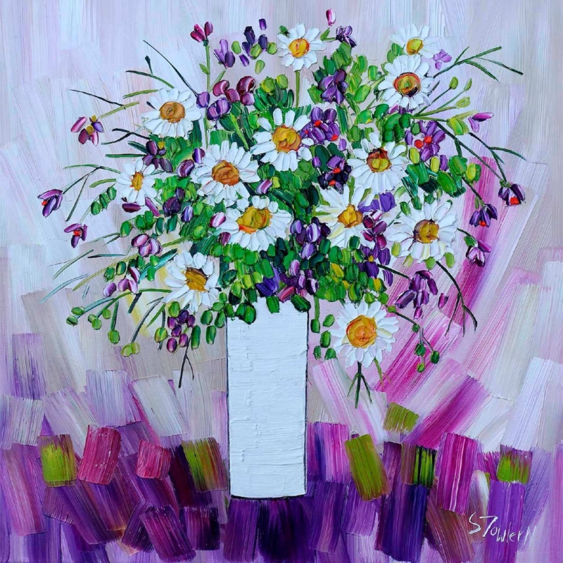
floral wall art for a garden designer’s studio should feel connected to plants without behaving like a specimen chart. A working studio needs inspiration, but it also needs enough visual calm for drawings, samples, and client plans. Daisies and Campanula by Sheila Fowler offers that balance. White daisies and blue-violet campanula emerge through lively green marks, creating the impression of a border in bloom rather than a rigid botanical record.

What floral wall art for a garden designer’s studio needs to contribute

A design workspace already contains visual information. Plant photographs, material samples, site plans, and colour swatches can quickly fill every surface. The artwork should therefore contribute atmosphere and observation rather than another layer of technical reference. An expressive flower painting works well because it recalls the movement and irregularity of a real garden.

Daisies and Campanula is especially useful in this setting. Its pale flower heads provide clear pauses among richer blues and greens. Looser marks suggest stems, foliage, and changing light without prescribing a particular planting scheme. That leaves room for a designer’s own ideas while keeping the studio rooted in the living material behind the work.

Use the painting as a conversation point, not a mood board

Place the print where a client can see it from the consultation table, but avoid surrounding it with pinned references. Clear wall around the frame lets the image read as a finished piece. It can then open useful conversations about looseness, seasonal change, or the balance between white flowers and saturated colour without implying that every garden should copy its palette.

Studio questionWhat the artwork can demonstrate
How can white planting avoid looking flat?Darker blue and green marks give the pale daisies definition and depth.
How much colour is enough?Blue-violet flowers create rhythm while the white blooms provide breathing space.
Can an informal border still feel composed?Repeated flower heads hold the energetic brushwork together.

Choose a position that supports the working layout

A wall beyond the main desk can give the eye a useful change of focus after close work. The print could also sit above a low sample cabinet, provided doors and tall display boards do not obscure it. Make a paper template using the finished framed size, then view it from both the designer’s chair and the client’s seat.

Daylight is helpful for a garden-led subject, but direct sun and strong reflections are not. Check the wall at different times before fixing the position. If task lighting dominates after dusk, use a soft, offset light that preserves the quieter white petals as well as the deeper campanula colour.

Frame the colour without making the studio feel themed

A light timber moulding may connect naturally with material samples and worktables. A restrained dark frame can instead sharpen the expressive marks and separate the print from a busy sample area. There is no need to repeat flower motifs elsewhere. One blue notebook, glazed pot, or fabric sample is enough to create a quiet relationship.

First 4 Frames produces colour-managed Giclée prints and completes bespoke framing in-house at its Falkirk workshop. That considered finish matters in a professional studio, where clients will notice clean presentation and the relationship between colour, paper, mount, and moulding.

Painterly flowers grounded in close observation

Sheila Fowler is known for expressive paintings of Scottish landscapes, coastlines, wildflowers, and still life. Her layered colour feels well suited to a creative practice concerned with growth and changing seasons. See more work at Sheila Fowler’s official website, or browse the Sheila Fowler collection at First 4 Frames.

Thoughtful floral wall art for a garden designer’s studio can make the workplace feel connected to its purpose while remaining polished for meetings. View the framed Daisies and Campanula print for a lively botanical focal point made with colour-managed printing and hand-finished craftsmanship.