Posted on

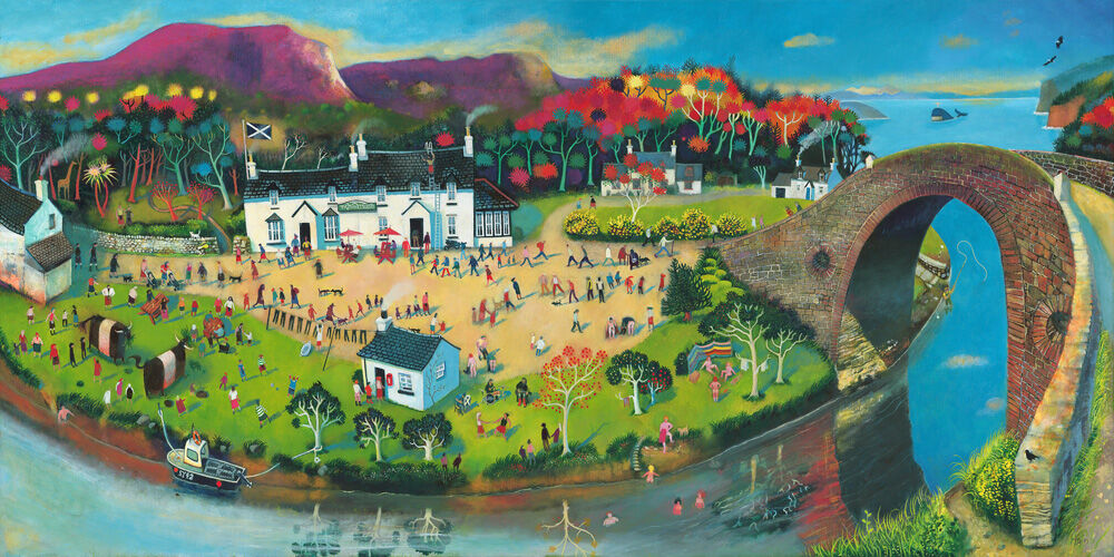
Scottish Wall Art Feels More Sociable With Tigh an Truish (The Hoose o’ Troosers)

A vibrant painting of Tigh an Truish (The Hoose o’ Troosers), showing a lively riverside village with people strolling, boating, autumn trees, white houses, and the famed stone bridge arching over the water.

Strong Scottish wall art should feel rooted without becoming predictable. Tigh an Truish (The Hoose o’ Troosers) manages that beautifully. It brings a recognisable west coast spirit into the room, but it does so with warmth and humour rather than stiffness or cliche.

Why Scottish wall art can work especially well in sociable rooms

Shared spaces often benefit from artwork that gives people something to notice and talk about straight away. Tigh an Truish (The Hoose o’ Troosers) has that kind of appeal. It feels lived in and welcoming, which makes it particularly useful in kitchens, dining spaces, snug corners, or holiday homes where a sense of place matters.

There is also a generosity to the scene. Rather than simply decorating the wall, it helps the room feel more relaxed and more personal, which is often exactly what a well-used family or entertaining space needs.

Why Tigh an Truish feels welcoming rather than staged

First 4 Frames produces and frames every piece in-house with bespoke craftsmanship and colour-managed Giclee quality. That finish gives the artwork the superior quality presence it needs to feel properly integrated into the room, not just pinned there for effect.

For more on the west coast area behind the subject, VisitScotland on Argyll and Bute is useful. You can also browse more work by Rob Hain and view the exact framed product here.

If you want Scottish wall art that feels rooted, easy to enjoy, and full of local warmth, Tigh an Truish (The Hoose o’ Troosers) is a very strong fit.

Posted on

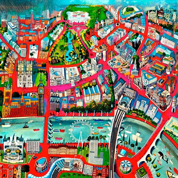
London Wall Art Feels More Grown Up With London in the Pink

The best London wall art should bring place and personality into a room without looking like a souvenir. London in the Pink does that especially well because the pink light gives the scene energy and charm, while the overall composition still feels refined enough for everyday living.

Why London wall art works best when it feels stylish rather than obvious

London is such a familiar subject that some prints can lean too hard on recognition alone. London in the Pink avoids that. It feels fashionable without becoming cold, and lively without shouting for attention. That makes it especially useful in a guest room, dressing room, hallway, or creative workspace where colour needs to feel intentional rather than random.

  • It brings city character without turning the room into a theme.
  • It suits interiors that want warmth as well as definition.
  • It feels expressive, but still easy to live with over time.

Why London in the Pink feels polished on the wall

First 4 Frames completes the work in-house in Falkirk with bespoke framing and colour-managed Giclee production. That matters here because the lighter tonal shifts and bolder accents need a superior quality finish if they are going to look composed rather than simply bright.

For more on the city behind the subject, Visit London is worth exploring. You can also browse more work by Rob Hain and view the exact framed product here.

If you are comparing London wall art and want something warmer, more confident, and less predictable, London in the Pink is an excellent choice.

Posted on

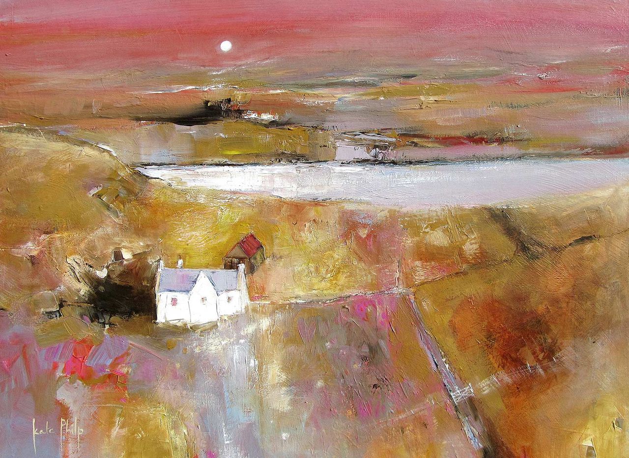
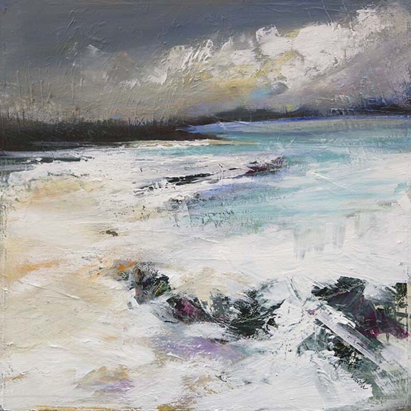
Art for Sandy Beige Walls Feels Lighter With Portnalong, Isle of Skye

The most effective art for sandy beige walls should keep a warm neutral room feeling alive. Portnalong, Isle of Skye does that beautifully because the coast, sky, and open light introduce freshness without fighting the quieter warmth of beige walls.

Why art for sandy beige walls needs lift as well as warmth

Sandy beige is easy to live with, but it can leave a space feeling a little sleepy if every finish stays on the same wavelength. Portnalong, Isle of Skye helps by introducing cooler light, open water, and more distance, which makes the room feel brighter and more resolved rather than simply pale.

That balance works especially well in living rooms, guest bedrooms, and hallways where warm neutrals are doing most of the quiet background work and the artwork needs to bring shape without disturbing the calm.

Why Portnalong, Isle of Skye keeps beige schemes feeling fresh

First 4 Frames completes the print and framing in-house with bespoke craftsmanship and colour-managed Giclee production. That finish helps the lighter tones stay clean, which is important when the surrounding paintwork is already warm and understated.

For more on the island setting behind the scene, VisitScotland on the Isle of Skye is worth exploring. You can also browse more work by Kate Philp and view the exact framed product here.

If you are choosing art for sandy beige walls and want a room to feel warm yet lighter on its feet, Portnalong, Isle of Skye is a very strong option.

Posted on

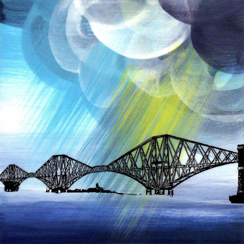
Wall Art for Tongue and Groove Walls Gains Structure With Storm Clouds over Forth Bridge

Well-chosen wall art for tongue and groove walls should feel strong enough to sit against panelled texture without becoming rigid. Storm Clouds over Forth Bridge works especially well because the bridge gives the piece clear structure, while the sky and weather keep the mood lively.

Why wall art for tongue and groove walls needs structure of its own

Tongue and groove gives a room rhythm before any artwork goes up. That means the picture needs enough shape to keep its place. Storm Clouds over Forth Bridge manages that beautifully. The bridge provides direction and authority, but the cloud movement stops the result feeling overcontrolled.

  • It suits panelled hallways, stair walls, and garden rooms with stronger texture.
  • It adds atmosphere without losing composure.
  • It helps a detailed wall treatment feel anchored by one confident focal point.

Why Storm Clouds over Forth Bridge feels right on a panelled wall

First 4 Frames produces and frames everything in-house in Falkirk using bespoke craftsmanship and colour-managed Giclee quality. That matters in a panelled room, because the artwork needs a superior quality presentation if it is going to read as intentional rather than visually absorbed by the wall treatment.

For more on the landmark itself, The Forth Bridges official site is worth a look. You can also browse more work by Esther Cohen and view the exact framed product here.

If you are comparing wall art for tongue and groove walls and want structure, atmosphere, and craftsmanship in equal measure, Storm Clouds over Forth Bridge is a very appealing choice.

Posted on

Art for Willow Green Walls Feels Better Judged With Glen Prosen

The best art for willow green walls should make a green room feel richer, not greener for the sake of it. Glen Prosen works well because it brings natural contrast, distance, and enough tonal variation to stop the scheme becoming flat.

Why art for willow green walls needs contrast and breathing space

Willow green is a beautiful decorating colour, but it can start to feel a touch enclosed if every other element stays too close to it tonally. Glen Prosen opens the scheme back up. The landscape keeps the room rooted in nature, while the shifts in light and land stop the wall from feeling too same-note.

That is especially useful in sitting rooms, bedrooms, and hallway corners where painted green walls already set a strong mood and the artwork needs to add freshness rather than more density.

Why Glen Prosen keeps a green scheme feeling open

First 4 Frames completes the work in-house with bespoke framing and colour-managed Giclee production. That quality matters because green-led rooms benefit from artwork with enough clarity and control to feel deliberate, not muddy or overblended into the paint colour.

For more on the Angus glen behind the subject, Visit Angus on Glen Prosen is worth exploring. You can also browse more work by Hillary Barker and view the exact framed product here.

If you are choosing art for willow green walls and want a room to feel natural, layered, and well judged, Glen Prosen is a very strong fit.

Posted on

Wall Art for a Room With Woven Blinds Feels Softer With Evening Sparkle On The Loch

The right wall art for a room with woven blinds should add softness as well as interest. Evening Sparkle On The Loch does that beautifully because the shimmer on the water and the fading light stop a natural room scheme from feeling too matte or too dry.

Why wall art for a room with woven blinds needs a gentler sheen

Woven blinds bring lovely texture, but they can also leave a room feeling visually porous if everything else is equally dry or heavily natural. Evening Sparkle On The Loch solves that by adding reflected light and a calmer sense of flow, which helps the space feel layered rather than simply textured.

  • It complements natural blinds without repeating their texture too literally.
  • It gives a garden-facing room a softer point of focus.
  • It helps wood, linen, and woven finishes feel more balanced together.

Why Evening Sparkle On The Loch brings balance to natural textures

First 4 Frames produces and frames the work in-house, using colour-managed Giclee quality and bespoke craftsmanship. That careful finish keeps the dusk tones clear and helps the final piece feel refined enough to sit beside natural materials without getting lost.

For more on the kind of loch-and-landscape atmosphere that inspires rooms like this, VisitScotland on Loch Lomond and The Trossachs is useful. You can also browse more work by Nikki Monaghan and view the exact framed product here.

If you want wall art for a room with woven blinds that keeps a natural room feeling soft, calm, and properly finished, Evening Sparkle On The Loch is an excellent option.

Posted on

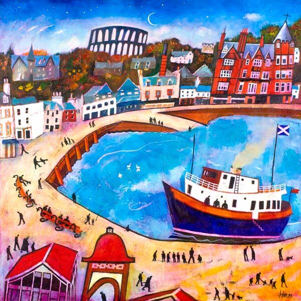
Wall Art for Terrazzo Floors Works Beautifully With Around and About Oban

Choosing wall art for terrazzo floors is often about controlling visual rhythm. Around and About Oban works especially well because it has movement, colour, and local character, but it still reads as one confident image rather than lots of disconnected detail.

Why wall art for terrazzo floors needs clear structure

Terrazzo can be brilliant at giving a room texture, but it already asks the eye to do some work. That means the artwork should feel intentional. Around and About Oban has enough energy to keep pace with the floor, yet its composition still feels gathered together and easy to read from across the room.

That is useful in kitchens, hallways, and modern living spaces where terrazzo introduces pattern below and the wall still needs a focal point that feels deliberate rather than busy for the sake of it.

Why Around and About Oban holds its own without competing

First 4 Frames completes every piece in-house using bespoke framing and colour-managed Giclee production. That finish matters because patterned interiors need artwork with enough presence to register cleanly, while still looking polished and easy to live with.

For more on the harbour town inspiration, VisitScotland on Oban is worth exploring. You can also browse more work by Rob Hain and view the exact framed product here.

If you are comparing wall art for terrazzo floors and want patterned flooring to feel complemented rather than challenged, Around and About Oban is a very strong fit.

Posted on

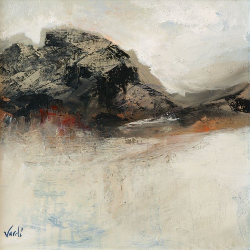
Art for a South Facing Room Feels More Balanced With Harr Over the Glen

The best art for a south facing room should work with stronger daylight rather than fighting it. Harr Over the Glen does that especially well because the atmosphere is soft, the colour is measured, and the overall image feels open without becoming washed out.

Why art for a south facing room needs softness as well as light

Rooms that receive sun for much of the day can make harsher artwork feel even harder. Harr Over the Glen avoids that problem. It gives the wall shape and interest, but the haze and tonal movement keep the room feeling relaxed rather than overlit or visually brittle.

  • It suits sitting rooms and bedrooms that already get plenty of natural sun.
  • It adds distance and calm without making the scheme feel cold.
  • It works well when you want framed artwork to steady a brighter room.

Why Harr Over the Glen feels composed in stronger daylight

First 4 Frames completes the work in-house in Falkirk with bespoke framing and colour-managed Giclee production. That matters here because subtle landscape transitions need a superior quality finish if they are going to hold their depth once the sun moves across the room.

For more on the Highland character behind the landscape, VisitScotland on Perthshire is useful. You can also browse more work by Arie Vardi and view the exact framed product here.

If you are choosing art for a south facing room and want something bright rooms can live with easily, Harr Over the Glen is an excellent option.

Posted on

Highland Cow Art Prints Feel More Lived In With Baravalla Og 6th and Her Bull Calf

The strongest highland cow art prints do more than trade on a familiar subject. They should make the room feel warmer and more human. Baravalla Og 6th and Her Bull Calf does that especially well because the image has presence and character, but it still feels natural enough for everyday living.

Why Highland cow art prints work best when they feel genuine

There is a reason Highland cattle remain popular, but the best pieces avoid feeling novelty led. Baravalla Og 6th and Her Bull Calf has a more settled warmth to it, which makes it especially useful in kitchens, family rooms, boot rooms, or country-style interiors that want character without becoming cartoonish.

The scene feels lived in rather than staged, and that helps the artwork stay enjoyable long after the first impression has passed. It becomes part of the home rather than a joke or theme piece.

Why Baravalla Og 6th and Her Bull Calf feels warm rather than novelty led

First 4 Frames completes the print and framing in-house with bespoke craftsmanship and colour-managed Giclee production. That finish helps the texture and colour stay balanced, giving the artwork a superior quality presence that feels hand-finished and easy to place with confidence.

For more on the breed itself, The Highland Cattle Society is worth exploring. You can also browse more work by Hillary Barker and view the exact framed product here.

If you are comparing highland cow art prints and want something warm, grounded, and genuinely room-friendly, Baravalla Og 6th and Her Bull Calf is a very strong option.

Posted on

Ready to Hang Wall Art Still Needs Character, Starting With Welcome to Argyll

The main promise of ready to hang wall art is simplicity, but that should not mean settling for something forgettable. Welcome to Argyll proves the point well because it feels welcoming and easy to place, while still carrying enough local character to make the room feel more individual.

Why ready to hang wall art should do more than save time

Buyers often choose a fully finished piece because they want a room to come together quickly. That is completely reasonable, but the strongest results still need some personality. Welcome to Argyll gives you that quicker route while also offering warmth, recognisable place, and the sort of calm colour that stays enjoyable over time.

  • It gives a hallway, sitting room, or study a more complete feel straight away.
  • It offers place and atmosphere without becoming overly theme led.
  • It keeps convenience paired with craftsmanship rather than compromise.

Why Welcome to Argyll feels finished in the best sense

First 4 Frames produces and frames everything in-house in Falkirk using bespoke craftsmanship and colour-managed Giclee quality. That means the piece arrives ready to hang, but it also arrives with the sort of superior quality finish that makes it feel hand-finished rather than off the shelf.

For more on the wider region, VisitScotland on Argyll and Bute is useful. You can also browse more work by Arie Vardi and view the exact framed product here.

If you want ready to hang wall art that feels warm, confident, and genuinely ready for the room, Welcome to Argyll is a very appealing choice.