Posted on

Art for Pale Blue Walls Feels More Layered With A Break in the Clouds

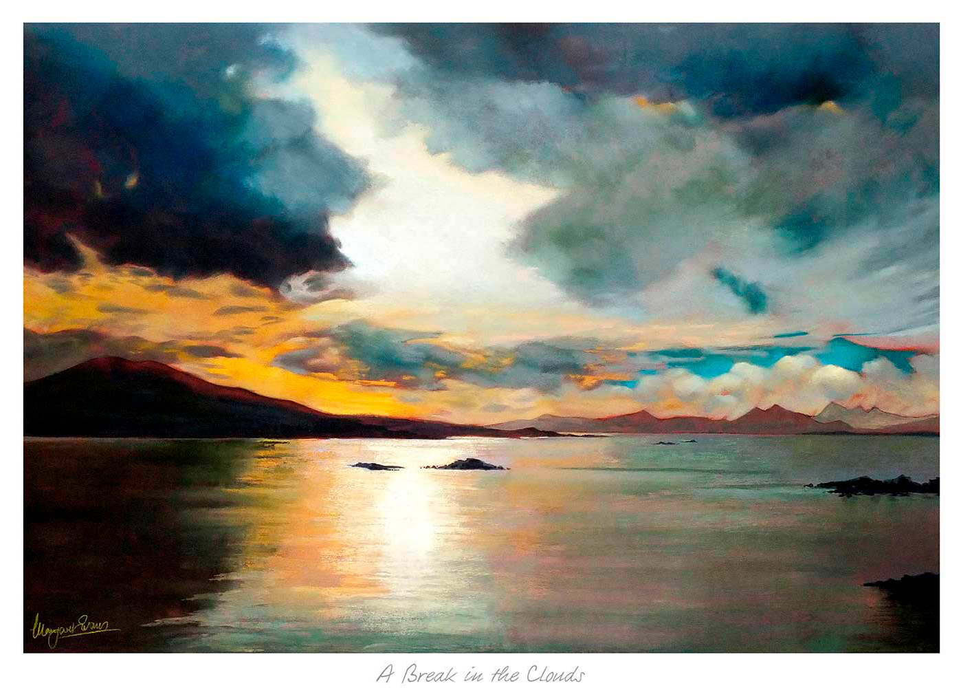
A Break in the Clouds is a dramatic seascape painting featuring dark clouds parting to reveal a glowing sunset, with vibrant orange, yellow, and blue reflections on calm water and distant mountains on the horizon.

Good art for pale blue walls should stop a cool scheme from feeling too slight. Pale blue can be restful and elegant, but it often needs artwork that adds a little warmth and movement. A Break in the Clouds works especially well because it brings light and atmosphere without breaking the calm that made the wall colour appealing in the first place.

Why A Break in the Clouds suits art for pale blue walls

The strength of A Break in the Clouds is its balance. It keeps enough freshness to sit naturally with pale blue, yet it also introduces tonal variation that stops the room feeling one-note. That makes it useful in bedrooms, sitting rooms, and hallways where you want calm but still need a little visual depth.

It is particularly helpful when pale blue walls are paired with white woodwork, lighter fabrics, or painted furniture. In those rooms the artwork can become the element that makes the scheme feel considered rather than merely safe.

  • It keeps a cool room soft rather than chilly.
  • It adds light and depth without overwhelming the wall colour.
  • It works well with gentler palettes that still need a focal point.

First 4 Frames completes the print and bespoke framing in-house, which is important for artwork built around subtle tonal shifts. That hand-finished presentation helps the final piece feel more substantial and room-ready from the moment it goes up.

For more on the kind of Scottish landscape atmosphere that makes this scene so appealing, VisitScotland’s Cairngorms guide is worth reading. You can also browse more work by Margaret Evans and see the exact framed product here.

If you are looking at art for pale blue walls, A Break in the Clouds is a strong example of how to keep a cooler room layered, welcoming, and quietly interesting.

Posted on

Conservatory Wall Art Feels More Settled With Ardroag Skye

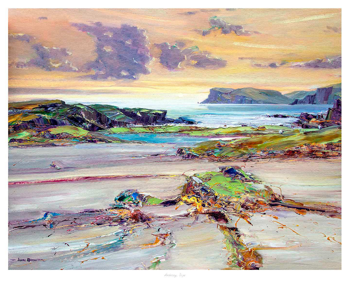
The challenge with conservatory wall art is that a bright room can make weaker artwork disappear. Conservatories and garden rooms need a piece with enough structure to hold the wall, but also enough calm to suit the light. Ardroag Skye strikes that balance beautifully.

Why Ardroag Skye works so well as conservatory wall art

Ardroag Skye feels open and light, but it does not drift away in a sun-filled space. That is exactly what many conservatories need. The room already has plenty of daylight and a connection to the garden, so the artwork should add shape and atmosphere rather than compete with the glazing.

This kind of piece works especially well where wicker, painted timber, softer upholstery, or stone floors already give the room a relaxed feel. The image keeps that ease while helping the space feel more deliberately finished.

  • It holds a bright wall without looking heavy.
  • It supports a calm, garden-adjacent room rather than fighting it.
  • It adds a clearer focal point to spaces that can otherwise feel visually fleeting.

With the Giclée printing and framing completed in-house by First 4 Frames, the result feels bespoke and colour-managed in a way that really matters in stronger daylight. In a bright room, good tonal control is visible straight away.

For more on the landscape that informs the scene, VisitScotland’s guide to Skye is well worth exploring. You can also browse more work by John Bathgate and view the exact framed product here.

If you are comparing conservatory wall art, Ardroag Skye is a strong choice for giving a bright room more calm, structure, and year-round presence.

Posted on

Wall Art by Room Feels Easier to Judge With Autumn Reflections Union Canal

Thinking about wall art by room usually leads to a better result than buying purely by colour or size. Different spaces ask different things of the artwork. Autumn Reflections Union Canal is a useful example because it has enough calm detail for a sitting room, enough structure for a study, and enough warmth for a hallway or landing.

Why Autumn Reflections Union Canal helps when choosing wall art by room

Some rooms need atmosphere, while others need steadiness or a gentle focal point. Autumn Reflections Union Canal works across those needs because the scene feels composed without becoming static. In a living area it adds softness and breathing space. In a home office it helps the room feel more measured. In a transitional space it gives the wall a stronger sense of purpose.

  • It suits rooms that need calm rather than visual noise.
  • It has enough detail to hold attention without becoming busy.
  • It works well where natural timber, neutrals, or softer wall colours are already doing part of the decorating work.

That flexibility becomes even more convincing when the final framing is right. First 4 Frames completes the Giclée printing and bespoke framing in-house in Falkirk, so the finished piece feels hand-finished and properly resolved rather than like a compromise made to fit several rooms at once.

For more on the setting that inspires the piece, Scottish Canals’ guide to the Union Canal is worth a look. You can also browse more work by Joseph Maxwell Stuart and view the exact framed product here.

If you are comparing wall art by room, Autumn Reflections Union Canal is a strong reminder that the best choice often comes from matching artwork to the room’s pace and purpose, not just the palette.

Posted on

Wall Art for a Room With Skylights Feels More Settled With House by the Cliff

Finding the right wall art for a room with skylights is often about balance. Skylights bring welcome brightness, but they can also make an upper room feel a little visually adrift if the walls are left too plain. House by the Cliff is a strong answer because it gives the space a clear point of focus while still feeling airy enough for a light-filled room.

Why House by the Cliff works as wall art for a room with skylights

Rooms with skylights often have strong natural light from above rather than a conventional window-led view. That means artwork needs enough structure to ground the space, but not so much density that it fights the openness. House by the Cliff gets that balance right by combining a sense of place with plenty of breathing room around it.

This makes it especially useful in loft rooms, upper-floor studies, attic guest rooms, or top-floor lounges where the light is generous but the wall arrangement can feel slightly awkward. The piece helps the room feel finished rather than merely bright.

  • It anchors a brighter upper room without weighing it down.
  • It works well where the walls need a clear focal point.
  • It complements natural light instead of competing with it.

Because First 4 Frames produces and frames the work in-house, the finished result has the bespoke quality and craftsmanship that help the image feel properly resolved. In a clean, light-driven room, that attention to finish makes a visible difference.

If you are planning or refining a loft-style interior, Ideal Home’s loft room ideas offers helpful inspiration. You can also browse more work by Matylda Konecka and view the exact framed product here.

If you are comparing wall art for a room with skylights, House by the Cliff is a strong option for adding focus, atmosphere, and a more grounded feel to a bright upper room.

Posted on

Art for a Room With Low Winter Light Feels Calmer With Northern Light II

The right art for a room with low winter light can change the whole mood of a darker room. When daylight is limited for much of the year, artwork needs to bring lift and openness without feeling artificially bright. Northern Light II works especially well because it offers light, distance, and calm in a very natural way.

Why Northern Light II suits art for a room with low winter light

Some darker rooms need more than a pop of colour. They need a sense of atmosphere that feels expansive rather than enclosed. Northern Light II delivers that by drawing the eye into the distance, which helps the room feel more open even on greyer days. That is useful in sitting rooms, studies, or upstairs spaces that naturally receive less direct light.

  • It brightens the feel of a room without looking forced.
  • It suits muted palettes that still need a clearer focal point.
  • It offers calm light rather than decorative glare.

At First 4 Frames, the in-house Giclée printing and bespoke framing make those subtler tonal shifts hold together beautifully. In a lower-light room, good colour management and a hand-finished presentation matter more than ever because every tonal change becomes part of the atmosphere.

If you are thinking about how daylight shapes interior mood, RIBA’s guide to daylight in interiors is useful background reading. You can also browse more work by Arie Vardi and see the exact framed product here.

For customers looking at art for a room with low winter light, Northern Light II is a strong option for making a darker room feel gentler, lighter, and more spacious through the colder months.

Posted on

Art for a Room With Green Velvet Sofa Feels Fresher With Cooling off

Choosing art for a room with green velvet sofa is often about stopping a richer room scheme from feeling too formal or too heavy. Green velvet has depth and elegance, but it benefits from artwork that adds warmth and approachability. Cooling off does that beautifully, bringing character and a grounded sense of comfort to the space.

Why Cooling off works as art for a room with green velvet sofa seating

The strength of this pairing is tonal rather than matchy. A green velvet sofa already gives the room texture and richness, so the artwork needs to complement that with warmth, not just more darkness. Cooling off introduces a natural, slightly rustic note that keeps the room feeling welcoming and lived with.

It is especially effective in living rooms where brass, timber, or layered neutrals sit alongside the green upholstery. The image adds personality and softness, which helps the scheme feel balanced rather than stage set.

  • It brings warmth to a richer palette.
  • It adds personality without making the room overly theme led.
  • It helps deeper seating colours feel more relaxed and approachable.

Because First 4 Frames completes the framing and colour-managed Giclée production in-house, the final piece has the kind of craftsmanship that suits a more design-aware room. The hand-finished presentation helps the artwork feel intentional from the start.

For more inspiration on using green in a living room, House Beautiful’s green living room ideas is a helpful place to look. You can also browse more work by Hillary Barker and view the exact framed product here.

If you are comparing art for a room with green velvet sofa, Cooling off is a very good example of how to keep a richer room warm, balanced, and easy to enjoy every day.

Posted on

Art for a Room With Exposed Brick Gains Softness With Astronomers

Good art for a room with exposed brick should balance texture rather than compete with it. Exposed brick already gives a room weight, pattern, and character, so the artwork needs to bring something different. Astronomers works especially well because it introduces atmosphere and story without arguing with the wall behind it.

Why Astronomers suits art for a room with exposed brick

The appeal of Astronomers is that it feels imaginative rather than industrial. That contrast is useful in brick-led interiors, where harder surfaces can benefit from something more lyrical and human. The result is a room that feels layered rather than one-note, especially if the furniture is simple or the palette leans warm and earthy.

  • It adds softness without losing presence.
  • It gives a textured wall a more thoughtful focal point.
  • It helps a loft-style or character property feel less visually hard.

This is also where framing matters. First 4 Frames completes the Giclée printing and bespoke framing in-house, which helps the finished work hold its own against a tactile brick backdrop while still feeling refined. A well-judged frame gives the image just enough separation from the wall to let the artwork breathe.

If you are weighing up material balance in this kind of interior, Architectural Digest’s guide to exposed brick walls offers useful background. You can also browse more work by Matylda Konecka and view the exact framed product here.

For anyone comparing art for a room with exposed brick, Astronomers shows how a more imaginative piece can make a textured room feel warmer, softer, and more complete.

Posted on

Wall Art for a Stairwell Feels More Story Led With Phonebox Cottage

The best wall art for a stairwell should do more than fill height. A staircase needs something with enough character to draw the eye upward while still feeling right as part of the home. Phonebox Cottage does that especially well, bringing narrative detail and warmth to a part of the house that is often overlooked.

Why Phonebox Cottage works well as wall art for a stairwell

Stairwells can feel narrow or purely functional if the artwork is too flat or anonymous. Phonebox Cottage avoids that by offering a clear sense of place and a little story. That makes the transition between floors feel more considered, almost as though the staircase belongs to the home’s personality rather than simply its layout.

The subject also suits a vertical journey through the house. As you move past it, you notice different details, which gives the image more staying power than a simpler decorative filler print. It works especially well with painted timber, runners, or stair walls that need warmth rather than extra heaviness.

Because First 4 Frames handles the print and framing in-house, the finished piece has the kind of hand-finished quality that helps a passing space feel properly finished too. That is often what elevates stairwell styling from adequate to genuinely polished.

For more on one of Scotland’s most atmospheric village settings, the National Trust for Scotland guide to Culross is a useful reference. You can also browse more work by Matylda Konecka and see the exact framed product here.

If you want wall art for a stairwell that adds warmth, personality, and a stronger sense of welcome, Phonebox Cottage is a very good fit.

Posted on

Art for a Room With Black Window Frames Feels Lighter With First Light 2

Choosing art for a room with black window frames is often about balance. Black window frames bring definition and architectural confidence, but they can also make a room feel a touch firmer than intended. First Light 2 works beautifully because it introduces light, distance, and atmosphere without losing the room’s sharper sense of structure.

Why First Light 2 suits art for a room with black window frames

The key here is contrast of mood rather than contrast of colour alone. Where black-framed glazing creates clear lines and stronger edges, this piece offers a gentler coastal openness that helps the room feel more relaxed. It is especially effective in spaces with pale walls, timber floors, or broad windows that already dominate the visual rhythm.

  • It softens a scheme without making it feel bland.
  • It gives a window-led room a second focal point that still feels calm.
  • It pairs well with modern joinery, natural textures, and quieter upholstery.

Because First 4 Frames completes the Giclée printing and framing in-house in Falkirk, the final piece feels bespoke and well judged. That craftsmanship matters when a room depends on clean lines and tonal control rather than decorative excess.

For broader context on the kind of coastal light that makes this subject so appealing, the East Neuk of Fife guide is worth exploring. You can also browse more work by Arie Vardi and view the exact framed product here.

If you are comparing art for a room with black window frames, First Light 2 is a strong example of how softer artwork can bring warmth and ease to a room with more architectural glazing.