


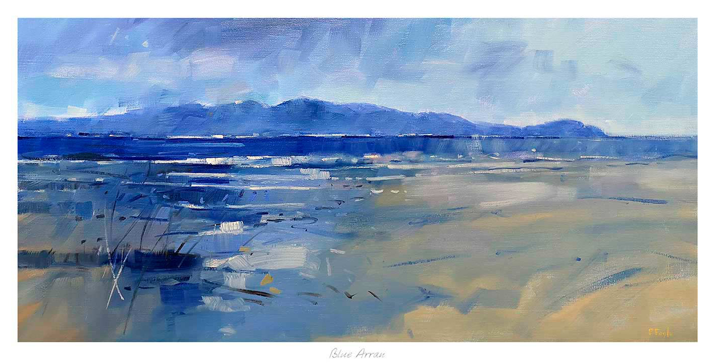
Choosing teal wall art can be tricky because the wrong piece makes a blue-green scheme feel colder or too deliberate. Blue Arran works especially well because the colour comes through landscape and atmosphere rather than as a flat decorative statement.
That gives the room more depth. Instead of simply matching the palette, the artwork helps the scheme feel layered and more naturally finished.
Why This Colour Feels Easier To Live With
Teal tends to work best when it shifts through several tones. In this piece, the coastal setting allows blue, green, and softer neutral notes to sit together in a calmer, more believable way.
- It supports blue-green rooms without overmatching them.
- It keeps the wall airy rather than dense.
- It adds colour with a more grown-up coastal feel.
Rooms Where It Can Really Help
Blue Arran would work beautifully in a living room, bedroom, hallway, or dining area where the scheme already leans into blue, green, brass, or pale timber. It is particularly helpful when the room wants colour continuity without looking overdesigned.
Why The Bespoke Finish Makes A Difference
A colour-led print needs careful tonal control to stay elegant. First 4 Frames completes the framing and colour-managed Giclee production in-house, helping the finished piece keep its subtle shifts and room presence.
You can view the exact framed product here, and browse more from Peter Foyle if you enjoy coastal work with the same layered use of colour.
For buyers exploring teal wall art that feels natural, balanced, and properly finished, Blue Arran is a strong contender.