


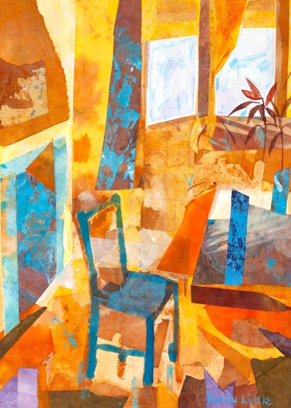
wall art for a colour-blocked interior needs to connect confident areas of colour without making the room feel like a collection of separate statements. Blue Chair by Emily Little offers a useful model. Its orange, ochre, teal, and pale blue shapes overlap within a recognisable interior, so the image feels energetic yet held together. It can give a bold room one focal point that explains the palette rather than merely adding another colour.
Why wall art for a colour-blocked interior needs a bridge
Colour blocking is most successful when each area feels intentional. A teal chair, rust-coloured curtain, blue cabinet, and warm painted wall can all look good alone. Together, however, they may seem unrelated. Artwork can act as the bridge because one composition can contain warm and cool notes while also introducing a clear rhythm of shapes.
Blue Chair is especially well suited to that role. The chair gives the eye an identifiable starting point, while the surrounding planes suggest windows, curtains, furniture, and changing light. That balance between representation and abstraction makes the picture easy to live with. It has enough subject to feel welcoming and enough visual structure to support a design-led room.
Build the room around three levels of colour
| Colour role | How to use it | What to avoid |
|---|---|---|
| Foundation | Keep the largest wall or floor area relatively quiet | Giving every surface equal intensity |
| Anchor | Choose one substantial teal, blue, rust, or timber element | Scattering many small accents around the room |
| Echo | Repeat one picture tone in a cushion, lamp, or ceramic | Matching every colour in the artwork exactly |
The print should not become a shopping list for accessories. Choose one dominant connection and perhaps one quieter echo. For example, a teal armchair could relate to the chair and cooler passages in the image, while a small rust cushion picks up a warm note. The remaining surfaces can stay calm. This gives the artwork room to carry the more complex colour relationships.
Use the vertical format to solve a narrower wall
The available print proportions are vertical, which makes the piece useful beside a doorway, at the end of a short dining wall, or above a compact side table. Measure the solid wall area rather than the whole elevation. The frame needs a clear margin on both sides so that the energetic composition does not feel squeezed.
Check the view from the main seat as well as from the entrance. From a distance, the broad orange and teal forms should read first. At closer range, the layered marks and interior details become more apparent. That change rewards repeated viewing and helps the picture work in a room used throughout the day.
Balance daylight and evening light
Strong daylight can make pale walls and brighter colours appear more separate. In the evening, warmer lamps may pull the orange and ochre forward. Test the intended wall at both times. A lamp positioned to wash the wall gently can keep the blues and layered texture visible after dusk, but it should not create a hard reflection across the glazing.
A mount can provide a quiet interval between the image and the room. A slim dark moulding may sharpen the geometry, while a warm timber can connect the ochre passages to furniture. Avoid choosing the frame from a tiny colour sample alone. Compare it with the actual print, the wall, and the room’s permanent finishes.
Let craftsmanship steady the colour
Artwork with layered colour depends on controlled reproduction. First 4 Frames uses colour-managed Giclée production and completes bespoke framing by hand at its Falkirk workshop. This in-house process supports the shifts between transparent-looking passages, stronger blocks, and smaller marks while giving the finished piece a polished, ready-to-hang presence.
Emily Little trained at Edinburgh College of Art and draws on memory, emotion, travel, and the dialogue between interior and landscape. Explore more about her practice on Emily Little’s official website, or browse the Emily Little collection at First 4 Frames.
Good wall art for a colour-blocked interior should make strong choices feel connected, not tame them. View the framed Blue Chair print for a vertical focal point that can unite warm and cool colour while keeping a confident room balanced.