
Posted on

Art for Terrazzo Floors Gains Warmth and Texture With Industrial Reverie

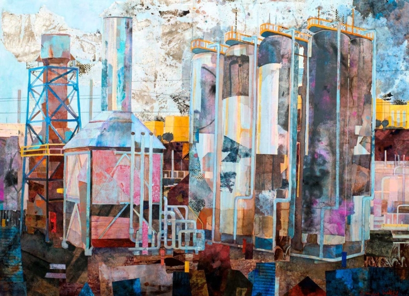
Image of Industrial Reverie by Emily Little

The right art for terrazzo floors should respond to the material’s texture without making the whole room feel harder. Industrial Reverie introduces atmosphere and a more reflective visual layer. It can echo the floor’s mineral character while giving the eye a warmer place to rest.

Balance art for terrazzo floors with softer layers

Terrazzo often contains several small colour notes. Select one quieter chip colour to repeat in the artwork or frame, rather than trying to match the entire floor. This creates a relationship without turning the room into a strict palette exercise.

  • Add softness: use wool, linen, or timber between picture and floor.
  • Control reflection: check the glazed frame under overhead lighting.
  • Create an edge: let the frame separate atmospheric imagery from a busy surface pattern.

Use industrial character without creating a theme

A title such as Industrial Reverie can tempt a room towards exposed bulbs and repeated metal details. Restraint is more effective. Let the picture supply the industrial note, then balance it with comfortable seating, warm wood, or tactile curtains.

The 345 by 250 mm landscape format is suitable above a compact console or within a quieter seating zone. First 4 Frames produces the Giclée print and bespoke frame in-house. Colour management protects tonal relationships, while the hand-finished frame adds clean definition against patterned flooring.

Discover the material’s history through the background and history of terrazzo. Then see more work by Emily Little or view Industrial Reverie in detail.

As art for terrazzo floors, Industrial Reverie offers texture, atmosphere, and the softness needed to balance a durable polished surface.

Posted on

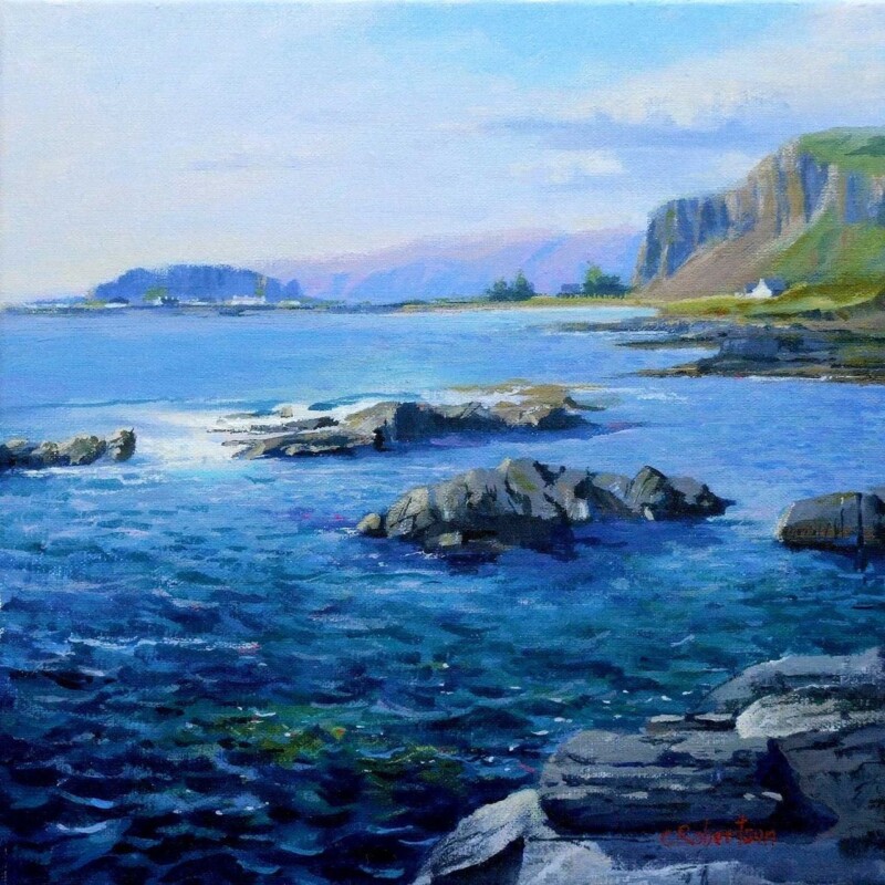
Art for Terrazzo Floors, Why Towards Easdale Feels So Balanced

Choosing art for terrazzo floors is often about balance. Terrazzo already brings pattern, fleck, and visual energy underfoot, so the wall usually benefits from artwork that adds atmosphere and colour without making the room feel restless. Towards Easdale does that especially well.

Its calm coastal movement helps the room feel softer and more joined up, which is often exactly what a terrazzo-based scheme needs.

Why Art for Terrazzo Floors Needs Calm Direction

When the floor carries texture and small-scale variation, the wall can work harder by offering a broader rhythm. This piece gives you horizon, water, and weather instead of another busy pattern, helping the eye settle while still keeping the room interesting.

  • It softens harder finishes without becoming vague.
  • It picks up cooler and warmer notes in terrazzo naturally.
  • It helps a room feel more layered rather than more crowded.

Where Towards Easdale Works Best

Towards Easdale would work beautifully in a kitchen-dining room, hallway, bathroom-adjacent space, or contemporary sitting room where terrazzo plays a visible role. It pairs naturally with pale woods, off-whites, chalky blues, brushed metal, and stone-toned accents because the image already carries that same balanced restraint.

Why The Framed Finish Matters Here

With a detailed floor beneath it, the artwork needs enough clarity and definition to hold its own. First 4 Frames handles bespoke framing and colour-managed Giclee production in-house, helping the final piece feel properly finished and confidently placed. You can view the exact framed product here, and browse more from Colin Robertson if you enjoy Scottish scenes with the same quiet coastal balance.

If you are looking for art for terrazzo floors that adds warmth and flow rather than extra visual noise, Towards Easdale is a very well-judged option.