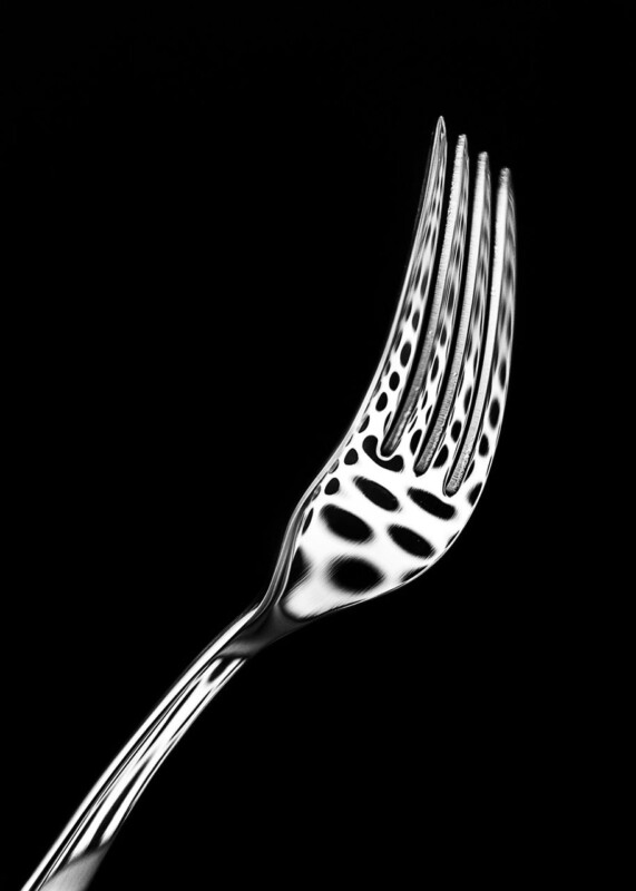
Black and white framed prints can give a modern kitchen graphic focus without resorting to coffee slogans or oversized recipe typography. Spork by Noel Fenech Photography transforms polished cutlery through reflection, pattern, and controlled light. The familiar subject feels witty, but the photographic treatment remains sophisticated.
Let black and white framed prints sharpen clean kitchen lines
| Kitchen finish | How Spork can relate |
|---|---|
| Stainless steel | Echo the reflective surface without adding another appliance-like object. |
| Matt black cabinetry | Use a pale wall or mount to preserve the photograph’s outer edge. |
| White slab doors | Let deep blacks introduce contrast and visual rhythm. |
| Natural timber | Allow warm grain to soften the precision of the monochrome image. |
Choose a wall beyond heat, steam, and food preparation. A dining end, tall pantry wall, or route into the kitchen may be safer than the splashback zone. The portrait format can also suit a narrow surface beside cabinetry where a broad landscape would feel squeezed.
Should other kitchen artwork match?
No. One strong monochrome photograph can provide enough graphic structure. If other pieces are present, connect them through frame finish or spacing rather than repeating cutlery subjects.
Protect every reflection and polished contour
Spork relies on deep blacks, bright highlights, and repeating reflections across metal. Colour-managed fine art production preserves that tonal range and surface detail. Bespoke framing, completed in-house, gives the photograph a clean architectural finish and protects it for long-term display.
To learn more about the photographer and his approach, visit Noel Fenech’s official artist biography. Browse more work by Noel Fenech Photography, or view the exact Spork framed print.
Within black and white framed prints, Spork offers a kitchen-relevant subject with enough abstraction and technical craft to remain interesting well beyond the first glance.