
Posted on

Blue Wall Art After Dark: Night by the Water of Leith

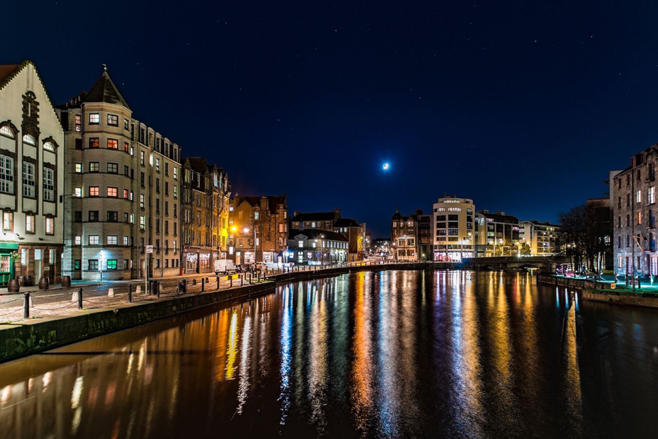
Night shot of Leith by Water of Leith near Edinburgh shows historic riverside buildings aglow, their lights reflecting in the water. A crescent moon and stars illuminate the tranquil urban night scene.

blue wall art should answer a practical need in the room, not simply fill an empty wall. Night shot by Water of Leith is a useful example because its moonlit blue setting is balanced by glowing windows and reflections, giving the scene depth without leaving it visually cold.

Balance blue wall art with warmer points of light

Keep the blue varied

Night colour is rarely one flat navy. Water, sky and building shadows should remain separate, giving the eye several quiet layers to explore.

Echo the warm light once

A warm lamp or a small brass detail can answer the riverside glow. Avoid repeating blue across every cushion, curtain and accessory.

This photograph suits a sitting room, dining area or hallway used in the evening. Position it away from a lamp reflected directly in the glazing. Soft light from the side will reveal the buildings and water while protecting the calm night atmosphere.

Successful blue wall art needs contrast and tonal depth, not a room filled with matching blue objects.

Preserve the difference between water, sky and shadow

Colour-managed Giclée production helps keep neighbouring dark tones readable instead of allowing them to merge. A restrained bespoke frame provides a clean boundary, while the hand-finished presentation gives the illuminated details suitable presence after dark.

To learn more about Edinburgh’s river and walkway, visit the Water of Leith Conservation Trust. You can also browse the Photography collection or view the exact framed product.

Blue wall art can make an evening room feel settled rather than chilly. Night by the Water of Leith achieves that balance through moonlight, architecture and warm reflections.

Posted on

Cobalt Water and the Calm Appeal of Blue Wall Art

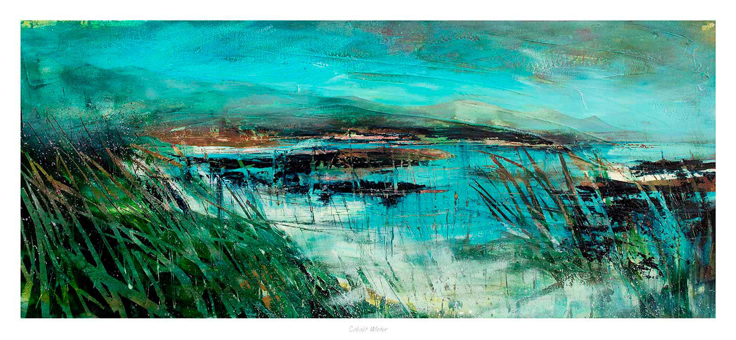
Well-chosen blue wall art can cool a room gently without making it feel distant. That balance matters because blue is often used to create calm, yet the wrong piece can leave the wall looking flatter than before. Cobalt Water works beautifully because it brings freshness and depth while still keeping the overall mood relaxed.

Why calmer colour still needs contrast

Rooms built around softer palettes often rely on subtle changes in tone. Artwork has to support that rather than break it. Cobalt Water does this especially well, giving the wall more shape and movement while keeping the palette airy and easy to live with.

  • It suits bedrooms, sitting rooms, and calmer corners that need a little more visual depth.
  • It adds blue in a way that feels refined rather than overly decorative.
  • It helps neutral walls feel more composed and less empty.

This is particularly useful where the room already includes pale paint, washed wood, or lighter upholstery. The artwork introduces clearer colour, but it still leaves the space feeling open and restful.

Why better presentation keeps the effect polished

First 4 Frames completes each piece in-house in Falkirk with bespoke framing, colour-managed Giclee printing, and hand-finished craftsmanship. That superior quality helps the colour stay purposeful on the wall, rather than feeling thin or easily lost within a quieter scheme.

You can explore more from Fiona Matheson and see the exact framed print here.

If you are comparing blue wall art and want something calm, fresh, and easy to place, Cobalt Water is a very appealing choice.