Posted on

Big Art for Living Room Walls, Why Chasing the Light Feels So Right

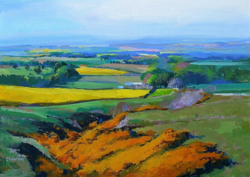
Image of Chasing the Light by Colin Robertson

The best big art for living room walls does more than cover space. It gives the seating area a clearer centre of gravity. Chasing the Light works especially well because the landscape has room to breathe, which helps a larger wall feel intentional rather than merely filled.

That sense of breadth matters in a living room where the sofa, coffee table, and lighting already create several visual points. One wider framed piece can pull them together more calmly than a cluster of smaller artworks that never quite settle.

Why Scale Matters More Than People Think

A larger wall behind a sofa or sideboard often needs artwork with enough spread to look related to the furniture below it. Chasing the Light has the kind of open movement that can hold that relationship without feeling heavy.

  • It helps the living room feel anchored rather than slightly fragmented.
  • It brings atmosphere without crowding a calmer decorating scheme.
  • It suits buyers who want one confident answer instead of several smaller fillers.

Where This Kind of Piece Works Best

This sort of landscape makes particular sense above a sofa, along a longer wall opposite the seating area, or in an open-plan living space where the art needs to give the room a stronger focal pause. It also works well with timber, stone, wool, and softer neutral palettes because the image adds distance and light rather than visual fuss.

When a living room already has plenty going on, that calmer sense of structure is often more useful than extra detail.

Why the Framed Finish Helps It Land Properly

Larger artwork needs a finish that feels properly resolved. First 4 Frames handles the bespoke framing and colour-managed Giclee production in-house, which helps a piece like this keep both its tonal depth and its presence on the wall.

You can view the exact framed product here, and browse more from Colin Robertson if you want Scottish landscapes with the same spacious, easy-to-live-with character.

If you are looking for big art for a living room that feels expansive, calm, and genuinely room-shaping, Chasing the Light is a very strong option.

Posted on

Scottish Landscape Art With Atmosphere, Why Afternoon Waves, The Bass Rock Works

The best Scottish landscape art does more than show scenery. It gives a room a stronger sense of place while still feeling calm enough to live with every day. Afternoon Waves, The Bass Rock does that particularly well because the recognisable landmark is balanced by soft movement, distance, and a quietly tide-led rhythm.

That combination stops the piece from feeling either overly formal or purely souvenir driven. Instead, it feels rooted and atmospheric, which is exactly what many buyers want from a framed Scottish landscape.

Why The Bass Rock Gives This Piece Real Identity

A familiar coastal landmark can anchor a room more confidently than a generic scene because it carries memory, place, and visual structure at the same time. Here, the Bass Rock gives the composition a clear focal point while the surrounding water keeps the mood relaxed.

  • It brings recognisable Scottish character without feeling heavy handed.
  • It suits interiors that need calm movement rather than busy detail.
  • It works well for buyers who want local identity with a polished finish.

Where It Sits Most Naturally

This kind of piece works especially well in a living room, hallway, or dining space where one framed landscape can settle the wall without taking over the whole scheme. It also suits homes that already use natural light, pale timber, or coastal colours and need artwork with a stronger sense of destination.

Because the image feels spacious rather than crowded, it can add character without making the room feel visually busier.

Why The Framed Finish Matters

Landscape art depends heavily on tone and presentation. If the print handling feels flat, much of the atmosphere can disappear. First 4 Frames produces work like this in-house with bespoke framing and colour-managed Giclee quality, helping the finished piece feel more substantial and better judged on the wall.

You can view the exact framed product here, and browse more by Colin Robertson if you want Scottish scenes with the same mix of place and calm.

For buyers searching for Scottish landscape art that feels spacious, rooted, and quietly expressive, Afternoon Waves, The Bass Rock is a very strong option.

Posted on

Why Parkland Reflections Works So Well as Wall Art for Bay Windows

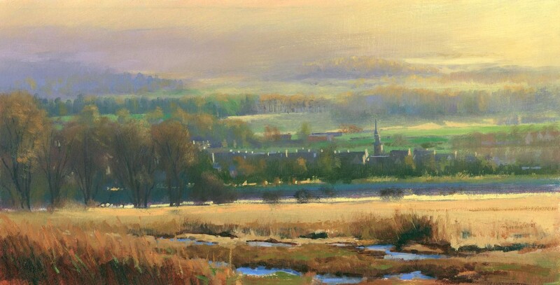
Choosing wall art for bay windows often means solving a balance problem. Bay windows bring welcome daylight and a sense of openness, but they can also make the surrounding walls feel visually lighter than the rest of the room. Parkland Reflections is a particularly good answer because it adds atmosphere and structure without making the space feel heavy.

Why bay window rooms benefit from artwork with calm presence

A room with a bay window usually has several sightlines at once. Light moves across the walls differently throughout the day, and furniture often sits at angles rather than in one straightforward line. That means the artwork needs enough presence to hold the room together while still feeling relaxed. Parkland Reflections does that beautifully. It gives the eye a natural place to settle, which helps the wider space feel more composed.

This is especially useful in sitting rooms, bedrooms, or reading areas where the bay window is one of the room’s best features. Instead of competing with the architecture, the print works with it, adding a quieter focal point that supports the light already coming in.

  • It helps a bright room feel more anchored without darkening it.
  • It suits spaces with multiple angles and changing daylight.
  • It offers a calmer, more lasting finish than generic decorative wall pieces.

Why hand-finished presentation matters in a light-filled room

Brighter rooms reveal finish more clearly, so quality presentation matters. First 4 Frames completes each piece in-house in Falkirk using bespoke framing, colour-managed Giclee printing, and hand-finished craftsmanship. That gives the print the refinement it needs to sit confidently in a room shaped by natural light.

You can explore more work by Colin Robertson and view the exact framed print here.

If you are looking for wall art for bay windows that feels calm, well judged, and easy to live with, Parkland Reflections is a very strong choice.

Posted on

Extra Large Framed Wall Art, Why Islands in the Tide, Clachan Bridge Works

The appeal of extra large framed wall art is not just size for its own sake. Often, the real benefit is clarity. A longer or emptier wall can look more settled with one expansive statement than with several smaller pieces trying to do the same job. Islands in the Tide, Clachan Bridge is a strong example of that principle in practice.

The composition has enough movement and distance to spread comfortably across a larger visual field, which helps a bigger wall feel intentional rather than merely filled.

When Bigger Is The Better Choice

There are rooms where multiple small frames only underline the awkwardness of the space. A single larger landscape can create calm, anchor furniture more convincingly, and stop the wall from feeling bitty.

  • It suits longer walls above sideboards, sofas, and larger beds.
  • It gives open-plan rooms a stronger centre of gravity.
  • It creates more calm than several unrelated pieces competing for attention.

Why This Landscape Has The Right Reach

Islands in the Tide, Clachan Bridge has the scale-friendly qualities you want in a bigger framed piece: open space, layered distance, and enough tonal variation to stay interesting across the room. It can make a living area feel more complete or help a hallway wall feel more considered from the first glance.

Because the image is spacious rather than busy, the larger presentation reads as confident rather than overwhelming.

Why Presentation Counts More At This Size

Once a framed piece becomes larger, every weakness in print handling or framing becomes more obvious. First 4 Frames completes work like this in-house with bespoke framing and colour-managed Giclee production, which is exactly what helps a bigger piece feel premium and settled rather than oversized for the sake of it.

You can view the exact framed product here, and explore more from Colin Robertson if this kind of expansive Scottish landscape feels right for your space.

If your wall needs extra large framed wall art that brings scale and calm in equal measure, Islands in the Tide, Clachan Bridge is a very strong option.

Posted on

What Makes Blue Thunder, The River Dee Feel Like Premium Framed Artwork

The phrase premium framed artwork only means something if the finished piece genuinely looks and feels better on the wall. That is why Blue Thunder, The River Dee is such a useful example. It has colour, movement, and atmosphere, but what really makes it convincing is how strongly the image benefits from a well judged framed presentation.

A lively landscape can quickly lose impact if the print looks flat or the frame feels like an afterthought. Here, the richness of the blues and greens needs proper support. Without that, the work would not carry the same confidence once it reaches the room.

What Premium Should Actually Mean

When buyers invest in premium framed artwork, they are usually paying for three things at once: a stronger image, a better print, and a more complete presentation. The point is not just to own the picture. It is to have a finished piece that looks settled and durable in a real interior.

  • The print needs believable depth and clean colour handling.
  • The frame should feel matched to the artwork rather than generic.
  • The final piece should arrive ready to hold the wall with confidence.

Why This Piece Rewards Better Presentation

Blue Thunder, The River Dee has enough energy to work as a focal point, but it also has enough calm to live comfortably in a home long term. That balance is exactly what makes premium presentation worthwhile. The artwork has something to say, and the framing helps it say it more clearly.

It would sit particularly well in a sitting room, study, or hallway where you want one piece to add depth without making the room feel visually crowded.

In-House Craftsmanship Matters

First 4 Frames completes the framed finish in-house in Falkirk, using colour-managed Giclée production and bespoke framing rather than a generic off-the-shelf treatment. That extra care is where the premium difference becomes visible. The result is more polished, more substantial, and much easier to place with confidence.

You can view the exact framed product here, and see more work by Colin Robertson if you want the same sense of colour and landscape atmosphere elsewhere in the home.

If you are looking for premium framed artwork that earns the label through quality and finish rather than sales language, Blue Thunder, The River Dee is a strong place to start.

Posted on

Why A Moment by the Sea Works So Well as Dental Waiting Room Wall Art

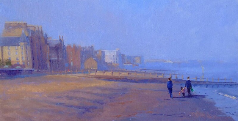
The right dental waiting room wall art can change how a client space feels before a word is spoken. A Moment by the Sea is especially effective because it brings movement, openness, and a gentler atmosphere without making the room feel themed or overly decorative.

Why calmer imagery matters in a dental waiting room

Dental waiting areas need to feel reassuring. Patients often arrive carrying some level of tension, even for routine appointments. Artwork that feels too sharp, too busy, or too corporate can make the room seem colder than it needs to be. A Moment by the Sea offers a different balance. It introduces light, space, and a familiar human scene that helps the room feel more approachable.

That is useful in smaller practices as well as larger clinics. The piece has enough presence to lift a plain wall, but it still feels composed and easy to live with in a professional environment.

  • It helps a waiting area feel calmer without slipping into generic spa styling.
  • It brings a friendlier first impression to a client-facing room.
  • It suits reception or seating areas that need polish as much as warmth.

Why a hand-finished framed print gives a better impression

In a professional setting, finish matters. First 4 Frames completes each piece in-house in Falkirk using bespoke framing, colour-managed Giclee printing, and hand-finished craftsmanship. That gives the final presentation the substance and quality a client-facing interior deserves.

You can explore more work by Colin Robertson and view the exact framed print here.

If you are choosing dental waiting room wall art that should feel calm, professional, and genuinely welcoming, A Moment by the Sea is well worth considering.

Posted on

Why Where Silence Speaks Works Beautifully as Yoga Studio Wall Art

The best yoga studio wall art should support the mood of the room rather than compete with it. In a practice space, that usually means choosing something with enough presence to shape the atmosphere while still leaving mental and visual breathing room. Where Silence Speaks works especially well because it brings depth, softness, and a strong sense of calm without feeling bland.

Why quieter landscape art suits a yoga space

A yoga studio often relies on balance. The room needs character, but it should not feel busy. It needs warmth, but not visual heaviness. Where Silence Speaks has a still, atmospheric quality that helps settle the room from the moment someone walks in. That can be valuable in a dedicated home studio, a small teaching room, or a broader wellbeing space where the goal is focus rather than distraction.

  • It gives the wall a calm focal point without becoming loud or over-styled.
  • It works naturally with timber, soft neutrals, and simpler studio finishes.
  • It helps the space feel more intentional and less like a spare room with mats in it.

A more grounded alternative to generic wellness decor

Many practice spaces end up with artwork that feels interchangeable. A hand-finished landscape print offers something stronger. It can create atmosphere while still feeling grown-up, polished, and lasting. Where Silence Speaks is particularly good for this because the mood is reflective rather than theatrical, so the artwork supports the room quietly over time.

At First 4 Frames, each piece is completed in-house in Falkirk using bespoke framing, colour-managed Giclee printing, and superior craftsmanship. That makes a difference in a studio setting where presentation and material quality are easy to notice.

You can explore more work by Colin Robertson and view the exact framed print here.

If you are looking for yoga studio wall art that feels calm, substantial, and professionally resolved, Where Silence Speaks is a very strong option.

Posted on

Why Sea Meets Skye, Easdale Works So Well as Large Coastal Wall Art

Good large coastal wall art needs to do more than cover square footage. On a broader wall, the artwork has to carry enough atmosphere and scale to feel intentional, while still leaving the room calm enough to live with every day. Sea Meets Skye, Easdale is especially effective because it brings width, distance, and a strong sense of place without becoming overbearing.

Why a wider wall needs more than just a bigger frame

Large rooms can make weaker artwork feel undersized surprisingly quickly. The answer is not simply choosing something bigger, but choosing a piece with enough visual breadth to belong there. Sea Meets Skye, Easdale has that quality. The composition feels open and immersive, which helps the wall feel properly resolved rather than merely occupied.

  • It gives a long wall a stronger focal point.
  • It keeps the room feeling airy rather than crowded.
  • It suits coastal, neutral, and softly layered interiors particularly well.

This is particularly helpful in sitting rooms, open-plan spaces, and larger bedrooms where the wall needs a steadier rhythm. A wide coastal scene can soften the room while still holding enough authority to stop the scheme drifting into the background.

Why the finish matters with larger artwork

First 4 Frames completes each piece in-house in Falkirk with bespoke framing, colour-managed Giclee printing, and hand-finished craftsmanship. When artwork is scaled for a bigger wall, that quality matters. A better finished piece feels settled and dependable in a way weaker presentation often does not.

You can browse more from Colin Robertson and view the exact framed print here.

If you are comparing large coastal wall art, Sea Meets Skye, Easdale is a very persuasive example of how a larger piece can feel expansive, polished, and calm all at once.

Posted on

How Islands in the Tide, Clachan Bridge Helps Answer How Large Should Artwork Be Above a Sofa

People asking how large should artwork be above a sofa are usually trying to avoid two common problems. The artwork is either too small to anchor the seating area, or so dominant that it pushes the whole room out of balance. Islands in the Tide, Clachan Bridge is a strong reference point because its shape and atmosphere suit that in-between decision very well.

Why sofa walls need proper visual weight

The wall above a sofa often carries more responsibility than any other wall in the room. It is central, highly visible, and closely tied to the scale of the furniture beneath it. A piece like Islands in the Tide, Clachan Bridge works because it feels expansive enough to belong there, while still leaving breathing space around the frame.

Artwork above a sofa should feel connected to the seating, not stranded above it.

  1. Panoramic compositions often help wider furniture feel more grounded.
  2. The frame should add authority without making the wall feel heavy.
  3. Calmer colour helps larger artwork settle into daily living more easily.

This matters especially in living rooms where the sofa already sits against a broad uninterrupted wall. The right piece should reinforce the shape of the room, not leave the seating looking separate from everything above it.

Why a bespoke framed finish improves the result

First 4 Frames completes every piece in-house with bespoke framing, colour-managed Giclee printing, and hand-finished craftsmanship. When artwork is placed above a sofa, it needs enough substance to hold its own in the main seating area. Better framing helps the piece feel permanent rather than simply decorative.

You can explore more from Colin Robertson and see the exact framed work here.

If you are working out how large should artwork be above a sofa, Islands in the Tide, Clachan Bridge is a very helpful example of the kind of scale, proportion, and calm presence that tends to work well.

Posted on

Silent Watcher and the Best Frame Colours for Art Prints

When people ask about the best frame colours for art prints, they are usually asking how the same artwork can feel more contemporary, more traditional, or simply more balanced in the room. Silent Watcher is an excellent example because the image is subtle enough for framing choices to make a visible difference.

How frame colour changes the reading of the print

A lighter frame can keep a piece like Silent Watcher airy and gentle, which suits calmer interiors and softer wall colours. A deeper frame can sharpen the image and give it more visual architecture, which may work better in a room with stronger joinery, darker accents, or more contrast overall.

  • Lighter frame colours usually feel easier and more relaxed.
  • Mid-tone options often connect well with timber furniture and warmer neutrals.
  • Darker frames can make a quieter print feel more defined from across the room.

The important point is that there is no universally right answer. The best choice depends on what the room already contains and whether you want the artwork to blend more softly or hold its place more firmly on the wall.

Why the quality of the framing matters as much as the colour

First 4 Frames completes each piece in-house in Falkirk with bespoke framing, colour-managed Giclee printing, and hand-finished craftsmanship. That matters because frame colour only works well when the overall build quality feels deliberate. Good materials and careful finishing make the choice look considered rather than cosmetic.

You can explore more from Colin Robertson and view the exact framed work here.

If you are comparing the best frame colours for art prints, Silent Watcher is a very helpful piece to think through because small framing changes can alter the whole character of the final result.