Posted on

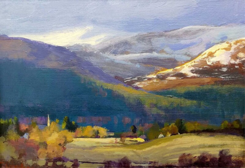
Choosing Art for Pebble Grey Walls, Why The Lairig Ghru, Cairngorms Feels So Balanced

Image of The Lairig Ghru, Cairngorms by Colin Robertson

Finding the right art for pebble grey walls is usually about stopping a neutral room from feeling too flat. Pebble grey is versatile and easy to live with, but it needs artwork with enough depth to build atmosphere without dragging the whole scheme darker. The Lairig Ghru, Cairngorms gets that balance right very naturally.

Why grey rooms need contrast with restraint

Grey can create a calm and elegant backdrop, but it often works best when the artwork introduces shape, distance, and tonal variation. The aim is not to shock the scheme into life. It is to give it more range and visual substance. The Lairig Ghru, Cairngorms brings that sense of depth while still keeping the room composed.

  • It adds atmosphere without making the room feel heavy.
  • It helps quieter paint colours feel more layered and intentional.
  • It works well in bedrooms, sitting rooms, and calmer shared spaces.

This is especially valuable if the room already includes soft neutrals, stone tones, or brushed finishes. The piece adds a clearer focal point while still respecting the gentler palette around it.

First 4 Frames produces each piece in-house in Falkirk with bespoke framing, colour-managed Giclee printing, and hand-finished craftsmanship. That superior presentation helps the artwork hold its own against a cooler, cleaner wall colour.

You can browse more from Colin Robertson and view the exact framed product here.

If you are weighing up art for pebble grey walls, The Lairig Ghru, Cairngorms is a very good example of how to add mood and depth without losing calm.

Posted on

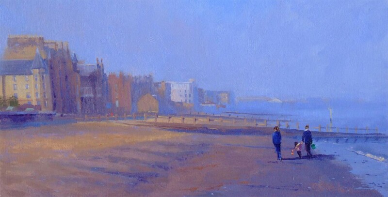
A Moment by the Sea and the Value of Custom Framed Art Prints in an Everyday Home

People often start searching for custom framed art prints when they want artwork to feel like a real part of the room rather than a quick finishing touch. A Moment by the Sea is a useful example of why that matters. The image itself is inviting, but the full impact comes from the way it is presented.

Why framing changes the feel of a piece

A good image can lose a lot when it is left feeling temporary. Bespoke framing helps artwork sit properly with the furniture, wall colour, and level of finish already in the room. It turns a print into something that feels chosen, settled, and built to last.

  • It gives the artwork more authority on the wall.
  • It helps the piece feel connected to the rest of the interior.
  • It offers a more polished result than a generic ready-made presentation.

A Moment by the Sea is especially well suited to that kind of treatment because the subject has enough subtle atmosphere to reward a better finish. In a hallway, bedroom, or living room, it feels calmer and more complete when framed with care.

Bespoke framing is often what turns a print from something you like into something that genuinely belongs in the room.

At First 4 Frames, every piece is completed in-house in Falkirk with colour-managed Giclee printing and hand-finished craftsmanship. That combination of print quality and bespoke framing is what gives the finished artwork its more confident, long-term presence.

You can explore more from Colin Robertson and view the exact framed version here.

If you are comparing custom framed art prints and want something that feels polished, lasting, and genuinely room-ready, A Moment by the Sea is a strong place to start.

Posted on

Where Water Dreams and the Quiet Strength of Art for Soft Blue Upholstery

Choosing art for soft blue upholstery is often about giving a gentle room enough depth. Softer blues can make an interior feel restful and elegant, but they also risk becoming a little washed out if the artwork does not bring enough definition. Where Water Dreams works beautifully because it keeps the scheme calm while adding the presence that a pale palette still needs.

Why quieter blue schemes still need contrast

Rooms with soft blue upholstery usually aim for comfort and ease. The best artwork supports that mood but also keeps the space from drifting into looking too light in weight. A framed print can bring exactly the right amount of anchor without sacrificing calmness.

In a gentler room, the artwork does not need to shout, but it does need enough presence to stop everything dissolving into one soft note.

Why Where Water Dreams is so well suited

The image has flow and atmosphere, yet it also brings enough tonal structure to hold the room together. That makes it especially useful in bedrooms, sitting rooms, and guest spaces built around quieter fabrics and lighter colour.

First 4 Frames produces every piece in-house in Falkirk with bespoke framing, colour-managed Giclee printing, and hand-finished craftsmanship. That superior finish helps the subtleties of colour and paper show properly in a scheme where detail matters.

You can explore more from Colin Robertson and view the exact framed print here.

If you are looking for art for soft blue upholstery that feels restful, polished, and beautifully resolved, Where Water Dreams is an excellent choice.

Posted on

Why Knoydart Light Works Beautifully as Art for a Room With Sisal Rugs

Finding the right art for a room with sisal rugs is often about balance. Sisal is practical, textural, and easy to live with, but it can also make a room feel slightly dry if the artwork does not add enough softness. Knoydart Light works beautifully because it introduces atmosphere and movement while still respecting the grounded feel that natural flooring brings.

Why textured flooring needs artwork with ease

Rooms with sisal often aim for a natural, uncluttered look. The artwork should support that intention rather than disturb it. One carefully framed print can keep the room feeling composed while adding the lift that plain textures sometimes need.

The goal is not to overpower the texture underfoot, but to give it something calmer and more atmospheric to work with.

Why Knoydart Light is such a good fit

The image has enough mood to enrich the room, yet it still feels spacious and easy on the eye. That makes it especially useful in sitting rooms, bedrooms, and studies where natural materials already set a quieter tone.

First 4 Frames produces every framed print in-house in Falkirk using bespoke framing, colour-managed Giclee printing, and hand-finished craftsmanship. That quality-led presentation helps the finished piece feel settled beside tactile materials and restrained colour palettes.

You can see more from Colin Robertson and view the exact framed print here.

If you are looking for art for a room with sisal rugs that feels natural, polished, and easy to live with, Knoydart Light is an excellent option.

Posted on

Why The Edge of Winter, Braemar Works Beautifully in a Room With Exposed Beams

Finding the right art for a room with exposed beams is often about balance. Exposed beams bring character and depth, but they can also make a room feel visually weighty if the rest of the scheme does not counter them well. The Edge of Winter, Braemar works so well because it adds atmosphere and softness while still respecting the room’s stronger architectural lines.

Why beam-heavy rooms need thoughtful contrast

Rooms with timber overhead already have texture and definition built in. Artwork should support that character without adding more heaviness. The right framed piece helps the room feel layered and settled, rather than overly rustic or visually crowded.

What you want is not blandness, but breathing space: enough contrast for the room to feel calm while still keeping its original character.

Why The Edge of Winter, Braemar is a strong answer

The image carries real mood, but it does so in a measured way. That makes it especially useful in cottages, converted steadings, and older properties where the architecture already has a lot to say.

First 4 Frames produces each framed print in-house in Falkirk using bespoke framing, colour-managed Giclee printing, and hand-finished craftsmanship. That quality-led finish helps the work feel at home beside natural timber, stone, and other characterful materials.

You can see more from Colin Robertson and view the exact framed print here.

If you are searching for art for a room with exposed beams that keeps a characterful room feeling calm and well judged, The Edge of Winter, Braemar is an excellent choice.

Posted on

Autumn’s Embrace, Edinburgh as Edinburgh Dining Room Wall Art With Real Character

Good Edinburgh dining room wall art should help a room feel welcoming before anyone sits down. Dining spaces need warmth and personality, but they do not always suit artwork that feels too solemn or too decorative. Autumn’s Embrace, Edinburgh works especially well because it adds local character and atmosphere while keeping the room comfortable and sociable.

Why dining rooms benefit from a stronger sense of place

A dining room is often used for slower evenings, conversations, and occasional gatherings, so the artwork should support that mood. A piece connected to Edinburgh can make the room feel more personal and memorable without leaning on obvious hospitality styling.

  • It suits city homes, tenement dining rooms, and open-plan eating areas with a local connection.
  • It adds atmosphere without making the room feel overly formal.
  • It helps a shared room feel more rooted and more distinctive.

Why Autumn’s Embrace, Edinburgh feels so well judged here

The scene has enough colour and presence to hold a dining wall, yet it still feels easy to live with through everyday meals and busier occasions alike. That balance is what keeps it inviting rather than overdone.

First 4 Frames produces every framed print in-house in Falkirk using bespoke framing, colour-managed Giclee printing, and hand-finished craftsmanship. That quality-led finish gives the artwork the presence it needs in a room shaped around hosting and presentation.

You can explore more from Colin Robertson and view the exact framed product here.

If you are searching for Edinburgh dining room wall art that feels warm, local, and naturally sociable, Autumn’s Embrace, Edinburgh is a very strong option.

Posted on

The Old Brig of Dee and the Case for Wall Art for a Room With Bookcases

Choosing wall art for a room with bookcases is often about preventing a layered room from feeling visually split up. Bookcases bring wonderful depth and personality, but they also create a lot of small shapes, spines, and changing detail. The Old Brig of Dee works beautifully because it gives the eye one calm, finished point of focus.

Why book lined rooms need a clearer visual anchor

Rooms with shelves tend to feel intelligent and lived in, but they can sometimes miss a single element that draws everything together. A framed print does that well. It helps the room read as a whole rather than as separate zones of storage and seating.

  • It suits studies, sitting rooms, and reading corners with wall shelving or built-in bookcases.
  • It adds calm structure without flattening the room’s character.
  • It helps layered interiors feel cohesive and more intentionally dressed.

Why The Old Brig of Dee is such a good fit

The composition has enough character to hold its place beside books and objects, but it still carries the steadier mood that stops the room feeling busy. That balance is especially useful in spaces where shelves are part of the architecture.

First 4 Frames produces every piece in-house in Falkirk using bespoke framing, colour-managed Giclee printing, and hand-finished craftsmanship. That quality-led finish suits rooms where people tend to care about material, detail, and things built to last.

You can explore more from Colin Robertson and view the exact framed product here.

If you need wall art for a room with bookcases that helps a book-filled room feel calmer, more anchored, and properly complete, The Old Brig of Dee is a very strong option.

Posted on

Why Summer Lingers On Works Beautifully as Art for Olive Green Walls

Finding the right art for olive green walls is often about balance. Olive green has depth and sophistication, but it can also pull a room towards feeling too earthy if the artwork nearby does not bring enough light or movement. Summer Lingers On is a particularly good answer because it adds freshness while still sitting comfortably within a richer palette.

What olive green needs from the artwork around it

Green walls usually look best when the artwork helps the colour feel intentional rather than dominant. The aim is not to fight the paint choice, but to stop the room becoming too uniform or heavy. One well-chosen framed print can do that very effectively.

  • It suits bedrooms, sitting rooms, and dining spaces with richer painted walls.
  • It adds lift without losing the room’s calm mood.
  • It helps a stronger colour choice feel polished rather than overcommitted.

Why Summer Lingers On is such a useful match

The image carries warmth and atmosphere, yet it still feels airy enough to keep the wall colour from closing in. That is exactly what helps olive green feel elegant rather than slightly over-saturated.

First 4 Frames completes each piece in-house in Falkirk using bespoke framing, colour-managed Giclee printing, and hand-finished craftsmanship. That superior presentation helps the artwork hold its own against a confident wall colour and quality furnishings.

You can explore more from Colin Robertson and view the exact framed product here.

If you need art for olive green walls that feels balanced, fresh, and fully at ease in a deeper scheme, Summer Lingers On is an excellent fit.

Posted on

Why Golden Cascade Falls of Dochart Works Beautifully as Art for Dark Wood Furniture

Well chosen art for dark wood furniture should complement the depth of the timber without leaving the room feeling heavy. Darker wood pieces bring wonderful substance to a space, but they can also make the palette feel weightier unless the artwork introduces some movement and lift. Golden Cascade Falls of Dochart handles that balance especially well.

Why richer timber needs artwork with enough light in it

Walnut, mahogany, stained oak, and other darker woods often give a room confidence and maturity. The wall art should respect that, yet still stop the scheme from feeling too closed in. A framed print with atmosphere, contrast, and flow can do exactly that.

Golden Cascade Falls of Dochart brings energy and tonal variation in a way that helps darker joinery and furniture feel more alive. It supports the richness of the room without adding extra visual weight.

  • It suits sitting rooms, studies, and dining spaces with substantial timber furniture.
  • It adds lift without undermining the room’s sense of depth.
  • It helps a darker scheme feel layered rather than slightly dense.

Why the finished presentation matters

First 4 Frames produces every piece in-house in Falkirk with bespoke framing, colour-managed Giclee printing, and hand-finished craftsmanship. That superior quality matters in rooms with darker woods, where poor framing quickly looks flat beside stronger materials.

This artwork is by Colin Robertson, and you can view the exact framed product here.

If you want art for dark wood furniture that feels bright enough to balance a richer interior while still looking entirely at home in it, Golden Cascade Falls of Dochart is a very strong fit.

Posted on

Bidean Nam Bian, Glencoe and the Challenge of Art for Slate Floors

Finding the right art for slate floors is often about protecting depth without letting the room become too heavy. Slate brings beautiful natural texture and a sense of permanence, but it can also make a scheme feel cooler if the artwork above it does not add enough warmth and atmosphere. Bidean Nam Bian, Glencoe handles that beautifully.

Why darker natural materials need balance

Rooms with slate underfoot often look grounded and well made, yet they benefit from artwork that introduces softness and visual lift. The aim is not to fight the flooring, but to stop the overall scheme from feeling too still or dense.

  • It suits kitchens, garden rooms, and sitting rooms with natural stone flooring.
  • It adds atmosphere without undermining the room’s stronger materials.
  • It helps a grounded scheme feel richer and more complete.

Why Bidean Nam Bian, Glencoe answers the brief

The image carries enough movement and openness to offset the weight of stone, while still feeling calm and properly resolved. That makes it a practical choice for rooms that want character without a hard edge.

First 4 Frames completes each piece in-house in Falkirk using bespoke framing, colour-managed Giclee printing, and hand-finished craftsmanship. That superior quality suits interiors where tactile materials and careful finishing already matter.

You can explore more work by Colin Robertson and view the exact framed product here.

If you are searching for art for slate floors that feels warm, balanced, and naturally suited to a more grounded room, Bidean Nam Bian, Glencoe is an excellent fit.