Posted on

What Makes The Old Mill Such a Good Wall Art Choice for Exposed Beams

Image of The Old Mill by Colin Robertson

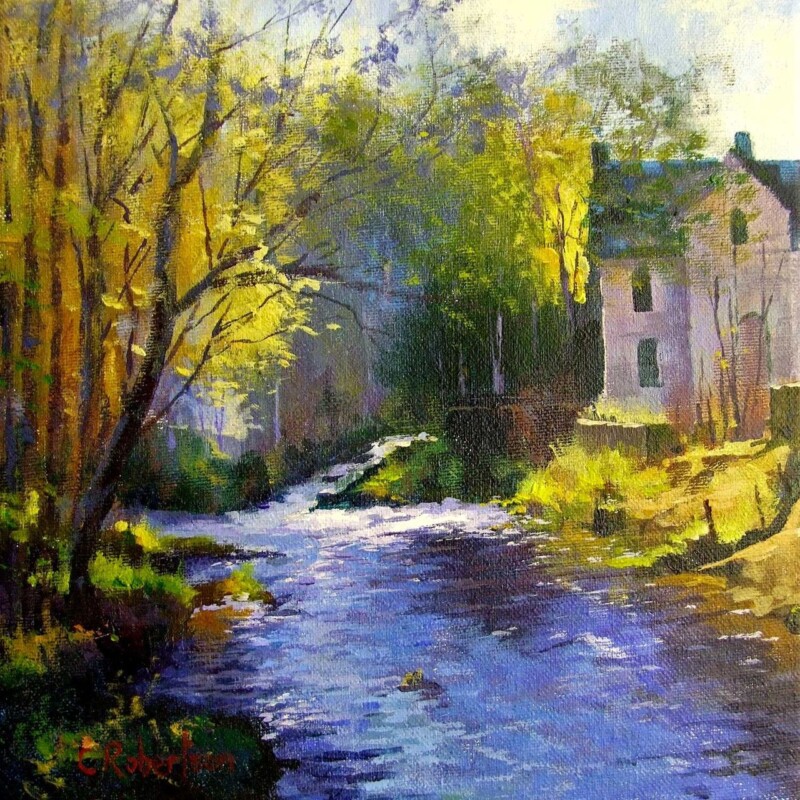
The best wall art for exposed beams needs to respect what is already in the room. Beams bring structure, texture, and history, so the artwork should support that character rather than fight for attention. The Old Mill works especially well because it feels grounded, settled, and naturally in tune with a room that already has architectural presence.

Why this kind of room needs the right balance

Rooms with exposed beams can look wonderful, but they already carry plenty of line and texture. That often means the artwork needs a steadier visual rhythm. The Old Mill has enough depth and character to belong in the space, yet it still feels calm enough to stop the room becoming too busy.

  • It suits cottages, converted outbuildings, and older homes with visible timber detail.
  • It adds warmth without competing with the room’s structure.
  • It helps a characterful interior feel curated rather than pieced together.

Where it can work particularly well

This type of piece sits comfortably above a mantel, on a main sitting room wall, or in a dining area where timber detail is already a feature. Because the subject feels established and rooted, it complements a room with age and texture rather than pulling away from it.

That makes it especially useful for homes where you want to keep the original character, but still bring in a framed focal point that feels intentional and polished.

Why the finish matters in a characterful room

First 4 Frames produces each piece in-house in Falkirk with bespoke framing, colour-managed Giclée printing, and hand-finished craftsmanship. In a room with exposed beams, those details matter. A cleaner, higher-quality finish helps the artwork sit confidently alongside older materials and stronger textures.

This artwork is by Colin Robertson, and you can view the exact framed product here.

If you want wall art for exposed beams that feels grounded, thoughtful, and properly finished, The Old Mill is a very good choice.

Posted on

Choosing Art for Patterned Wallpaper, Why Sea Meets Sky, Easdale Feels So Calm

Image of Sea Meets Sky, Easdale by Colin Robertson

Finding the right art for patterned wallpaper is often about restraint. When a room already has visual detail on the walls, the artwork needs to bring balance rather than more noise. Sea Meets Sky, Easdale does that beautifully, introducing calm horizon lines and a softer coastal mood that helps the whole scheme feel more settled.

Why calmer artwork works better here

Patterned wallpaper already carries rhythm, movement, and texture. That often means the best framed piece is one that gives the eye a place to rest. Sea Meets Sky, Easdale has enough presence to hold its own, but it does not compete with the wall behind it. Instead, it helps the room feel composed.

  • It suits wallpaper with florals, subtle geometrics, or country-inspired pattern.
  • It helps stop a more decorative room from feeling too visually busy.
  • It adds colour without introducing another competing motif.

Where a piece like this works best

This kind of artwork works particularly well above a sideboard, between windows, or on a chimney breast where wallpaper already plays a leading role. Because the image has a calmer structure, it can anchor the space without flattening its character.

That balance is often what makes the difference between a room that feels layered and one that feels crowded. Good art does not need to match the wallpaper exactly. It simply needs to steady the scheme.

Why the framed finish matters

At First 4 Frames, every piece is produced in-house with bespoke framing, colour-managed Giclée printing, and hand-finished craftsmanship. In a room with patterned walls, that cleaner presentation matters. It gives the artwork enough definition to look deliberate rather than lost.

This artwork is by Colin Robertson, and you can view the exact framed product here.

If you are looking for art for patterned wallpaper that feels calm, balanced, and properly finished, Sea Meets Sky, Easdale is a very strong option.

Posted on

Choosing Art for a Room With Brass Accents, Why Golden Cascade Feels So Well Judged

Image of Golden Cascade, Falls of Dochart by Colin Robertson

Choosing art for a room with brass accents is often about control. Brass can add welcome warmth and richness, but too many golden or amber notes in different places can make a scheme feel slightly disconnected. Golden Cascade, Falls of Dochart works beautifully because it gathers those warmer notes into one confident focal point.

Why this colour relationship feels natural

The artwork carries warmth through autumn colour and reflected light, yet it still has enough green, white, and cooler contrast to stop the room becoming heavy. That balance is exactly what helps brass accents feel intentional. Instead of isolated touches on handles, lamps, or mirror frames, the room starts to feel more coherent.

  • It suits sitting rooms, dining rooms, and hallways with brass hardware or lighting.
  • It adds warmth without pushing the interior into an overly autumnal look.
  • It helps richer metallic details feel connected to the rest of the palette.

A useful answer when a scheme feels slightly unfinished

Rooms often have one or two strong finishing details but still lack a visual centre. That is where a well-chosen framed print helps. This piece gives the warmth in the room somewhere to gather, which can make the whole space feel more deliberate and better resolved.

Why quality framing matters here

First 4 Frames completes the work in-house in Falkirk with colour-managed Giclée printing and hand-finished bespoke framing. In a room where metallic details already suggest quality, that superior presentation matters. The artwork needs to hold its own rather than look secondary to the rest of the finishes.

The artwork is by Colin Robertson, and you can view the exact framed product here.

If you want art for a room with brass accents that feels warm, balanced, and confidently put together, Golden Cascade, Falls of Dochart is an excellent fit.

Posted on

How A Passing Sail, Loch Linnhe Can Work Beautifully as Wall Art for Panelled Walls

Image of A Passing Sail, Loch Linnhe by Colin Robertson

Choosing wall art for panelled walls can be more complicated than it first appears. Panelling already gives a room rhythm and structure, so the artwork needs to complement that character rather than fight with it. A Passing Sail, Loch Linnhe does this especially well, bringing a sense of openness and movement to a more architectural backdrop.

Why it works against a structured backdrop

Panelled rooms often benefit from artwork that introduces flow. This piece has exactly that quality. The sail, water, and wider landscape help break up straight lines gently, so the room feels less rigid while still staying tidy and composed.

  • It suits dining rooms, sitting rooms, and hall spaces with timber or painted panelling.
  • It brings colour and depth without making the wall feel overcrowded.
  • It helps a more traditional interior feel fresher while still looking considered.

A good choice when the wall already has presence

When a wall has moulding, panelling, or shaker-style detailing, not every print will sit comfortably on it. This artwork works because it has enough presence to hold its own, but the composition still feels calm. That balance makes it easier to live with over time.

Why the finish matters

First 4 Frames completes each piece in-house in Falkirk using colour-managed Giclée printing and hand-finished bespoke framing. That superior quality finish is important in a room with panelled walls, because the presentation needs to feel every bit as deliberate as the interior itself.

The artwork is by Colin Robertson, and you can view the exact framed product here.

If you want wall art for panelled walls that feels calm, polished, and naturally well balanced, A Passing Sail, Loch Linnhe is a very strong option.