Posted on

Welcome to Edinburgh: A Farewell Gift for Someone Leaving Edinburgh

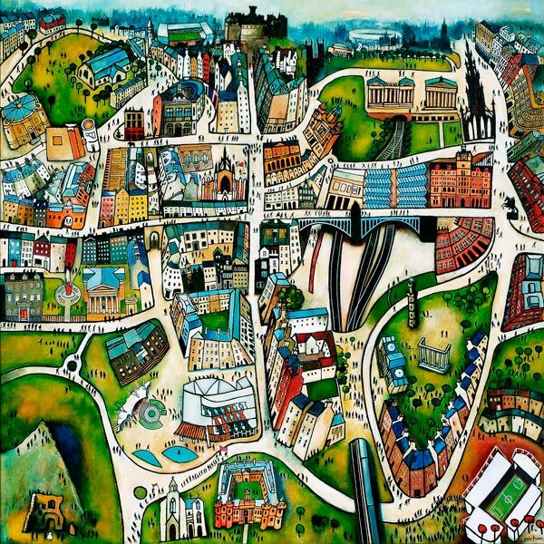
Welcome to Edinburgh features a colorful, whimsical cityscape with winding roads, green parks, historic buildings, crowds of tiny people, and playful, vibrant urban details in an exaggerated style.

A farewell gift for someone leaving Edinburgh has to acknowledge two things at once: the excitement of a new chapter and the value of the place being left behind. Welcome to Edinburgh by Rob Hain does that with warmth. Its busy city composition focuses on buildings, streets, and people, making it a reminder of lived experience rather than a formal record of one monument.

What makes a farewell gift for someone leaving Edinburgh feel personal?

The most useful starting point is not the recipient’s job title or the distance of the move. Think about how they experienced Edinburgh. Perhaps they studied in the city, built a career there, raised a family, made close friends, or returned to the same streets every weekend. A cityscape can hold several of those associations without asking everyone in a group to agree on one private memory.

Welcome to Edinburgh is especially suitable because Rob Hain treats people as the spirit of a city. The figures bring activity and scale to the architecture. That makes the artwork feel connected to ordinary days, shared outings, and familiar journeys rather than only to Edinburgh’s grand public image.

Use four questions to decide whether the print fits

  1. Does Edinburgh matter to their story? The gift works best when the city represents real time and relationships, not just a recent visit.
  2. Will they have a place to display it? A framed print is practical for a new home, office, or study, but the finished scale should match the likely wall.
  3. Do they enjoy lively detail? The busy scene suits someone who likes discovering small figures, buildings, and visual stories over time.
  4. Can the group add context? A card signed with specific memories makes the reason for choosing the image clear.

These questions help distinguish a meaningful leaving present from a last-minute city-branded object. The artwork can stand on its own, while the written message records the relationships behind it.

A group gift that still feels individual

Colleagues, neighbours, or friends often need one present that represents several people. Artwork is useful because contributors do not need to choose clothing sizes, hobbies, or practical equipment for the recipient’s next stage. The city itself becomes the shared reference.

Keep signatures and messages on a separate card rather than writing on the print or mount. This protects the presentation and lets the recipient display the picture in any room. If a longer collection of memories matters, place them in a small book or envelope to accompany the framed piece.

Help the artwork settle into the next home

A detailed city scene can bring energy to a simple interior. In a living room, it can give a quiet wall a strong conversation point. In a home office, it can sit behind or beside the desk as a reminder of the city. In a hallway, it can make the route into a new home feel more personal from the start.

Allow breathing room around the frame, particularly if the new space already has bookshelves, photographs, or patterned textiles. Pick one or two colours from the image to connect with nearby objects rather than trying to match the entire palette. A well-proportioned mount can also give the lively composition a calmer boundary.

Craftsmanship for a gift intended to last

First 4 Frames uses colour-managed Giclée production and completes bespoke framing in-house in Falkirk. That careful process preserves the many small shifts of colour and detail that give the scene its character. It also means the frame can be chosen as part of the gift, with a finish suited to the recipient rather than a generic ready-made presentation.

Rob Hain paints cities, towns, and villages with particular attention to the people who make them lively. Explore his wider work at Rob Hain’s official website, or browse the Rob Hain collection at First 4 Frames.

The right farewell gift for someone leaving Edinburgh should carry recognition without becoming sentimental clutter. View the framed Welcome to Edinburgh print for a colourful reminder of the streets, buildings, and shared city life that can travel into the recipient’s next chapter.

Posted on

Purple Wall Art Feels More Atmospheric With Purple Rain, Scott Monument

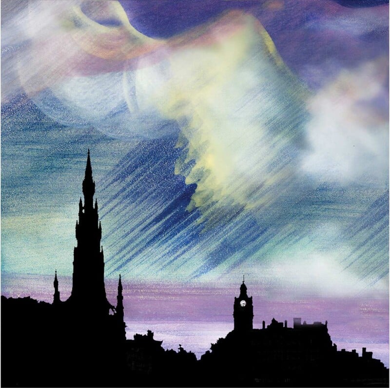
The challenge with purple wall art is making colour feel elegant rather than overpowering. Purple Rain, Scott Monument works especially well because it uses purple through light, weather, and city atmosphere, which gives the room depth without making the palette feel forced.

That is often what helps stronger colour last in a home. The artwork feels expressive, but it still has enough structure to stay easy to live with.

Why Purple Wall Art Works Best With Structure

Purple can be surprisingly versatile when it is anchored by architecture and light. This Edinburgh scene keeps the colour feeling rich and grown-up by pairing it with recognisable form and evening mood.

  • It adds colour without feeling sugary.
  • It gives the wall atmosphere as well as brightness.
  • It helps bolder tones feel more considered in the room.

Where This Piece Can Work Beautifully

Purple Rain, Scott Monument would suit a hallway, sitting room, dining room, or guest bedroom where one framed piece can lift the whole scheme. It works naturally with soft greys, aubergine accents, brushed brass, and warmer neutrals because the image already balances glow with definition.

Why The Framed Finish Makes A Difference

Colour-led city scenes need enough print clarity to keep their light and weather believable. First 4 Frames completes bespoke framing and colour-managed Giclee production in-house, helping the final result feel crisp, warm, and properly finished. You can view the exact framed product here, and browse more from Esther Cohen if you enjoy Edinburgh scenes with the same atmospheric colour.

For anyone comparing purple wall art and wanting something richer and more sophisticated, Purple Rain, Scott Monument is an excellent choice.

Posted on

Pink Wall Art Can Feel Grown-Up, Why Edinburgh In Pink (Open Edition) Works

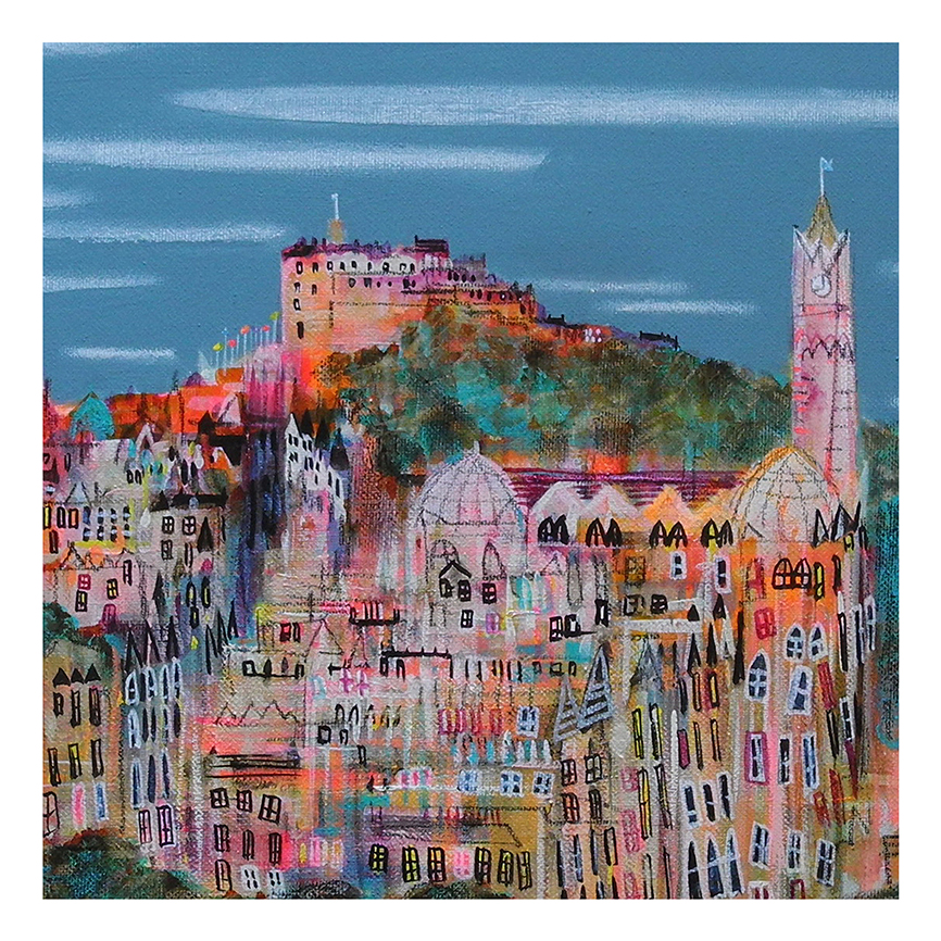
Good pink wall art should bring warmth and lift without tipping a room into something overly sweet. Edinburgh In Pink (Open Edition) works especially well because the colour comes through a recognisable city setting, which makes the overall effect feel grounded and much more grown-up.

That is often what helps a brighter colour palette last. The artwork feels cheerful, but it still has enough structure to sit naturally in a considered interior.

Why Pink Wall Art Works Best With Some Structure

Pink is often at its strongest when it is balanced by architecture, line, and a sense of place. This Edinburgh scene keeps the room feeling lively while still looking composed.

  • It adds warmth without feeling overly delicate.
  • It helps pink feel decorative in a polished way.
  • It suits rooms that need lift as much as colour.

Where This Piece Can Shine

Edinburgh In Pink (Open Edition) would suit a hallway, dressing room, sitting room, or guest bedroom where one brighter framed piece can make the space feel more welcoming. It works especially well with pale neutrals, soft greys, brushed brass, and painted furniture because the image already balances warmth with definition.

Why The Final Finish Matters

Colour-led artwork needs careful print handling so the brighter notes stay clean rather than heavy. First 4 Frames completes bespoke framing and colour-managed Giclee production in-house, helping the finished piece feel assured from the outset. You can view the exact framed product here, and browse more from Nikki Monaghan if you enjoy Scottish city work with the same lively charm.

For anyone searching for pink wall art that feels warm, stylish, and refreshingly grown-up, this piece is a lovely choice.

Posted on

Travel Poster Prints With More Character, Why Advocate’s Close Works

The appeal of travel poster prints is not just about the destination. It is about whether the artwork captures a feeling worth returning to. Advocate’s Close does that beautifully, turning a well-known Edinburgh setting into something more atmospheric and imaginative than a standard city souvenir image.

That gives the room a stronger sense of narrative. Instead of reading as a flat reminder of a place, the print feels like a small world with depth, memory, and movement.

Why This Feels Richer Than Generic Destination Decor

Travel-led artwork becomes more successful when it holds onto local detail while still feeling designed for the home. The layered steps, light, and architectural framing in this piece give it that extra room presence.

  • It carries memory and place without feeling obvious.
  • It gives a wall urban character in a softer, more inviting way.
  • It suits buyers who want destination art with story rather than slogan.

Where A Piece Like This Can Work

Advocate’s Close would sit naturally in a hallway, study, guest room, or stair landing where city imagery can add identity and curiosity. It also pairs well with darker timber, black accents, and painted walls because the composition already carries its own structure and contrast.

That makes it particularly useful where the room needs personality without becoming visually loud.

Why Framing Gives It More Staying Power

A city print with this much detail benefits from a finish that feels properly judged. First 4 Frames handles the framing and colour-managed Giclee printing in-house, helping the final piece look more substantial and more at home in a finished interior.

You can view the exact framed product here, and browse more by Matylda Konecka if you enjoy Scottish city artwork with the same imaginative pull.

If you want travel poster prints that feel more personal and room-ready than generic destination art, Advocate’s Close is a strong choice.