


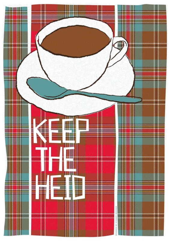
Scottish wall art for a staff break room can make a shared pause feel more welcoming without turning the space into an extension of the office noticeboard. Keep the Heid by Stewart Bremner combines a cup of tea, layered tartan, and a familiar Scots reminder to stay calm. It brings humour and local identity to the room, yet its clear graphic design still feels polished enough for a professional workplace.
What Scottish wall art for a staff break room should do
A break room has a different purpose from reception or a meeting space. It should let people step out of work mode for a few minutes. Artwork can support that change by replacing formal brand language with something warm, recognisable, and human. The aim is character, not another instruction.
Keep the Heid works because the message is conversational. The teacup makes sense in a place used for a quick drink, while the tartan pattern adds colour and Scottish context. The wording offers perspective with a light touch. It can raise a smile after a demanding morning without pretending that a poster can solve workplace pressure.
Keep practical notices away from the focal point
Shared kitchens often collect rotas, cleaning reminders, menus, and safety information. These materials are necessary, but they change regularly and create visual noise. Group them on one clearly defined board. Give the framed print its own wall section above a small table, beside the seating area, or where it can be seen on entering.
| Area | Best use | Helpful principle |
|---|---|---|
| Noticeboard | Changing operational information | Keep it current and contained |
| Refreshment counter | Kettle, cups, and daily supplies | Leave the wall easy to clean |
| Seating wall | Permanent framed artwork | Create one calm visual anchor |
Use the vertical format where floor space is limited
The portrait proportions make the print useful on a narrower wall between a door and a cupboard, or above a compact two-person table. Measure the clear wall rather than the full room. Leave enough margin for the tartan to read as a deliberate block of pattern rather than being squeezed between fittings.
Check the hanging height from a seated position as well as while standing at the counter. The words should be easy to read without the frame sitting directly above heads or chairs. In a busy shared space, secure fixings matter. The artwork should remain safely clear of opening cabinet doors, steam, and regular cleaning activity.
Let the tartan carry the colour
Red, turquoise, cream, and brown already give the design a strong palette. The surrounding room can stay simple. Neutral walls, plain seating, and one small turquoise or warm red detail are enough to connect the piece. Avoid adding several competing slogans or tartan accessories, which can make a workplace feel themed rather than genuinely local.
A restrained frame can sharpen the graphic layout. First 4 Frames produces colour-managed Giclée prints and completes professional framing in-house at its Falkirk workshop. The hand-finished presentation gives the playful subject a durable, display-worthy finish suited to daily use in a business setting.
Scots language with graphic confidence
Stewart Bremner is an Edinburgh-based artist, illustrator, and graphic designer whose work celebrates Scottish language, landscapes, and culture. Learn more on Stewart Bremner’s official website, or browse the Stewart Bremner collection at First 4 Frames.
Well-chosen Scottish wall art for a staff break room should make a shared space feel more personal without becoming distracting. View the framed Keep the Heid print for a clear, good-humoured focal point built around tea, tartan, and a useful Scots phrase.