Posted on

Why Sailor’s Guardian Works So Well as Coastal Landing Wall Art

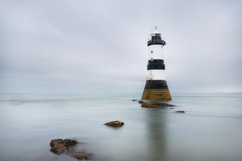
Image of Sailor's Guardian by Noel Fenech Photography

Good coastal landing wall art should do more than fill a passing wall. A landing often sits between rooms and between moments, so the artwork there needs enough presence to hold the space together. Sailor’s Guardian does that especially well, bringing atmosphere, coastal character, and a sense of direction that helps the area feel finished rather than forgotten.

Why coastal landing wall art works best when it gives the space a sense of purpose

Landings and upper hallways can easily become purely practical spaces. They connect the home, but they do not always feel like destinations in their own right. That is why art matters there. The right framed print gives the eye somewhere to settle, adds personality between rooms, and makes the transition through the house feel more intentional.

Sailor’s Guardian is especially effective for that job. Its coastal mood feels open and reflective, but the composition still has enough strength to anchor a narrower wall. It can suit a stair landing, upstairs hallway, or quiet turn in the house where you want atmosphere without clutter.

What makes Sailor’s Guardian a strong coastal landing wall art choice

  1. It gives a transitional space a clearer focal point and stronger identity.
  2. It adds coastal atmosphere without falling into obvious seaside styling.
  3. It feels calm enough for everyday living while still carrying real visual presence.

First 4 Frames presents each piece with bespoke framing, colour-managed Giclee printing, and hand-finished craftsmanship completed in-house in Falkirk. That quality-led finish helps a smaller transitional wall feel considered, because the print is not just there to occupy space. It becomes part of how the home flows and feels.

You can browse more work by Noel Fenech Photography, discover more about the photographer at Noel Fenech Photography, and view the exact framed print here.

If you are looking for coastal landing wall art with atmosphere, direction, and lasting display value, Sailor’s Guardian is well worth considering.

Posted on

Premium Wall Art Feels More Contemporary With Zebra Glass

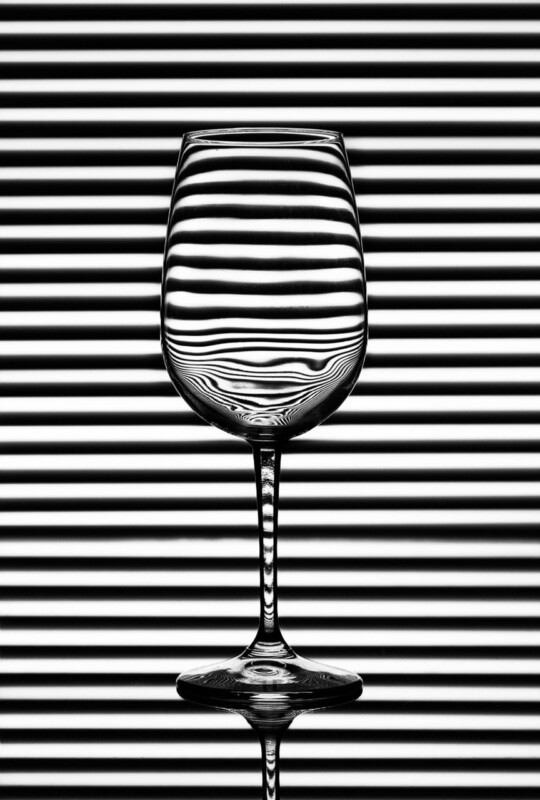
The phrase premium wall art often gets reduced to size or price, but the better examples usually succeed through judgement. Zebra Glass shows that clearly. It brings a more contemporary edge through composition and clarity, while the finished framing gives it the weight needed to feel genuinely substantial on the wall.

Why Zebra Glass works as premium wall art

Zebra Glass has a cleaner, design-aware feel than many more conventional decorative pieces. That matters in modern rooms where the artwork needs to look intentional, not just expensive. The image feels precise and distinctive, but the framed finish stops it from becoming cold or too slight.

  • It gives a modern room a stronger focal point without clutter.
  • It shows how premium wall art can be crisp and contemporary rather than ornate.
  • It suits interiors where finish and composition matter as much as subject.

This kind of piece can work especially well in hallways, dining rooms, offices, or cleaner living spaces with sharper furniture lines and more restrained colour palettes. The final frame helps the work feel integrated into the room rather than floating as a loose image.

Because First 4 Frames completes the framing in-house, the result carries the kind of craftsmanship that helps premium wall art live up to the label. The piece feels polished, resolved, and properly display-ready rather than simply fashionable for the moment.

For wider context on the photographic discipline behind strong image-led interiors, the Royal Photographic Society is a relevant source. You can also browse more work by Noel Fenech Photography and see the exact framed product here.

If you are comparing premium wall art, Zebra Glass is a compelling option for a room that needs modern presence, visual clarity, and a more refined framed finish.

Posted on

Premium Framed Artwork Feels More Immersive With Whispering Woods

When people search for premium framed artwork, they are usually looking for more than a nice image. They want a finished piece that holds onto atmosphere and detail once it is framed and placed in the room. Whispering Woods is an excellent example because the woodland depth only really convinces when the final presentation is handled properly.

Why Whispering Woods shows the value of premium framed artwork

Whispering Woods depends on subtle transitions, layering, and a sense of visual depth. That is exactly where premium framed artwork earns its place. If the print quality is weak or the finish feels generic, the mood can flatten very quickly. When it is handled well, the image keeps its immersive character and feels much more transportive on the wall.

  • It rewards careful print quality and tonal control.
  • It suits rooms that need atmosphere rather than louder statement colour.
  • It shows why framing quality is part of the image experience, not just the border around it.

This kind of photographic piece works especially well in bedrooms, calmer sitting rooms, reading spaces, or boutique commercial interiors where texture and mood matter. The right frame gives the composition structure while still letting the woodland softness do its work.

At First 4 Frames, the in-house print and bespoke framing process helps preserve that depth with colour-managed output and a more considered finish. That is why premium framed artwork feels different in practice, especially when the source image relies on restraint rather than obvious drama.

For broader inspiration around the landscapes and woodland character that make such images so appealing, Forestry and Land Scotland is a relevant resource. You can also browse more work by Noel Fenech Photography and view the exact framed product here.

If you are assessing premium framed artwork, Whispering Woods is a strong reminder that photographic atmosphere depends just as much on the finish as on the file itself.

Posted on

How Where Ghosts Wander Softens a Room with Exposed Ceiling Beams

The best wall art for exposed ceiling beams should balance a room rather than compete with it. In spaces with visible timber overhead, the architecture already carries strong lines and texture. Where Ghosts Wander works especially well because it brings depth and atmosphere while softening the harder structure around it.

Why wall art for exposed ceiling beams needs softness and depth

Exposed beams can give a room wonderful age, rhythm, and presence, but they also make the upper part of the space feel visually firm. That often means the artwork below needs to introduce some ease. The strongest choice brings atmosphere, movement, or tonal variation so the room feels layered instead of slightly top heavy.

Where Ghosts Wander does that beautifully. Its woodland subject feels immersive and calm, and the tree forms echo natural structure without repeating the straight geometry of the beams themselves. That makes it a strong fit for living rooms, garden rooms, studies, and bedrooms where you want a period or cottage interior to feel settled rather than busy.

How Where Ghosts Wander helps wall art for exposed ceiling beams feel more resolved

  1. It softens stronger joinery with organic shapes and tonal depth.
  2. It adds atmosphere without making a characterful room feel darker or heavier.
  3. It suits homes where texture and craftsmanship matter more than trend-led styling.

First 4 Frames completes every piece in-house in Falkirk with bespoke framing, colour-managed Giclee printing, and hand-finished craftsmanship. That superior finish matters in older or more characterful rooms because the artwork needs enough quality to sit confidently beside natural timber, stone, or traditional joinery.

You can browse more by Noel Fenech Photography, read the Woodland Trust guide to ancient woodland, and view the exact framed print here.

If you are looking for wall art for exposed ceiling beams with mood, softness, and lasting presence, Where Ghosts Wander is a very strong option.

Posted on

Why Whispering Woods Works Beautifully as Wall Art for Olive Walls

The best wall art for olive walls should work with the richness already in the room rather than fight it. Olive paint can feel warm, grounded, and stylish, but it also needs artwork that keeps the scheme from becoming too shaded or visually heavy. Whispering Woods does that particularly well, bringing woodland light, natural depth, and a softer sense of movement that helps a green room feel more open.

Why wall art for olive walls needs light as well as depth

Olive walls already bring character, so the question is not whether the room needs personality. The question is how to stop that richer colour from making the space feel slightly enclosed. A well-chosen framed print can introduce lift, atmosphere, and a more natural sense of balance without losing the warmth that made olive appealing in the first place.

Whispering Woods is especially effective here because the woodland setting carries enough tonal depth to belong with olive, while the lighter areas keep the room from closing in on itself. It suits sitting rooms, studies, hallways, bedrooms, and quieter corners where a green scheme needs a focal point that feels thoughtful rather than forced.

Why Whispering Woods feels so natural as wall art for olive walls

  • It complements a deeper green palette without blending away into it.
  • It introduces natural light and visual rhythm that help the room feel more breathable.
  • It keeps an earthy scheme refined, calm, and easy to live with every day.

First 4 Frames completes each piece in-house in Falkirk with bespoke framing, colour-managed Giclee printing, and hand-finished craftsmanship. That superior finish matters in a richer room, where the quality of the print and frame has to stand up to stronger wall colour rather than disappear against it.

You can learn more about the photographer at Noel Fenech, browse more work by Noel Fenech Photography, and view the exact framed print here.

If you are comparing wall art for olive walls and want something atmospheric, balanced, and naturally polished, Whispering Woods is well worth considering.

Posted on

Why First Morning Rays Works Beautifully as Wall Art for a Room With Linen Curtains

The best wall art for a room with linen curtains should support the softness already in the room while still giving the eye a clear place to settle. Linen curtains create a calm, relaxed mood, but they can also leave a scheme feeling a touch too light if the artwork does not bring enough structure. First Morning Rays works especially well because its sunrise light and woodland depth add warmth without disturbing that gentler atmosphere.

Why wall art for a room with linen curtains needs warmth as well as calm

Rooms with linen window dressings often feel airy, natural, and easy to live with from the start. The challenge is making sure they do not drift into looking visually thin, especially if the walls, upholstery, and flooring are also fairly soft in tone. One well-judged framed print can hold the room together while keeping the look relaxed.

First Morning Rays does that naturally. The early woodland light brings a sense of morning warmth, while the longer shadows and tree forms add just enough definition to give the room more shape. It suits bedrooms, quieter sitting rooms, reading corners, and garden-facing spaces where texture matters as much as colour.

Why First Morning Rays feels so well judged in a softer scheme

  • It adds warmth without making a calm room feel heavier.
  • It gives linen-rich interiors a focal point that still feels natural and unforced.
  • It helps a paler scheme feel layered rather than slightly washed out.

First 4 Frames completes each piece in-house in Falkirk with bespoke framing, colour-managed Giclee printing, and hand-finished craftsmanship. That superior finish matters in quieter interiors, where the details of presentation tend to stand out more clearly.

You can learn more about the photographer at Noel Fenech, browse more work by Noel Fenech Photography, and view the exact framed print here.

If you are comparing wall art for a room with linen curtains and want something warm, balanced, and easy to live with, First Morning Rays is a very strong option.

Posted on

Moody Nature Wall Art Feels More Layered With Drift in Fall

The strongest moody nature wall art does not simply make a room darker. It gives the space depth, texture, and a quieter kind of focus. Drift in Fall works well because the autumn tones feel atmospheric without becoming oppressive.

Why moody nature wall art suits calmer rooms

Reading rooms, snugs, and quieter corners often benefit from artwork that slows the eye a little. A nature-led image with darker tones can do that beautifully when it still keeps enough detail and breathing space. Drift in Fall manages that balance well, which is why it feels thoughtful rather than simply sombre.

  • It adds texture to neutral walls and timber furniture.
  • It suits rooms lit more for atmosphere than glare.
  • It creates calm depth without demanding constant attention.

Why Drift in Fall feels atmospheric rather than gloomy

The photograph already has strong pacing and tonal contrast, so the presentation matters. First 4 Frames completes the print and framing in-house with bespoke care and colour-managed Giclee production, helping the final piece feel clean, polished, and properly resolved on the wall.

For more on woodland settings and autumn atmosphere, Forestry and Land Scotland is useful. You can also browse more work by Noel Fenech Photography and view the exact framed product here.

If you want moody nature wall art that feels layered, restful, and refined, Drift in Fall is a very appealing choice.

Posted on

Why Out of Reach Works Beautifully as Wall Art for a Room With Exposed Brick

The right wall art for a room with exposed brick should bring some softness into the room without fighting against the texture already on show. Brick walls have presence, pattern, and natural warmth, so the artwork needs to complement that character rather than add more visual hardness. Out of Reach works especially well because its woodland atmosphere brings a calmer, lighter counterpoint that still feels grounded.

Why wall art for a room with exposed brick needs softness as well as character

Exposed brick can make a room feel rich, tactile, and full of history, but it can also leave the space looking visually firm if every other element is equally bold. Artwork is one of the easiest ways to introduce balance. A more atmospheric image can soften the harder edges of the wall and help the room feel finished rather than slightly stark.

Out of Reach does that naturally. The autumn woodland scene brings colour variation, organic shape, and a sense of depth that sits beautifully against brick. It can work in a dining space, hallway, garden room, or relaxed sitting area where you want texture to remain part of the design without dominating it.

What makes Out of Reach such a balanced choice

  • It introduces softer natural forms against a stronger architectural surface.
  • Its colour and atmosphere help a textured wall feel warmer rather than harsher.
  • It gives the room a calm focal point without flattening the character of the brick.

At First 4 Frames, each piece is presented with bespoke framing and colour-managed Giclee printing completed in-house in Falkirk. That hand-finished quality matters in more tactile interiors, where the final presentation needs to feel every bit as considered as the room around it.

You can discover more about the photographer at Noel Fenech Photography, browse more work by Noel Fenech Photography, and view the exact framed print here.

If you are comparing wall art for a room with exposed brick and want something atmospheric, grounded, and easy to live with, Out of Reach is a very strong option.

Posted on

Why Once Upon a Time Works Beautifully as Wall Art for Built-In Bookshelves

Good wall art for built-in bookshelves should do more than fill the gap between shelves. Built-in bookshelves already give a room structure, weight, and personality, but they can also make the wall feel visually broken up if the central artwork is too slight. Once Upon a Time works especially well because it gives the eye one calm focal point that holds the whole arrangement together.

Why wall art for built-in bookshelves needs real presence

Joinery brings rhythm and storage, but it also introduces many vertical and horizontal lines. The artwork in the middle needs enough atmosphere to soften that framework without fighting it. One well-chosen framed print can stop the room feeling segmented and help the shelving, books, and decorative objects read as part of one coherent space.

  • It suits reading rooms, lounges, home libraries, and sitting areas with alcove shelving.
  • It helps busier book-lined walls feel calmer and more intentional.
  • It gives stronger joinery a focal point that feels decorative rather than merely practical.

Why Once Upon a Time works so naturally in a book-lined room

The piece has enough mood to stand up to darker shelving and stacked books, yet it still feels open rather than heavy. That balance matters in a room where the eye is already taking in many details. Instead of adding more visual noise, it gives the space somewhere to settle.

First 4 Frames completes every piece in-house in Falkirk using bespoke framing, colour-managed Giclee printing, and hand-finished craftsmanship. That superior finish is especially useful in a room built around books, paper, and texture, where weaker presentation can look flat very quickly.

If you would like to see more of Noel Fenech’s photography, you can visit his official website. You can also explore more work by Noel Fenech Photography and view the exact framed product here.

If you are looking for wall art for built-in bookshelves that helps shelving feel calmer, richer, and more fully resolved, Once Upon a Time is a very strong option.

Posted on

Upload and Frame Your Own Artwork? Sailor’s Guardian Shows What to Look For

If you are planning to upload and frame your own artwork, the image itself still has to do a lot of the work. A finished framed piece usually feels strongest when the source picture already has good balance, a clear focal point, and enough tonal depth to hold up once printed. Sailor’s Guardian is a useful example of exactly that.

Why upload and frame your own artwork works best with a clearly structured image

Sailor’s Guardian shows why structure matters. The lighthouse gives the eye an anchor, the water adds space, and the light creates enough tonal variation for the finished print to feel deliberate rather than flat. When customers upload their own image, those are exactly the qualities worth looking for before they even think about frame style.

That is also why framing decisions matter. A cleaner or deeper frame can support the image differently, but only when the original composition is strong enough to benefit from that finish.

Why Sailor’s Guardian is a good benchmark for framed image quality

First 4 Frames handles the work in-house in Falkirk with bespoke framing, colour-managed Giclee printing, and superior craftsmanship. That approach is useful whether you are choosing this finished product or thinking about how your own uploaded image should translate into a fully framed piece.

For more on lighthouse subjects and their visual appeal, Trinity House lighthouse guide is worth browsing. You can also explore more work by Noel Fenech Photography and view the exact framed product here.

If you are considering upload and frame your own artwork, Sailor’s Guardian is a helpful reminder that image quality, composition, and final presentation all need to work together.