Posted on

Art Gifts Feel More Lasting With Papillon

Image of Papillon by Noel Fenech Photography

The best art gifts give someone more than a quick reaction on the day. They give them something to keep enjoying. Papillon does that beautifully because the photograph feels detailed, calm, and quietly striking without becoming overly decorative or difficult to place.

Why art gifts work best when they keep rewarding attention

A good art gift should not feel like filler. It should feel chosen for the person and for the space they live in. Papillon works well because the butterfly detail gives the image elegance and focus, while the restrained presentation keeps it easy to live with in a bedroom, hallway, or reading corner.

  • It feels personal without becoming sentimental.
  • It suits quieter interiors as well as more decorative ones.
  • It offers enough detail to stay interesting over time.

Why Papillon feels generous once framed

First 4 Frames completes the piece in-house in Falkirk using bespoke framing, colour-managed Giclee printing, and hand-finished craftsmanship. That superior finish helps the gift feel complete from the moment it arrives, which is exactly what most buyers want from a present that should last.

If you enjoy butterfly subjects more broadly, Butterfly Conservation is a useful resource. You can also browse more work by Noel Fenech Photography and view the exact framed product here.

If you are choosing between different art gifts and want something elegant, display-worthy, and genuinely lasting, Papillon stands out well.

Posted on

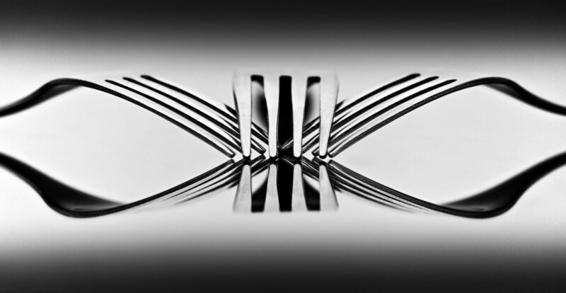
Trippy Shows Why Framed vs Canvas Art Is Not a Small Decision

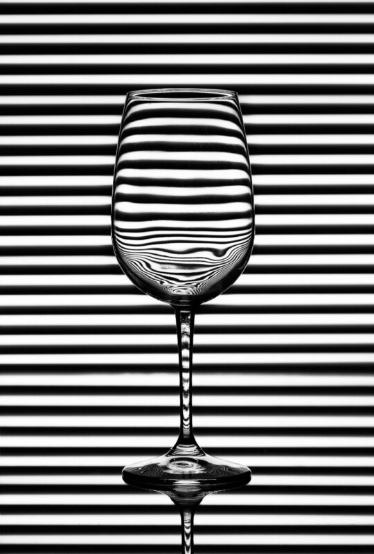
The question of framed vs canvas art often sounds like a simple matter of taste, but some images make the practical difference very obvious. Trippy is one of them. The whole photograph relies on line clarity, distortion, and a precisely controlled visual effect, so the final presentation needs to keep those edges crisp rather than softening them.

Why framed vs canvas art matters more with graphic photography

Canvas can work beautifully for some looser, painterly subjects, but a more graphic image usually depends on definition. Trippy is built around contrast and visual tension. The glass, the warped pattern, and the tight composition all need the image to feel clean at the edges. That is one reason a framed finish can feel more convincing and more complete here.

It also changes how the piece sits in a room. Framing gives the work a neater boundary, which helps it feel intentional in a study, dining area, or more contemporary living space where strong lines already matter.

Why Trippy benefits from sharper presentation

First 4 Frames produces the piece in-house with bespoke framing, colour-managed Giclee printing, and superior craftsmanship. That kind of finish suits a photograph like this because the presentation needs to support precision instead of relaxing it. The result feels cleaner, more architectural, and more display-ready.

For more on the visual tradition behind this kind of image, Tate on Op Art is worth reading. You can also browse more work by Noel Fenech Photography and view the exact framed product here.

If you are weighing up framed vs canvas art and want a piece that stays crisp, clever, and visually controlled, Trippy makes the framed case very well.

Posted on

Why Where Ghosts Wander Makes the Case for Conservation Framed Art

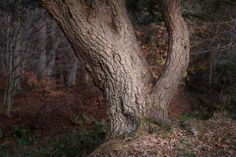
Good conservation framed art is not only about keeping a print safe. It is also about preserving the quieter qualities that made you want the image in the first place. Where Ghosts Wander shows that especially well because the photograph depends on bark texture, woodland atmosphere, and a restrained palette that can easily lose impact if the final presentation feels careless.

Why conservation framed art suits quieter photography

Some images work through bold colour or obvious drama. Others work through surface, tone, and a slower kind of attention. Where Ghosts Wander belongs firmly in the second group. The split trunks, leaf cover, and muted woodland light ask the viewer to look properly, which means the frame and print finish need to support that mood rather than compete with it.

  • It rewards closer viewing because the texture does much of the work.
  • It suits rooms that need calm depth rather than loud contrast.
  • It benefits from careful framing that keeps the whole piece settled.

Why Where Ghosts Wander benefits from a more careful finish

First 4 Frames completes each piece in-house in Falkirk using bespoke framing, colour-managed Giclee printing, and hand-finished craftsmanship. That matters here because conservation-minded presentation helps the image keep its balance, depth, and natural softness over the long term rather than feeling like a quick decorative print.

If you are interested in woodland landscapes more broadly, Forestry and Land Scotland is a useful starting point. You can also browse more work by Noel Fenech Photography and view the exact framed product here.

If you want conservation framed art that feels calm, textural, and properly protected by the final presentation, Where Ghosts Wander is a very persuasive choice.

Posted on

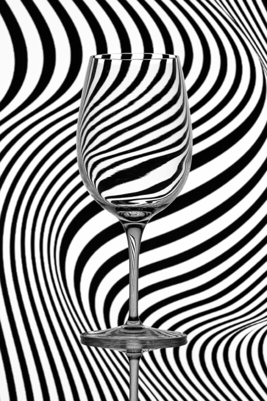
Why Zebra Glass Works Brilliantly as Home Cocktail Bar Wall Art

Good home cocktail bar wall art should add atmosphere without slipping into obvious drinks branding or novelty signage. Zebra Glass does that beautifully. It brings precision, wit, and a sharper visual rhythm that suits an entertaining space where the details matter.

A cocktail corner or home bar often looks best when it feels considered rather than over themed. That is why this photograph works so well. The bold black and white pattern, the distorted reflections through the glass, and the clean composition all give the room a more design-led feel. It has energy, but it still looks composed.

Why home cocktail bar wall art needs restraint

In smaller entertaining spaces, artwork has to do more than fill a gap above a bar cart or sideboard. It should support the mood of the room. Zebra Glass feels stylish and conversational, which makes it particularly useful in spaces with glassware, darker painted walls, metal accents, or a more contemporary finish.

  • It gives a home bar a more polished focal point.
  • It suits monochrome, brass, smoked glass, and darker timber finishes.
  • It feels more individual than predictable bottle or slogan artwork.

Craftsmanship and photography that hold attention

First 4 Frames completes each piece in-house in Falkirk using colour-managed Giclée printing and hand-finished bespoke framing. That superior finish matters in a home cocktail space, because reflective surfaces and stronger contrasts tend to show up weak printing quickly. A crisp, well-made presentation helps the artwork feel intentional from every angle.

This artwork is by Noel Fenech Photography. You can see more about the artist on Noel Fenech’s website, and view the exact framed product here.

If you want home cocktail bar wall art that feels contemporary, smart, and genuinely display worthy, Zebra Glass is a very strong choice.

Posted on

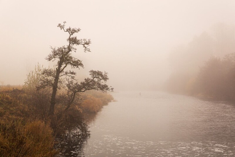
Why Drift in Fall Works Beautifully as Autumn Reading Room Wall Art

The best autumn reading room wall art should make a quieter space feel more settled as soon as you step into it. A reading room does not need loud colour or a busy focal point. It needs atmosphere, softness, and enough depth to encourage people to slow down. Drift in Fall works especially well because it brings woodland warmth and gentle detail without making the room feel heavy.

What autumn reading room wall art needs to do well

Reading rooms and book corners often rely on texture, calmer colours, and a sense of enclosure. That makes them ideal for autumnal artwork, but only if the image supports the mood without turning the room gloomy. The strongest pieces add seasonal warmth while still feeling refined enough to live with all year.

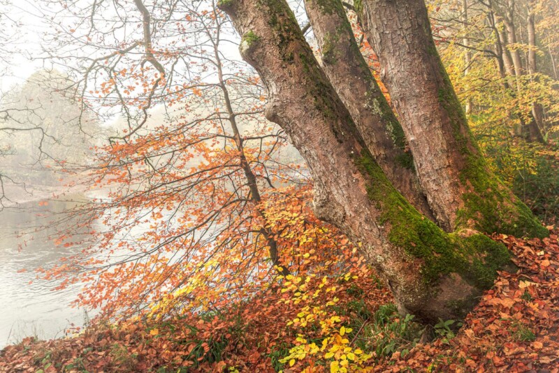
Drift in Fall handles that balance beautifully. The mossy tree forms, soft river edge, and muted autumn tones give the image a grounded, reflective quality. It feels seasonal in the best sense, offering atmosphere and character, while still staying calm and easy on the eye.

Why woodland photography suits a quieter room

  1. Natural textures echo the layered feel of books, throws, and upholstered seating.
  2. Gentler colour shifts help the room stay restful rather than visually busy.
  3. Fine art photography adds detail and depth that reward slower looking.

First 4 Frames presents each piece with bespoke framing and superior quality print finishing completed in-house in Falkirk. That hand-finished approach matters in a more intimate room, where materials, tone, and presentation are often noticed at closer range.

You can explore more from Noel Fenech Photography, visit Noel Fenech’s official site, and see the exact framed print here.

If you are looking for autumn reading room wall art that gives a reading space warmth, quiet atmosphere, and a more polished sense of finish, Drift in Fall is an excellent option.

Posted on

Custom Framing for Photographers Feels More Useful With Out of Reach

Strong custom framing for photographers is not only about protecting a print. It is about helping the image land properly on the wall. Out of Reach is a very good example because the photograph depends on upward movement, autumn colour, and a sense of lift that can be sharpened or dulled by the framing choices around it.

Why custom framing for photographers changes the feel of the image

Photography often carries a particular pacing. In this case, the eye moves upward through branches and colour into open sky. The wrong frame can make that movement feel cramped or too abrupt. A well-judged frame helps the composition breathe and gives the photograph the authority it needs in the room.

That matters whether the artwork is going into a hallway, home office, reading corner, or living space with natural materials and calmer colours. The final presentation should support the image, not interrupt it.

Why Out of Reach is such a useful example

Out of Reach already has beautiful seasonal colour and a clear point of view, so it responds especially well to bespoke presentation. First 4 Frames completes the work in-house in Falkirk with colour-managed fine art printing and hand-finished framing, helping the piece feel more resolved, more valuable, and easier to place with confidence.

For wider inspiration around woodland atmosphere and colour, the Woodland Trust is worth a look. You can also explore more work by Noel Fenech Photography and see the exact framed product here.

If you are considering custom framing for photographers, Out of Reach shows why the finish around a photograph is part of the experience, not an afterthought.

Posted on

Why Museum Framing Matters More With Greenan Castle

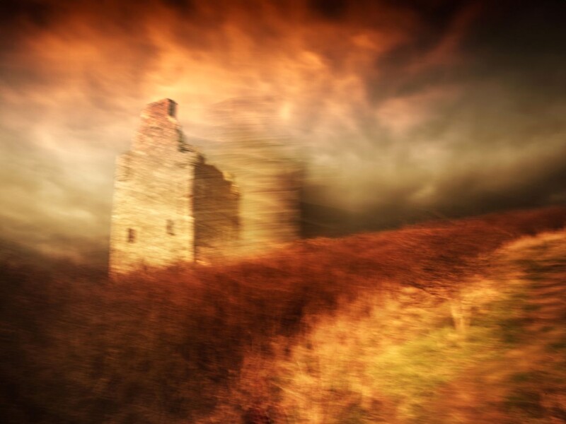
The appeal of good museum framing is not only protection. It is also about presentation. Greenan Castle is a strong example because the image already has drama, scale, and a strong sense of place. The way it is framed determines whether that drama feels elegant or simply heavy.

Why museum framing helps a dramatic image breathe

Powerful subjects need enough visual space around them to feel deliberate. With a piece like Greenan Castle, careful framing can stop the image from crowding the room, while still giving it the weight it deserves. That balance is especially useful in studies, sitting rooms, hallways, or offices where the artwork needs to feel confident rather than overpowering.

  • It helps the print feel more collected and less simply mounted.
  • It gives the image clearer authority on the wall.
  • It supports a more timeless result for subjects with heritage and atmosphere.

Why Greenan Castle suits that more formal approach

The subject already carries history, coastline, and weather, so it benefits from a presentation that feels equally measured. First 4 Frames completes the work in-house with bespoke framing and colour-managed fine art printing, helping the finished piece feel polished, spacious, and properly integrated into the room.

For more on the site itself, VisitScotland on Greenan Castle is a useful resource. You can also browse more work by Noel Fenech Photography and view the exact framed product here.

If you are exploring museum framing and want a print that benefits from careful visual discipline, Greenan Castle makes a persuasive case.

Posted on

Premium Framed Artwork Feels More Convincing With Silent Morning

People searching for premium framed artwork are usually looking for more than decoration. They want a piece that feels settled, substantial, and rewarding to live with. Silent Morning is a very good example because its quiet atmosphere depends on subtle shifts of light rather than on obvious impact alone.

Why premium framed artwork matters with quieter images

When a print relies on mist, morning light, and softer tonal transitions, average finishing quickly shows. The image can lose depth or feel flatter than it should. That is why Silent Morning benefits from a higher standard of print and presentation. The mood is part of the artwork, so the framed result needs to protect it.

This kind of piece works particularly well in a bedroom, reading corner, study, or quieter sitting room where you want calm presence rather than a louder statement. It has enough character to shape the wall, but it still leaves the room feeling restful.

Why Silent Morning rewards a more careful finish

First 4 Frames handles the framing and colour-managed Giclee printing in-house in Falkirk. That matters here because the print needs clarity without harshness and softness without muddiness. The final piece feels bespoke, hand-finished, and genuinely room-ready.

For broader inspiration around the kind of landscape calm many buyers enjoy, the Scottish Wildlife Trust is a useful reference. You can also explore more work by Noel Fenech Photography and see the exact framed product here.

If you are weighing up premium framed artwork, Silent Morning is a strong reminder that quieter art often benefits most from superior quality.

Posted on

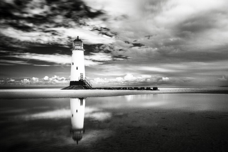
Why The Final Beacon Works So Well as Black and White Framed Prints

The best black and white framed prints do more than strip colour away. They create a clearer sense of structure, contrast, and mood. The Final Beacon is a particularly strong example because the lighthouse subject feels crisp and architectural, while the wider scene still carries atmosphere and movement.

Why black and white framed prints often feel more composed

Monochrome artwork can be a very practical choice when a room already has plenty of texture, pattern, or mixed materials. Instead of competing for attention, it brings direction. That is one reason The Final Beacon works so well in a hallway, home office, sitting room, or stair wall where the room wants focus rather than more colour.

  • It gives the eye a strong focal point without visual clutter.
  • It sits easily with timber, stone, metal, and neutral upholstery.
  • It feels atmospheric rather than flat because the subject has depth and weather in it.

Why The Final Beacon feels easier to live with than many monochrome pieces

Some black and white work can feel severe if the image only offers contrast. The Final Beacon avoids that because the composition still carries reflection, sky, and distance. First 4 Frames completes the piece in-house with bespoke framing and colour-managed fine art printing, so the final result feels polished and substantial rather than merely graphic.

For wider background on lighthouse heritage, the Northern Lighthouse Board is useful. You can also explore more work by Noel Fenech Photography and view the exact framed product here.

If you want black and white framed prints that feel calm, dramatic, and well finished, The Final Beacon is an excellent option.

Posted on

Archival Ink Prints Feel More Worthwhile With Formal Glory

People looking for archival ink prints are often trying to avoid a print that feels good only on the day it arrives. They want something that will continue to look refined, stable, and worthwhile on the wall. Formal Glory is an excellent example of why that matters.

Why archival ink prints are about more than longevity alone

Longevity matters, of course, but so does how the print looks in the present. The richer and more controlled the tonal range, the more composed the artwork feels. That is especially important with photography-led pieces, where weak output can quickly flatten the entire image.

Formal Glory benefits from that better standard because the finished print needs depth and clarity rather than a merely serviceable reproduction. When printing and framing are handled properly, the artwork feels more substantial and better suited to a considered interior.

Why First 4 Frames makes this easier to trust

Everything is completed in-house in Falkirk, from colour-managed printing through to the hand-finished framed result. That means the final piece is built around craftsmanship, not a mass-market compromise. The difference shows most clearly in artwork that depends on control and polish.

For wider professional context around fine art print standards, Fine Art Trade Guild is a useful reference. You can also explore more work by Noel Fenech Photography and view the exact framed product here.

If you are comparing archival ink prints, Formal Glory is the kind of piece that shows why better materials and better finishing are worth it.