


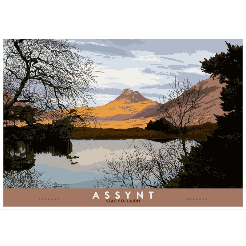
Scottish mountain art for a mid-century room can connect clean-lined furniture to a real landscape without making the home feel like a themed period display. Assynt: Stac Pollaidh by Stewart Bremner reduces mountain, water, trees and cloud to clear graphic shapes. Warm ochre light on Stac Pollaidh contrasts with the darker foreground and pale reflected sky. The composition feels structured, but the view still has space and atmosphere.
What Scottish mountain art for a mid-century room should contribute
Mid-century-influenced rooms often rely on clear silhouettes, useful proportions and a limited material palette. Artwork can support that order, but it should also stop the room from becoming too controlled. This print does both. Its travel-poster character relates to graphic design, while the branches and reflected shoreline introduce finer natural detail.
The mountain provides a single readable focal point from across the room. Closer up, the layered cloud, bare trees and dark woodland hold attention. That change in scale makes the picture suitable for everyday living rather than a purely decorative reference to one design era.
Start with shape rather than trying to match a decade
Look at the furniture already in the room. A low sideboard, tapered legs and a simple lounge chair create strong horizontal and diagonal lines. The artwork’s broad waterline can settle above those pieces, while the sloping mountain introduces a less rigid counterpoint. This relationship matters more than finding accessories that look historically exact.
- Above a sideboard: keep the print centred and leave the surface below relatively clear.
- Near a lounge chair: allow the mountain to remain visible above the chair back.
- Between tall storage: check that dark trees do not merge into the furniture on both sides.
- On an open wall: use a paper template to judge whether the framed size has enough presence.
The product is available in two substantial landscape print sizes. Include the frame and any mount when testing dimensions. A presentation that is too small can look like a poster sample, while one that crowds the furniture loses the quiet space that makes the landscape effective.
Borrow the palette in measured amounts
The ochre mountain and muted brown title band work naturally with walnut, teak and other warm timbers. Pale blue-grey sky can connect with upholstery or painted walls, while the black-green foreground adds definition. Use those relationships selectively. Repeating every shade would make the room feel overly coordinated.
| Existing room feature | Connection in the artwork | Useful restraint |
|---|---|---|
| Walnut or teak furniture | Ochre mountain and muted brown border | Avoid adding several more orange accessories |
| Blue-grey upholstery | Layered sky and water reflection | Keep the wall warmer than a cold pure grey |
| Black metal legs | Dark woodland and branch silhouettes | Do not choose an unnecessarily heavy frame |
| Cream or oatmeal textile | Pale open areas in the sky | Let texture supply interest instead of pattern |
Let the poster influence stop at the artwork
The title panel and simplified colour give the piece a confident travel-poster quality. That does not mean the rest of the room needs vintage signs, old suitcases or multiple destination prints. One graphic landscape is often enough. Contemporary ceramics, books and natural textiles can sit beside it without reinforcing a theme.
This restraint also keeps the sense of place genuine. Stac Pollaidh is not a generic mountain silhouette. Its distinctive ridge, Assynt setting and reflection carry the subject. Giving the print clear wall space lets those features remain more important than any retro reference.
Choose a frame that links old and new
A dark narrow moulding can echo the foreground and sharpen the graphic edge. A warm timber can create a softer link to furniture. Avoid choosing solely from an online swatch if the room contains several wood tones. Viewing samples beside a photograph or finish reference helps prevent an accidental near-match.
First 4 Frames completes colour-managed Giclée production and bespoke framing in-house at its Falkirk workshop. The careful finish preserves the separation between ochre hillside, dark trees, pale cloud and reflected water. It also gives the print the substantial, ready-to-hang presence needed above low furniture.
Keep Assynt at the centre of the story
Stewart Bremner is an Edinburgh-based artist, illustrator and graphic designer. His Scottish landscapes use bold shapes and a contemporary interpretation of twentieth-century travel art. See more at Stewart Bremner’s official website, or browse the Stewart Bremner collection at First 4 Frames.
Thoughtful Scottish mountain art for a mid-century room can support a room’s clean lines while bringing in wild landscape, reflection and a specific Scottish place. View the framed Assynt: Stac Pollaidh print for a structured focal point that feels graphic without losing its natural atmosphere.