


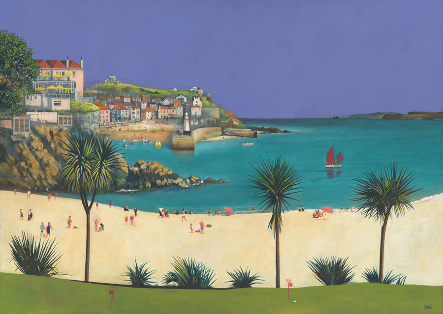
colourful wall art for a glass kitchen extension needs enough presence to hold its own beside broad views and changing daylight. In a heavily glazed room, the few solid walls matter more, not less. Sun, Sea and St Ives by Rob Hain can give one of those walls a clear purpose. Its busy beach, turquoise water, boats, palms, and clustered buildings bring human energy to a space that can otherwise feel architecturally impressive but visually unfinished.
Give a glazed room an indoor point of focus
Glass extensions naturally direct attention outside. That is part of their appeal, but it can leave the interior without a visual stopping point, especially after dark. A lively framed image offers somewhere for the eye to rest when the garden becomes reflective glass. It also makes the room feel furnished rather than simply added to the house.
Sun, Sea and St Ives works because it contains movement at several scales. People animate the foreground, boats carry the eye across the water, and the town forms a substantial backdrop. The result feels sociable and expansive, qualities that suit a kitchen-dining extension used for family meals and informal gatherings.
Where colourful wall art for a glass kitchen extension works best
| Possible wall | Why it works | What to check |
|---|---|---|
| Above a dining bench | Creates a destination at the social end of the room | Allow comfortable head clearance |
| On the original house wall | Connects the extension back to the older interior | Keep clear of doors and switches |
| Beside tall kitchen units | Softens a large block of cabinetry | Leave breathing space around the frame |
| On a short return wall | Adds colour without competing with the main view | Check the picture in strong side light |
Avoid a position directly over a hob, sink, or regular source of steam. Also watch how sunlight travels across the room through the seasons. A wall that seems shaded in September may receive strong direct light at another time of year. Thoughtful placement protects the artwork and reduces distracting glare.
Borrow colour without creating a seaside theme
The artwork can introduce blue-green, sandy, and warm architectural tones without dictating every finish. Repeat one or two notes in small ways: a ceramic bowl, seat fabric, or planter may be enough. Keeping those echoes limited lets the picture remain the focal point and avoids a coordinated holiday-home look.
Natural timber is an especially useful bridge between the print and a garden view. It can appear in the dining table, shelving, or frame. Dark metal offers a sharper alternative when the glazing bars, lights, or door frames are black. The best moulding should connect to the permanent finishes rather than to a temporary accessory colour.
Judge scale against the furniture, not the glass
A glass wall can make any picture seem small if it becomes the reference point. Instead, relate the finished frame to the table, bench, sideboard, or cabinet below it. A generous horizontal format can define a dining zone, while clear margins stop the solid wall from feeling overfilled.
First 4 Frames uses colour-managed Giclée production and completes bespoke framing in-house in Falkirk. That quality-led approach supports the print’s many bright details and gives it enough finish to sit confidently within a contemporary extension.
Keep the room bright after the daylight changes
See more of the artist’s distinctive town and coastal scenes on Rob Hain’s official website, and browse the wider Rob Hain collection. If you are choosing colourful wall art for a glass kitchen extension with a sociable sense of place, view the framed Sun, Sea and St Ives print.