Posted on

Ready to Hang Wall Art for an Entrance: Let Stirling Castle Set the Tone

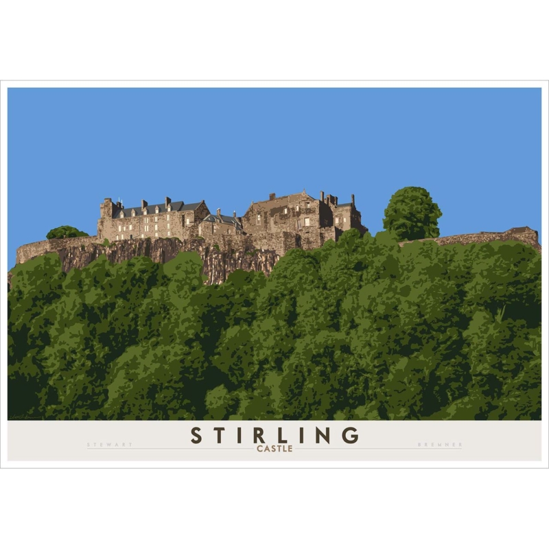
Image of Stirling Castle by Stewart Bremner

ready to hang wall art offers a convenient finished presentation, but the position must still work with movement, storage and the first sightline into the home. Stirling Castle provides a real subject, scale and finished product for the decision.

Plan ready to hang wall art around the arrival route

  1. Open the front door fully.
  2. Mark the complete framed outline.
  3. Hang coats and place everyday bags.
  4. Walk in at normal pace.
  5. Check that the castle stays protected.

A landmark can establish Scottish place immediately, but it should remain artwork rather than a souvenir display. Let Stirling Castle stand alone. Tartan accessories, miniatures and slogans would weaken the arrival.

Entrance riskResponse
Door impactStay beyond handles and full swing.
Coat movementAllow space around hooks.
Narrow routeAvoid projections near carried bags.
GlareCheck daylight from the open door.

The 594 × 420 mm image can suit a modest hall. The 840 × 594 mm option belongs on a broader entrance or stair wall when the complete frame leaves safe clearance. Use correct fixings for the wall and final weight.

Should entrance art be centred on the whole wall?

Not always. Centre it on the usable zone after excluding doors, switches and storage. Practical balance matters more than mathematical centre.

Choose ready to hang wall art with a properly finished presence

Stirling Castle needs clear architectural detail and controlled landscape colour. Colour-managed Giclée production preserves that definition. Bespoke, hand-finished framing completed in-house delivers a polished entrance piece.

For history, collections and visitor context, use the official Stirling Castle visitor website. Explore the Stewart Bremner collection, or view the exact product, sizes and framing choices.

Ready to hang wall art makes the final stage simpler, but placement begins with measurement. Stirling Castle sets a confident tone when the frame respects doors, storage and the way people arrive.
Posted on

Reading Nook Wall Art With a Glasgow Story: The Mitchell Library

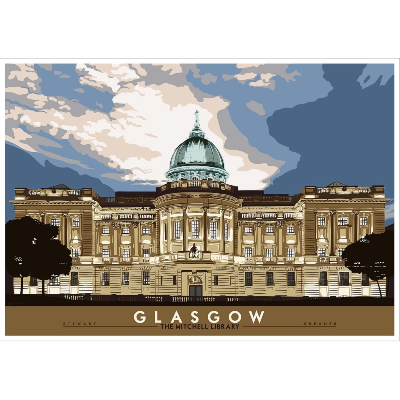
reading nook wall art can add meaning without demanding attention from every page, especially when the subject has a genuine connection to books and place. Glasgow: the Mitchell Library provides a real subject, scale and finished product for the decision.

Build reading nook wall art around the chair and lamp

Place the chair first. The picture should be visible on entering and easy to enjoy while seated. Keep its architectural silhouette above the chair back, and avoid a bright window opposite the glazing.

  1. Sit at normal reading height.
  2. Mark the full frame with paper.
  3. Switch on the task lamp.
  4. Check for a reflected bulb.
  5. Edit the nearest shelf.
Should a reading corner use several literary pictures?

It does not need to. The Mitchell Library already connects architecture, books and Glasgow. One landmark is quieter than quotations and decorative volumes.

Both image sizes are landscape: 594 × 420 mm and 840 × 594 mm. The smaller may leave better clearance above a chair or bookcase. The larger needs open wall around it.


Choose a lamp for comfortable reading first. Then angle it so light falls on the page rather than the picture. The artwork should support the ritual, not create visual effort.

Give reading nook wall art a calm architectural finish

Architectural details and tonal edges reward accurate reproduction. Colour-managed Giclée production keeps the Mitchell Library clear, while bespoke framing completed in-house gives it a settled presence beside books and textiles.

For opening information, collections and the building’s role, visit Glasgow Life’s Mitchell Library guide. Explore the Stewart Bremner collection, or view the exact product, sizes and framing choices.

Reading nook wall art feels personal when it reflects what the corner is for. The Mitchell Library links a quiet habit to Glasgow, while measured placement leaves the chair and books in charge.

Posted on

Wall Art for Tongue and Groove Walls: Balance Staffa’s Horizontal Forms

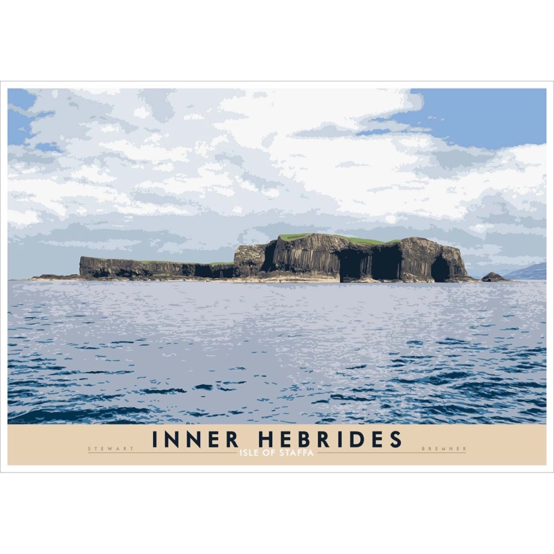
wall art for tongue and groove walls works best when the picture introduces a clear counter-direction and enough separation from the repeated lines of the panelling. Inner Hebrides: Isle of Staffa provides a real subject, scale and finished product for the decision.

Let wall art for tongue and groove walls cross the vertical rhythm

Use the island as a horizon

Staffa’s long profile gives the eye a horizontal pause. Centre the complete frame across several boards instead of matching every edge to a groove.

Create visible separation

A frame needs enough tonal difference from painted timber to read clearly. An exact colour match can disappear into the wall pattern.

Resolve fixings before height

Identify the construction behind the boards and use suitable fixings for the wall and finished weight. A convenient groove is not a structural plan.

The print is available at 594 × 420 mm and 840 × 594 mm before framing. Compare the whole outer frame. The larger format can suit broad panelling, while the smaller one can hold a dining nook or bedroom wall.

  • Check board direction and spacing.
  • Mark a horizontal outer frame.
  • Confirm the wall construction.
  • Keep furniture visually simple.
  • Avoid shells, rope and nautical signs.

Frame wall art for tongue and groove walls with clear contrast

Staffa’s rock, sea and sky need controlled distinction beside a strongly lined surface. Colour-managed Giclée production preserves those divisions. A bespoke frame, hand-finished in-house, provides the visual break.

For the island’s geology, wildlife and visiting guidance, read National Trust for Scotland information about Staffa. Explore the Stewart Bremner collection, or view the exact product, sizes and framing choices.

Wall art for tongue and groove walls can work with the panelling. Staffa supplies a calm horizontal counterpoint, while exact scale and a distinct frame keep both wall and artwork legible.

Posted on

Use a Wall Art Visualiser to Place Scott’s View Before You Commit

wall art visualiser is useful when it answers exact questions about size, alignment and distance instead of merely placing a small image over a room photograph. Roxburghshire: Scott’s View provides a real subject, scale and finished product for the decision.

Make the wall art visualiser match the real viewing route

Begin where the wall is seen most often. That may be the doorway rather than the sofa. Scott’s View has a broad landscape rhythm, so preserve enough distance to read the whole composition at once.

Digital checkPhysical check
594 × 420 mm imageMark the full frame over narrower furniture.
840 × 594 mm imageStand at the longest regular view.
Horizontal alignmentCompare with a sofa, desk or sideboard.
Open wallKeep lamps clear of the landscape.

A screen cannot show physical depth perfectly. Follow the preview with masking tape or paper. Add likely mount and moulding widths, because image dimensions are not finished dimensions.

  1. Photograph the wall straight on.
  2. Enter a reliable wall measurement.
  3. Compare both image sizes.
  4. Mark the preferred outer frame.
  5. Recheck every doorway and seat.

A preview becomes useful when it leads to one full-size test on the actual wall.

Use the wall art visualiser to compare, then let the room decide

Scott’s View depends on clear landscape layers and a generous horizontal sweep. Colour-managed Giclée production keeps those relationships controlled. Bespoke framing completed in-house gives the chosen scale a precise boundary.

For context on the celebrated Borders viewpoint, visit VisitScotland’s introduction to Scott’s View. Explore the Stewart Bremner collection, or view the exact product, sizes and framing choices.

A wall art visualiser should reduce uncertainty, not encourage an automatic larger choice. Accurate measurements and a physical template turn the preview into a dependable placement plan.

Posted on

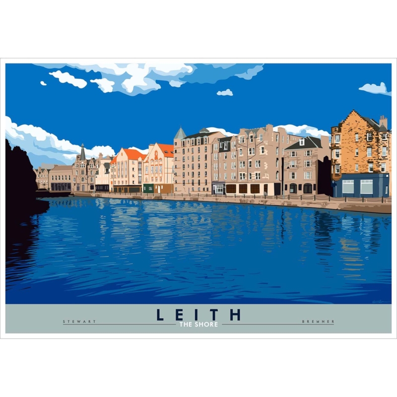
Custom Framed Art Prints for an Urban Dining Room: Meet at Leith Shore

custom framed art prints are useful in a dining room where local subject, finished dimensions and the materials around the table need to feel connected. Leith: The Shore gives the decision a real subject, format and finished product.

Plan custom framed art prints from a seated viewpoint

  1. Sit in every regular chair.
  2. Keep the Shore view above flowers and serving pieces.
  3. Switch on the pendant and trace reflections.
  4. Compare frame width with table or sideboard.
  5. Leave clearance around switches and doors.

A named Leith subject gives the dining room conversation without generic skyline photography. It can connect residents, visitors and port history while still functioning as artwork first.

Let table materials guide, not dictate

Timber, metal, linen and ceramic can suggest a warmer, darker or quieter frame. It need not match the table exactly. It needs enough separation to look intentional across the room.

Is one local city print enough?

Usually. A specific place establishes identity more clearly than a crowd of signs, maps and postcard views. Keep other details useful and restrained.

With 594 × 420 mm and 840 × 594 mm image sizes available, choose by complete framed outline and distance. Mark both before selecting the larger format automatically.

Use custom framed art prints to support hospitality

A dining room changes between daylight, task light and softer evening use. Colour-managed Giclée production keeps urban detail consistent through those shifts. Bespoke framing made in-house provides a durable presentation for a social space.

For wider context on the port district and its development, read historical and geographical background on Leith. Browse the Stewart Bremner collection, or compare the exact product, sizes and framing choices.

Custom framed art prints work in dining rooms because presentation can respond to the actual table, light and wall. Leith Shore brings the local story; measured framing lets conversation gather around it naturally.

Posted on

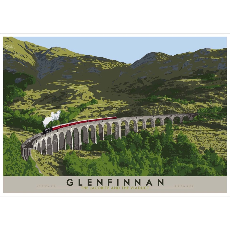
Art Inspired by Scotland: Let Glenfinnan Connect Journey and Place

art inspired by Scotland feels convincing when a real landmark and sense of movement replace generic tartan, slogans and disconnected souvenirs. Glenfinnan: the Jacobite and the Viaduct gives the decision a real subject, format and finished product.

Choose art inspired by Scotland for a guest’s first view

Start at the doorway

A guest should understand the focal point on arrival. Place the landscape where the viaduct and train read clearly. Keep hooks, luggage racks and switches outside the frame outline.

Above a bedUse secure fixings and measure against the headboard.
Opposite a bedKeep the train visible from pillow height.
Near a windowTest daylight reflections before drilling.
Beside luggageAllow clearance for cases and handles.

The subject combines railway travel with a specific Highland structure. Let that connection carry the narrative. Framed maps, station signs and tartan bedding would turn the room into a set.

One landmark. One journey. One clear wall.

Compare the 594 × 420 mm and 840 × 594 mm image sizes against the furniture. The larger version needs distance for the full viaduct sweep to remain legible.

Frame art inspired by Scotland as a lasting journey

Architectural rhythm, landscape and a moving train need clear detail. Colour-managed Giclée production preserves that definition. A hand-finished frame made in-house turns the travel subject into a lasting piece rather than themed décor.

For the site’s history, visitor information and landscape context, use National Trust for Scotland information about Glenfinnan. Browse the Stewart Bremner collection, or compare the exact product, sizes and framing choices.

Art inspired by Scotland can make a guest room memorable through one exact place. Glenfinnan offers movement and recognition, while restrained styling leaves visitors free to connect it with journeys of their own.

Posted on

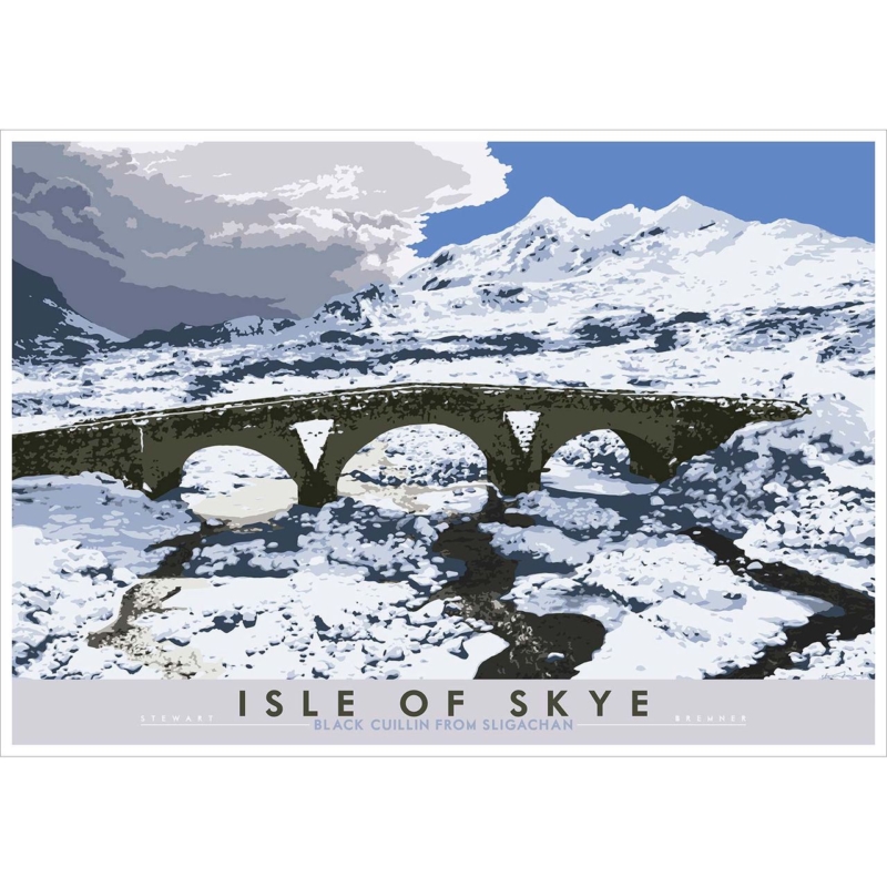
Highland Art Prints: Build a Quiet Study Around the Black Cuillin

Highland art prints can bring depth to a study when the landscape offers a real viewpoint and the working wall remains visually disciplined. Isle of Skye: Black Cuilin from Sligachan gives the decision a real subject, format and finished product.

Use Highland art prints to create distance beyond the desk

From the chair

Place the landscape where it offers a pause away from the screen. Keep the mountain line above monitor height and avoid a bright window reflecting across the glazing.

From the door

Let the named Skye view read before files and equipment. A clear arrival gives the study identity without signs or motivational wording.

The print comes in 594 × 420 mm and 840 × 594 mm image sizes. A full frame template helps decide whether it belongs above a low cabinet, on a return wall, or opposite the desk.


  • Edit shelves within the sightline.
  • Keep task lights out of the glazing.
  • Choose one wall for the landscape.
  • Leave branding to another surface.

Sligachan and the Cuillin carry enough geographical character. A study does not need tartan accessories, miniature stags or several competing Skye views.

Present Highland art prints with working-room clarity

Mountain forms and distant layers rely on tonal separation. Colour-managed Giclée production keeps those distinctions clear, while bespoke framing completed in-house gives the landscape a settled boundary beside practical study furniture.

For walking context and an introduction to the Sligachan landscape, consult Walkhighlands information about Sligachan and the Cuillin. Browse the Stewart Bremner collection, or compare the exact product, sizes and framing choices.

Highland art prints can help a study feel rooted and spacious without decorative noise. The Black Cuillin supplies distance; careful placement keeps that outward view useful during focused work.

Posted on

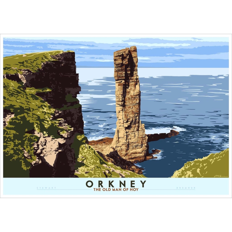
Oversized Wall Art: Measure the Old Man of Hoy From Across the Room

oversized wall art succeeds when the subject can carry a broad field and the room offers enough distance to read the whole composition at once. Orkney: The Old Man of Hoy gives the decision a real subject, format and finished product.

Plan oversized wall art from the furthest useful view

Begin at the doorway or opposite end of the room. The sea stack should register as the destination before chairs, lamps or shelving cut into the view. If the wall only works from one close seat, the larger scale may not earn its space.

  1. Mark the 840 × 594 mm image option.
  2. Add likely mount and moulding widths.
  3. View the outline from every entrance.
  4. Compare it with the main furniture line.
  5. Leave calm wall around every edge.
Should the frame fill most of the wall?

No. A large work still needs negative space. Open wall keeps the sea stack from feeling boxed in and makes the scale look deliberate.

The 594 × 420 mm option may be stronger in a medium room or above narrower furniture. Oversized wall art is a relationship, not a fixed label. Finished dimensions, distance and visual weight matter together.

Give oversized wall art a restrained frame

At a broader size, every edge and tonal transition becomes visible. Colour-managed Giclée printing maintains clarity across the sea-stack landscape. In-house bespoke framing gives physical authority while a restrained finish protects the open-air feeling.

To understand the sea stack’s location, height and climbing history, see history and geographical context for the Old Man of Hoy. Browse the Stewart Bremner collection, or compare the exact product, sizes and framing choices.

Oversized wall art should make the room feel ordered, not crowded. The Old Man of Hoy brings a monumental subject; accurate templates and long sightlines decide whether the larger format belongs.

Posted on

Wall Art for Limestone Flooring: Let Rattray Lighthouse Add Direction

wall art for limestone flooring should introduce enough definition to balance a pale hard surface while keeping the room’s natural restraint intact. Buchan: Rattray Lighthouse gives the decision a real subject, format and finished product.

Balance wall art for limestone flooring with texture and horizon

Room elementResponse
Limestone toneCompare the stone in daylight and lamplight before choosing the frame.
Hard surfaceAdd wool, linen or timber instead of asking the art to supply all the warmth.
HorizonKeep tall accessories away from the lighthouse and open coastal line.
GlazingCheck floor and window reflections from seated height.

The landscape format is available at 594 × 420 mm and 840 × 594 mm before framing. The larger choice can steady a broad wall, but only when the complete frame relates to the furniture below. Use a paper template.

Keep the coast specific

A named Buchan lighthouse already creates place. Shell bowls, rope and repeated nautical motifs make that story too literal. One coastal subject and a few tactile materials are enough.

  • Test stone undertones beside the artwork.
  • Preserve a clear lighthouse sightline.
  • Use textiles to soften touch and sound.
  • Measure the finished width.

Frame wall art for limestone flooring without severity

A coastal graphic needs separation between land, sea, sky and architecture. Colour-managed Giclée production keeps those relationships controlled. A bespoke, hand-finished frame provides definition against limestone while the room retains its quiet palette.

For context on the headland, dunes and lighthouse setting, read geographical background on Rattray Head. Browse the Stewart Bremner collection, or compare the exact product, sizes and framing choices.

Wall art for limestone flooring works best when it adds direction rather than more hardness. Rattray Lighthouse supplies a destination, while textile warmth and an exact framed boundary make the room comfortable.

Posted on

Choose Your Frame Online for Scottish Typography: Start With the Words

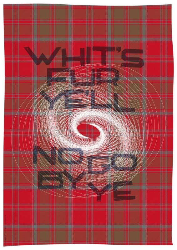
choose your frame online with more confidence when you judge the words from across the room, compare tonal separation and measure the complete framed outline. Whit’s Fur Ye’ll No Go By Ye gives the decision a real subject, format and finished product.

Choose your frame online by protecting the lettering

Read it from the doorway

Typography must stay clear where people first meet it. View the product at several screen sizes, then step back. The frame should define the edge without taking attention from the phrase.

Compare contrast

A pale frame can create breathing room. A darker direction may add a firmer graphic boundary. Compare both against the artwork and wall instead of repeating every tone.

The print comes in 420 × 594 mm and 594 × 840 mm image sizes. Mark the image first. Add a realistic allowance for mount and moulding, so the completed frame does not surprise you on the wall.

  1. Pick the normal reading distance.
  2. Mark the full proposed outline.
  3. Compare a quiet and a stronger border.
  4. Check that letter edges stay crisp.
  5. Remove nearby signs that compete.

The useful frame helps the words arrive before the border is noticed.

Choose your frame online, then check the real wall

Online comparison narrows the direction, but the room decides the final balance. First 4 Frames produces the Giclée print in a colour-managed workflow and completes the framing in-house. That hand-finished process gives large typography a clean edge.

For background on Scots language, writing and current use, visit the Scots Language Centre. Browse the Stewart Bremner collection, or compare the exact product, sizes and framing choices.

When you choose your frame online, treat the phrase as the focal point and the frame as support. Careful contrast and full-size measuring let the humour and meaning hold the wall without extra slogan décor.