Posted on

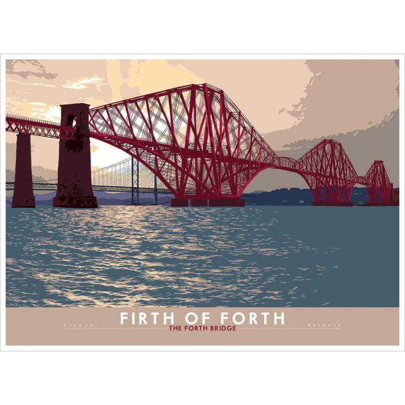
Firth of Forth: The Forth Bridge — A Lasting Gift for a Retired Engineer

Image of Firth of Forth: The Forth Bridge by Stewart Bremner

A gift for a retired engineer should acknowledge a working life without reducing it to a slogan on a mug. The best choice reflects how the recipient thinks, what they have achieved, and what still interests them. Firth of Forth: The Forth Bridge by Stewart Bremner does that through one of Scotland’s most recognisable feats of design. It celebrates structure, judgement, and endurance in a form that can remain on the wall long after the retirement cards have gone.

Why the Forth Bridge speaks to an engineering career

The Forth Bridge is admired because its visual force comes directly from the problem it solves. Repeated forms, clear loads, and an unmistakable silhouette make the structure compelling even before its history is considered. An engineer can appreciate that clarity in a way that is personal but not sentimental.

This print also avoids the narrowness of a trade-specific tool or technical diagram. It can suit someone from civil, structural, mechanical, rail, or project engineering. The image recognises a professional way of seeing: attention to proportion, materials, systems, and work built to last.

Make a gift for a retired engineer feel genuinely personal

  1. Connect it to their story. Mention a project, commute, visit, or professional interest that makes the bridge relevant.
  2. Record the milestone separately. Add dates and colleagues’ names to a card rather than writing over the artwork.
  3. Choose for their next space. Think about the study, sitting room, hallway, or workshop where the picture will live after work.

A short, specific message gives the present its emotional weight. It might thank the recipient for calm decisions, patient mentoring, or work that other people rely on every day. That context turns the bridge from a famous landmark into an apt symbol of their contribution.

Choose a size for life beyond the office

Large workplace presentations can be impressive, but retirement often changes where possessions are displayed. A medium framed print is versatile enough for a home office or landing and substantial enough to mark the occasion. If family members know the intended wall, measure the space and nearby furniture before selecting the finished size.

For a group gift, put the budget into print and framing quality instead of adding several small extras. One resolved piece usually feels more considered. It is also easier for the recipient to display than a collection of objects bearing dates, logos, or private jokes.

Let the bridge’s geometry guide the frame

A clean dark moulding can echo the bridge’s graphic structure and suit a contemporary room. Natural timber offers a warmer alternative for a relaxed study or traditional interior. The frame should define the image without adding unnecessary ornament, because the repeated engineering forms already provide plenty of rhythm.

First 4 Frames produces colour-managed Giclée prints and completes bespoke framing in-house at its Falkirk workshop. That careful, hand-finished presentation is especially appropriate here: craftsmanship in the finished object supports an artwork whose subject is itself a landmark of craftsmanship.

A retirement present with meaning after the presentation

Explore more Scottish design and landmark work on Stewart Bremner’s official website, or browse the Stewart Bremner collection at First 4 Frames. For a gift for a retired engineer that respects expertise and remains rewarding to look at, view the framed Firth of Forth: The Forth Bridge print.

Posted on

Give a Transitional Space a Destination With Craigievar Castle

Scottish castle art for a hallway works best when it gives the space a destination rather than simply filling a gap. Aberdeenshire: Craigievar Castle uses the castle’s distinctive pink walls, towers, and compact silhouette to create an immediate focal point. The graphic treatment reads clearly as someone approaches from either end.

Place Scottish castle art for a hallway at the natural pause

  1. Find the pause. Choose the wall facing an entrance, turn, or stair landing rather than the busiest run of doors.
  2. Check the sightline. Keep the centre comfortable at standing eye level and test it from both directions.
  3. Leave a border. Clear wall around the frame lets the towers read cleanly beside architraves and switches.

Use the pink as an accent, not a scheme

A small echo in a runner, lamp base, or nearby flower is enough. Neutral paint and a restrained frame keep the historic subject crisp and contemporary.

The composition carries place and history, yet its clean shapes avoid a heavy heritage look. That balance suits both a period hall and a simple modern entrance.

First 4 Frames prints and frames the work in-house at its Falkirk workshop. Precise colour management keeps the pink architecture distinct, while bespoke framing gives the illustration the polished, ready-to-hang finish a busy entrance deserves.

For further context, visit the National Trust for Scotland’s Craigievar Castle guide. You can also explore the Stewart Bremner collection or see the exact Aberdeenshire: Craigievar Castle framed print.

For Scottish castle art for a hallway, Aberdeenshire: Craigievar Castle turns an in-between wall into a clear, characterful arrival point.

Posted on

Why Gaun Yersel Makes an Encouraging Gift for a New Business Owner

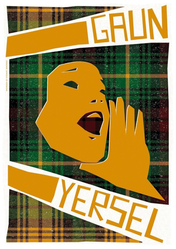
A gift for a new business owner should recognise both the courage of starting and the work still ahead. Flowers disappear, business accessories can feel impersonal, and specialist equipment is best chosen by the owner. Gaun Yersel by Stewart Bremner takes a warmer route. Its familiar Scots encouragement says, in effect, keep going and trust yourself.

What makes art a useful gift for a new business owner?

New ventures often begin with practical purchases, long lists, and many decisions. A framed print serves a different purpose. It marks the personal achievement behind the company and can make an unfamiliar workspace feel owned. Unlike branded stationery or technology, it remains relevant as the business changes.

Gaun Yersel is direct without sounding like formal corporate motivation. The phrase has energy, humour, and a recognisable Scottish voice. That makes it particularly apt for a founder who values local character or has built their business around an individual point of view.

Choose the moment that gives the present meaning

At the launch

Give it when the doors open, the website goes live, or the first order is completed. A short card can record the exact milestone while the artwork stays uncluttered.

After the first hard stretch

Encouragement may matter even more a few months later. The print can acknowledge persistence when the novelty has passed and the real work is under way.

Think beyond a conventional office wall

The new owner may work from a studio, salon, treatment room, workshop, shop, or spare bedroom. A graphic print is flexible enough for these varied settings. It can greet visitors near the entrance, sit behind a desk for video calls, or add personality to a quieter staff area.

Before choosing the finished size, ask whether the business premises are permanent. A more compact framed version is easier to move and can also transfer to the owner’s home. If the recipient has a settled customer-facing space, a larger format can provide a confident focal point.

Let the message lead the presentation

Typographic art benefits from a frame that protects its graphic clarity. A clean dark moulding can sharpen the lettering, while natural timber may make the piece feel more relaxed and personal. There is no need to match the business logo unless the colours already work comfortably together.

First 4 Frames uses colour-managed Giclée production and hand-finishes bespoke framing in-house in Falkirk. The result arrives ready to hang, which is valuable for a busy recipient who is unlikely to have time for a separate framing job during a launch.

Give confidence without giving a lecture

See more of the artist’s bold Scottish design on Stewart Bremner’s official website, and browse the wider Stewart Bremner collection. When you need a gift for a new business owner that feels supportive, distinctive, and ready for the wall, choose the framed Gaun Yersel print.

Posted on

Scottish Coastal Art Finds a Story-Rich Focal Point in Kisimul Castle

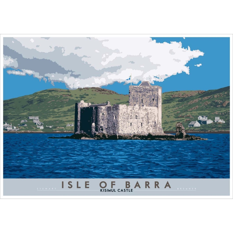
Scottish coastal art can offer more than a broad horizon. Isle of Barra: Kisimul Castle brings stone architecture, island history, and surrounding water into one composed image. That combination makes the print a useful focal point for a room that needs character as well as a feeling of space.

Let Scottish coastal art carry a sense of history

Kisimul Castle sits on a rocky islet in Castlebay, so the subject naturally balances shelter and exposure. In an interior, the strong silhouette gives the eye a clear stopping point. The water and sky then prevent that architecture from making the composition feel too formal or heavy.

Where it can work

  • Above a hallway console
  • On a dining-room feature wall
  • In a study with natural materials

What to pair with it

  • Wool and weathered timber
  • Stone, slate, or soft blue-grey
  • Simple lighting that limits glare

The available square format can create a self-contained focal point, while the larger option gives the island setting more breathing room. Avoid adding nautical ornaments around it. The specific place and architecture already provide enough coastal identity.

First 4 Frames produces the colour-managed Giclée print and bespoke frame in-house in Falkirk. Careful framing can echo the castle’s definition while preserving the lighter atmosphere around it.

Read Historic Environment Scotland’s Kisimul Castle guide for the site’s history. You can also browse more work by Stewart Bremner or view the exact Kisimul Castle print.

For Scottish coastal art with narrative depth, Isle of Barra: Kisimul Castle offers a memorable balance of place, structure, and open water.

Posted on

How Ah Dinnae Ken Brings Scots Language Wall Art Into a Modern Home

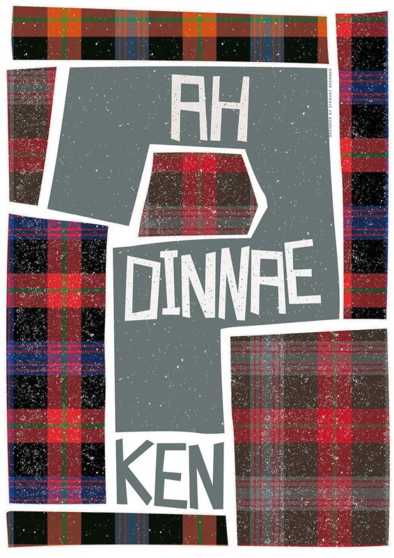
Scots language wall art can give a room identity without relying on a landscape or a familiar landmark. The key is choosing typography with enough design strength to work as art. Ah Dinnae Ken by Stewart Bremner does this with confidence. Its Scots phrase brings wit and cultural recognition, while the bold composition gives it a clear place in a modern interior.

Why Scots language wall art can feel contemporary

Words on a wall can sometimes feel temporary or overly playful. Good typographic art avoids that problem through proportion, spacing, colour, and a strong visual hierarchy. The phrase matters, but the design must still hold the room when it is viewed from across the space.

Ah Dinnae Ken has that balance. The familiar expression gives Scots speakers an immediate point of connection. At the same time, its poster-like treatment makes the piece easy to place beside clean furniture, painted walls, and simple architectural details.

Choose the wall before choosing the frame

This kind of artwork works best where people can stop and read it. A kitchen-dining space, hall, home office, or relaxed sitting room can all suit it. Give the print enough clear wall around it. That breathing room lets the letters become the focal point instead of competing with shelves, signs, or several smaller pictures.

A restrained frame is often the strongest choice. Black can sharpen the graphic quality, while a lighter timber can soften the overall effect. The right decision depends on nearby finishes. First 4 Frames can advise on a bespoke presentation at its Falkirk workshop, where the printing and framing are completed in-house.

Three reasons Ah Dinnae Ken avoids the souvenir look

  • The phrase feels genuine and conversational rather than manufactured for visitors.
  • The graphic treatment has enough presence to work with contemporary furniture.
  • Hand-finished framing turns the idea into a lasting piece for everyday display.

Artist context also helps. You can explore the designer’s wider Scottish work on Stewart Bremner’s official website and browse the Stewart Bremner collection at First 4 Frames. Together, those links make it easier to see how the print fits within a consistent visual style.

If you want Scots language wall art that feels personal but still polished, view the framed Ah Dinnae Ken print. It offers humour, place, and a strong graphic finish without asking the whole room to follow a theme.

Posted on

A Scottish Housewarming Gift With Heart: We’re Aw Jock Tamson’s Bairns

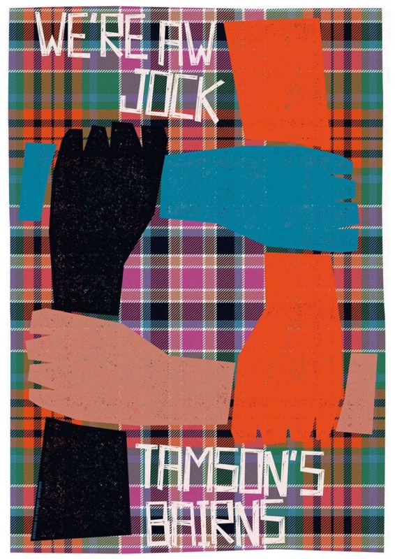
A thoughtful Scottish housewarming gift should say something about welcome, belonging, and the people who make a home. We’re Aw Jock Tamson’s Bairns does exactly that. The familiar Scots expression presents everyone as part of one family, giving the artwork warmth as well as strong visual character.

Why this Scottish housewarming gift feels personal

The message is inclusive rather than sentimental for sentiment’s sake. It can suit a first home, a move back to Scotland, or a new household formed by friends and family. Stewart Bremner’s graphic approach also gives the words enough design presence to work as artwork, not simply as a slogan.

  • For a hallway: let it establish a welcoming tone near the entrance.
  • For a kitchen: use it where family and visitors naturally gather.
  • For a living room: give the larger print size enough clear wall to hold attention.

Consider the recipient’s home before choosing the presentation. A clear frame edge can sharpen the bold graphic design, while a little surrounding wall space keeps the wording easy to read. First 4 Frames produces and frames the print in-house in Falkirk. Its colour-managed Giclée process and bespoke, hand-finished framing turn a good message into a lasting wall piece.

Dictionaries of the Scots Language is a useful resource for Scots words and expressions. You can also explore more work by Stewart Bremner or view the exact framed print.

As a Scottish housewarming gift, We’re Aw Jock Tamson’s Bairns offers humour, identity, and a generous idea of home without feeling like a generic keepsake.

Posted on

Why We’re Aw Jock Tamson’s Bairns Makes a Thoughtful Gift for a Scottish Language Lover

A good gift for a Scottish language lover should feel personal without tipping into novelty. For someone who genuinely enjoys Scots language, the best piece is often one that carries humour, recognition, and proper display value at the same time. We’re Aw Jock Tamson’s Bairns does exactly that, bringing a familiar phrase into the home in a way that still feels polished and easy to live with.

Why a gift for a Scottish language lover should feel genuine rather than novelty led

Many language-themed gifts are amusing for a moment, but they do not always earn a lasting place in the home. A framed print can do more because it offers humour, design, and cultural recognition in one piece. That makes it especially suitable for birthdays, housewarmings, or thank-you gifts when you want the present to feel considered rather than quickly bought.

We’re Aw Jock Tamson’s Bairns stands out because the phrase is immediately recognisable, warm in spirit, and rich in everyday Scottish character. It works in hallways, kitchens, studies, and shared living spaces where a piece of framed art can raise a smile while still looking intentional.

What makes We’re Aw Jock Tamson’s Bairns such a strong gift for a Scottish language lover

  • It celebrates Scots language in a way that feels familiar rather than forced.
  • It gives the recipient something display-worthy instead of a short-lived novelty gift.
  • It suits a wide range of rooms, from welcoming hallways to more personal studies.

First 4 Frames completes each piece in-house in Falkirk with bespoke framing, colour-managed Giclee printing, and hand-finished craftsmanship. That superior quality matters when the gift is meant to stay in view and become part of the home rather than disappear into a drawer.

You can explore more from the artist at Stewart Bremner, learn more through Stewart Bremner Prints, and view the exact framed print here.

If you are trying to choose a gift for a Scottish language lover with humour, warmth, and lasting display value, We’re Aw Jock Tamson’s Bairns is well worth considering.

Posted on

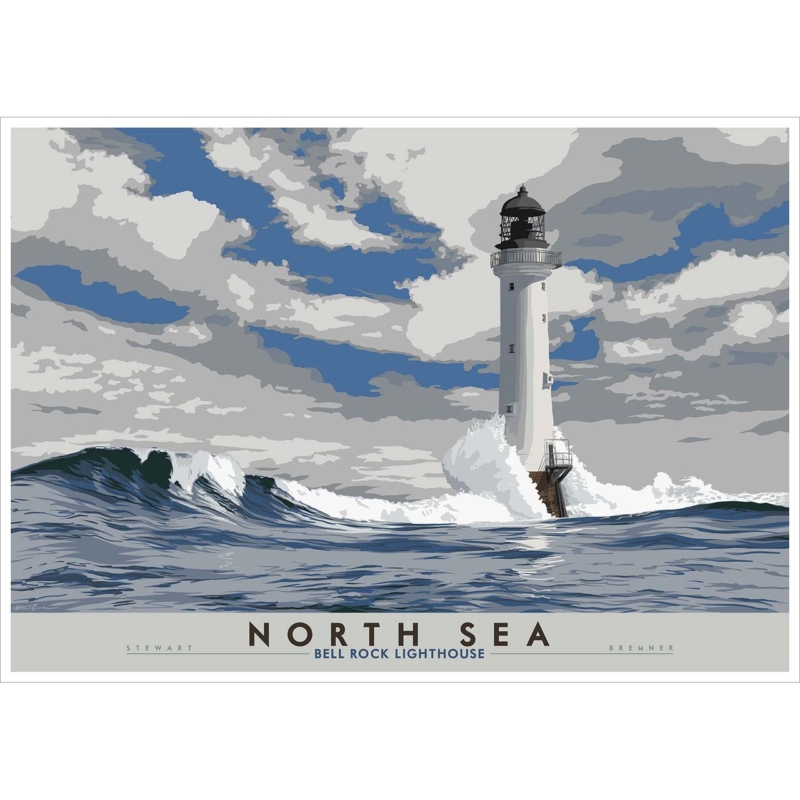
North Sea: Bell Rock Lighthouse Gives Fireplace Wall Art More Presence

Choosing fireplace wall art usually means choosing the visual anchor of the whole room. North Sea: Bell Rock Lighthouse is a strong example because the lighthouse subject gives the wall clear structure and atmosphere, helping a chimney breast feel purposeful without becoming heavy.

Why North Sea: Bell Rock Lighthouse strengthens fireplace wall art

North Sea: Bell Rock Lighthouse carries exactly the kind of upright structure that suits the space above a mantel. The subject has presence, but it also leaves enough breathing room around it to stop the wall feeling clogged. That balance is valuable in living rooms where the fireplace is already a focal point and the artwork needs to reinforce rather than compete with it.

Good fireplace wall art should steady the room, not simply fill the space above the mantel.

Because First 4 Frames handles the framing and Giclée production in-house, the finished piece arrives with the sort of hand-finished presentation a central wall deserves. Craftsmanship matters here, as even a strong image can feel underwhelming if the finish lacks definition or confidence.

If the subject itself interests you, the Bell Rock Lighthouse Signal Tower Museum offers useful background. You can also browse more work by Stewart Bremner and view the exact framed print here.

For anyone choosing fireplace wall art that feels structured, atmospheric, and properly resolved, North Sea: Bell Rock Lighthouse is a very strong contender.

Posted on

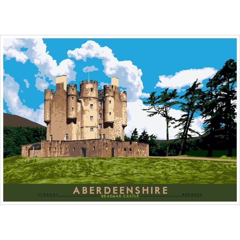
How to Choose Framed Wall Art? Braemar Castle Makes the Decision Clearer

Knowing how to choose framed wall art often comes down to one question: does the image have enough presence to justify the space it will take in the room? Aberdeenshire: Braemar Castle answers that well because the subject has architecture, history, and a clear compositional backbone that framing can support rather than rescue.

What Braemar Castle shows about how to choose framed wall art

Aberdeenshire: Braemar Castle is a strong guide because it already contains definition and place. That means the frame can sharpen the final impression, control the weight of the piece, and help it sit confidently in a hallway, study, or upper landing without the room feeling overworked.

Good framed wall art starts with an image that can hold the wall before the frame even enters the conversation.

First 4 Frames completes the bespoke framing and colour-managed Giclée work in-house, which is particularly important with an image like this. When the subject is detailed and architectural, small presentation choices have a bigger impact on whether the finished piece feels polished or merely serviceable.

If you want to learn more about the landmark itself, Braemar Castle is worth a visit. You can also browse more work by Stewart Bremner and see the exact framed print here.

For customers thinking carefully about how to choose framed wall art, Aberdeenshire: Braemar Castle is the kind of piece that makes the process much easier to judge well.