


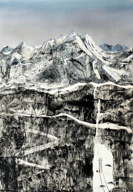
Best frame colours for art prints are chosen by studying the image as well as the room. The Clearing is nearly monochrome, with snow-lined mountains, dark rock bands, a pale winding road and one tiny red accent. That restraint makes the effect of the surrounding frame unusually easy to see.
Compare the best frame colours for art prints before deciding
| Frame direction | Likely effect on The Clearing | Room relationship |
|---|---|---|
| Fine black | Connects to the darkest rock marks and sharpens the edge. | Useful against pale walls and simple furniture. |
| Soft white | Extends the snow and sky, making the image feel more open. | Works where the wall has enough contrast to retain a boundary. |
| Pale natural timber | Adds quiet warmth without introducing a strong new colour. | Relates well to oak, ash and textured neutral interiors. |
Do not choose from a small online swatch alone. Consider the finished width, any mount, and the wall colour together. A broad black profile could overpower the delicate road, while a very bright white frame may look stark on a warm cream wall.
The frame should clarify the image’s hierarchy: mountains first, rock texture second, and the tiny red detail last.
Keep monochrome depth from becoming flat
Near-monochrome artwork depends on tonal range more than obvious colour. Colour-managed Giclée production retains the subtle steps between sky, snow, stone and ink-dark marks. Bespoke in-house framing then allows the profile and mount to be judged against the actual print.
For broader background on print as an art form, read Tate’s introduction to prints. Browse the Emily Little collection, or view the exact The Clearing framed print.
The Clearing proves that the best frame colours for art prints are not automatically neutral choices; they are tools for protecting contrast, atmosphere and the order in which details are seen.