


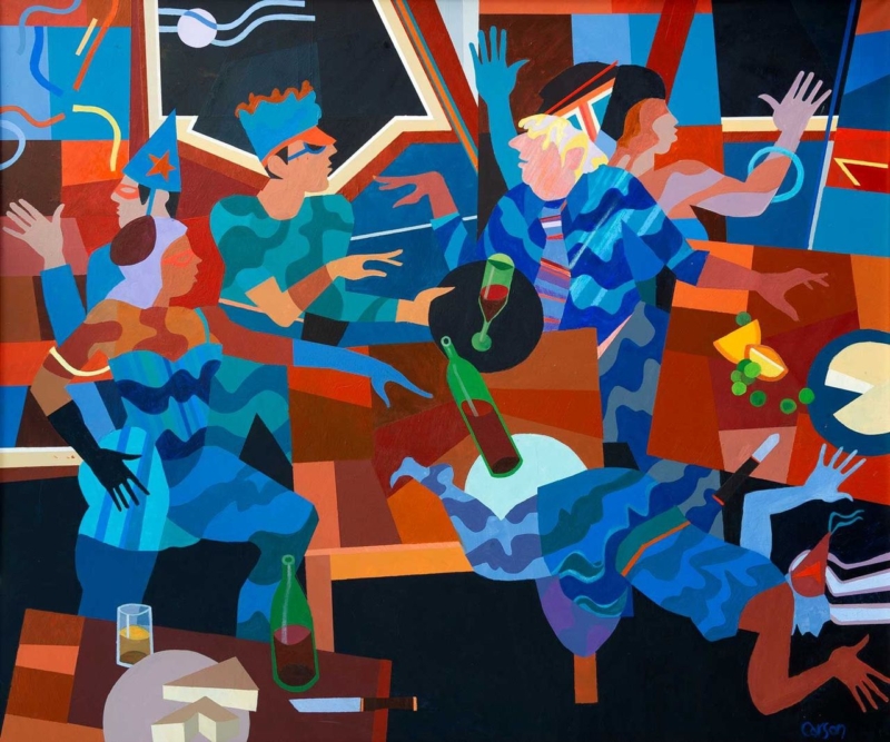
wall art for an event planner’s studio should express the energy of bringing people together without making a professional workspace resemble a permanent party set. Garden Party by Fred Carson offers a lively but structured alternative. Stylised figures talk, gesture, carry glasses, and move through a bold arrangement of blue, red, terracotta, black, and cream. The scene feels social, yet its strong geometry keeps the image composed.
What wall art for an event planner’s studio needs to communicate
Clients visit an event professional to imagine an experience that does not yet exist. The studio therefore needs to feel organised and dependable, but also alert to atmosphere, colour, and human behaviour. Generic office prints can make the room feel cautious. Literal balloons, champagne labels, or wedding slogans can narrow the business to one type of brief.
Garden Party focuses on people rather than decorations. Hands, faces, drinks, chairs, and tables overlap in a scene full of conversation. The painting suggests arrival, connection, and movement without defining whether the gathering is a wedding, launch, dinner, or private celebration. That openness makes it relevant to a varied events practice.
Use the picture to anchor a client conversation
The strongest position is one clients can see without turning away from the discussion. Behind a consultation table, beside a materials library, or on the first clear wall inside the studio may work well. Avoid placing it among mood boards that change every week. The artwork should supply continuity while project samples come and go.
| Studio zone | What the artwork contributes | Practical check |
|---|---|---|
| Consultation area | A relaxed social cue before the meeting begins | Check that chairs do not hide the lower edge |
| Entrance wall | An immediate statement about people and atmosphere | Keep reception signs and notices separate |
| Sample library | A stable focal point beside changing colours and materials | Leave enough clear wall to prevent visual competition |
| Team workspace | Energy and character beyond schedules and screens | Test glare from task lighting and monitors |
The print measures 360 by 300 millimetres before framing. Its near-square landscape shape has enough width for the group to read as a social scene while remaining suitable for a smaller client studio. Mark the full framed size above furniture and view it from both seated and standing positions.
Let the composition demonstrate visual coordination
Event work often involves many simultaneous details. In this image, different figures, gestures, colours, and table forms remain connected through repetition. Blue moves across clothing and background shapes. Warm red and orange passages establish rhythm. Pale curved lines travel through the darker upper area, while black sections hold the brighter elements together.
That balance can support a studio filled with swatches, stationery, flowers, floor plans, and screens. Keep active project material grouped in trays, drawers, or defined boards. Giving the framed picture a clean boundary shows that abundance can still be edited and controlled, which is a useful message for clients trusting someone with a complex occasion.
Choose colours that belong to the business all year
- Neutral studio: allow the blue and terracotta to provide the main colour rather than adding several bright accessories.
- Dark joinery: use the image’s black structure to connect with shelving or a consultation table.
- Warm timber: let rust, brown, and cream bridge the furniture with the cooler blue figures.
- Existing brand colour: echo one compatible tone in a folder or chair, but do not force the whole painting into the brand palette.
Because the scene is not tied to one season, it can remain in place while spring weddings, autumn dinners, corporate launches, and winter celebrations move through the calendar. The studio gains personality without needing to redecorate for each campaign.
Keep creative atmosphere separate from operational information
An attractive studio still needs clear working systems. Risk planning, supplier details, access notes, and production schedules should remain legible and current. the HSE event safety guidance provides practical background on responsibilities and planning. Place essential documents where the team can use them, while letting the artwork perform a different role: expressing why people gather in the first place.
This separation also helps during client meetings. The picture can establish mood without competing with the exact plan under discussion. When the team turns to timings, budgets, or logistics, the room remains visually engaging but does not blur decoration with instruction.
Frame bold figurative art for a professional setting
A slim dark moulding can reinforce the image’s graphic structure. A restrained warm timber may soften the scene and relate to tables or sample storage. A coloured frame is possible, but it should be compared against the full composition; choosing one bright tone in isolation could make the result look promotional rather than collected.
First 4 Frames produces colour-managed Giclée prints and completes bespoke framing by hand at its Falkirk workshop. That careful in-house process helps the closely related blues, reds, creams, and dark shapes remain separate. It also gives a creative business a polished, ready-to-hang piece suited to repeated client use.
A social scene by Edinburgh artist Fred Carson
Fred Carson is an Edinburgh-based artist whose contemporary work combines stylised figures, bold colour, and geometric form. His background spans painting, ceramics, sculpture, and architectural commissions. Browse the wider Fred Carson collection at First 4 Frames to compare how other compositions handle movement and groups.
Effective wall art for an event planner’s studio should make creativity visible while leaving the studio calm enough for decisions. View the framed Garden Party print for a sociable, carefully structured image finished with lasting in-house craftsmanship.