


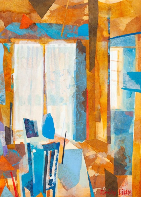
The right wall art for a room with blue walls should build on the colour already in the room rather than simply repeating it. Blue Reflections is a strong example because it adds movement, tonal contrast, and a gentler layered feel that stops a blue scheme becoming too flat or overly cool.
How Blue Reflections improves wall art for a room with blue walls
Blue Reflections works well when the room already has painted blue walls, upholstery, or cooler accent tones. Rather than disappearing into the scheme, it gives the palette more depth and rhythm. That is especially useful in bedrooms, sitting rooms, or upstairs spaces where the colour story needs variation to feel complete.
- It keeps a blue room feeling layered rather than one-note.
- It adds visual movement without introducing a clashing colour story.
- It helps a cooler scheme feel calmer instead of colder.
Because First 4 Frames completes the framing and Giclée production in-house, the finished piece keeps those shifts of tone intact. That kind of colour-managed presentation is particularly important when a room depends on subtle variation rather than stronger contrast.
If you enjoy the broader role colour can play in a composition, Tate’s guide to colour in art offers useful background. You can also browse more work by Emily Little and view the exact framed print here.
For buyers comparing wall art for a room with blue walls, Blue Reflections is a persuasive choice when the goal is depth, calm, and a more resolved finish.