


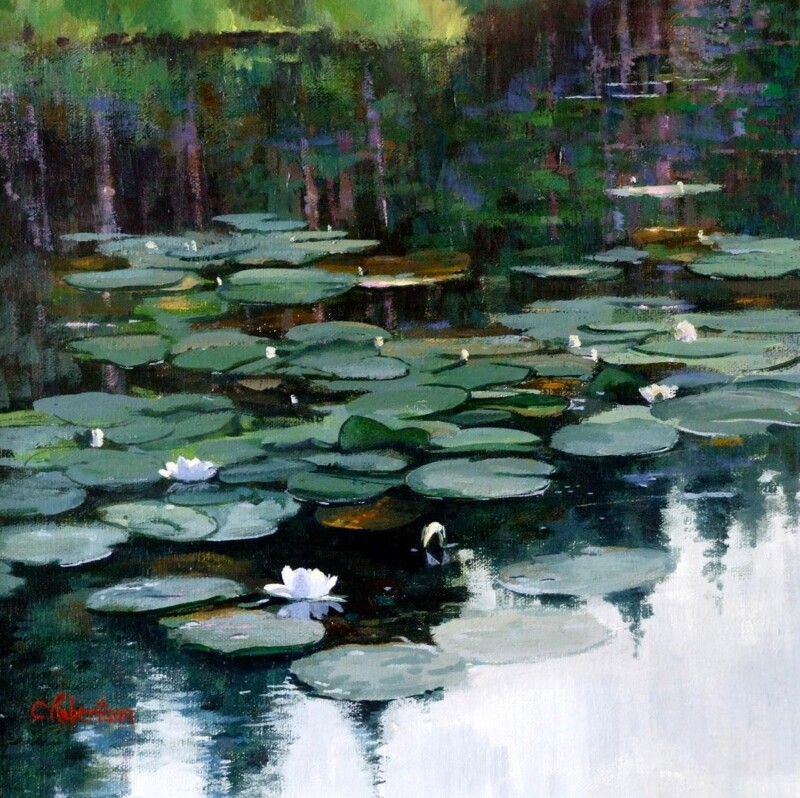
Choosing wall art for a room with blue walls is rarely about finding a picture that repeats the exact same shade. Usually the room works better when the artwork deepens the palette and adds a little variation. Where Water Dreams does that beautifully, bringing watery movement and softer contrast that stop blue walls feeling too flat or overcontrolled.
Why Where Water Dreams suits wall art for a room with blue walls
Where Water Dreams works because it keeps the room in the same emotional register without becoming too literal. The image has fluidity, quieter transitions, and enough tonal variation to make blue paint feel intentional rather than one-note. That is especially useful in living rooms, bedrooms, or calmer dining spaces where the wall colour is already doing a lot of the mood-setting work.
- It keeps a blue scheme calm rather than over-contrasted.
- It adds movement that prevents the room feeling static.
- It gives the wall a focal point without looking aggressively colour matched.
This is also where the framed finish matters. A hand-finished frame gives the artwork enough presence to stand with a stronger painted wall, instead of fading into it. First 4 Frames completes that work in-house in Falkirk, combining bespoke framing with colour-managed Giclée production so the final piece feels settled and superior quality from the outset.
If you are thinking about how colour behaves in an interior, the Design Museum on the colour blue offers useful context. You can also browse more work by Colin Robertson and view the exact framed product here.
For anyone weighing up wall art for a room with blue walls, Where Water Dreams is a strong reminder that the best match is often the one that adds depth, softness, and rhythm rather than simply repeating the paint.