


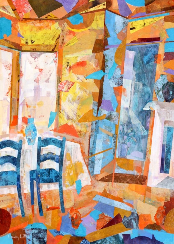
wall art for a maximalist living room does not need to calm every object into submission. It needs to give the eye a confident place to begin. The Collector’s Room by Emily Little is well suited to that role. Its layered interior subject belongs naturally among books, textiles, ceramics, and collected furniture, while its clear composition can help a richly furnished room feel deliberate.
What should wall art for a maximalist living room actually do?
A maximalist room often contains many things with genuine meaning. The problem is rarely that it owns too much. Instead, several strong elements may compete at the same visual level. One substantial framed print can establish a hierarchy. It gives the arrangement a centre, so smaller objects can read as supporting detail rather than unrelated clutter.
The subject of The Collector’s Room reinforces that idea. An imagined, collected interior does not fight against a shelf of well-used books or a patterned chair. It echoes the pleasure of living with interesting things. At the same time, the artwork’s boundaries create a useful moment of order on the wall.
Build the room outward from one visual anchor
- Choose a wall visible from the main doorway or primary seat.
- Let the finished frame be larger than most nearby decorative objects.
- Repeat two colours from the print elsewhere, but vary their shade and texture.
- Leave a narrow area of clear wall around the artwork to protect its outline.
This method makes the room easier to read without making it sparse. A dark tone from the print might return in a lamp base, while a warmer colour appears in a cushion or rug. Exact matching is unnecessary. Variation keeps the scheme collected over time rather than purchased as a set.
Choose scale before adding another pattern
When a wall already sits behind patterned upholstery or full shelving, a cluster of small pictures may fragment it further. A single larger image often has more authority. Measure the clear wall and compare the framed dimensions with the furniture below. The print should relate to the width of a sofa, console, or cabinet rather than floating as a small isolated rectangle.
If the room has a quieter wall, a smaller version can create a thoughtful pause instead. This is especially useful beside a reading chair or at the end of a book-lined space. The goal is not maximum size. It is a scale that remains legible among the room’s other details.
Use the frame to sharpen, not decorate
A restrained moulding can give a colourful, layered image a firm edge. Dark finishes add definition, while a simple timber frame may connect the print to vintage furniture. An ornate option can work, but it should earn its place through proportion and finish rather than adding detail for its own sake.
First 4 Frames completes colour-managed Giclée production and hand-finished framing in-house at the Falkirk workshop. That one-to-one process helps customers compare scale and moulding choices before the finished piece joins an already expressive room.
Explore the painter’s wider use of colour and memory on Emily Little’s official website, then browse the Emily Little collection at First 4 Frames. For wall art for a maximalist living room that celebrates a layered interior while giving it direction, view the framed The Collector’s Room print.