

The ‘safe’ mount colour you’re considering might be the very thing holding your artwork back. It’s a familiar dilemma: you’ve found a beautiful piece, perhaps a spectacular print from one of our First4Frames Gallery artists, but now you’re stalled. Faced with an overwhelming wall of colour swatches, the fear of making the wrong choice is real. Should it match the wall? Should it pull a colour from the art? When you’re asking, “what colour mount should I choose?”, defaulting to a simple cream can feel like the only option, but it rarely does justice to the art.
We believe choosing a mount shouldn’t be a source of stress. It’s an art form in itself. With over 20 years of bespoke framing experience, we’re here to share our professional secrets and give you a clear framework for making the perfect choice. This guide will show you exactly how to select mount colours that enhance your artwork, creating a seamless bridge between your art and your home décor. We’ll explore the simple rules professionals follow, so you can feel confident creating a truly stunning, gallery-quality display at home.
Key Takeaways
- Learn the professional technique of looking beyond the dominant colour in your artwork to find the perfect complementary mount.
- Find a definitive answer to what colour mount should I choose by learning how to assess the artwork’s unique mood and energy.
- Discover how a mount can act as the perfect design bridge, harmonising your chosen art with your room’s unique lighting and furnishings.
- See these principles applied in practice with expert analysis of framing iconic Scottish artists like John Lowrie Morrison (Jolomo) and Jack Vettriano.
The Essential Role of the Picture Mount: More Than Just a Border
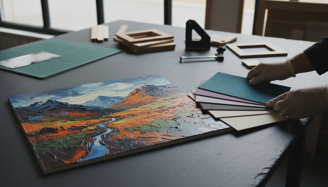
Choosing the perfect frame is an exciting step, but there’s a crucial element sitting between the art and the frame that deserves just as much attention: the picture mount. Before we explore the central question of what colour mount should I choose, it’s vital to understand why the mount itself is so fundamental. A mount, also known as a mat, is the precision-cut, premium card that creates a window around your artwork, sitting directly between the print and the protective glass. It’s far more than a simple border; it’s a key player in both the presentation and preservation of your art.
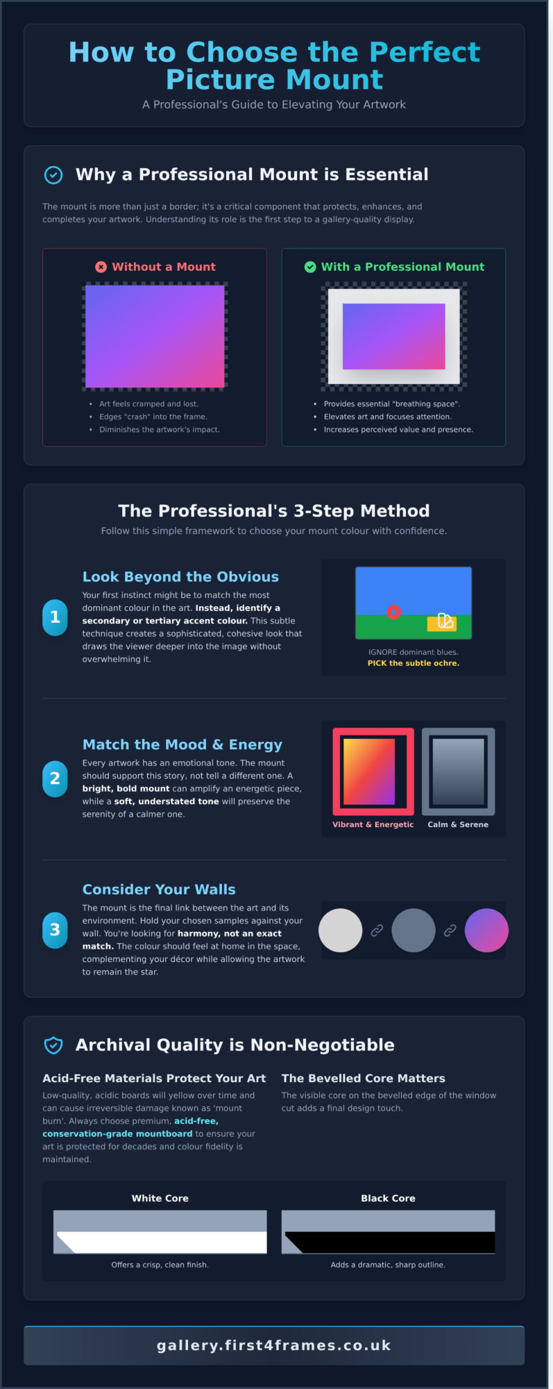
Think of the mount as providing essential ‘breathing space’. Without it, a piece of art can feel cramped and lost within its frame, its edges visually crashing into the frame moulding. A mount provides a quiet, neutral space that allows the eye to transition smoothly from the surrounding room into the artwork itself. At First4Frames, we see the mount as the perfect bridge connecting your room’s décor with the world inside the picture. It harmonises the colours of a vibrant abstract print, like those in our gallery, with the calm tones of your wall, creating a cohesive and professional display.
Why a Professional Mount Makes the Difference
The difference between a piece of fine art framed with and without a mount is instantly noticeable. A ‘bare’ frame can diminish the artwork, whereas a professionally selected mount elevates it, focusing the viewer’s attention and drawing them into the artist’s world. The width of the mount also has a profound impact. A generous mount can make a smaller print feel more substantial and significant, increasing its visual presence and perceived value. A standard A4 print, for example, can command the same wall space as a much larger piece when given a 3- to 4-inch mount, turning it into a spectacular focal point.
Archival Quality: Beyond Just Colour
The material of your mount is just as important as its shade. Low-quality, acidic boards will yellow over time and can cause irreversible damage to your print, a phenomenon known as ‘mount burn’. That’s why at First4Frames, we use only premium, acid-free, conservation-grade materials for all our picture framing services. This commitment to quality ensures your art is protected for decades. Part of this quality comes down to the core of the mountboard, which becomes visible as a fine line on the bevelled edge of the window cut. A white core offers a crisp, clean finish, while a black core can add a dramatic, sharp outline that works beautifully with monochrome photography. Understanding the role of the picture mount in preservation is key. In short, archival mounting is the non-negotiable industry standard for ensuring Giclée print longevity and colour fidelity.
Now that you appreciate the mount’s crucial role as a protector and a vital design tool, you’re ready for the next step. Answering the question of what colour mount should I choose is where your personal creative journey truly begins.
The Professional’s 3-Step Guide to Choosing Mount Colours
Choosing a mount colour can feel overwhelming, but it doesn’t have to be. With over 20 years of bespoke framing experience, we’ve refined the process into a simple, three-step method that ensures a spectacular result every time. This isn’t just about matching colours; it’s about creating a bridge between your room and the artwork, enhancing the piece without overpowering it. Our goal is to help you answer the question, “what colour mount should I choose?” with confidence and creativity.
Follow these steps to find the perfect partner for your print:
- Step 1: Look Beyond the Obvious. Your first instinct might be to match the mount to the most dominant colour in the artwork. Instead, we advise looking for the secondary or tertiary colours. In a landscape by an artist like Anthony Barrow, you might ignore the dominant blue of the sky and instead pick up the subtle, warm ochre from a distant field. This technique creates a sophisticated, cohesive look that draws the viewer deeper into the image.
- Step 2: Match the Mood. Every piece of art has its own emotional energy. Is it a vibrant, dynamic abstract bursting with life? Or is it a calm, muted photograph that inspires quiet contemplation? A bright, bold mount can amplify an energetic piece, while a soft, understated tone will preserve the serenity of a calmer one. The mount’s job is to support the artwork’s story, not to tell a different one.
- Step 3: Consider Your Walls. The mount is the final link between the art and its environment. Hold your chosen mount samples against your actual wall paint or wallpaper. You’re looking for harmony, not an exact match. The colour should feel at home in the space, complementing your décor while allowing the artwork to remain the star.
Option A: The Neutral Approach (Timeless & Safe)
For a classic, gallery-quality finish, you can’t go wrong with neutral tones like off-white, cream, or pale grey. This approach is timeless for a reason: it provides breathing room, allowing the artwork to speak for itself without any competition. It’s the perfect choice for busy compositions or pieces you want to stand the test of time. For our premium Giclée prints, matching the mount to the specific white tone of the archival paper creates a seamless, professional transition from print to frame. This attention to detail is a key part of professional presentation, a topic covered well in this comprehensive guide to framing art.
Option B: The Accent Approach (Bold & Modern)
If you’re aiming for a more contemporary or dramatic effect, using the mount to create an accent is a powerful choice. By selecting a colour that picks up a tiny, almost hidden detail in the art, you can make that element pop and bring a new dimension to the piece. Dark mounts in charcoal, deep navy, or forest green work beautifully to add depth and drama, especially for light-toned prints or monochrome photography. Just remember the ‘Rule of Tones’: ensure your mount is either significantly darker or lighter than your wall colour to create a clean contrast and avoid a muddled appearance. You can see these principles beautifully applied when you browse the professionally framed pieces in our gallery.
Case Studies: Mounting Iconic Scottish Art from First4Frames
Theory is a great starting point, but the real magic happens when you apply it to actual artwork. To truly understand the impact of a mount, let’s explore how we approach framing for two of Scotland’s most iconic and stylistically different artists, both featured in our First4Frames gallery. Their work provides a perfect lesson in how a bespoke mount can either tame a riot of colour or deepen a dramatic narrative.
Framing Jolomo: Managing Intense Colour
John Lowrie Morrison’s (Jolomo) paintings are an explosion of expressionist energy. His depictions of the Scottish West Coast pulse with vibrant pinks, electric blues, and brilliant yellows. A single, stark white mount can often feel jarring against such intensity. So, when customers ask us what colour mount should I choose for a Jolomo, our bespoke framing team often recommends a double mount. The top mount, a wider layer of a soft, neutral colour like ‘Hayseed’ or ‘Cloudy White’, gives the artwork essential breathing room. The second, thinner mount underneath provides a ‘sliver’ of colour. By carefully selecting a subtle secondary shade from the painting, like a pale yellow to echo a sunlit cottage wall, you create a beautiful, harmonious transition that pulls you right into the landscape. With this much happening in the art and mount, a simple, elegant frame in a matte black or light oak finish is all that’s needed to complete the piece.
Framing Vettriano: Enhancing the Narrative
Jack Vettriano’s work is the polar opposite of Jolomo’s. His art is cinematic, atmospheric, and steeped in a noir-inspired narrative. Here, a light, neutral mount can sever the connection to the piece’s moody interior world. To honour this aesthetic, we often guide clients toward deep, rich tones. A wide, dramatic mount in a deep burgundy, charcoal grey, or classic black can extend the painting’s atmosphere beyond its edges. While many an expert guide to framing and hanging art suggests playing it safe with white, Vettriano’s work often demands a bolder choice. This creates a powerful ‘window’ effect, making you feel as though you’re peering into a private scene from another era. A crucial consideration with dark mounts is reflection. We always recommend pairing them with one of our premium glazing options, like anti-reflective Artglass, to ensure the view remains crystal clear. It’s this attention to detail that our customers praise in their 5-star reviews, ensuring the final framed piece is nothing short of spectacular.
Understanding these different approaches shows that the answer to “what colour mount should I choose?” isn’t a single rule, but a creative decision based on the artwork itself. Whether you’re purchasing a print from our gallery or using our framing service for your own art, our expert team is here to help you make the perfect choice.

Matching the Mount to Your Interior Décor
A picture mount does more than just protect your artwork; it acts as a crucial design bridge, connecting the piece to your room’s décor. The right mount colour can harmonise with your wall paint, echo the tones in your soft furnishings, or create a deliberate, stunning contrast. It’s the final touch that transforms a simple print into an integral part of your home’s aesthetic. So, when asking yourself ‘what colour mount should I choose?‘, think beyond the artwork and consider the entire space.
This holistic view extends to all elements of the room’s architecture and design. For example, the way light enters a room through its windows plays a huge role. The clean, structured lines of high-quality window shutters, such as those designed by specialists like Shutters Factory, can create a particular style—be it modern minimalism or classic elegance—that you may want your framing choices to reflect.
The lighting in your room plays a significant role. A crisp, brilliant white mount might look spectacular in a room with abundant natural light, but under the warm, yellow glow of a 2700K tungsten bulb in the evening, it can appear jarringly bright. Conversely, a subtle off-white or cream mount can look dull under cool, blue-toned LED office lighting. We find that our ‘Minuet’ conservation-grade mount board, a soft and versatile off-white, works beautifully in over 90% of residential settings because it adapts gracefully to changing light conditions.
Your goal also dictates the choice. For a personal gallery wall at home, the selection is about your unique story. For commercial spaces, such as staging a new property development or designing a hotel lobby, the mount’s job is to create a cohesive and aspirational atmosphere that appeals to a wider audience.
The Gallery Wall Strategy
Creating a gallery wall is a beautiful way to display a collection, but it presents a key question: should all the mounts match? Using a uniform mount colour, like a consistent off-white, is a professional trick to bring order and sophistication to a collection of different art styles and frame types. It creates a visual rhythm that allows the eye to move seamlessly from a vibrant abstract by Sarah Hooper to a delicate botanical print. This approach is one we frequently recommend to our commercial clients, helping them curate a high-end, cohesive look across multiple rooms with precision and style.
Measuring and Proportion
Great mounting isn’t just about colour; it’s about proportion. Have you ever noticed how professionally framed art just looks ‘right’? The secret is often ‘bottom weighting’. This technique involves making the bottom border of the mount slightly wider than the top and sides, typically by 10-20%. This small adjustment counteracts an optical illusion that makes a centred object appear to be slipping down, giving the artwork a stable, perfectly balanced foundation. This level of detail is only achievable with a bespoke service, which allows for creative and precise proportions that standard off-the-shelf frames can’t offer.
Achieving this professional finish is embedded in our simple, three-step process. First, browse the beautiful fine art in our gallery. Second, choose your bespoke frame and mount combination, applying these expert principles. Third, place your order and let our craftsmanship bring it all together. Ready to find the perfect piece and apply these professional mounting principles? Explore the First4Frames gallery today.
Experience the First4Frames Bespoke Framing Service
Choosing the right mount is an art form in itself, but you don’t have to master it alone. For over 20 years, our family-run business in Falkirk, Scotland, has been the trusted partner for art lovers and creators. We combine a deep passion for craftsmanship with professional expertise to help you find the perfect finish for your artwork, ensuring every piece looks its absolute best.
Our unique advantage is the ‘one-stop-shop’ experience. You can explore our gallery’s stunning collection of fine art Giclée prints and have your chosen piece professionally mounted and framed right here. This seamless process means your art arrives ready to hang, with every element perfectly harmonised by our expert team. We handle all the details, so you can simply enjoy the beautiful result. This commitment to quality is why our customers have given us a 4.9-star rating on Google Reviews; we believe every frame should be a masterpiece.
At the heart of our service is an unwavering dedication to quality. We source only the best materials for every bespoke order, from premium, conservation-grade mount boards that protect your art from discolouration to high-clarity glazing. Our professional craftsmanship ensures precision-cut mounts and flawlessly joined frames that are built to last a lifetime.
Custom Framing for Your Own Treasures
Our expertise extends far beyond the prints in our gallery. We apply the same principles of colour theory and design to your own cherished items. Bring us your family photographs, military medals, or treasured memorabilia, and we’ll help you preserve and display them with the care they deserve. Our consultation process makes deciding what colour mount should I choose a creative and enjoyable experience, as we guide you through a spectacular range of options to find the perfect match.
Visit Our Falkirk Gallery
The best way to understand the impact of a mount is to see it for yourself. We invite you to visit our Falkirk gallery to experience our spectacular Giclée prints in person, where you can truly appreciate their rich texture and vibrant colour. Get hands-on with our extensive range of mount samples and see the ‘bridge’ effect in real-time as you pair different tones with beautiful artwork. Let us help you find the perfect combination. Start your artistic discovery and browse our gallery today.
Frame Your Art with Confidence and Craftsmanship
Choosing a mount is no longer a mystery. By remembering to serve the artwork first and considering how the mount acts as a bridge to your décor, you can select a colour that truly elevates your piece. You now have the professional insight to decide whether a neutral tone will let the art speak for itself or if a bolder choice will create a stunning statement. Armed with this advice, the question of what colour mount should I choose transforms from a daunting task into an exciting part of the creative process.
At First4Frames, we’ve channelled over 20 years of bespoke framing expertise into helping art lovers make these very decisions. Our passion for craftsmanship is reflected in our top-rated customer reviews for quality and service, particularly for the spectacular Scottish fine art and Giclée prints we specialise in. You’re not just buying a frame; you’re investing in decades of experience.
Ready to put your knowledge into action? Design your perfect bespoke frame at First4Frames Gallery and see your vision come to life. Let’s create a beautifully framed piece that you’ll be proud to display for years to come.
Frequently Asked Questions
What is the most popular mount colour for art prints?
The most popular mount colour is overwhelmingly a shade of off-white or ivory. Classic choices like our ‘Snow White’ or ‘Antique White’ mounts are versatile and timeless. They create a clean, bright space around your artwork, allowing the piece itself to be the true focus without any colour distraction. This neutral approach complements the vast majority of art styles and interior decors, making it a safe yet professional choice for almost any print in our gallery.
Should the mount be lighter or darker than the wall?
A mount should typically be lighter than the artwork but distinct from your wall colour. This creates a beautiful, seamless transition from the wall to the art. If you’re wondering what colour mount should I choose to make a statement, a darker mount can make the colours in your print appear more vibrant and ‘pop’. However, for most pieces, a soft, neutral mount that is a few shades lighter than the most prominent colour in the art provides a classic, gallery-quality finish.
What is a double mount, and when should I use one?
A double mount features two layers of mountboard, with the bottom layer cut slightly larger to reveal a thin border of colour around the artwork. It’s a premium technique used to add depth and a bespoke, decorative finish. We often use a double mount to pick out a subtle secondary colour from one of our artist’s prints, creating a stunning, cohesive look. This small detail elevates the final piece, demonstrating true bespoke craftsmanship and drawing your eye into the image.
Can I change the mount colour if I change my room décor?
Yes, you can absolutely change the mount if your décor changes. It’s one of the simplest and most effective ways to refresh your framed art. Our professional picture framing service can easily replace an existing mount with a new one to perfectly match your updated colour scheme. This is a far more cost-effective solution than buying entirely new art, ensuring the pieces you love continue to look perfect in your home, a service reflected in our excellent customer ratings.
Does the mount colour affect the perceived size of the artwork?
Yes, the mount colour significantly affects the perceived size of your artwork. A light or white mount tends to open up the image, making the entire framed piece feel larger and more airy on your wall. In contrast, a dark mount, such as a deep grey or black, creates a more focused and contained effect. This can sometimes make the artwork itself appear slightly smaller, but it also adds a sense of drama and intimacy to the viewing experience.
Is there a ‘standard’ width for a picture mount?
There isn’t a strict ‘standard’ width, as the perfect mount is always proportional to the artwork. However, a common guideline for most A4 to A2 sized prints is a width between 50mm and 85mm. The primary goal is to give the artwork breathing room, preventing it from feeling cramped against the frame. For very large or small pieces, our bespoke framing experts adjust this width to achieve the perfect visual balance, ensuring a professional and harmonious result.
How do I choose a mount for a black and white photograph?
For a black and white photograph, classic mount choices are crisp white, off-white, or black. A pure white mount creates a sharp, high-contrast look that makes the blacks in the photo appear deeper and richer. An off-white provides a softer, more traditional feel. For a bold, contemporary statement, a black mount is superb, especially when paired with a thin white inner mount (a double mount) to cleanly separate the photograph from the dark surround.
Why should I choose an acid-free mount for my Giclée prints?
You should always choose an acid-free mount for Giclée prints to guarantee their preservation. Standard mounts contain acids that can seep into the paper over years, causing permanent yellowing and damage known as ‘mat burn’. Our conservation-grade, acid-free mounts are pH neutral. They protect your fine art print from deterioration, ensuring the archival inks and paper retain their vibrancy and quality for over 100 years, safeguarding your investment in beautiful, lasting art.