Posted on

Choosing Art for Olive Green Walls, Why Milis Playing Peekaboo Feels So Warm

Image of Milis Playing Peekaboo by Hillary Barker

Choosing art for olive green walls usually comes down to warmth and personality. Olive is an excellent colour for creating depth, but it can become slightly heavy if the artwork does not bring enough life to the scheme. Milis Playing Peekaboo works especially well because it adds charm and brightness while still feeling grounded enough for a richer room.

Why earthy wall colours need a little lift

Olive green can look sophisticated and restful, but too many similarly weighted elements in the room can leave everything feeling dense. Artwork is often the best way to change that. The right framed piece gives the wall a focal point and helps the colour feel intentional rather than slightly dark.

  • It suits kitchens, boot rooms, family spaces, and country-style interiors.
  • It adds warmth without pushing the room into novelty.
  • It helps deeper green walls feel more welcoming day to day.

Why this subject works with olive so naturally

The character in Milis Playing Peekaboo brings exactly the kind of softness an earthy palette can benefit from. The piece feels lively, but it is still easy to place in a well-finished home. That is important when you want the room to feel warm and personal rather than overly themed.

Why the finish counts

First 4 Frames completes every piece in-house with bespoke framing, colour-managed Giclée printing, and hand-finished craftsmanship. In a colour-rich room, that quality matters because better presentation keeps the artwork feeling polished and substantial.

This artwork is by Hillary Barker, and you can view the exact framed product here.

If you need art for olive green walls that feels warm, characterful, and professionally finished, Milis Playing Peekaboo is a lovely choice.

Posted on

What Makes Echoes of Understanding a Calm Coaching Room Wall Art Choice

Good coaching room wall art should help a space feel calm without making it feel impersonal. In one-to-one settings, the room matters. It should support focus, trust, and ease from the moment someone sits down. Echoes of Understanding is a very strong choice because it brings presence and feeling without overwhelming a quieter professional space.

Why private client rooms need the right tone

Coaching rooms often work best when they feel settled and human rather than too corporate. Artwork can help create that balance. The right piece suggests care and personality, but it should still leave enough visual quiet for conversation and reflection.

  • It suits coaching rooms, mentoring spaces, and private appointment studios.
  • It adds warmth without making the room distracting.
  • It helps the space feel considered and welcoming from the outset.

Why this artwork works in a reflective space

Echoes of Understanding has a calm emotional quality that fits naturally in rooms built around attentive conversation. It feels expressive, but still controlled. That makes it easier to live with over time, especially in a setting where clients may notice the piece closely while they talk and think.

Why the First 4 Frames finish supports the room

At First 4 Frames, every piece is completed in-house in Falkirk with bespoke framing, colour-managed Giclée printing, and hand-finished craftsmanship. In a professional room where trust and presentation matter, that superior quality helps the artwork feel reassuringly well judged.

This artwork is by Diana Hand, and you can view the exact framed product here.

If you want coaching room wall art that feels calm, thoughtful, and professionally finished, Echoes of Understanding is an excellent fit.

Posted on

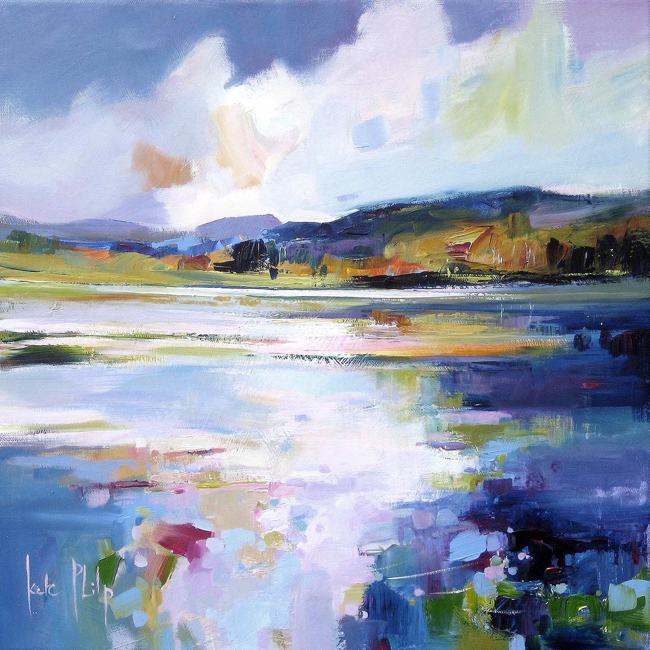
Croft House and the Appeal of Wall Art for Sisal Carpet

Choosing wall art for sisal carpet is often about building warmth around texture. Sisal gives a room wonderful natural character, but it can also leave the scheme feeling a little dry if the walls do not bring enough softness or colour. Croft House works very well in that setting because it keeps the natural mood while adding a more welcoming focal point.

Why natural flooring needs more than neutrals alone

Sisal often appears in rooms built around relaxed materials and quieter tones. That can look beautiful, but it still helps to have artwork that gives the eye a clear resting point. A framed print can stop the room from feeling too textural and not quite finished.

  • It suits sitting rooms, bedrooms, and lightly dressed guest spaces.
  • It adds warmth without losing the room’s natural ease.
  • It helps textured materials feel curated rather than accidental.

Why this artwork feels especially compatible

Croft House has a grounded, approachable quality that sits naturally with woven flooring and other tactile materials. It gives the wall enough presence to anchor the room, yet it still feels calm. That balance is exactly what many sisal-led spaces need.

Why the framing quality matters

First 4 Frames produces each piece in-house with bespoke framing, colour-managed Giclée printing, and hand-finished craftsmanship. In a room where material quality is part of the appeal, that higher standard helps the artwork feel properly resolved rather than decorative for its own sake.

This artwork is by Kate Philp, and you can view the exact framed product here.

If you need wall art for sisal carpet that feels warm, natural, and professionally finished, Croft House is an excellent option.

Posted on

Why Sunset, The Cuillins, Isle Of Skye Suits Wall Art for Acoustic Slat Panels

The right wall art for acoustic slat panels should soften the wall rather than fight it. Slatted panels add useful texture and often improve the sound of a room, but they can also make the scheme feel a little rigid if nothing interrupts that rhythm. Sunset, The Cuillins, Isle Of Skye works especially well because it introduces warmth, movement, and a stronger focal point.

Why slatted walls benefit from more fluid artwork

Acoustic slat panels create clear lines and repetition. That can look polished, but it also means the artwork nearby needs a different quality. A framed print with atmosphere helps loosen the structure of the wall and stops the room from feeling too engineered.

  • It suits media spaces, family rooms, and contemporary offices.
  • It gives warmth to a more architectural surface treatment.
  • It helps texture feel intentional rather than severe.

Why this piece earns its place

The colour and landscape character in this artwork create a softer counterpoint to the slats behind it. That balance matters. You still get the benefit of the panelling, but the room becomes more welcoming and less dependent on straight lines alone.

Why First 4 Frames quality matters here

Every piece is completed in-house in Falkirk with bespoke framing, colour-managed Giclée printing, and hand-finished craftsmanship. In a room where joinery and wall finishes already suggest quality, that superior standard helps the artwork look entirely at home.

This artwork is by Nikki Monaghan, and you can view the exact framed product here.

If you want wall art for acoustic slat panels that feels warm, balanced, and professionally finished, Sunset, The Cuillins, Isle Of Skye is a lovely fit.

Posted on

Choosing Art for Dusty Blue Walls, Why Goatfell, Arran Feels So Balanced

Finding the right art for dusty blue walls is usually about balance. Blue can feel calm, elegant, and very easy to live with, but it can also leave a room looking slightly flat if the artwork does not bring enough warmth or contrast. Goatfell, Arran works beautifully because it lifts the cooler base colour without breaking the room’s quieter mood.

Why cooler wall colours need some visual warmth

Dusty blue often looks at its best when the room has more than one temperature in play. Artwork can do that job very effectively. The right framed print keeps the scheme from feeling overly soft or one-note, while still respecting the calm quality that made blue appealing in the first place.

  • It suits bedrooms, sitting rooms, and smarter guest spaces.
  • It adds warmth without making the palette feel busy.
  • It helps a blue scheme feel considered rather than simply safe.

Why this subject works so naturally

Goatfell, Arran brings landscape character and a wider sense of space, which is often exactly what a blue room benefits from. It gives the wall a clear focal point, but it still feels relaxed and easy to place. That makes it especially useful when the room already leans toward softer tones and restrained materials.

Why a hand-finished framed print elevates the result

First 4 Frames completes each piece in-house with bespoke framing, colour-managed Giclée printing, and hand-finished craftsmanship. In a colour-led room, that better finish matters because cleaner framing and stronger print quality help the artwork feel intentional rather than incidental.

This artwork is by Esther Cohen, and you can view the exact framed product here.

If you need art for dusty blue walls that feels warm, composed, and professionally finished, Goatfell, Arran is a very strong option.

Posted on

Why Coastal Path web Works So Well as Wall Art for Sliding Patio Doors

Choosing wall art for sliding patio doors is often about restoring balance. Large panes of glass bring in wonderful light and a strong garden connection, but they can also leave the interior feeling visually light on one side. Coastal Path web works especially well because it gives the room a calm focal point without making it feel heavier or more enclosed.

Why wide glazing needs something steady nearby

Patio doors naturally pull the eye outward. That is part of their appeal, but it means the walls around them need a little more intention. A well-chosen framed print helps the room feel finished even when the view outside changes with the weather and the time of day.

  • It suits sitting rooms, dining spaces, and garden rooms with broad glazing.
  • It adds structure without competing with the outdoor view.
  • It helps the room feel styled indoors rather than defined only by the doors.

Why this piece feels right in a brighter room

Coastal Path web has enough movement and colour to hold its place, yet it still keeps the room relaxed. That matters in spaces with large glass openings, where artwork needs presence but should not feel too dense. The result is a more settled room that still feels open and easy to live with.

Why the finish matters

First 4 Frames completes each piece in-house in Falkirk with bespoke framing, colour-managed Giclée printing, and hand-finished craftsmanship. In a light-filled room, that superior presentation makes a real difference because better framing and print quality stop the artwork from looking washed out beside the glass.

This artwork is by Arie Vardi, and you can view the exact framed product here.

If you want wall art for sliding patio doors that feels calm, balanced, and professionally finished, Coastal Path web is an excellent choice.

Posted on

Masters of all they survey and the Appeal of Wall Art for Wool Upholstery

Choosing wall art for wool upholstery is often about keeping a room tactile without letting it become too muted. Wool fabrics bring comfort, warmth, and substance, but they can benefit from artwork that gives the scheme a stronger point of focus. Masters of all they survey works especially well because it adds presence while staying true to a room shaped by texture and natural character.

Why tactile rooms still need one clearer anchor

Rooms with wool upholstery often feel comfortable and grounded from the start. The challenge is making sure they also feel visually resolved. This piece helps by adding definition and a stronger sense of intent, which stops a softer room from drifting into looking too understated.

  • It suits sitting rooms, studies, and snug spaces with layered textiles.
  • It adds focus without losing the warmth of the room.
  • It works especially well with natural fibres, timber, and softer lighting.

Why wildlife artwork can feel so at home here

Wool upholstery often appears in interiors that value comfort, craft, and a connection to natural materials. Masters of all they survey fits that mood very well. It brings character and quiet strength, helping the room feel more complete without becoming theme-led.

It can work beautifully above a sofa, beside a reading chair, or on the wall that needs a little more substance in a room built around textured fabrics and calmer colours.

Why the made-in-house finish matters

First 4 Frames completes each piece in-house in Falkirk with bespoke framing, colour-managed Giclée printing, and hand-finished craftsmanship. In a room where the appeal already comes from texture and better materials, that higher standard gives the artwork the right kind of authority.

This artwork is by Chris Sharp, and you can view the exact framed product here.

If you need wall art for wool upholstery that feels warm, grounded, and professionally finished, Masters of all they survey is an excellent option.

Posted on

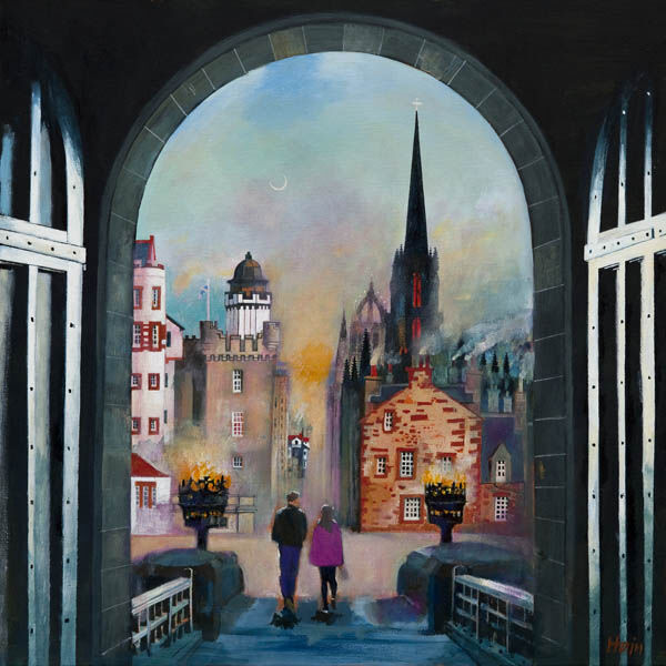
Why Gingerbread Tree (Princess Street Gardens) Suits Wall Art for Dado Panelling

The best wall art for dado panelling needs to work with a wall that already has plenty of character. Panelling adds depth and structure, but it also means the artwork has to hold its own above a clear visual break. Gingerbread Tree (Princess Street Gardens) does that beautifully, bringing colour and personality without making the room feel fussy.

Why panelled rooms benefit from artwork with energy

Dado panelling gives a room instant definition, but it can also make the upper wall feel a little formal if nothing above it loosens the look. This piece brings movement and story into the space, which helps the room feel more lived in and less rigidly arranged.

  • It suits hallways, dining rooms, and sitting rooms with traditional detail.
  • It adds character without clashing with panelling lines.
  • It helps a classic room feel spirited rather than stiff.

Why this subject feels so effective here

Rooms with dado panelling often respond well to artwork that introduces personality and a little surprise. Gingerbread Tree (Princess Street Gardens) has exactly that quality. It feels memorable and expressive, yet the framed presentation keeps the overall effect neat and considered.

It can work especially well above the panelling line in a hallway, over a dining room sideboard, or on a landing wall where the joinery needs a stronger focal point above it.

Why quality framing matters in a detailed room

First 4 Frames completes every piece in-house in Falkirk with bespoke framing, colour-managed Giclée printing, and hand-finished craftsmanship. In a room where wall treatments and joinery already carry weight, that superior finish helps the art feel appropriate to the setting.

This artwork is by Matylda Konecka, and you can view the exact framed product here.

If you want wall art for dado panelling that feels lively, polished, and distinct, Gingerbread Tree (Princess Street Gardens) is a very strong choice.

Posted on

How Moody Blues Can Work Beautifully as Wall Art for a Room With Wall Lights

Choosing wall art for a room with wall lights is often less about daylight and more about how the space feels in the evening. When the room relies on side lighting, the artwork needs enough depth and character to hold attention without disappearing after dark. Moody Blues is especially effective because it comes alive in a softer, more atmospheric setting.

Why evening rooms need artwork with depth

Wall lights create warmth and intimacy, but they also flatten weaker pieces or make them feel secondary to the lighting itself. This artwork has enough tonal interest to stay present as the light levels change, which helps the room feel layered rather than simply dim.

  • It suits sitting rooms, bedrooms, and snug spaces used more in the evening.
  • It works well where lighting is softer and more directional.
  • It helps an intimate room feel richer without adding clutter.

Why the mood of the piece matters

Some artwork only really reads in bright natural light. Moody Blues is different. Its atmosphere means it still feels expressive when lit by wall sconces or lamps, which makes it a very practical as well as attractive choice for rooms that come into their own later in the day.

It can work beautifully between two wall lights, above a sideboard with ambient lighting nearby, or on the wall opposite a sofa where the room needs a quieter but still memorable focal point.

Why the framed finish helps after dark

First 4 Frames completes each piece in-house with bespoke framing, colour-managed Giclée printing, and hand-finished craftsmanship. In evening rooms, those details matter because the quality of the presentation helps the artwork keep its presence even under softer light.

This artwork is by Stuart Roy, and you can view the exact framed product here.

If you need wall art for a room with wall lights that feels atmospheric, polished, and easy to live with, Moody Blues is an excellent option.

Posted on

Twinky and the Case for Better Wall Art by Banquette Seating

Good wall art for banquette seating should make an everyday eating space feel more inviting rather than more crowded. A built-in bench often gives a kitchen or dining nook practical structure, but it can also leave the wall above it feeling quite plain. Twinky works beautifully here because it adds charm and warmth without making the area feel overdone.

Why dining nooks need personality

Banquette seating is often chosen to make a room more useful, sociable, and space-efficient. The finishing touch is usually on the wall above it. Twinky helps turn that practical arrangement into somewhere that feels genuinely welcoming, whether it is used for family breakfasts, working lunches, or slower weekend coffee.

  • It suits kitchen diners, breakfast corners, and alcove benches.
  • It adds warmth without cluttering a compact eating area.
  • It helps a built-in seating spot feel more personal and finished.

Why this subject works so naturally

Artwork near seating needs a friendliness that feels easy to live with. Twinky brings that in a way that is characterful rather than novelty-led. It gives the dining area a touch of humour and heart, but the framed presentation keeps the overall look polished.

It can work especially well centred above the bench, at the end of a banquette run, or in a breakfast nook that needs one warmer focal point to balance painted cabinetry and timber surfaces.

Why a bespoke framed print suits the space

First 4 Frames completes every piece in-house in Falkirk with bespoke framing, colour-managed Giclée printing, and hand-finished craftsmanship. That superior finish matters in a hard-working room, where better materials and presentation help the artwork feel lasting rather than temporary.

This artwork is by Hillary Barker, and you can view the exact framed product here.

If you want wall art for banquette seating that feels friendly, well judged, and professionally finished, Twinky is a very appealing choice.