Posted on

Choosing Art for Striped Upholstery, Why Sanna Bay, Ardnamurchan Feels So Well Judged

Impressionistic painting titled "Sanna Bay, Ardnamurchan" featuring turquoise waters, sandy shores, rocky outcrops, and distant hills beneath a blue sky with clouds, all bathed in soft light for a serene atmosphere.

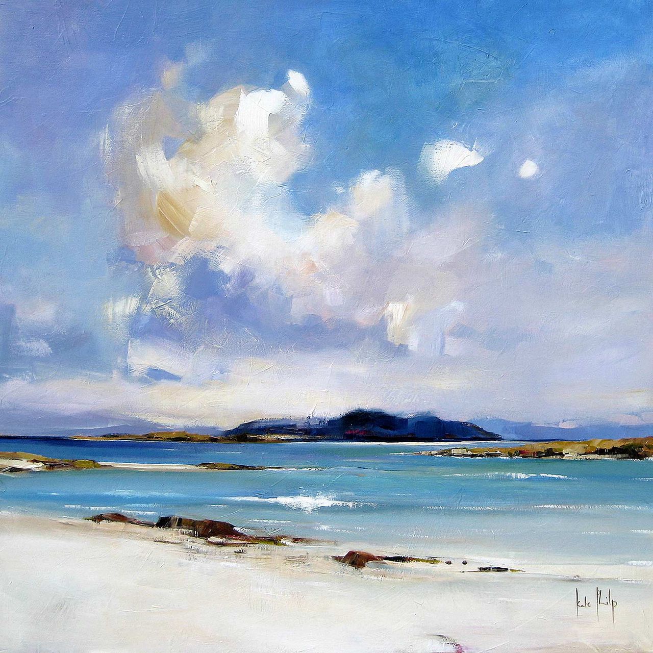
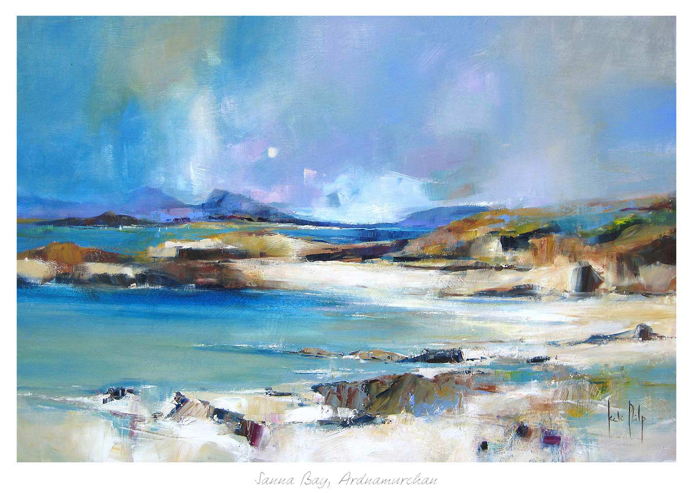
Finding the right art for striped upholstery is usually about control. Stripes bring rhythm and structure to a room, but they can also make the scheme feel busier if the artwork adds too much competition. Sanna Bay, Ardnamurchan works beautifully because it softens that effect without making the room feel flat.

Why patterned rooms benefit from calmer artwork

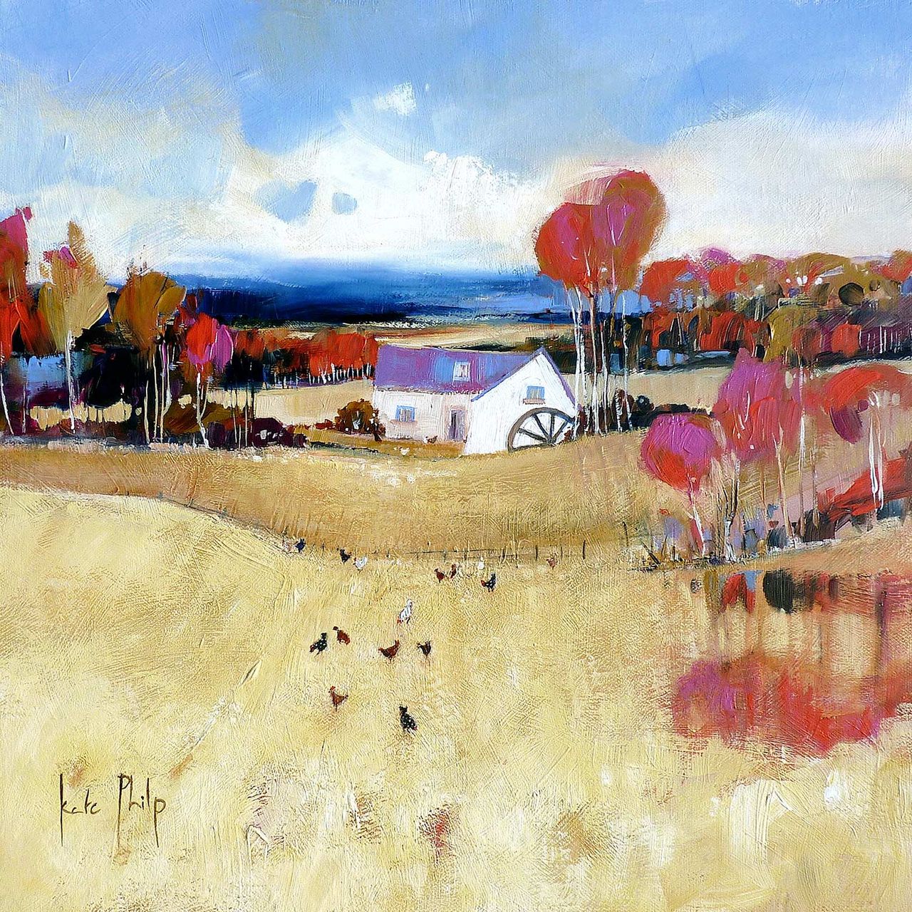
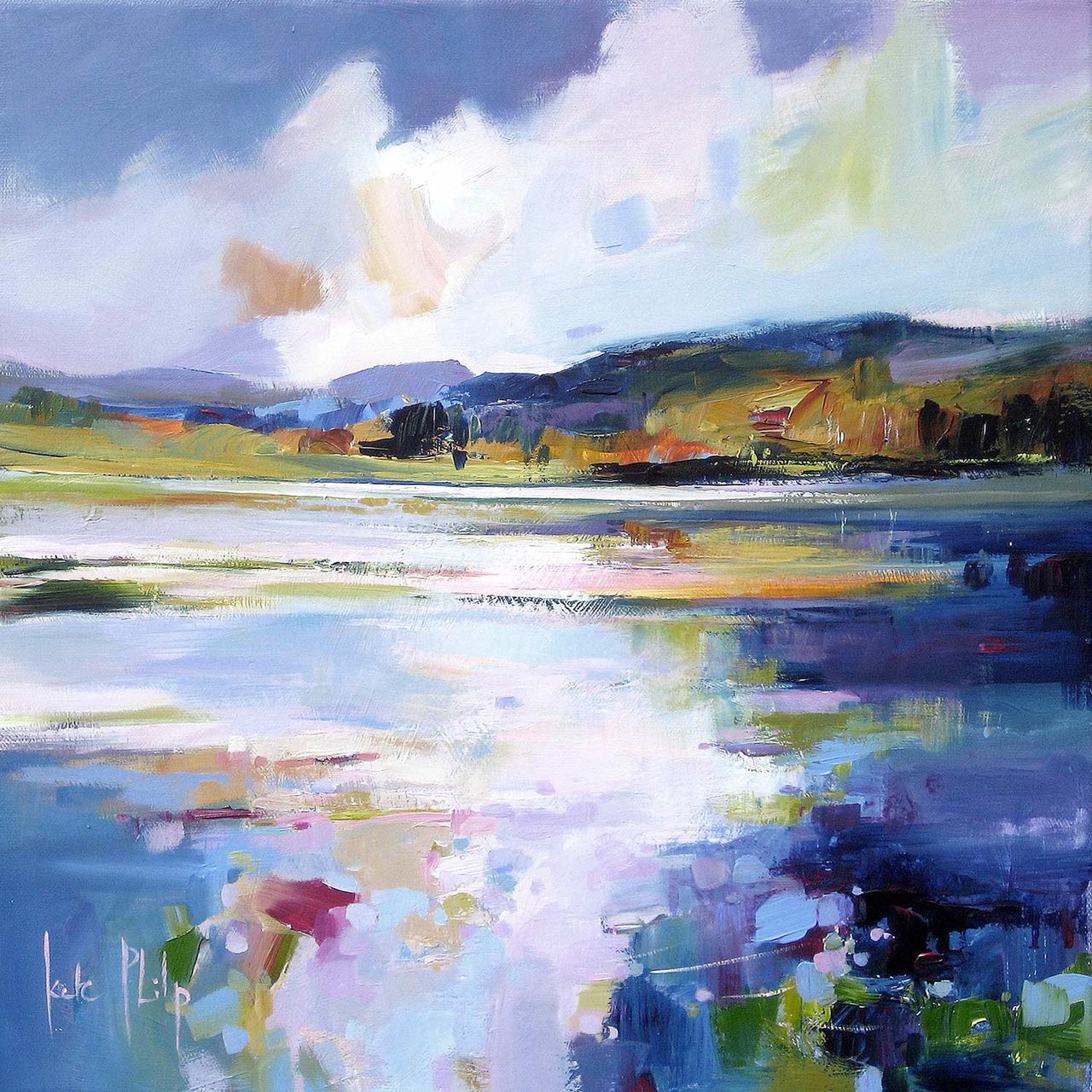
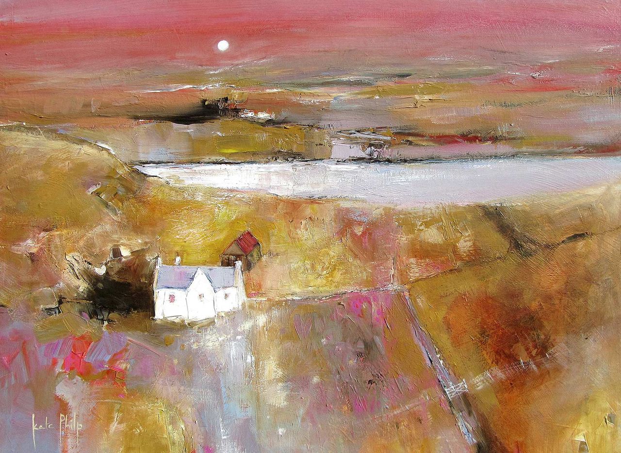
When upholstery already introduces repeated lines, the wall often needs a slightly steadier note. Artwork can bridge the room together, helping fabrics, cushions, and furniture feel like part of one scheme rather than separate decorative decisions.

Sanna Bay, Ardnamurchan has enough atmosphere to hold its place, but it still reads as composed and restful. That makes it especially useful in sitting rooms, bedrooms, or reading spaces where stripes are part of the main visual character.

  • It suits striped armchairs, sofas, and banquette seating.
  • It helps pattern feel layered rather than cluttered.
  • It adds softness without losing decorative confidence.

Why the finish matters in a well-styled room

First 4 Frames produces every piece in-house in Falkirk with bespoke framing, colour-managed Giclee printing, and hand-finished craftsmanship. In a room where fabrics and detail already matter, that superior presentation helps the artwork feel fully at home.

You can explore more work by Kate Philp and view the exact framed product here.

If you are searching for art for striped upholstery that feels balanced, calm, and naturally cohesive, Sanna Bay, Ardnamurchan is an excellent fit.

Posted on

How Molly’s Mill Can Soften a Holiday Cottage Bedroom

Good holiday cottage bedroom wall art should help guests feel welcomed rather than simply accommodated. A cottage bedroom often benefits from artwork that carries a sense of place while still keeping the room restful and easy to unwind in. Molly’s Mill is especially well suited to that kind of setting.

Why guest bedrooms need calm with character

Holiday rooms can easily slip into generic styling if every choice tries too hard to signal location. One carefully framed piece works better because it gives the room personality without turning it into a theme.

  • It suits cottage bedrooms, guest rooms, and quieter coastal retreats.
  • It adds place and personality without making the room feel busy.
  • It helps a simple bedroom feel more welcoming and complete.

Why Molly’s Mill feels so comfortable here

The subject has enough local character to feel memorable, yet the overall tone remains calm and settled. That balance is exactly what helps a guest room feel thoughtful rather than overworked.

First 4 Frames completes each piece in-house in Falkirk using bespoke framing, colour-managed Giclee printing, and hand-finished craftsmanship. That superior finish gives the room a more polished and well-cared-for feel straight away.

You can explore more work by Kate Philp and view the exact framed product here.

If you are looking for holiday cottage bedroom wall art that feels restful, locally rooted, and easy to place, Molly’s Mill is a very appealing option.

Posted on

Torridon and the Case for Art in a Room With Fluted Glass

Choosing art for a room with fluted glass often comes down to balance. Fluted glass brings beautiful texture to doors, cabinets, or partitions, but it can also make a space feel slightly segmented unless the other elements help tie it together. Torridon works especially well because it adds calm presence without fighting that detail.

Why textured glazing changes the feel of a room

Fluted glass catches the eye in a subtle, repeating way. That means the artwork nearby should not be too abrupt or overcomplicated. A framed piece with atmosphere and steady composition can soften the rhythm and make the room feel more cohesive.

  • It suits hallways, kitchens, and living spaces with reeded or fluted glass details.
  • It adds softness without losing definition.
  • It helps a more architectural room feel warmer and more complete.

Why Torridon is such a good partner

The mood is calm and grounded, which makes it easy to place beside stronger lines and textured surfaces. It gives the eye a place to rest while still contributing to the room in a meaningful way.

Why craftsmanship supports the effect

First 4 Frames produces each piece in-house in Falkirk using bespoke framing, colour-managed Giclee printing, and hand-finished craftsmanship. That superior finish matters when the interior already includes careful material choices and the artwork needs to feel equally well judged.

This artwork is by Kate Philp, and you can view the exact framed product here.

If you are searching for art for a room with fluted glass that feels calm, textural, and easy to live with, Torridon is an excellent option.

Posted on

What Makes The Waterlily Lochan So Well Suited to a Room With a Reading Bench

The right wall art for a room with a reading bench should support the slower rhythm of the space. A reading bench often sits in a bay, alcove, or spare corner that already feels promising, but the wall behind it still needs something to make the area feel complete. The Waterlily Lochan works especially well because it brings calm presence without disrupting the sense of retreat.

Why reading corners need visual calm

When a corner is meant for reading or pausing, the décor should feel settled rather than busy. The artwork matters because it shapes how the area feels when the book is down and the room is quiet.

  • It suits reading benches, bay-window seats, and quieter corners in bedrooms or landings.
  • It adds softness without making the space feel fussy.
  • It helps a small retreat feel intentional rather than leftover.

Why The Waterlily Lochan is such a natural partner

The mood is gentle and reflective, which makes it especially easy to place where you want the eye to settle rather than keep moving. That is exactly the quality many reading corners need.

Why the First 4 Frames finish helps

First 4 Frames completes every piece in-house in Falkirk using bespoke framing, colour-managed Giclée printing, and hand-finished craftsmanship. That superior finish gives the artwork enough presence to make a smaller corner feel fully considered.

This artwork is by Kate Philp, and you can view the exact framed product here.

If you are looking for wall art for a room with a reading bench that feels calm, restorative, and easy to live with, The Waterlily Lochan is a lovely choice.

Posted on

Choosing Art for Pale Oak Floors, Why From Iona Feels So Balanced

Finding the right art for pale oak floors is often about giving a light room a little more depth. Pale oak floors can look fresh, calm, and beautifully modern, but they can also leave a space feeling slightly thin if the artwork does not bring enough atmosphere. From Iona works especially well because it adds warmth without losing the room’s easy, natural feel.

Why lighter timber schemes need artwork with presence

Pale oak gives a room openness and softness, but it also reduces contrast. That means the artwork has an important role in making the space feel finished rather than slightly diffuse, especially if the rest of the palette is neutral too.

  • It suits bedrooms, sitting rooms, and calmer open-plan interiors.
  • It adds depth without making a light scheme feel heavier.
  • It helps timber, paint, and textiles feel more connected.

Why From Iona works so naturally in that setting

The piece has enough movement and colour to stop the room feeling one-note, but it still remains gentle enough for a quieter interior. That balance is exactly what many pale wood schemes need.

Why in-house craftsmanship helps

First 4 Frames produces each piece in-house in Falkirk using bespoke framing, colour-managed Giclée printing, and hand-finished craftsmanship. That superior finish helps the artwork bring substance to a lighter room without ever feeling abrupt.

This artwork is by Kate Philp, and you can view the exact framed product here.

If you are looking for art for pale oak floors that feels calm, layered, and easy to live with, From Iona is an excellent choice.

Posted on

What Makes Coral Bay Such a Good Narrow Dining Room Wall Art Choice

Choosing narrow dining room wall art is usually about proportion. A slimmer dining space can easily feel either too empty at one end or too crowded once furniture, lighting, and seating are in place. Coral Bay works especially well because it brings openness and colour without making the room feel tighter.

Why shape matters so much in a narrower dining space

Longer or slimmer dining rooms need artwork that helps the eye travel comfortably rather than stopping the room short. The right framed piece can create a more generous feeling and make everyday meals feel less squeezed into a leftover area.

  • It suits narrower dining rooms, kitchen-diners, and eating spaces along one side of an open-plan room.
  • It adds lightness without making the room feel vague.
  • It helps the dining area feel more welcoming for everyday use and guests.

Why Coral Bay works so naturally

The scene carries enough colour to give the wall presence, but it also has the sense of space that a narrower room benefits from. That combination helps the dining area feel more open while still looking properly anchored.

Why quality framing adds polish

First 4 Frames completes every piece in-house in Falkirk using bespoke framing, colour-managed Giclée printing, and hand-finished craftsmanship. In a room where proportion is important, that superior finish helps the artwork feel clean, balanced, and deliberate.

This artwork is by Kate Philp, and you can view the exact framed product here.

If you need narrow dining room wall art that feels airy, polished, and genuinely helpful to the room, Coral Bay is a very strong choice.

Posted on

How Portnalong, Isle of Skye Can Soften Wall Art for Timber Cladding

Choosing wall art for timber cladding is usually about contrast and control. Clad walls bring texture, rhythm, and natural warmth, but they can also make a room feel visually busy if every other element follows the same note. Portnalong, Isle of Skye works beautifully because it softens that texture while still feeling entirely in keeping with the room.

Why clad rooms need a calmer focal point

Timber cladding already gives a wall strong identity. That can look wonderful, but it means the artwork has to bring enough ease and atmosphere to keep the room from feeling too repetitive. This print helps by introducing colour variation and a more open sense of space.

  • It suits garden rooms, coastal homes, cabins, and modern spaces using timber detailing.
  • It adds softness without losing the room’s natural character.
  • It works well where customers want warmth with a more finished focal point.

Why Portnalong, Isle of Skye fits so naturally

The subject feels spacious and calm, which is exactly what a textured wall often needs. Rather than adding more visual structure, the framed piece relaxes the scheme slightly and helps the cladding feel like part of a complete room rather than the whole story.

Why the First 4 Frames finish matters here too

First 4 Frames produces each piece in-house in Falkirk using bespoke framing, colour-managed Giclée printing, and hand-finished craftsmanship. In a room where materials and texture matter, that superior quality helps the artwork feel properly integrated rather than added as an afterthought.

This artwork is by Kate Philp, and you can view the exact framed product here.

If you need wall art for timber cladding that feels soft, balanced, and genuinely easy to live with, Portnalong, Isle of Skye is a very strong fit.

Posted on

Morning Sail Broughty Ferry and the Appeal of Wall Art for Plantation Shutters

Finding the right wall art for plantation shutters is often about softening a room that already has strong clean lines. Shutters can make a space feel polished and orderly, but they also set quite a crisp tone. Morning Sail Broughty Ferry works beautifully because it keeps that sense of control while adding a gentler, more relaxed focal point.

Why shuttered rooms benefit from a softer note

Plantation shutters bring structure, rhythm, and a tailored look to a room. The artwork nearby needs to stop the space feeling too stiff. This piece helps by introducing light, atmosphere, and a more natural sense of movement, which keeps the room inviting.

  • It suits sitting rooms, bedrooms, and garden-facing spaces with a bright, tidy feel.
  • It adds warmth without undoing the cleaner look of the shutters.
  • It works well where daylight and calm decoration matter.

Where this sort of piece works best

Morning Sail Broughty Ferry sits especially well on the wall opposite the windows or beside a seating area where the shutters already shape the room. In those positions, it helps the whole space feel connected rather than visually split between the windows and everything else.

Why in-house craftsmanship matters

First 4 Frames produces each piece in-house in Falkirk using bespoke framing, colour-managed Giclée printing, and hand-finished craftsmanship. In a room with crisp joinery and carefully chosen finishes, that superior quality helps the artwork feel equally considered.

This artwork is by Kate Philp, and you can view the exact framed product here.

If you want wall art for plantation shutters that feels calm, polished, and naturally balanced, Morning Sail Broughty Ferry is an excellent choice.

Posted on

Vallay Strand, Uist and the Challenge of Art for a Room With Woven Blinds

Choosing art for a room with woven blinds is often about keeping natural texture from becoming too dominant. Woven blinds add warmth and softness, but they also introduce pattern and tone at window height. Vallay Strand, Uist is a strong fit because it keeps the room airy while still feeling grounded.

Why natural window treatments need the right partner on the wall

Rooms with woven blinds often already feel tactile and relaxed. The wrong artwork can make them feel a little muddy or over-layered. This piece works well because it brings openness and a sense of light, which helps balance the denser texture around the windows.

  • It suits bedrooms, sitting rooms, and garden-facing spaces.
  • It complements rattan, linen, and pale timber without looking forced.
  • It helps a naturally textured room stay calm.

Where this sort of artwork tends to shine

It sits especially well on the wall opposite the windows or on the main side wall where the blinds already shape the room’s atmosphere. In those positions, the artwork helps carry the natural mood through the whole space rather than leaving it at the window alone.

Why a quality framed finish matters

First 4 Frames completes each piece in-house in Falkirk with bespoke framing, colour-managed Giclée printing, and hand-finished craftsmanship. In a room built around quieter textures, that superior finish helps the artwork feel subtle but still substantial.

This artwork is by Kate Philp, and you can view the exact framed product here.

If you want art for a room with woven blinds that feels light, calm, and naturally connected to the space, Vallay Strand, Uist is a lovely choice.

Posted on

How Light On Loch Faskally Can Soften a Room With Woven Pendant Lighting

Choosing art for a room with woven pendant lights is often about balance. Natural pendants made from rattan, cane, or similar materials add welcome texture overhead, but they can also make a room feel slightly busy unless the walls bring some calm back into the scheme. Light On Loch Faskally is a particularly good match because it introduces colour and atmosphere in a gentle, composed way.

Why textured lighting benefits from calmer artwork

Woven pendants naturally draw attention because of their shape and shadow. That is part of their appeal, but it means the wall art needs a different job. Instead of adding more texture for the sake of it, it should steady the room and give the eye a quieter place to rest. This piece does that very well.

  • It works beautifully in dining spaces, bedrooms, and relaxed sitting rooms.
  • It complements natural materials without looking theme-led.
  • It helps a textured room feel layered rather than visually restless.

Why this pairing feels easy to live with

The softer reflected light in the artwork sits comfortably with the filtered shadows that woven pendants cast. Together they create warmth without making the scheme feel crowded. That makes the room feel more resolved and more restful from day into evening.

It can work especially well on the wall nearest the dining table, above a chest of drawers, or anywhere the pendant lighting already creates a strong overhead feature.

Why a bespoke framed print belongs in this kind of room

First 4 Frames produces each piece in-house in Falkirk with bespoke framing, colour-managed Giclée printing, and hand-finished craftsmanship. In rooms built around natural materials and considered details, that superior finish helps the artwork feel intentional from the outset.

This artwork is by Kate Philp, and you can view the exact framed product here.

If you need art for a room with woven pendant lights that feels calm, warm, and professionally finished, Light On Loch Faskally is an excellent option.