Posted on

Why Cuillins Bothy Works So Well as Scottish Bothy Wall Art

Cuillins Bothy features a small stone cottage by Esther Cohen set in a vibrant landscape of flowers with mountains behind and swirling, pastel clouds in an orange and purple sky for a surreal, dreamlike feel.

Good Scottish bothy wall art should feel grounded and restorative rather than overly themed. Cuillins Bothy achieves that beautifully, using the bothy subject to create a sense of shelter that suits a snug, den, or reading room especially well.

What makes Cuillins Bothy feel right as Scottish bothy wall art

The strength of this piece is not just place, but mood. A bothy suggests protection, pause, and a simpler kind of comfort, so the artwork carries more emotional warmth than a straightforward landscape alone. That makes it useful in interiors where customers want a Scottish connection without relying on something loud or obviously decorative.

It also suits the First 4 Frames approach particularly well. In-house Giclee production and bespoke framing give quieter tones and finer detail the clarity they need, while the hand-finished presentation helps the finished piece feel like part of the room rather than an afterthought on the wall.

If you enjoy the wider Skye setting behind the image, the Isle of Skye guide offers useful background. You can also browse more work by Esther Cohen and see the exact framed product here.

For customers looking at Scottish bothy wall art, Cuillins Bothy stands out because it feels calm, rooted, and naturally at home in a more personal interior.

Posted on

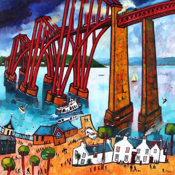
Framed Art Prints UK Can Feel More Dynamic With Crossing the Bridge

The best framed art prints UK should feel finished and distinctive, not generic. Crossing the Bridge does that especially well, bringing a sense of movement and direction that can lift a hallway, stair landing, or city-facing room without making it feel hard.

Why Crossing the Bridge suits framed art prints UK homes so well

There is a useful rhythm to this piece. The bridge subject gives the composition structure, while the colour and line keep it approachable enough for everyday spaces. That balance matters when a customer wants artwork with more presence than a quiet neutral print, but does not want the room to feel formal or cold.

  • It gives narrower walls more purpose without adding clutter.
  • It works well where a room needs a little pace and direction.
  • It feels especially convincing once the framing is part of the finished presentation.

Because First 4 Frames completes the print and framing in-house in Falkirk, the result feels bespoke and properly resolved. That craftsmanship is important with a structured image like this, where edge definition, colour control, and a hand-finished frame all help the artwork keep its authority.

For wider context on Scotland’s most recognisable bridge setting, the official Forth Bridges guide is worth exploring. You can also browse more work by Rob Hain and view the exact framed product here.

If you are comparing framed art prints UK, Crossing the Bridge is a very good example of how a stronger subject can still feel polished, welcoming, and easy to place.

Posted on

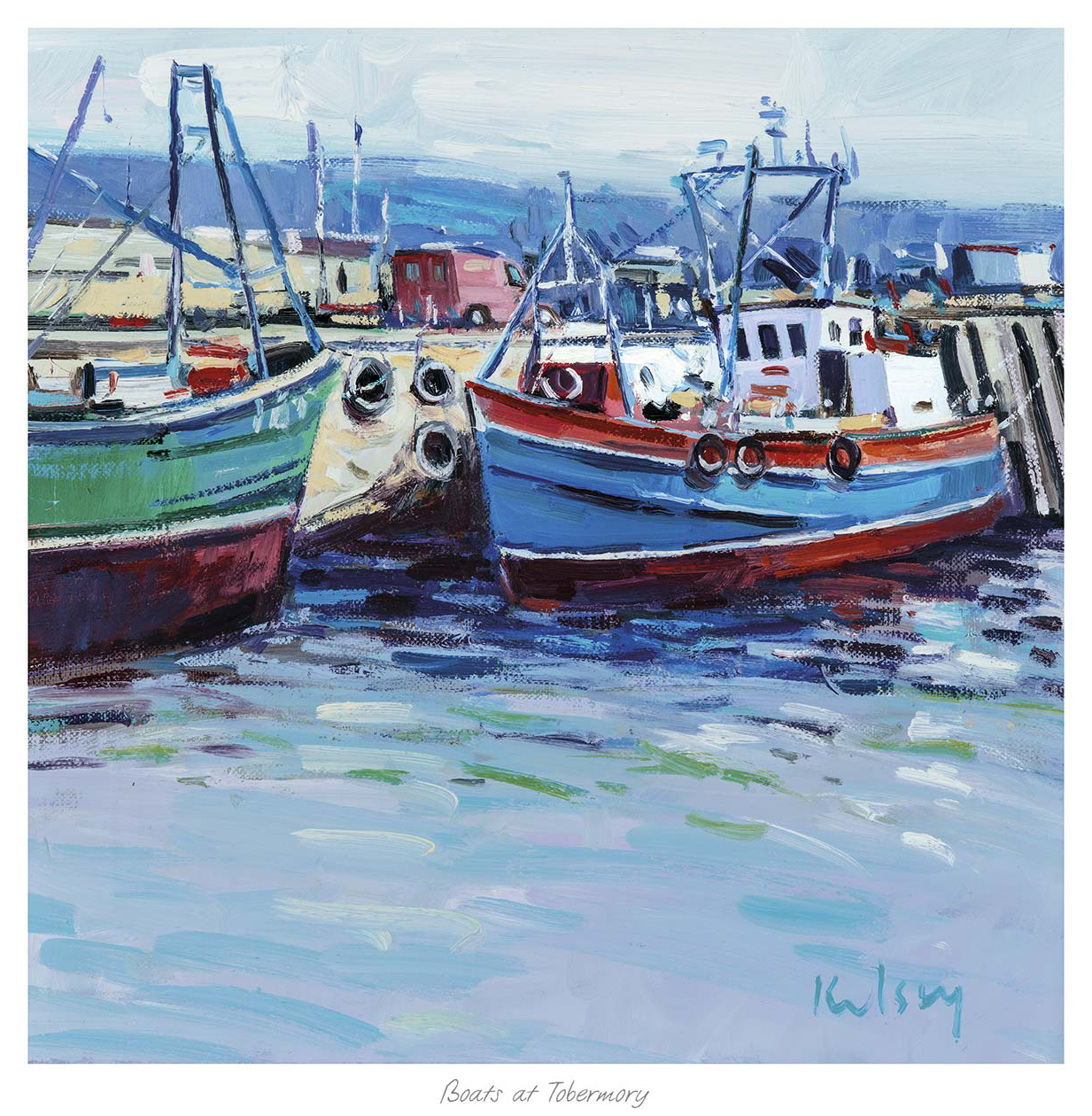
Limited Edition Prints Feel More Liveable With Boats at Tobermory

Many buyers want limited edition prints that feel special without becoming intimidating to live with. Boats at Tobermory is a strong example, bringing collectable appeal together with colour, warmth, and a more welcoming everyday character.

Why Boats at Tobermory makes limited edition prints feel easier to place

Some limited edition work can feel too formal for relaxed family spaces. Boats at Tobermory takes a friendlier route. The harbour setting is lively and recognisable, while the composition still feels measured enough for kitchens, dining rooms, home offices, or living rooms that need a little more colour and local character.

  • It offers collectable quality without losing warmth.
  • It works particularly well where a room needs brighter colour and structure.
  • It makes a good choice for buyers who want a piece to feel both special and welcoming.

At First 4 Frames, the print and framing are completed in-house with bespoke craftsmanship and colour-managed Giclee production. That finish matters for limited edition work, because customers expect both the image and the presentation to feel carefully judged, superior in quality, and ready to hang with confidence.

For more on the colourful harbour town behind the scene, VisitScotland on Tobermory is a useful resource. You can also browse more work by Robert Kelsey and view the exact framed product here.

If you are comparing limited edition prints and want something more welcoming than stern, Boats at Tobermory is an excellent place to start.

Posted on

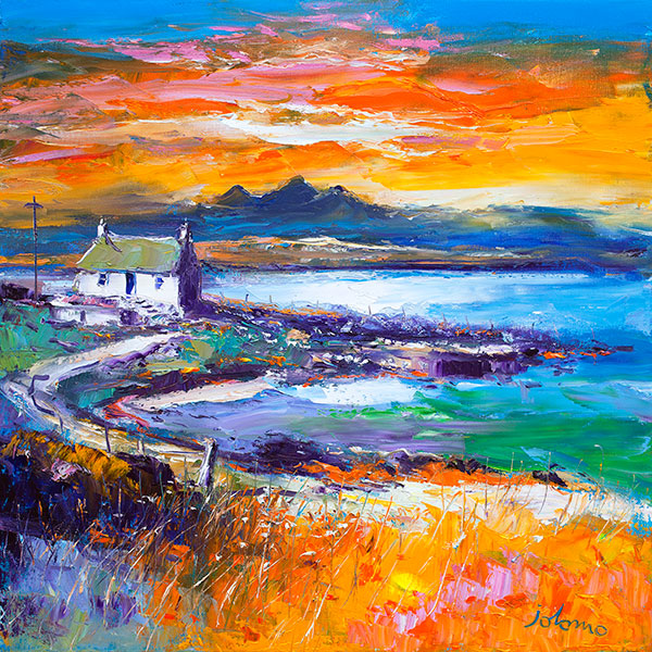
Luxury Wall Art Feels Calmer With A Jura Sunset from Port Nan Gallan, Keills

The strongest luxury wall art rarely depends on obvious flash. A Jura Sunset from Port Nan Gallan, Keills shows a more convincing route, using atmosphere, depth, and careful colour to create a wall piece that feels refined from the first glance.

Why A Jura Sunset from Port Nan Gallan, Keills suits luxury wall art

Luxury in art often comes from control rather than excess. A Jura Sunset from Port Nan Gallan, Keills has that sense of control. The sunset colour gives the image warmth and presence, but the scene still feels spacious and measured enough for a composed living room, quieter dining room, or bedroom that needs one substantial focal point rather than many smaller accents.

  • It adds richness without making the room feel louder.
  • It suits interiors that lean on texture, craftsmanship, and restrained colour.
  • It works beautifully where the framing finish needs to feel part of the overall design.

Because First 4 Frames completes the piece in-house in Falkirk, the final result benefits from bespoke framing, colour-managed Giclee production, and hand-finished craftsmanship. That superior quality is exactly what helps a more atmospheric image feel quietly luxurious rather than merely decorative.

For more on the island landscape behind the title, Isle of Jura visitor guide is worth exploring. You can also browse more work by John Lowrie Morrison OBE and view the exact framed product here.

If you want luxury wall art that feel composed, beautifully finished, and genuinely lasting, A Jura Sunset from Port Nan Gallan, Keills is a very strong choice.

Posted on

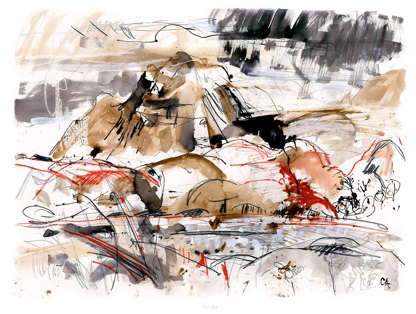
Grey Wall Art Gains More Depth With Cul Mor

The best grey wall art should do more than match a neutral room. Cul Mor shows how a quieter palette can still add depth, movement, and a clearer focal point without overwhelming the rest of the scheme.

Why Cul Mor helps grey wall art feel layered rather than flat

Neutral interiors often need artwork that keeps the room calm while still separating the wall from the furniture and flooring around it. Cul Mor does that well. The landscape offers tonal variation and a sense of distance, which means the piece reads as intentional and atmospheric rather than simply another grey surface.

  • It works especially well with pebble, stone, and soft timber schemes.
  • It adds interest without pulling a restful room off balance.
  • It suits living rooms, bedrooms, and hallways that need a quieter focal point.

At First 4 Frames, each piece is completed in-house with bespoke framing and colour-managed Giclee production. That quality-led finish matters in tonal work like this, because subtle shifts in grey and light need to stay crisp if the image is going to keep its atmosphere once framed.

If you want more context on the mountain itself, Walkhighlands on Cul Mor is useful. You can also browse more work by Clare Arbuthnott and view the exact framed product here.

If you are looking at grey wall art and want something with calm presence instead of flat neutrality, Cul Mor is an excellent option.

Posted on

Purple Wall Art Feels More Grown Up With Dragonfly and Thistle

The best purple wall art should feel rich and expressive without becoming overly sweet. Dragonfly and Thistle manages that beautifully, using thistle detail and a natural palette to make purple feel refined, characterful, and easy to place.

Why Dragonfly and Thistle makes purple wall art feel more considered

Purple can be difficult to use well in a room if the artwork pushes too hard into novelty or brightness. Dragonfly and Thistle takes a more balanced route. The organic subject matter gives the colour somewhere natural to sit, which helps the finished piece work well in hallways, dressing spaces, reading corners, or rooms that already carry plum, lilac, or heather notes elsewhere in the scheme.

  • It brings colour while still feeling calm enough for everyday spaces.
  • It pairs well with brass, painted wood, and softer neutral backdrops.
  • It gives floral or botanical styling a more distinctive Scottish edge.

Because First 4 Frames produces and frames the work in-house, the result benefits from bespoke presentation, colour-managed Giclee quality, and hand-finished craftsmanship. Those details help richer tones stay controlled and prevent the final piece from feeling flat or overdone.

For more on the thistle as a Scottish emblem, National Museums Scotland on the Scottish thistle offers helpful background. You can also browse more work by Lee Scammacca and view the exact framed product here.

If you are comparing purple wall art, Dragonfly and Thistle is a very good choice for bringing richer colour into the room in a more polished way.

Posted on

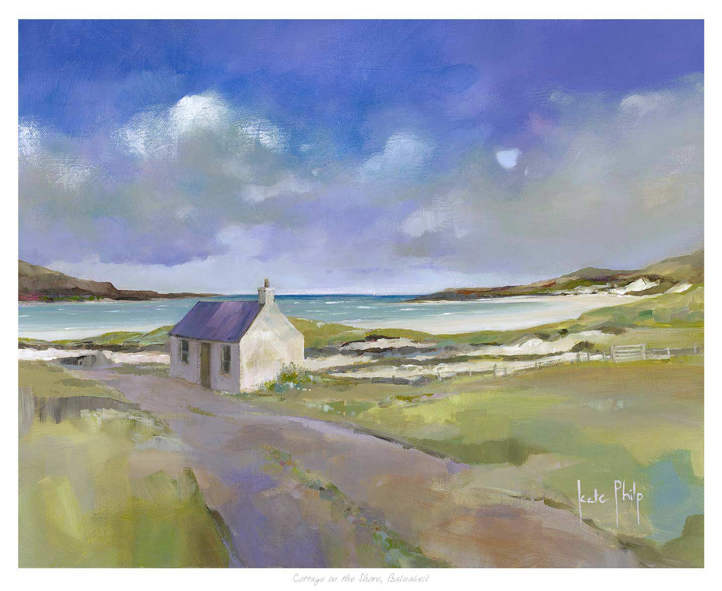
Beach Wall Art Feels More Grounded With Cottage on the shore, Balnakeil

Good beach wall art should bring calm and openness, but it should still feel like part of a real home. Cottage on the shore, Balnakeil gets that balance right by combining shoreline light with a cottage subject that feels warm, settled, and easy to live with.

Why Cottage on the shore, Balnakeil works as beach wall art with more depth

Some coastal pieces lean too heavily on obvious seaside cues and can make a room feel themed rather than thoughtfully styled. Cottage on the shore, Balnakeil feels more grounded than that. The cottage gives the image a lived-in note, while the surrounding coast keeps the overall mood light, open, and restorative for bedrooms, guest rooms, or quieter sitting spaces.

  • It softens neutral interiors without drifting into blandness.
  • It suits homes that want a coastal note without overt nautical styling.
  • It feels especially convincing in rooms with natural wood, linen, or pale painted walls.

At First 4 Frames, the print and framing are completed in-house with bespoke craftsmanship and colour-managed Giclee quality. That superior finish helps the softer coastal tones hold their clarity and gives the final piece the room-ready presence customers expect.

For more on the wider landscape around Balnakeil, VisitScotland on Durness and the north coast is worth a look. You can also browse more work by Kate Philp and see the exact framed product here.

If you want beach wall art that feel calm, homely, and more substantial than a simple seaside accent, Cottage on the shore, Balnakeil is a beautiful fit.

Posted on

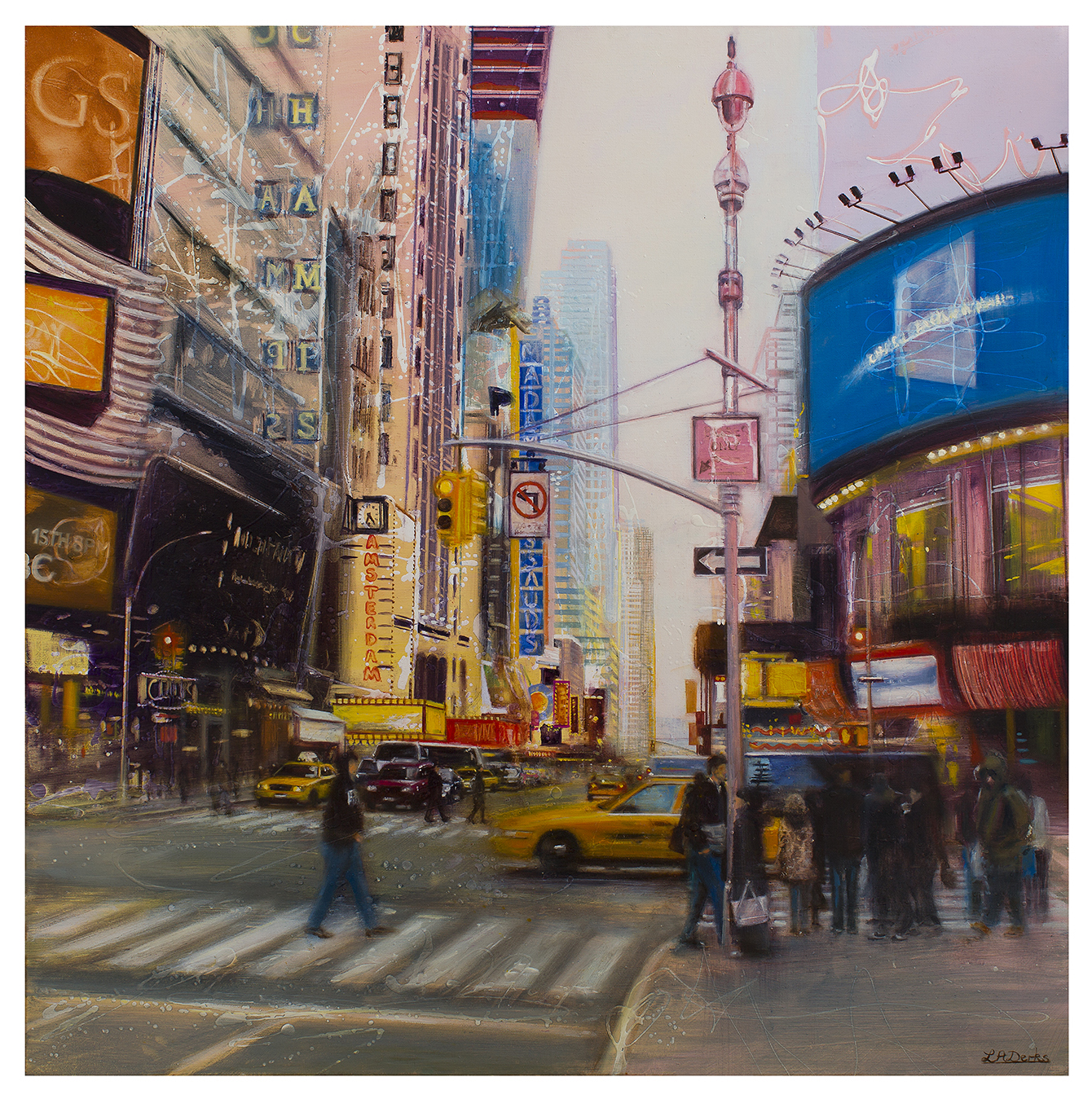
City Skyline Prints Feel More Lively With Day Dream Of New York

The best city skyline prints should bring energy without making the room feel hard or hectic. Day Dream Of New York does that well, giving the wall movement, vertical rhythm, and enough atmosphere to feel lively rather than merely busy.

Why Day Dream Of New York suits city skyline prints so well

Urban artwork needs enough structure to read clearly from across the room, but it also needs warmth if it is going to live comfortably in a home. Day Dream Of New York manages both. The skyline effect feels recognisable and confident, yet the overall composition still leaves breathing space for softer furnishings, timber tones, and quieter surrounding colours.

  • It gives a study, living room, or hallway more pace without clutter.
  • It works especially well with cleaner-lined interiors that still need personality.
  • It creates a stronger focal point than a softer neutral print would on its own.

Because First 4 Frames completes the framing and colour-managed Giclee production in-house in Falkirk, the finished piece feels bespoke and hand-finished rather than generic. That craftsmanship matters with a city subject, where edge definition and tonal control help the print keep its intended impact.

For wider context on the city behind the scene, New York City tourism guide is useful. You can also browse more work by Lesley Anne Derks and view the exact framed product here.

If you want city skyline prints that feel energetic, refined, and easy to place in a real home, Day Dream Of New York is a very strong option.

Posted on

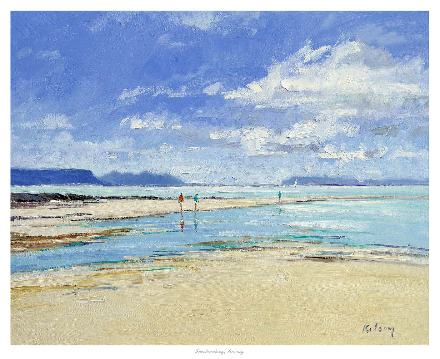
Retirement Gift Art Feels More Lasting With Beachcombing, Arisaig

The most successful retirement gift art should feel meaningful after the occasion itself has passed. Beachcombing, Arisaig does that beautifully, offering calm, reflection, and a sense of space that suits a new chapter in life.

Why Beachcombing, Arisaig suits retirement gift art so well

Retirement gifts often work best when they invite slower enjoyment rather than making one loud statement. Beachcombing, Arisaig has that quality. The shoreline setting feels open and thoughtful, which makes it especially suitable for someone moving into a gentler routine, spending more time at home, or planning more travel around Scotland’s coast.

  • It feels generous and lasting rather than purely ceremonial.
  • It can suit living rooms, studies, or quieter bedrooms with equal ease.
  • It offers a sense of space and possibility that fits the occasion naturally.

At First 4 Frames, the print and framing are completed in-house with bespoke craftsmanship and colour-managed Giclee quality. That hand-finished presentation is especially important for a retirement present, because the piece should feel carefully chosen and genuinely worth keeping.

For more on the coastal setting behind the artwork, VisitScotland on Arisaig is useful. You can also browse more work by Robert Kelsey and view the exact framed product here.

If you want retirement gift art that feels calm, generous, and ready to enjoy for years, Beachcombing, Arisaig is a very strong choice.

Posted on

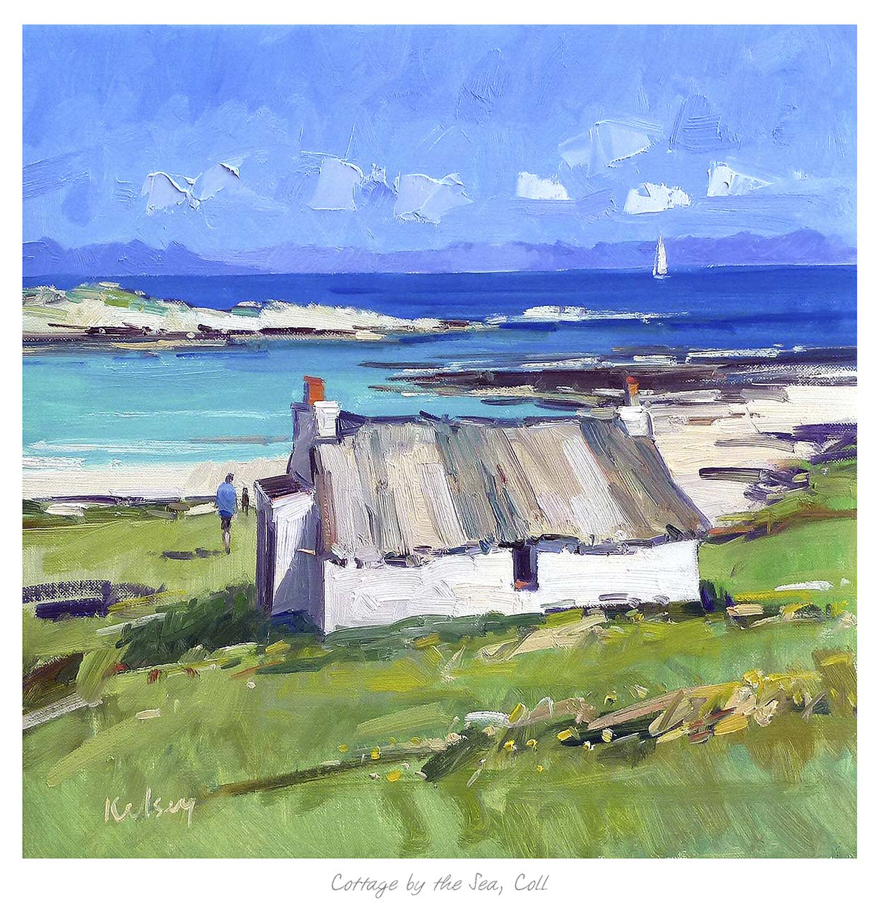
Why Cottage by the Sea, Coll Makes a Thoughtful Scottish Housewarming Gift

A well chosen Scottish housewarming gift should feel lasting rather than token. Cottage by the Sea, Coll does that beautifully, offering a sense of place and home that suits a new beginning far better than something purely novelty led.

Why Cottage by the Sea, Coll works so well as a Scottish housewarming gift

Housewarming presents are often at their best when they can be displayed immediately and enjoyed for years. Cottage by the Sea, Coll has that kind of appeal. The cottage setting feels warm and homely, while the coastal backdrop gives the piece a little extra air and character. It suits people moving into a first home, a new family house, or a quieter coastal-minded retreat.

  • It feels more personal than a generic home accessory.
  • It carries a clear Scottish sense of place without feeling gimmicky.
  • It arrives as a framed piece ready to make a room feel more lived in.

First 4 Frames completes each work in-house in Falkirk with bespoke framing and colour-managed Giclee production. That superior quality matters for gifting, because the piece should feel thoughtful, hand-finished, and ready to hang rather than like a last-minute purchase.

For more on the island behind the subject, Visit the Isle of Coll is worth a look. You can also browse more work by Robert Kelsey and view the exact framed product here.

If you are searching for a Scottish housewarming gift that feels thoughtful, useful, and genuinely display-worthy, Cottage by the Sea, Coll is an excellent option.