Posted on

Spare Room Wall Art Feels Warmer and Less Forgotten With Glen Prosen

Image of Glen Prosen by Hillary Barker

The challenge with spare room wall art is that these rooms are often decorated last. They can end up tidy and functional, but not especially warm. Glen Prosen changes that dynamic quickly. It brings character, colour, and a friendly sense of presence that helps a spare room feel like part of the home rather than a space waiting for its turn.

Why Glen Prosen works so well as spare room wall art

Glen Prosen has a warmth that is immediately useful in a guest or occasional room. The subject feels engaging without becoming demanding, which is exactly right for a space that should feel easy to settle into. Instead of leaving the walls generic, it gives the room personality and helps overnight guests feel that the space has been genuinely considered.

This is also a good example of how framing changes the impression of a room. A hand-finished frame turns one characterful print into something with enough authority to shape the whole space. First 4 Frames handles that in-house, along with colour-managed Giclée printing, so the final presentation feels bespoke and superior quality rather than temporary.

  • It makes a spare room feel more welcoming.
  • It adds personality without visual clutter.
  • It helps a less-used room feel fully finished.

You can explore more of the artist’s work through Hillary Barker’s artist page, browse more work by Hillary Barker, and view the exact framed print here.

If you are choosing spare room wall art, Glen Prosen is a strong reminder that a room used less often still deserves warmth, craftsmanship, and a sense of welcome.

Posted on

Wall Art for a Room With Picture Windows Feels More Balanced With Evening Sparkle On The Loch

Finding the right wall art for a room with picture windows can be surprisingly difficult. When a room already has a strong outlook, the artwork has to support that sense of openness rather than fight for attention. Evening Sparkle On The Loch does that beautifully. Its reflected light and calmer atmosphere echo the pleasure of looking outward, while still giving the interior its own visual centre.

Why Evening Sparkle On The Loch suits wall art for a room with picture windows

Evening Sparkle On The Loch works because it shares some of the same visual language as a good outward view: light, distance, and quiet movement. That means the piece can sit comfortably in the room without feeling redundant or over-assertive. In practical terms, it helps a view-led interior feel finished on the walls as well as the windows.

What to avoid in a picture-window room

Very dense artwork or highly restless colour can make these rooms feel visually split. A calmer piece with depth is often more successful. It gives the eye somewhere to pause when you are not looking outside, which helps the room feel complete through the evening and on greyer days as well.

  • Choose artwork that echoes calm rather than clutter.
  • Let the framed piece support the room’s sense of light.
  • Use quality presentation so the wall still feels important beside the glazing.

First 4 Frames completes that presentation in-house, pairing bespoke framing with colour-managed Giclée printing for a superior quality finish. For broader decorating guidance, Nikki Monaghan’s artist website is worth reading. You can also browse more work by Nikki Monaghan and see the exact framed print here.

If you are comparing options for wall art for a room with picture windows, Evening Sparkle On The Loch is a strong example of artwork that complements a view-rich room instead of competing with it.

Posted on

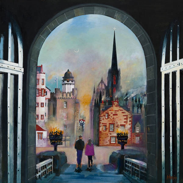
Art for a Hallway Feels More Welcoming With Gateway to the Mile

Choosing art for a hallway is really about first impressions. Hallways are transitional by nature, but they do not need to feel anonymous. Gateway to the Mile works well here because it brings movement and destination to the wall, giving the space a clearer sense of welcome from the moment someone steps inside.

Why Gateway to the Mile works as art for a hallway

Gateway to the Mile has exactly the kind of visual pull that a hallway benefits from. The architecture, colour, and sense of passage make the image feel active without becoming busy. That helps a narrow or under-dressed entrance area feel more purposeful, and it gives guests something immediate to register beyond doors, flooring, and storage.

Three practical hallway gains from the right artwork

  1. It creates a stronger welcome point as soon as the door opens.
  2. It gives a long wall direction so the space feels designed rather than empty.
  3. It helps a hallway connect visually with the personality of the rest of the home.

A hand-finished frame is particularly useful in a hallway because these spaces need clarity and edge definition. First 4 Frames completes the bespoke framing and colour-managed Giclée production in-house, so the final piece has the craftsmanship and presence to stand up well in a hard-working part of the home.

To see more of the artist’s work, visit Rob Hain’s artist website. You can also browse more work by Rob Hain and view the exact framed print here.

If you are exploring art for a hallway, Gateway to the Mile shows how a hallway can feel much more welcoming when the wall art suggests movement, place, and intent.

Posted on

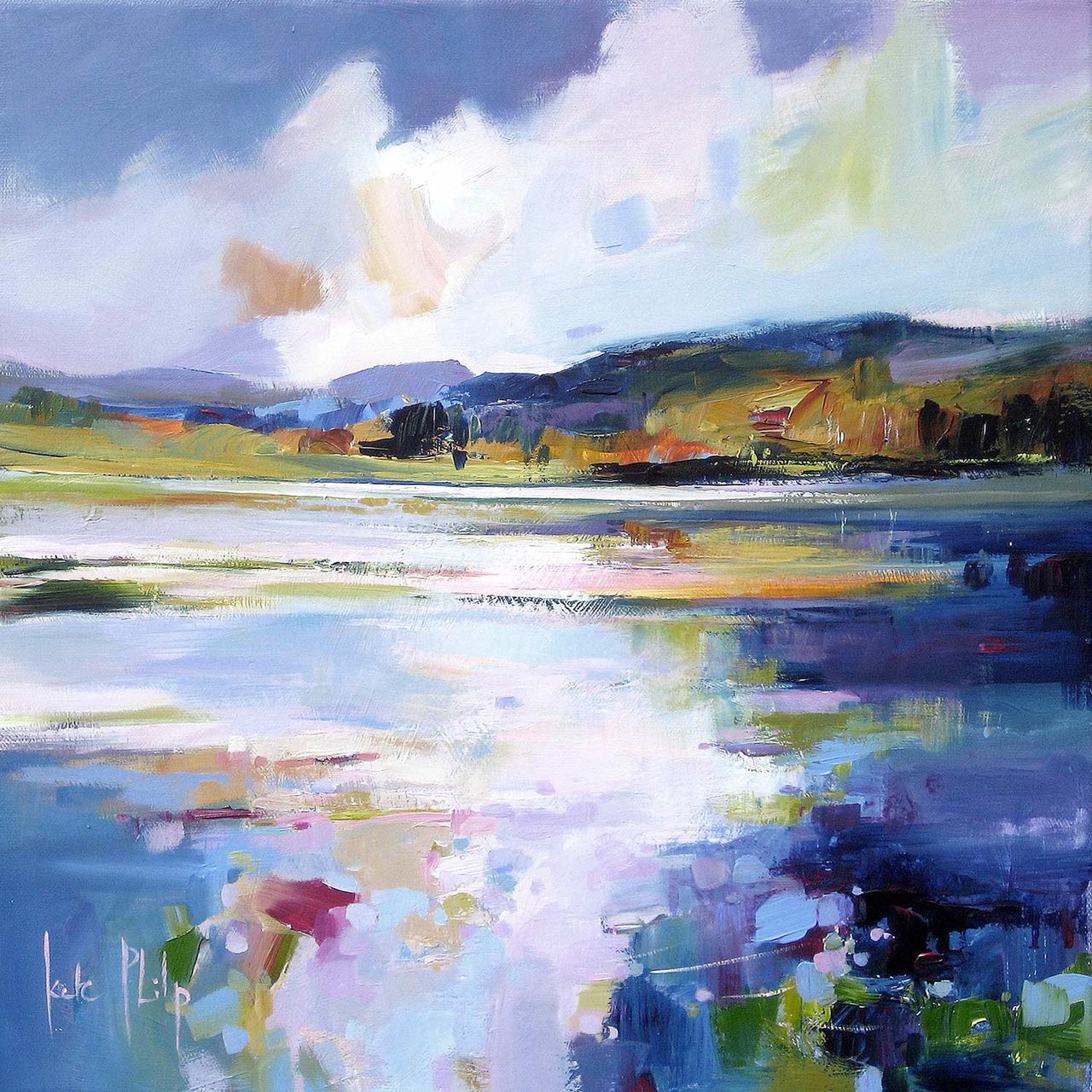
Cloakroom Wall Art Feels More Considered With The Waterlily Lochan

Good cloakroom wall art can do more for a home than people often expect. A cloakroom is usually small, regularly used, and easy to leave feeling purely practical. The Waterlily Lochan helps shift that balance. It introduces reflection, stillness, and enough colour interest to make the room feel considered without asking the space to carry anything too bold.

Why The Waterlily Lochan makes excellent cloakroom wall art

The Waterlily Lochan suits a cloakroom because it creates atmosphere quickly. In a compact room, one framed piece often matters more than a larger collection. The waterlily subject and softer palette give the wall a more welcoming presence, which can stop the room feeling like an afterthought tucked between the more obviously styled spaces in the home.

That matters even more when the room has harder surfaces and cleaner lines. A print with this kind of calm rhythm balances tiles, paint, mirrors, and fittings without adding clutter. The bespoke framing helps too, giving the piece enough definition to feel properly placed rather than casually hung.

  • It brings calm to a compact room.
  • It feels refined rather than novelty led.
  • It gives a practical space a stronger sense of finish.

First 4 Frames handles the framing and colour-managed Giclée production in-house, which keeps the presentation polished and the detail clean. You can explore more from the artist at Kate Philp’s artist website, browse more work by Kate Philp, and view the exact framed print here.

For anyone searching for cloakroom wall art, The Waterlily Lochan proves that even a smaller room can feel memorable when the artwork is calm, well judged, and properly framed.

Posted on

Reading Nook Wall Art Feels More Absorbing With Astronomers

The best reading nook wall art does not drag attention away from the corner it belongs to. Instead, it deepens the feeling of retreat. Astronomers is especially effective because it brings quiet narrative and curiosity to the wall, making a reading nook feel less like spare furniture in a corner and more like a place you actively want to return to.

Why Astronomers works as reading nook wall art

Astronomers feels attentive and inward-looking, which is exactly why it suits a reading space. The northern lights, the stillness of observation, and the touch of whimsy all help the wall contribute to the experience of the nook rather than simply decorating it. It invites pause, which is a valuable quality in any corner meant for slower time.

What makes a reading corner feel complete

A good reading nook usually benefits from one piece that establishes mood. That can be more persuasive than several smaller items competing for attention. A hand-finished frame helps too, giving the artwork enough structure to feel intentional while the colour-managed Giclée finish preserves the subtler tones that make the image rewarding at closer range.

  • Choose artwork that encourages stillness rather than visual noise.
  • Let one stronger piece set the tone for the nook.
  • Use framing to make the corner feel finished, not improvised.

First 4 Frames produces and frames work like this in-house, which makes a difference when you want craftsmanship as well as character. To explore more of the artist’s world, visit Matylda Konecka’s artist website. You can also browse more work by Matylda Konecka and see the exact framed print here.

If you are weighing up reading nook wall art, Astronomers shows how one thoughtful image can make a smaller corner feel far more absorbing and personal.

Posted on

Conservatory Wall Art Feels More Peaceful With First Light 2

Choosing conservatory wall art is often less about filling a sunny wall and more about controlling the mood of the room. In a space with strong daylight, too much contrast can feel harsh surprisingly quickly. First Light 2 works beautifully because it brings the gentler atmosphere of early light, helping a conservatory feel bright but not overexposed.

Why First Light 2 suits conservatory wall art so well

First Light 2 has exactly the kind of colour transition that helps a glass-heavy room feel balanced. Instead of fighting the natural light already pouring in, it works with it. The piece adds warmth, movement, and a sense of horizon, which is especially useful in conservatories that can otherwise feel visually flat once the sun shifts through the day.

  • It keeps a bright room calm rather than glaring.
  • It adds warmth without becoming visually heavy.
  • It gives a conservatory a proper focal point instead of a blank end wall.

The framed finish matters here too. In a room full of windows, the artwork needs enough presence to hold its own. First 4 Frames completes the bespoke framing and colour-managed Giclée printing in-house in Falkirk, giving the final piece the superior quality and edge definition that help it sit confidently within a lighter, more open room.

If you are also thinking about how a conservatory should feel as a finished space, House Beautiful’s conservatory ideas offers useful decorating context. You can browse more work by Arie Vardi and view the exact framed print here.

For anyone comparing conservatory wall art, First Light 2 is a good reminder that the most effective choice often adds softness and atmosphere, not simply more brightness.

Posted on

Gallery Wall Ideas Start Better With One Story Led Anchor Like A Bear Who Carried A Kingdom

The best gallery wall ideas often begin with one picture that tells you what the rest of the arrangement should do. A Bear Who Carried A Kingdom is ideal for that role because it has warmth, narrative, and enough visual presence to set the tone for nearby pieces without overwhelming them.

Why A Bear Who Carried A Kingdom helps gallery wall ideas feel more composed

A Bear Who Carried A Kingdom gives a gallery wall a point of character. That matters because collections can quickly look scattered if every piece tries to shout at the same volume. Starting with one anchor print makes it easier to judge scale, spacing, and which supporting works should stay quieter or more textural.

  • Use one stronger anchor before adding smaller companions.
  • Let colour and mood flow out from the main piece.
  • Choose a framed finish that gives the lead work enough authority.

This approach works particularly well in family rooms, hallways, stair runs, or relaxed sitting spaces where a gallery wall should feel collected rather than busy. A hand-finished frame helps the lead artwork stand its ground, while smaller surrounding pieces can be more varied without making the display feel disorderly.

Because First 4 Frames handles bespoke framing and colour-managed Giclée production in-house, the final result feels polished enough to hold the arrangement together. For more practical curation advice, the V&A on curating a gallery wall is worth a look. You can also browse more work by Matylda Konecka and view the exact framed product here.

If you are collecting gallery wall ideas, A Bear Who Carried A Kingdom is a useful reminder that a gallery wall usually looks stronger when one memorable piece leads and the rest support it.

Posted on

Best Wall Art for a Bedroom Often Feels Calmer With Spring Blue

The best wall art for a bedroom usually has one job above all others: helping the room feel settled. That does not mean the artwork should disappear. Spring Blue is a good example because it brings softness and depth together, giving the room a focal point that still feels restful at the end of the day.

Why Spring Blue feels like some of the best wall art for a bedroom

Spring Blue succeeds because the image gives the eye somewhere gentle to settle. There is enough tonal interest to stop the wall feeling empty, but not so much contrast that the artwork starts to feel restless. That balance is exactly what makes a bedroom piece easier to live with over time.

  • It adds calm without becoming washed out.
  • It suits bedrooms that need a little more depth, not more noise.
  • It helps the room feel considered instead of sparsely decorated.

The framing also plays an important part here. A bespoke, hand-finished frame gives the artwork enough structure to feel complete, while the colour-managed Giclée print keeps the subtler tones intact. First 4 Frames completes that work in-house in Falkirk, which is why the finished piece feels polished rather than generic.

For broader thinking around restful rooms, the Sleep Foundation on calmer bedroom environments is useful reading. You can also browse more work by Colin Robertson and view the exact framed product here.

If you are weighing up the best wall art for a bedroom, Spring Blue is a persuasive reminder that calm rooms still benefit from artwork with presence, so long as that presence arrives softly.

Posted on

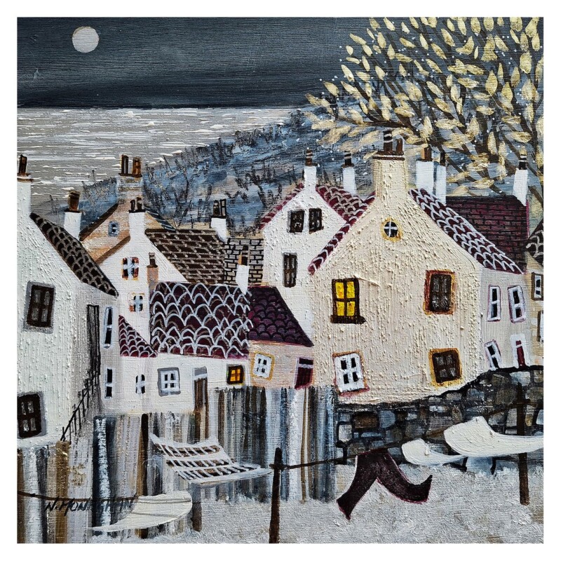
How to Style Coastal Wall Art Without Going Theme Led, Starting With Pittenweem, Sea View

Learning how to style coastal wall art is often about restraint. The best rooms do not rely on ropes, anchors, or overly obvious seaside references. Pittenweem, Sea View is a strong example because it brings place, light, and everyday harbour character without making the room feel dressed up around a theme.

How to style coastal wall art so it feels lived in, not themed

Pittenweem, Sea View works because it carries the relaxed structure of a real place. That lets the artwork shape the atmosphere without demanding that everything else in the room become overtly coastal. Soft paint colours, natural timber, simple upholstery, or even cleaner modern furniture can all work well around a piece like this because the subject feels authentic rather than decorative in a forced way.

  • Use coastal art to bring light and place, not novelty props.
  • Let the framed piece carry the story while the room stays fairly simple.
  • Choose artwork with enough character to feel rooted rather than generic.

A framed Giclée print also helps keep the result polished. Instead of looking like a holiday souvenir, the artwork feels integrated into the room and worthy of longer-term display. First 4 Frames completes the framing and colour-managed print work in-house, giving the final piece the craftsmanship that helps coastal styling feel deliberate and calm.

If you want a little more sense of the place behind the scene, more about Pittenweem and the East Neuk offers helpful context. You can also browse more work by Nikki Monaghan and see the exact framed product here.

For anyone thinking about how to style coastal wall art, Pittenweem, Sea View shows that the most successful approach usually comes from atmosphere, local character, and good framing rather than anything too literal.

Posted on

How Large Should Artwork Be Above a Sofa? Blue Thunder, The River Dee Makes It Easier to Judge

People often ask how large should artwork be above a sofa, but the better question is how the piece relates to the whole seating area. Blue Thunder, The River Dee makes that easier to see. It has enough width, movement, and visual energy to anchor a sofa wall properly, without making the room feel top heavy or overfilled.

How large should artwork be above a sofa? Start with width, not guesswork

Blue Thunder, The River Dee works because it feels generous enough to speak to the full seating zone. A broader piece usually looks more convincing above a sofa than a small picture placed too high or too centrally. The aim is not to dominate the wall, but to create a proportion that makes the furniture and artwork feel like one joined composition.

  • Look for artwork that relates to the sofa width rather than floating in isolation.
  • Leave enough wall around the frame so the piece can breathe.
  • Use the artwork to anchor the seating area, not just fill a blank patch.

This is where a well-made framed print becomes especially useful. The final frame adds edge definition and visual authority, helping a substantial landscape hold the wall properly. First 4 Frames handles that in-house, combining bespoke framing and colour-managed Giclée production so the finished piece feels ready for the room rather than like an unfinished idea.

For more general placement guidance, House Beautiful’s guide to hanging art is a practical reference. You can also browse more work by Colin Robertson and view the exact framed product here.

If you are trying to answer how large should artwork be above a sofa, Blue Thunder, The River Dee is a helpful reminder that the best result usually comes from one piece with enough width and calm confidence to hold the seating area together.