Posted on

Teal Wall Art for a Compact Cloakroom: Look Out to St Andrews Harbour

Image of St Andrews Harbour by Sheila Fowler

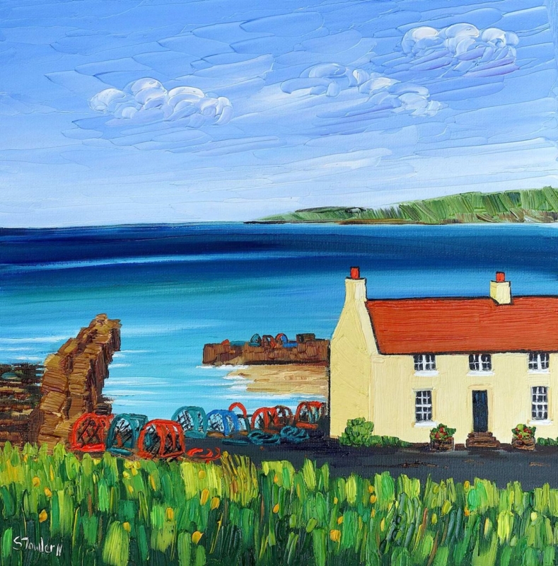
teal wall art should answer a real question about the room or recipient. St Andrews Harbour is useful here because a harbour scene adds visual distance to a small room while blue-green water provides a focused colour cue.

Place teal wall art safely in a compact cloakroom

Start with the driest wall. Keep the frame beyond the basin splash zone, away from persistent condensation and clear of the opening door. Ventilation matters more than a coastal theme. If the room remains damp, choose another location for framed art.

  1. Open the door fully and mark its swing.
  2. Stand at the basin and identify splash areas.
  3. Check the extractor and normal ventilation.
  4. Mark both square sizes at framed dimensions.
  5. View the template from the doorway and close range.

The 265 x 265 mm print may suit a narrow wall beside a mirror. The 500 x 500 mm option needs more breathing room. Do not add teal towels, shells, anchors and stripes together. One plain textile can acknowledge the water; the harbour can carry the coastal identity.

Can framed art go in every cloakroom?

No. Reliable extraction, a dry wall and distance from direct splashes are essential checks before hanging any framed print.

Frame the view for close-range looking

Small rooms reveal mounting and corner finish immediately. Colour-managed printing keeps harbour tones clear, while precise in-house framing gives the square image a resolved edge. Suitable placement remains essential near water.

For context about the town and harbour behind the picture, explore the official St Andrews visitor guide. Browse the Sheila Fowler collection, or view the exact product and framing choices.

Teal wall art can make a cloakroom feel larger when the colour belongs to a real view. St Andrews Harbour supplies distance and identity, while sensible moisture checks protect the piece.
Posted on

Pink Wall Art Without a Sugary Scheme: Start With a Summer Border

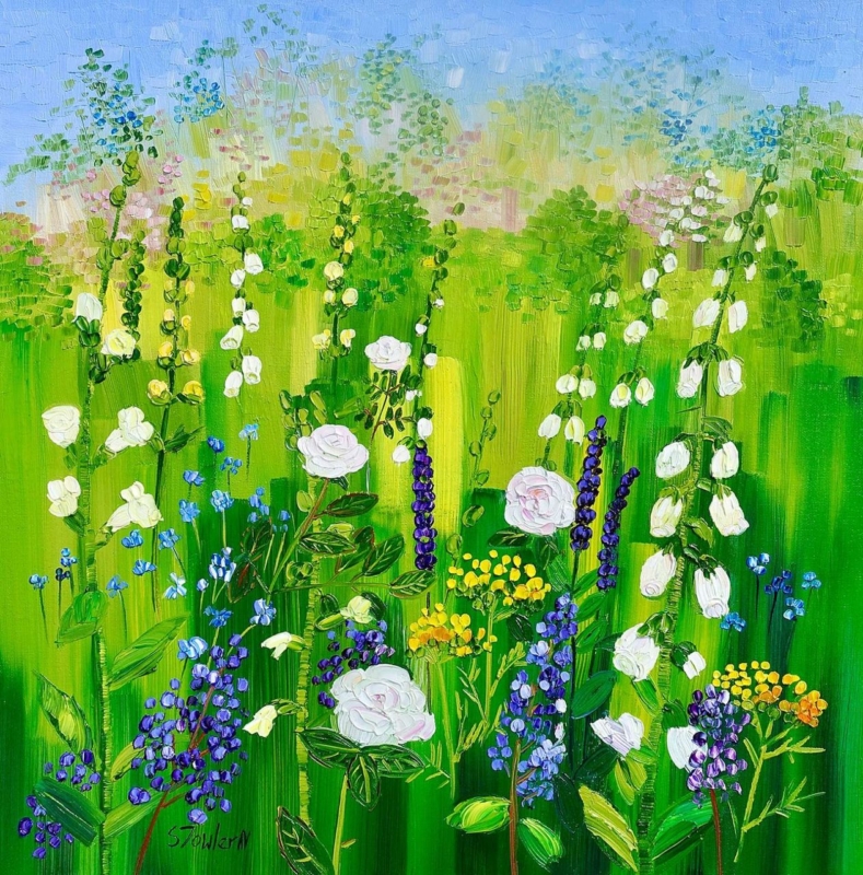
pink wall art should answer a real question about the room or recipient. Summer Border with Roses and Foxgloves is useful here because roses and foxgloves place pink among greens and natural notes, giving the colour context instead of asking it to cover the whole room.

Build a balanced palette around pink wall art

Choose one pink from the picture as the leading accent, then stop. A cushion edge, small ceramic or thread in a neutral fabric is enough. Green foliage and quiet timber provide balance, while cream, stone or soft grey lets the flower colour stay fresh.

Use the square format deliberately

  • Use 265 x 265 mm on a compact return or above a bedside cabinet.
  • Use 500 x 500 mm above a small chest or in a sitting-room corner.
  • Mark the finished frame and preserve clear wall on every side.

Floral curtains and bedding can compete with a garden picture quickly. If one major textile is patterned, keep other surfaces plain. The artwork can then supply the season and detail instead of becoming another layer of repeated blooms.

Use pink as the invitation to look, then let green and neutral space make the room liveable.

Keep every flower colour distinct

A summer border contains more than its strongest pink. Colour-managed Giclée production separates petals, foliage and quieter notes. A bespoke frame creates a calm boundary against painted walls or fabric.

To explore more of the artist’s floral and Scottish landscape work, visit Sheila Fowler’s official website. Browse the Sheila Fowler collection, or view the exact product and framing choices.

Pink wall art does not require a pink room. Summer Border with Roses and Foxgloves can lead a mature scheme when one accent is repeated and competing patterns are edited back.

Posted on

Art for Hotels With a Sense of Place: Welcome Guests to Inveraray

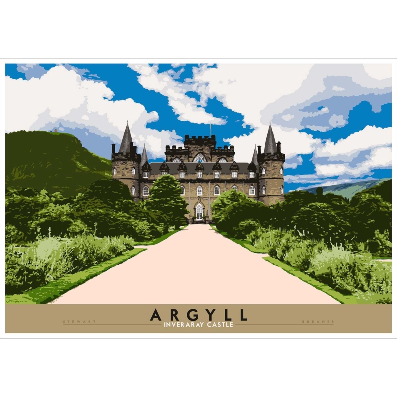
art for hotels should answer a real question about the room or recipient. Argyll: Inverary Castle is useful here because its recognisable Argyll landmark gives guests a destination and local context rather than an anonymous landscape or corporate pattern.

Specify art for hotels from the guest journey

Walk the route from entrance to reception, lift, corridor and bedroom. The castle can work as an arrival statement, a wayfinding pause or a quieter view above low furniture. Decide its role before choosing between the 594 x 420 mm and 840 x 594 mm print sizes.

Hotel zonePractical response
ReceptionGive the larger landscape clear space beyond the desk and check reflections.
Corridor endUse the landmark as a destination without placing signs across it.
BedroomMeasure from the headboard or console and test the doorway view.
LoungeRelate the frame to fixed timber rather than adding tartan motifs.

A recognisable place supplies its own story. Keep accessories restrained. Across several rooms, consistent outer dimensions and hanging heights can create order without repeating the same image everywhere.

Balance local character with commercial consistency

Colour-managed Giclée production supports dependable reproduction, while in-house bespoke framing can coordinate a single statement piece or a wider hospitality scheme. The result is ready to hang but still specific to Argyll.

For visitor information and history connected with the landmark, see the official Inveraray Castle website. Browse the Stewart Bremner collection, or view the exact product and framing choices.

Art for hotels should help guests understand where they have arrived. Argyll: Inverary Castle brings a clear destination to the wall while disciplined framing keeps the interior professional rather than themed.

Posted on

Scottish Art Gifts for a New Baby: Let Ally Bally Tell the Story

Scottish art gifts should answer a real question about the room or recipient. Ally Bally Ally Bally Bee is useful here because the familiar rhyme can connect a child with family voices and Scottish language while remaining a proper framed artwork.

Choose Scottish art gifts that can outlast the nursery

Begin with the family connection. If parents or grandparents know the song, the words carry a memory that generic baby motifs cannot supply. A note can explain who sang it and why it was chosen, without adding names or dates permanently to the print.

For the first room

Hang the portrait print away from the cot, direct sun and reachable furniture. Leave clear wall so the words are easy to read.

For later years

The 420 x 594 mm and 594 x 840 mm sizes can move to a landing, reading corner or family room as the child grows.

Avoid surrounding it with several sayings. One familiar line has more presence when shelving, bunting and patterned textiles leave it visual space. Measure the complete framed outline before selecting either size.

Give a remembered rhyme a durable finish

Accurate mounting and hand-finished framing turn familiar words into a resolved gift. First 4 Frames completes the work in-house in Falkirk, so the presentation feels substantial while the typography remains warm and immediate.

For more of the illustrator’s Scotland-led work, visit Stewart Bremner’s official website. Browse the Stewart Bremner collection, or view the exact product and framing choices.

Scottish art gifts feel personal when they carry a real connection. Ally Bally Ally Bally Bee can mark a new arrival through language and family memory, then follow the child into later rooms.

Posted on

Scottish Town Wall Art for a Kitchen Diner: Meet on Peebles High Street

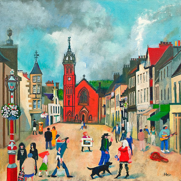
Scottish town wall art for a kitchen diner can reflect the social purpose of the room. High Street, Peebles shows people walking, shopping and meeting among colourful buildings. A dog walker crosses the foreground, while the red church gives the busy street a clear landmark.

Use Scottish town wall art for a kitchen diner as shared narrative

A kitchen diner already contains conversation and movement. Rob Hain’s street scene can echo that activity without adding physical clutter. Place it on the dining side of the room, where people can notice different figures and buildings over time. Avoid the wall behind a permanently open door or a tall bank of chairs.

Where should framed art sit in a working kitchen diner?

Choose a dry wall away from the hob, sink, kettle steam and direct food preparation. Keep the frame outside chair movement and establish normal ventilation. A dining-zone wall or sideboard position is usually more practical than a splash-prone worktop.

The square composition suits a social furniture group. Mark the finished frame above a low sideboard or within the table’s visual zone. Check it with the table extended and every chair occupied. Pendant lights should not cut across the church or central street when viewed from the doorway.

Let the picture supply the activity

Repeat one building colour in a tea towel, chair seat or small ceramic if desired. Keep the rest practical. The figures, shopfronts and changing architecture already offer plenty to discover, so extra signs and souvenir objects are unnecessary.

Give detailed illustration a dependable finish

Colour-managed Giclée production helps small figures, varied buildings and the red church remain clear. Bespoke framing completed in-house provides a durable, ready-to-hang presentation and a defined edge against a busy family room.

Discover how the artist describes people as the soul of a town at Rob Hain’s official website. Browse more places in the Rob Hain collection, or view High Street, Peebles.

Scottish town wall art for a kitchen diner can make everyday gathering feel connected to a real place. High Street, Peebles adds community, colour and detail while leaving worktops and table space free.

Posted on

Large Black and White Wall Art for a Reception Area: Direct Energy

Large black and white wall art for a reception area can organise the first view without adding another message to read. Energy transforms architectural curves, layered forms and controlled light into a tall monochrome composition. That movement can guide the eye through a client-facing space.

Map large black and white wall art for a reception area to the visitor route

Stand at the entrance and identify the wall seen before the reception desk. Then repeat the check from every waiting chair. Energy’s portrait proportions can work on a column, a wall between doorways or the end of a corridor, but the curves need enough distance to be understood as one composition.

Site conditionCheck before ordering
Reception deskKeep the lower image clear of monitors, signs and flower displays.
Waiting seatsTest the finished frame at seated as well as standing eye level.
Glass entranceLook for daylight reflections during the busiest hours.
SpotlightsAim fittings across the surface evenly rather than creating one bright patch.

Four print sizes range from 266 x 400 mm to 466 x 700 mm. This allows the work to fit a modest office reception or a larger hospitality setting without changing its proportions. Measure from the occupied furniture group, not the empty wall, and include the finished frame in every comparison.

Protect the rhythm within the monochrome detail

Black and white output depends on separation between highlights, gradients and deep shadow. Colour-managed production and precise in-house framing help preserve those transitions. A restrained frame can then support the architecture without making the display feel severe.

Read about the photographer’s approach at Noel Fenech’s artist profile. More architectural and fine-art photography appears in the Noel Fenech Photography collection, and Energy’s product page lists all four sizes.

Large black and white wall art for a reception area should establish confidence before conversation begins. Energy brings structure and forward movement while leaving the space free from generic motivational text.

Posted on

Contemporary Framed Art Prints for a Minimalist Living Room: Upside Down I

Contemporary framed art prints for a minimalist living room do not have to be quiet or obvious. Upside Down I can introduce a question into a restrained room. Its title invites a second look, while the square format gives that visual uncertainty a controlled boundary.

Let contemporary framed art prints for a minimalist living room create the question

A restrained room still needs a point of curiosity. Minimalism is not the same as removing every story.

Begin with the main seated view. A single work opposite the sofa can give the eye somewhere definite to rest. Avoid placing it beside a television, open shelving or a collection of sculptural accessories. Upside Down I should provide the visual puzzle; the surrounding wall can provide the pause.

Compare all three square sizes

  • 265 x 265 mm: useful for a compact wall return or reading chair.
  • 500 x 500 mm: a balanced choice above a console or beside a low cabinet.
  • 800 x 800 mm: suitable for a broader statement wall when furniture width and viewing distance support it.

Make three paper templates and include an allowance for the frame. Live with them for a day before choosing. The largest print is not automatically the most minimal choice; a square that overwhelms its furniture can feel as busy as several smaller pictures.

Use the frame to make restraint feel intentional

Accurate mounting and a bespoke finish give a simple arrangement authority. First 4 Frames produces and hand-finishes the presentation in-house, helping the frame relate to the room’s timber, metal and upholstery without merely matching them.

For wider context on art made in the present, read Tate’s introduction to contemporary art. Browse other work in the David Short collection, or compare the three Upside Down I sizes.

Contemporary framed art prints for a minimalist living room work best when they add meaning rather than more objects. One carefully scaled Upside Down I can give the room personality while preserving its calm.

Posted on

Abstract Wall Art for a South-Facing Room: When the Sky Breaks

Abstract wall art for a south facing room must work through very different light levels. When the Sky Breaks has an atmospheric title and confident square format that can hold attention as sunshine moves, but its position still needs to be chosen with care.

Plan abstract wall art for a south facing room over one full day

  1. Mark the full framed square on the proposed wall.
  2. Check it in morning, midday and late-afternoon light.
  3. Exclude any position reached by persistent direct sun.
  4. Sit in the main chairs and look for glazing reflections.
  5. Repeat the test with lamps switched on after dusk.

A pale picture is not automatically best for a bright room. It can lose definition at the strongest point of the day. An expressive work can provide a firmer visual pause, especially when nearby upholstery and window treatments are quiet. Let the artwork carry the movement rather than adding several competing patterns.

Choose scale from furniture, not sunlight

The 265 x 265 mm print can suit an intimate corner. The 500 x 500 mm option can anchor a broader wall above low furniture. Measure both as finished frames, then choose the proportion that belongs to the furniture zone. Brightness should affect placement and protection, not tempt you to oversize the piece.

Keep changing atmosphere intact

Controlled Giclée production gives colour and tonal shifts a reliable starting point. A hand-finished frame then provides a stable boundary as daylight changes around it. Blinds can soften glare, but normal conservation care still means avoiding sustained direct sunlight.

Learn more about the artist’s varied use of colour and form at Fred Carson’s official website. The Fred Carson collection offers related work, while the product page shows both available sizes.

Abstract wall art for a south facing room should remain engaging from breakfast to evening. When the Sky Breaks can supply that focal energy when the wall, light and framing are considered together.

Posted on

Wall Art for Willow Green Walls: Let Wild Gorse Add Coastal Warmth

Choosing wall art for willow green walls is easier when the picture adds contrast as well as harmony. Wild Gorse, Arisaig offers both. The Arisaig subject keeps the palette connected to nature, while flowering gorse introduces warmth that can stop a muted green room feeling flat.

Test wall art for willow green walls in real daylight

Willow green can look grey in northern light and yellower in a sunny room. Move a printed colour reference or the online visualisation around the room before selecting a frame. The aim is not an exact green match. It is to keep enough separation for the landscape and its warmer gorse notes to remain visible.

Room detailUseful response
Pale oak furnitureLet the timber echo the warmer vegetation rather than adding more green accessories.
Cream upholsteryUse it as a quiet bridge between the wall and brighter yellow notes.
Patterned curtainsKeep the frame area clear so the square composition has a firm boundary.
Low natural lightChoose layered room lighting and test glazing reflections after dark.

The two square print sizes provide useful flexibility. A 265 x 265 mm print can finish a small reading corner or wall return. The 500 x 500 mm choice has enough presence above a compact sideboard. In either case, mark the complete framed outline and leave visible wall around all four sides.

Use one yellow accent instead of a matching scheme

A small ochre cushion or warm ceramic can acknowledge the gorse. More is rarely needed. Colour-managed Giclée production helps the different natural tones stay distinct, while bespoke framing creates a clean edge between the artwork and painted wall.

For more landscape and floral work, visit Sheila Fowler’s official website. Browse the Sheila Fowler collection, or see Wild Gorse, Arisaig and its available sizes.

Wall art for willow green walls should deepen the room, not disappear into it. Wild Gorse adds a Scottish destination and a controlled touch of warmth while allowing the wall colour to remain calm.

Posted on

Scottish Typography Wall Art for a Landing: A Braw Bricht Welcome

Scottish typography wall art for a landing can give a passing space a reason to pause. It’s a Braw Bricht Moonlicht Nicht the Nicht brings a familiar Scots phrase into that role. Its musical wording feels welcoming, while the portrait proportions suit a wall that may be taller than it is wide.

Give Scottish typography wall art for a landing time to be read

A landing is viewed from several directions. Walk upstairs, come out of each doorway and look back towards the proposed wall. The complete line should appear before a door leaf, banister or tall light fitting interrupts it. A paper template at the finished framed size makes that test more reliable than judging the print dimensions alone.

Use the smaller size

The 420 x 594 mm print can suit a compact return wall where the phrase is read at close range. Keep its centre connected to normal eye level.

Consider the larger size

The 594 x 840 mm option can hold a taller stair landing, provided switches, alarms and opening doors remain clear of the full frame.

Typography already supplies pattern and personality. Avoid surrounding it with several other sayings. One runner, a simple wall colour and warm, even light are enough. If the landing is dim after sunset, position a fitting so it reveals the words without throwing a hard reflection across the glazing.

Frame a familiar phrase as lasting artwork

Precise mounting and a hand-finished frame help bold lettering feel deliberate rather than temporary. First 4 Frames completes the work in-house in Falkirk, so the final proportions and finish can be judged for a narrow circulation space.

See more of the illustrator’s Scots-led work at Stewart Bremner’s printmaking website. You can also explore the Stewart Bremner collection or view the exact print and framing choices.

Scottish typography wall art for a landing works when people can read it naturally as they move. Give this braw bricht line one clear position and it can make the route feel personal without filling every wall.