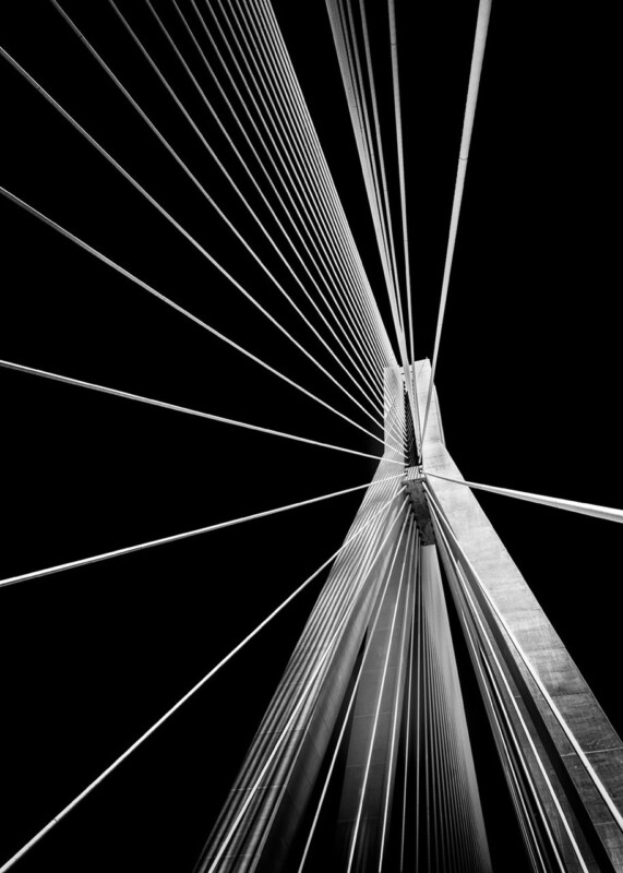
black and white office wall art should earn its place by answering a real question about the room or recipient. Rio is a useful starting point because the upward architectural viewpoint replaces visual clutter with converging bridge cables, a central pylon and strong monochrome contrast.
Use black and white office wall art to create order
Rio is not a conventional skyline. Its viewpoint turns engineering into an almost abstract arrangement. The cables radiate towards the central structure, so the eye receives direction and balance before it identifies the bridge. That makes the photograph useful in a workspace where clarity matters.
Private office
Use a side wall in the seated sightline. Keep pinboards and loose cables away from its exact geometry.
Meeting room
Give it enough distance for the radiating structure to register. Avoid placing it behind a glossy screen.
Reception
Align the central pylon with a low desk or seating group so the composition connects to the room.
Monochrome does not mean the whole office must be grey. Timber, one muted upholstery colour and warm task lighting can stop the scheme becoming severe. The photograph supplies structure; the working materials can supply warmth.
Preserve crisp geometry at the finished scale
Architectural photography exposes weak alignment quickly. Precise mounting, controlled monochrome output and a carefully finished frame help the cables and central tower remain exact. First 4 Frames can produce and frame the image in-house, including custom sizing where required.
Black and white office wall art can feel purposeful without becoming impersonal. Rio brings movement, engineering and visual order while leaving desks, screens and people to provide everyday colour.
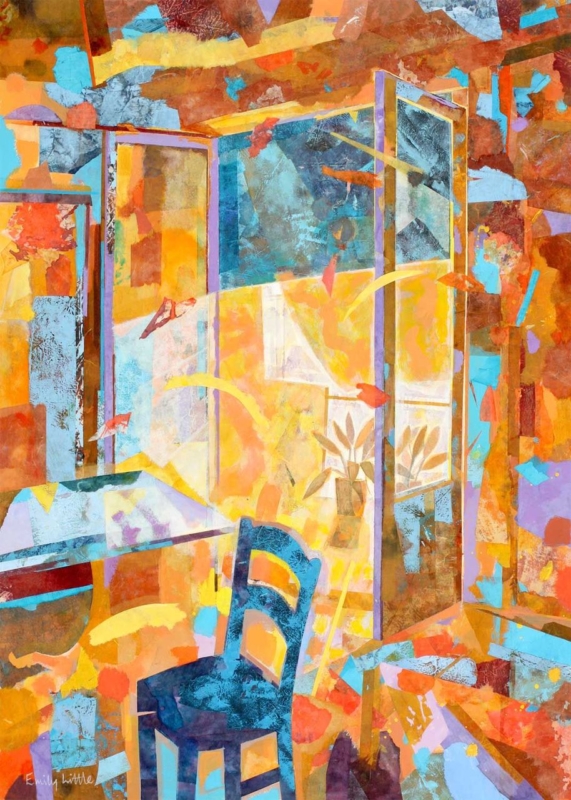
wall art for a glazed garden room should earn its place by answering a real question about the room or recipient. Summer Reflections is a useful starting point because its portrait proportions can occupy a solid return wall and its semi-abstract character can converse with garden colour without reproducing the exact view outside.
Plan wall art for a glazed garden room around movement
A conservatory often has little uninterrupted wall. Identify the solid section visible from the doorway and main chair, then make a paper template using the finished framed dimensions. A narrow return can suit a portrait composition better than several small pictures.
Run a one-day light check
Note when direct sunlight reaches the proposed wall.
Look for reflections from opposite roof and side glazing.
Check the sightline with doors open and closed.
Keep foliage from touching or covering the frame.
Do not match every colour to flowers that change through the year. Choose one connection, such as a cooler green, a warm bloom colour or the quality of reflected light. Neutral seating and a limited number of pots will let the picture remain readable in winter as well as summer.
Summer Reflections is offered in two portrait sizes, so it can be tested against the available wall rather than guessed from a screen. Leave a generous gap from glazing bars and heating controls so the frame appears intentional.
Protect colour while keeping the room bright
Colour-managed production gives nuanced colour a sound starting point, but display conditions still matter. In-house bespoke framing creates a precise edge; placement away from persistent direct sun and harsh reflections keeps the artwork comfortable to view.
Wall art for a glazed garden room should offer something the outside view cannot: a stable composition and an indoor point of pause. Summer Reflections can provide that focus without competing with every leaf beyond the glass.
romantic framed art gift should earn its place by answering a real question about the room or recipient. Breton Lovers is a useful starting point because its title and paired subject suggest intimacy, while the compact square composition remains artwork first and an occasion marker second.
How to choose a romantic framed art gift personally
Begin with the couple’s home, not the anniversary number. Notice whether they use bold colour, graphic forms or small focal artworks. Breton Lovers is most convincing for someone who responds to contemporary figures and a clear emotional idea, rather than literal hearts or written declarations.
Question
Why it matters
Do they choose art together?
A shared visual taste is more useful than a generic romantic message.
Where could a square piece live?
A bedside wall, reading corner or sitting-room return can offer an intimate scale.
Would bold colour suit their home?
The gift should belong there after the occasion has passed.
Do they value craftsmanship?
A finished frame makes it ready to keep and display.
Resist adding a plaque, printed date or matching ornament unless the recipients genuinely enjoy personalised objects. A handwritten card can explain why you chose the image. The artwork itself can then remain flexible if they move it to another room later.
Make the lasting part of the gift visible
A romantic gift should arrive as a resolved object, not another job for the recipients. First 4 Frames combines colour-managed printing with bespoke, hand-finished framing in Falkirk, giving the compact image enough presence to hang immediately.
A romantic framed art gift becomes meaningful through recognition rather than wording. Breton Lovers can mark a shared story quietly, while its colour and form remain enjoyable long after the anniversary.
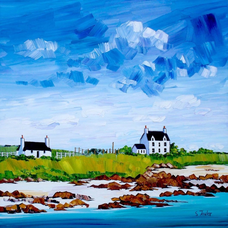
coastal art beside woven blinds should earn its place by answering a real question about the room or recipient. Gott Bay, Tiree is a useful starting point because its square format and Tiree setting can answer the blinds’ natural texture while adding a distinct view beyond the room.
Balance coastal art beside woven blinds
Woven blinds already introduce pattern through their fibres and horizontal lines. Artwork does not need to imitate that texture. Instead, use the coastal subject to add distance and light, then allow the frame to create a clean boundary between the picture and window treatment.
Lower the blind to its usual daytime position.
Mark the complete framed square on the adjacent wall.
Keep the frame clear of the window reveal.
View the arrangement from the room’s main seat.
Repeat only one quiet colour from the picture elsewhere.
Gott Bay is available in two square print sizes, so the choice should follow the wall rather than the size of the window. The smaller option can settle a compact corner. The larger version can hold its own beside a broad blind, provided there is still visible wall between both elements.
Natural materials work together through balance, not exact matching. Let the blind provide texture and the artwork provide the view.
Keep coastal colour separate from a seaside theme
Colour-managed Giclée production helps subtle island colour remain distinct in changing daylight. A bespoke frame made in-house can separate the coastal image from the tactile blind, giving each element enough definition.
Coastal art beside woven blinds can feel relaxed without becoming rustic. Gott Bay brings Scottish island identity, while careful spacing keeps the relationship calm, natural and properly finished.
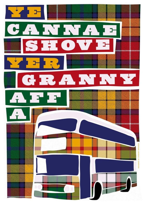
Scottish phrase wall art should earn its place by answering a real question about the room or recipient. Ye Cannae Shove Yer Granny Aff a Bus is a useful starting point because the familiar line carries rhythm, shared memory and a distinctly Scottish sense of humour without needing a long explanation.
Give Scottish phrase wall art one confident position
Words need a different kind of breathing room from a landscape. Place this print where the whole phrase can be read in one pause: above a kitchen bench, beside a breakfast table or on the wall facing a family-room doorway. Avoid hanging it behind open shelving, tall appliances or a busy collection of signs.
For everyday rooms
Let the line supply the humour. Plain ceramics, timber and a restrained wall colour keep the setting warm without repeating the joke.
For a family gift
Choose it when the recipient already knows the song or saying. That shared recognition makes the gift personal rather than generically Scottish.
The available landscape proportions suit a wall above low furniture. Mark the full framed width before ordering, then check that a standing viewer can read the wording without looking through pendant lights or across a cluttered worktop.
Frame the words as artwork, not a temporary sign
Accurate mounting and a hand-finished frame give typography a deliberate edge. First 4 Frames completes its framing in-house in Falkirk, so the finished piece can feel substantial while the bold line remains clear and immediate.
Scottish phrase wall art works best when the humour is specific and the display is disciplined. This familiar family line can bring warmth to a social room without turning the whole interior into a collection of slogans.
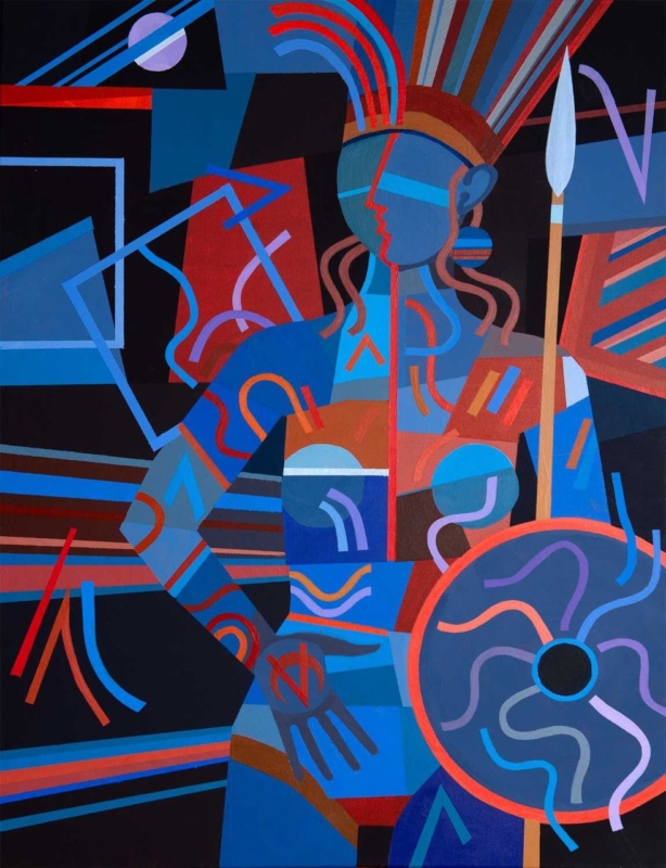
empowering wall art for a home gym can give an exercise space identity without covering it in instructions or slogans. Warrior Princess by Fred Carson centres a poised female figure holding a spear and shield. Red, blue, rust, violet, and black shapes interlock around her, creating strength through posture, rhythm, and composition rather than a printed command to work harder.
Why empowering wall art for a home gym need not use words
Home gyms often accumulate visual messages: app screens, exercise charts, equipment labels, timers, and personal targets. Adding another block of bold lettering can make the room feel like a noticeboard. Figurative art provides a different kind of motivation. It can suggest focus and capability while leaving the person training free to define those qualities for themselves.
The figure in Warrior Princess is still, yet the image is not static. Curved bands rise from the headdress. Diagonal lines cross behind the body. Circular forms in the shield, bracelets, and surrounding geometry establish a repeated beat. The upright spear gives the portrait a clear vertical axis, making the composition feel controlled amid all that movement.
Start with the activity zones, not an empty wall
A home gym must remain safe and functional. Identify the full movement area around each piece of equipment before choosing a position. Include space for raised arms, resistance bands, skipping ropes, benches, and doors. Artwork should never sit where a dropped weight, moving bar, or swinging attachment can reach it.
Possible position
Practical check
Beyond a cardio machine
Confirm the frame remains outside the equipment’s moving parts and ventilation path
Opposite a training mat
View it from floor level and standing height without placing it behind a swing zone
Beside storage
Open racks, cupboards, and doors fully before marking the frame
Near a mirror
Keep enough separation for both elements to read clearly and check doubled reflections
The print size is 265 by 345 millimetres before framing. Its portrait format suits a narrower wall between functional areas, but the final mount and moulding will increase both width and height. Mark those complete dimensions. A compact piece can still have presence when the surrounding wall is kept clear.
Let the palette organise a practical room
Gym equipment can introduce unrelated colours through mats, bands, handles, screens, and storage. The artwork already combines several strong tones, so it can act as a visual anchor rather than another item that needs matching. Choose one dominant relationship and allow the smaller colours to remain within the picture.
Black equipment: the dark ground creates continuity while blue and red stop the room feeling severe.
Blue or grey walls: cooler shapes connect naturally, with rust and coral adding warmth.
White walls: the portrait becomes a concentrated focal point instead of requiring several accessories.
Timber details: brown and terracotta passages can link shelves or flooring to the cooler training equipment.
Avoid repeating every hue through colour-coded kit. The goal is a coherent space, not a complete theme. Closed storage for smaller items will also let the figure and shield remain readable when the room is at rest.
Choose an image that belongs to the person using the room
Motivation is personal. Some people respond to competition; others value consistency, recovery, confidence, or a few quiet minutes away from daily demands. A composed warrior figure can represent resolve without dictating a specific sport or body type. That openness makes the artwork suitable for strength work, mobility, yoga, indoor cycling, or mixed training.
It is also worth thinking beyond decoration. Research and practical guidance on sportscotland’s women and girls research discusses participation, barriers, and inclusion in physical activity. A well-designed personal space cannot solve those wider issues, but it can feel welcoming, individual, and free from the narrow imagery often used in fitness advertising.
Account for changing light and working conditions
Check the proposed wall with overhead lights on and off. Strong downlights may create glare in glazing, while coloured smart bulbs can distort the distinction between red, violet, and blue. Daylight from a nearby window can also reflect a bright rectangle across the darker background. A small change in height or angle may improve visibility.
Keep framed paper away from recurring condensation, direct heat, and damp external walls. Good ventilation matters in any exercise area. Wipe equipment with care so cleaning spray does not travel towards the frame, and do not hang the picture where towels or clothing will be placed over it.
Frame the graphic figure with a decisive edge
A slim black moulding can continue the dark background and keep attention on the figure. A deep blue frame may support the cooler geometry, while a restrained warm timber can soften a room dominated by metal and rubber. The moulding should clarify the portrait rather than compete with the shield and patterned bands.
First 4 Frames produces colour-managed Giclée prints and completes bespoke framing in-house at its Falkirk workshop. Careful production helps the closely related blues, reds, violets, and dark shapes remain distinct. Hand-finished presentation also gives a practical exercise room one crafted element designed to last beyond a passing fitness trend.
Bold geometry from an Edinburgh artist
Fred Carson is an Edinburgh-based artist whose work uses stylised figures, strong geometry, and vivid colour. Browse the wider Fred Carson collection at First 4 Frames to compare related compositions and formats. In this portrait, the quiet stance and energetic surface create a useful balance between focus and momentum.
The best empowering wall art for a home gym should support the room without trying to shout over every session. View the framed Warrior Princess print for a poised, colourful figure that brings strength, character, and hand-finished craftsmanship to a personal training space.
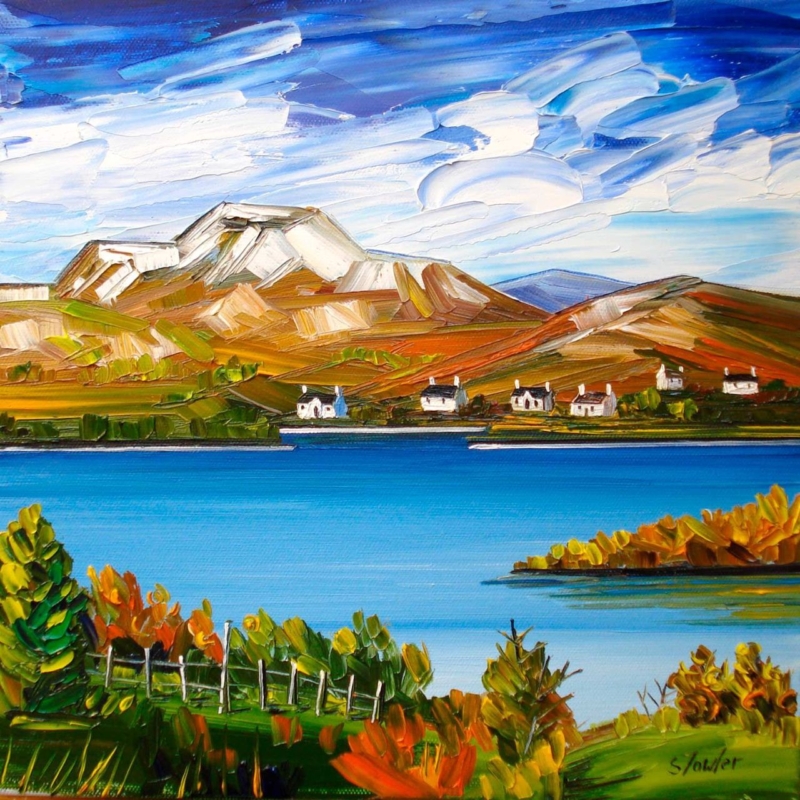
autumn wall art for a room with low daylight needs to bring warmth without absorbing the little natural light the space already receives. Autumn, Loch Lomond by Sheila Fowler offers a useful balance. Copper, orange, and yellow foliage establish the season, while vivid blue water and a broad, cloud-filled sky keep the square composition open. The result feels autumnal without turning the room brown, dim, or overly rustic.
Why autumn wall art for a room with low daylight needs contrast
A darker room does not automatically need pale, nearly colourless art. It needs an image with a readable structure and enough contrast to remain clear throughout the day. In this landscape, the bright horizontal band of the loch separates the deeper foreground from the hills. White cloud moves across the intense sky, while small cottages create crisp points on the far shore.
Those divisions help the scene retain depth when daylight is subdued. The darker greens and burnt orange leaves still provide richness, but they do not fill the entire picture. Open water and sky occupy generous areas, giving the eye somewhere to rest.
Work with the direction of the available light
Before choosing a wall, watch the room at three points: morning, the brightest part of the afternoon, and after the lamps come on. Low daylight may be caused by a northern aspect, a deep window reveal, nearby buildings, or heavy planting outside. Each condition affects the artwork differently.
Find the clearest wall. A position facing the window may receive useful light, although reflections must be checked.
Avoid the darkest recess. Rich foreground greens can lose definition if the frame is placed inside a permanently shadowed alcove.
Check the view from the doorway. The blue loch should read as a bright horizontal pause before the smaller details become visible.
Test evening lighting. A warm lamp can enrich the foliage, but it should not flatten the blue water or produce glare across the glazing.
Picture lighting is not always necessary. A nearby adjustable wall light or well-placed floor lamp may be enough. Keep bulbs and fittings at a safe distance from the finished frame, and aim the light so the picture is even rather than creating one bright spot.
Use seasonal colour without redecorating the whole room
The painting already carries several autumn notes: russet, ochre, olive, and a small amount of fresh green. Repeating all of them in cushions, throws, and accessories would make the scheme feel too literal. Choose one quieter connection instead. A rust wool cushion, an olive ceramic, or warm timber can relate to the foreground while the rest of the room stays calm.
Existing room palette
How the artwork can help
Cool grey or off-white
Orange foliage adds warmth while the blue water keeps continuity
Deep green
Bright sky and loch prevent the scheme from becoming too enclosed
Warm neutral
Blue provides a clean counterpoint to beige, oatmeal, or natural linen
Dark timber
White cottages and cloud introduce small, useful areas of brightness
This approach also lets the picture remain on the wall beyond autumn. The clear water, mountain forms, and strong sky are not seasonal props. They carry the landscape throughout the year, while the foliage supplies an extra layer of warmth when the days shorten.
Choose the square size from the viewing distance
The print is available in 265 by 265 millimetres and 500 by 500 millimetres before framing. The smaller option can suit a compact landing, reading corner, or wall beside a doorway. The larger version gives the loch and hills enough presence for a living room or dining area. Mounting and moulding will increase the final dimensions, so map the complete framed size rather than the print alone.
Use a paper template or low-tack tape and view it in the room’s dullest daytime conditions. If the proposed size looks visually slight then, it is unlikely to gain authority after framing. Conversely, a square that crowds furniture or window trim will lose the open quality that makes the landscape helpful.
Frame for definition, not extra heaviness
A restrained dark moulding can sharpen the edges and relate to the deeper foreground. A light neutral frame may suit a smaller, dimmer room, while a carefully chosen warm timber can echo the landscape without adding a heavy brown border. Compare the options against the real print because the blue, white, green, and orange must remain balanced together.
First 4 Frames uses colour-managed Giclée production and completes bespoke framing by hand at its Falkirk workshop. That in-house process helps preserve the separation between bright water, textured cloud, cottages, and foliage. It also allows the mount, moulding, glazing, and final scale to be chosen for the actual light conditions.
Colour and place in Sheila Fowler’s landscape
Sheila Fowler is a Scottish artist known for expressive colour, texture, landscapes, coastlines, and flowers. Explore further work on Sheila Fowler’s official website, or browse the Sheila Fowler collection at First 4 Frames. The painting’s recognisable setting gives the colour a sense of place rather than using autumn as a decorative theme alone.
Effective autumn wall art for a room with low daylight should make limited light feel considered, not apologetic. View the framed Autumn, Loch Lomond print for a bright loch, open sky, and warm seasonal foreground presented with lasting, hand-finished quality.
What if the frame is just as important as the drawing? Minimalist line art prints for sale can look deceptively similar online, yet the subject, scale and finish all affect how a piece feels in a room. Choosing the print and frame together helps the artwork sit comfortably on your wall, with a considered look that doesn’t overwhelm the space.
It’s natural to wonder how a design will look at home, or whether a standard frame will fit and do it justice. This guide explains how to compare line art styles, measure for the right print size and choose a frame to suit your space. You’ll also find practical ways to visualise art on your wall before you buy, plus what to look for in bespoke framing. At First4Frames Gallery, each frame is individually made for the order using high-quality materials, with 2mm float glass for clear viewing. Finished frames are fully packaged to help prevent damage in transit and shipped via professional couriers.
Key Takeaways
Compare abstract faces, figurative sketches, botanical lines and geometric designs to find minimalist line art prints for sale that suit your room’s mood.
Match print size and frame width to the wall and nearby furniture, allowing negative space to keep a simple composition balanced.
Before buying online, choose a subject, measure the display area and review the artwork presentation and product details.
Decide whether framed or unframed art suits your plans, and consider how bespoke framing can complete the artwork.
How to Choose Minimalist Line Art Prints for Sale That Suit Your Space
Pared-back drawings can bring a sense of calm, but a simple image still changes a room’s mood. A fine, flowing line may feel gentle and intimate, while bold black strokes create a stronger focal point. Contrast affects how clearly the artwork stands out from its surroundings; negative space gives the eye room to rest and keeps a composition feeling light. In minimalist line art, deliberate lines and open space do much of the work.
For a broader introduction to the form, explore What is Line Art?. Then consider how the drawing relates to the room. It might echo existing shapes and tones, or provide a deliberate point of contrast.
Which minimalist line art style fits your room?
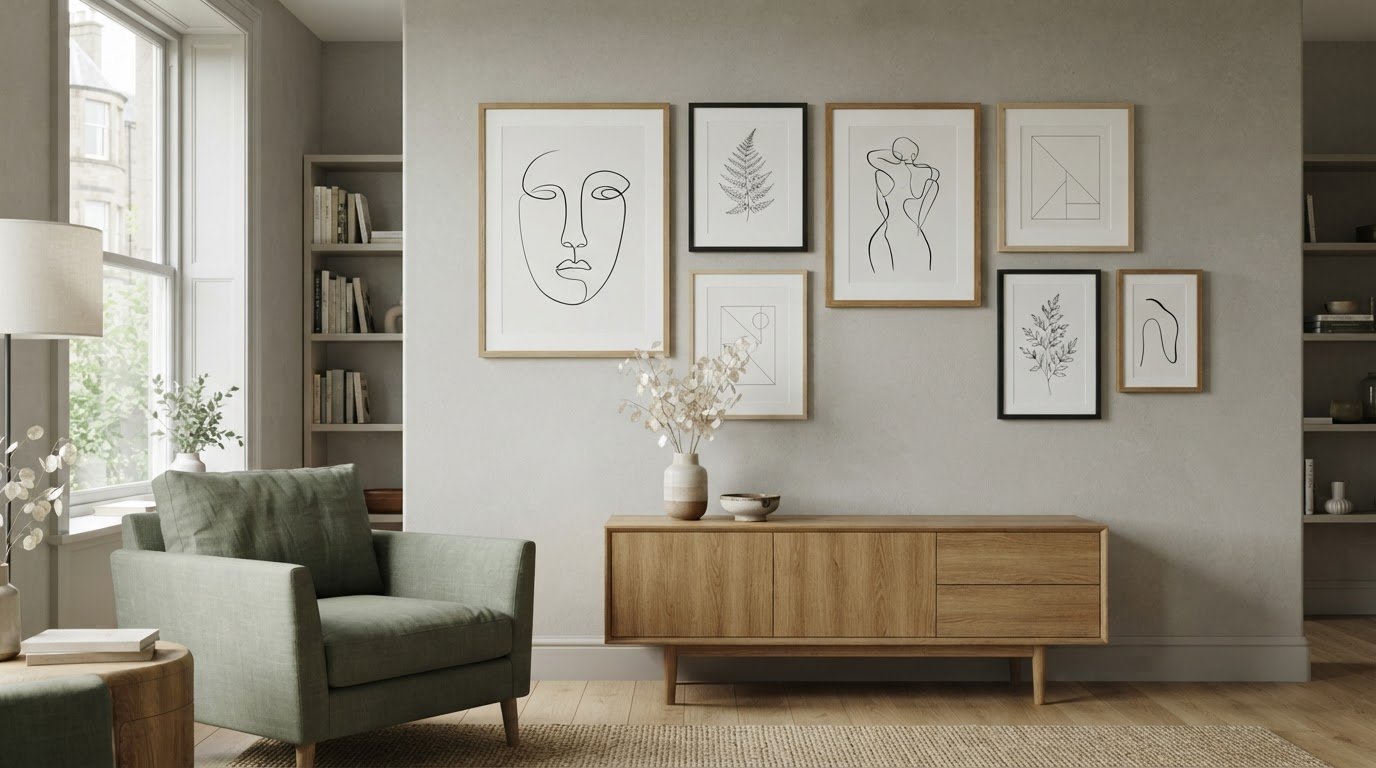
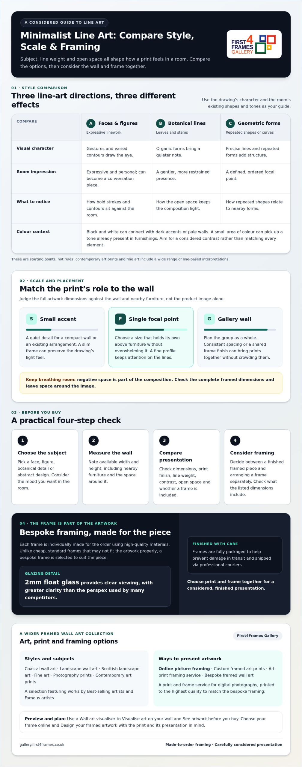
Abstract faces and figurative sketches often feel expressive and personal. Their gestures and varied contours draw attention, making them a good choice when you want the print to become a conversation piece. Botanical lines tend to feel quieter, with leaves and stems bringing an organic note. Geometric compositions, built from repeated shapes or precise curves, add structure.
These are starting points, not rules about which interior style can accommodate each design. Contemporary art prints and fine art offer broader contexts for line-based work, from playful modern interpretations to restrained drawings. Black-and-white art can connect with dark accents or pale walls; a small area of colour can pick up a tone already present in cushions, ceramics or furnishings. Let the room guide your choice without trying to make every element match.
How can you visualise art on your wall before buying?
Measure the area you’re considering, then mark the intended artwork dimensions on the wall with removable tape or paper. This outline helps you judge the scale beside furniture, switches and nearby pictures. Stand back to assess it from the room’s entrance and from the place where you’ll usually sit.
A wall art visualiser can help you visualise art on your wall and see artwork before you buy by previewing a design in your space. Use the preview as a guide, then compare the stated artwork dimensions with your measurements before choosing a print.
Choose the Right Size, Print Finish, and Framing for Line Art
Judge print size against both the wall and the furniture beneath it, not in isolation. A design that looks generous on a product page may feel lost above a broad sofa, while a large print can crowd a narrow wall. Check the artwork’s full dimensions, including the frame, and leave breathing room around the image so its open space remains part of the composition.
Small accent
Use a smaller print to add a quiet detail to a compact wall or an existing arrangement. A slim frame can preserve the drawing’s light feel.
Single focal point
Choose a size that holds its own above furniture without overwhelming it. A broader frame adds visual presence, while a fine profile keeps attention on the lines.
Gallery wall
Plan the group as a whole. Consistent spacing or a shared frame finish can bring different prints together without making each image feel cramped.
When comparing minimalist line art prints for sale, check the artwork dimensions as well as the image preview. Review the print-finish details and consider how the surface will look in the room’s light. Keep the frame colour and profile in proportion to the linework: strong contrast can emphasise a spare drawing, while a quieter edge lets delicate marks lead.
What should you consider when choosing a frame online?
Choose your frame online with the drawing’s character and intended position in mind. Bespoke framing brings print and frame together, with each frame individually made for the order using high-quality materials. Unlike cheap, standard frames, which may not fit the artwork properly, a made-to-measure frame is selected to suit the piece. Design your framed artwork as one considered whole rather than choosing a frame as an afterthought.
Why does glazing matter for minimalist artwork?
Clear glazing helps fine marks remain crisp. First4Frames uses 2mm float glass, which offers clearer viewing than the perspex used by many competitors. For more on frame choices and display, see Picture Frames: The Ultimate Guide to Choosing, Hanging, and Displaying Art.
Explore the online art gallery with your measurements in mind, so you can consider the artwork and its eventual presentation together.
How to Buy Minimalist Line Art Prints Online With Confidence
A clear order of decisions makes choosing minimalist line art prints for sale more straightforward. Work through these steps before placing an order:
Choose the subject. Decide whether you want a face, figure, botanical detail or abstract design, and consider how its mood will suit the room.
Measure the wall. Note the available width and height, including space around nearby furniture, so you can compare the artwork’s dimensions with its intended position.
Compare the presentation. Review product imagery from different views and read the details for print dimensions, finish and whether a frame is included. Look closely at line weight, contrast and open space, not just the thumbnail.
Select framing. Decide whether you want a finished framed piece or prefer to arrange a frame separately. Consider how its profile and colour will complement the drawing.
Online picture framing and an art print framing service bring these decisions into one process, helping you weigh the artwork and its presentation together. Check whether the stated dimensions refer to the complete framed piece or the print alone, as this affects how much space it will occupy.
How do you compare framed and unframed art prints?
Ready-to-hang framed wall art offers convenience: the print arrives as a complete piece, so you don’t need to source and fit a separate frame. An unframed print gives you flexibility to choose framing later, but you’ll need to consider fit and finish yourself. Custom framed art prints are made to suit the artwork rather than relying on a standard frame that may not fit its dimensions.
What should buyers know about packaging and delivery?
Finished frames are fully packaged to help prevent damage in transit and shipped via professional couriers. This is useful reassurance when ordering framed artwork online. You can also make a more confident choice by reviewing the print’s details and presentation before buying.
Find Bespoke Framed Minimalist Line Art That Feels Finished
The final choice depends on how you want the artwork to arrive and fit into your plans. An unframed print leaves you free to arrange the presentation later; ready-to-hang framed art brings print and frame together as a finished piece. Bespoke framing lets you consider the artwork and its setting as one, with choices tailored to the individual piece.
What makes bespoke framed wall art a considered choice?
First4Frames offers a wide online selection of artwork and frames, alongside custom picture framing for a tailored result. Browse coastal wall art, landscape wall art, Scottish landscape art, photography prints and contemporary art prints, as well as works by best-selling artists and famous artists. With a broad choice of frame styles, you can choose an understated finish that lets delicate linework lead or a more defined profile that gives it presence.
Can you print and frame a digital photograph?
Yes. First4Frames’ print-and-frame service turns a digital photograph into finished wall art, with high-quality printing to complement its bespoke framing. Explore the online photo printing and framing service to create a framed piece from your own image.
A well-chosen piece can become a quiet part of your everyday routine, catching your eye as you pass or bringing calm to a busy corner. As you browse minimalist line art prints for sale, picture the feeling you want the room to hold, not just the colours or shapes that match it. A graceful outline might soften a space, while a more expressive drawing can add personality without filling the wall with visual noise.
Give yourself time to notice which artwork you keep returning to. The strongest choice often feels natural in the room and meaningful to you, rather than simply following a trend. Once a design has caught your attention, explore the gallery’s selection of artwork and framed prints.
Minimalist line art uses a pared-back visual approach, often relying on a small number of marks rather than detailed shading or colour. A single continuous outline might suggest a face, while a few curved strokes can evoke a leaf or figure. The viewer’s eye fills in what’s left unsaid, making the artwork feel simple but expressive.
How do I choose the right size for a minimalist line art print?
Compare the print’s stated dimensions with the clear wall space, then consider nearby furniture and how far away you’ll usually view it. A small design above a narrow side table can feel deliberate, while the same print may look undersized over a broad sofa. Include the frame in your measurements when comparing finished minimalist line art prints for sale.
Are minimalist line art prints suitable for a gallery wall?
Yes. Their clean compositions can sit comfortably alongside photography, abstract work or other illustrations. To make a group feel connected, repeat one feature, such as a frame colour, while varying image shapes or subject matter for interest. Lay out paper templates on the floor first, then adjust spacing and order before marking positions on the wall.
Is framed line art better than an unframed print?
Neither option is automatically better; it depends on how much choice and preparation you want. A framed print gives you a complete presentation, while an unframed one lets you select a frame later to suit a changing room or an existing collection. If choosing separately, check that the frame opening and print dimensions are compatible before purchasing.
What glazing does First4Frames use for framed art prints?
First4Frames uses 2mm float glass for framed art prints. It offers clearer viewing than the perspex used by many competitors. When deciding where to hang a print, consider daylight and room lighting, and choose a position where reflections are less likely to distract from the artwork.
office wall art UK works best when it solves a real decorating question rather than merely filling a gap. Panorama of Edinburgh in the early morning light at sunrise is a useful example because the broad panorama joins historic landmarks, modern buildings and open sky in a city view that feels recognisable without becoming a corporate graphic.
What office wall art UK workplaces need from a panorama
A workplace picture is often seen while people are moving, waiting or beginning a conversation. A panorama suits that pattern. It offers an immediate city identity from a distance, then reveals the castle, Balmoral clock tower and rooftops when someone stands closer.
Reception
Align the view with the seating group or desk. Keep signs and screens away from its silhouette.
Meeting room
Use a side wall rather than the video backdrop. The city adds distance without distracting from faces.
Shared office
Hang the long format above low storage so desks remain practical and clear.
Local identity works best when it is specific and quietly confident. There is no need to add Edinburgh wording, maps or repeated landmarks. One accurately framed city view can establish place while the workplace remains professional and flexible.
A recognisable city can welcome clients more naturally than a motivational slogan when the view connects with where the organisation works.
Specify the finished piece for a working environment
A commercial setting benefits from dependable scale, clean alignment and a finish made for repeated viewing. First 4 Frames offers in-house colour-managed production and bespoke framing from Falkirk, helping the detailed skyline stay clear and the wide presentation feel polished.
Office wall art UK workplaces can live with should support identity and everyday use. Edinburgh at sunrise brings local recognition, architectural depth and an optimistic horizon without generic business decoration.
wall art for a room with grey walls works best when it solves a real decorating question rather than merely filling a gap. Winter landscape image of River Etive iconic snowcapped Stob Dearg Buachaille Etive Mor mountain is a useful example because its cloudy sky belongs naturally with a restrained palette, while brown moorland, crisp snow and reflection prevent the scheme becoming flat.
Build contrast into wall art for a room with grey walls
Grey paint changes with its undertone. Blue-grey can sharpen the winter atmosphere, while pebble grey connects with the moorland. Hold a neutral sample against the wall in daylight and lamplight before deciding whether the picture needs a dark, pale or timber frame.
Find three useful points of difference
Light: snow and water provide crisp highlights.
Warmth: brown grass keeps the scene from feeling entirely cool.
Depth: reflection doubles the landscape without unrelated colour.
Do not repeat grey across every textile and object. A wool throw, timber table or muted leather detail can answer the foreground. Those materials add warmth while leaving the snowy mountain and calm water as the clearest elements.
Position the photograph where diffuse daylight can reach it without a window appearing directly in the glazing. A lamp set to one side will keep the reflection and riverbank readable on winter afternoons.
Use framing to separate neutral tones cleanly
Colour management matters when neighbouring greys carry different information. It helps cloud, snow, rock and reflection stay legible. A bespoke frame then defines the cool landscape against the painted wall, with in-house finishing making the result deliberate rather than merely matched.
Wall art for a room with grey walls should introduce depth, not more sameness. River Etive uses winter light, earthy ground and reflected mountain structure to enrich a neutral room while keeping its calm.