


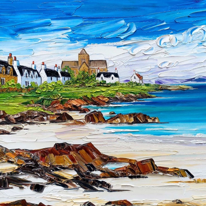
coastal wall art above a round dining table can give a dining area a stable focal point while respecting the softer geometry of the furniture below. Abbey and Cottages, Iona by Sheila Fowler is square, spacious and full of island colour. Its shoreline leads the eye towards Iona Abbey and the cottages, so the wall feels more open beyond the table rather than crowded by a heavy decorative block.
How coastal wall art above a round dining table creates balance
A round table encourages movement and conversation, but the wall behind it may still be rectangular and visually empty. A square artwork provides a useful bridge. It has enough structure to anchor the wall, while its equal sides relate more naturally to a circle than a very long landscape might. The effect can feel settled without becoming rigid.
Abbey and Cottages, Iona adds another kind of balance within the picture. Rocky foreground marks give the lower half weight. Pale sand, open water and expressive sky then create distance. The abbey and cottages sit between those areas, giving diners a recognisable point to return to without dominating the view.
Start with the complete dining view
Do not centre the artwork by measuring the bare wall alone. Pull out the chairs, place the table as it will be used and stand at the main entrance to the room. In most cases, the visual centre should relate to the table group. If a pendant light hangs above the table, consider the light, artwork and furniture as one composition.
| Element | What to check | Why it matters |
|---|---|---|
| Table diameter | The framed width should feel substantial but not wider than the dining group | Keeps the wall and furniture connected |
| Chair movement | Allow for people standing and pulling chairs back | Prevents the frame feeling vulnerable or too low |
| Pendant position | Check the overlap from the doorway | Stops the shade hiding the abbey |
| Nearby window | View the glazing at breakfast and evening | Protects the lighter sea and sky detail from reflection |
Use the square format to steady curved furniture
Repeating every curve can make a scheme feel overly coordinated. A square frame creates a quiet counterpoint to the tabletop and pendant shade. The coastal scene keeps that geometry from feeling severe because its painted edges, cloud forms and shoreline are loose and lively. This mix of structure and movement suits both traditional dining rooms and simpler open-plan spaces.
Make a paper template to the finished framed size and leave it in place for a day. View it while seated, when entering the room and from any adjoining kitchen or sitting area. The artwork should remain comfortably above heads without floating so high that it loses contact with the table.
Draw out colour in small, useful amounts
- Sea blue: repeat it once in a serving bowl, linen napkins or a small glass detail.
- Grassy green: use a simple plant or muted seat fabric rather than a full botanical scheme.
- Rocky ochre: connect it to oak, rattan or warm ceramic tableware.
- Chalky white: let the cottages relate to pale walls without trying to match the paint exactly.
- Dark roof tones: echo these through slim frame details, chair legs or a pendant fitting.
Two or three connections are enough. The picture already combines strong blues, greens and earth tones. Repeating every colour around the table would turn a flexible coastal view into an obvious theme. Neutral table linens and natural materials let the artwork remain the most concentrated source of colour.
Keep the island mood, lose the nautical clichés
The appeal of the scene comes from a real place: the abbey, cottages, layered shore and changing island weather. It does not need rope accessories, shells or striped ornaments to explain itself. A clear tabletop and simple lighting will give the textured paint room to work. This approach also helps the dining area feel appropriate throughout the year.
If the dining room contains traditional furniture, the abbey and cottages provide architectural familiarity. In a modern scheme, the bright palette and bold palette-knife texture offer energy. The subject can therefore connect old and new pieces without forcing the room towards either a rustic or minimalist extreme.
Choose lighting for texture and conversation
A dining pendant should light faces and the table first. Add soft ambient light if the artwork disappears after dusk. A broad wall light or nearby lamp can reveal the raised-looking sweeps of colour more naturally than a harsh spotlight. Check that the brightest reflection does not sit across the abbey or the pale shoreline.
Sheila Fowler paints Scottish landscapes, coastlines and wildflowers with expressive colour and texture. This Iona view turns familiar buildings and shore into a lively, welcoming composition. Explore more work at Sheila Fowler’s official website, or browse the Sheila Fowler collection at First 4 Frames.
First 4 Frames uses colour-managed Giclée production and completes bespoke framing in-house at its Falkirk workshop. Careful printing preserves the small shifts in white, turquoise and blue. A hand-finished frame can then connect the square image to the table and surrounding materials without dulling its open coastal character.
Thoughtful coastal wall art above a round dining table can make dining furniture and architecture feel like one complete arrangement. View the framed Abbey and Cottages, Iona print for a square island scene that brings colour, distance and an easy sense of place to the table.