


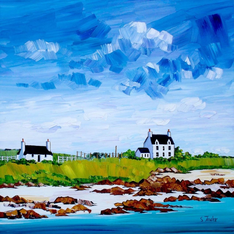
coastal wall art for an east-facing room has to work through a noticeable change in daylight. Morning sun can make colour feel clear and energetic, while the same room may become cooler and quieter after noon. Gott Bay, Tiree by Sheila Fowler is well suited to that rhythm. Its turquoise water and expansive blue sky welcome early brightness. White cottages, green land and rust-coloured rocks retain warmth and definition when direct light has moved away.
Why coastal wall art for an east-facing room needs range
East-facing rooms often look their brightest near the start of the day. Clear sun sharpens pale walls and makes saturated colour appear especially vivid. By late afternoon, however, the light is usually indirect. A picture built only from delicate cool tones can lose presence, while one dominated by very dark colour may feel heavy once the sun has passed.
Gott Bay, Tiree contains useful contrast at several levels. Broad blue marks create an airy sky. White buildings form crisp stopping points. The grassy strip supplies yellow-green warmth, and the rocky shoreline introduces brown, red and charcoal edges. These elements allow the composition to change with the room without becoming flat.
Test the wall in the morning and late afternoon
Do not choose a position after observing the room at only one time. An east wall may receive little direct glare but look strongly illuminated by the opposite window. A side wall can catch a bright reflection across glazing. The best location should preserve the pale cottages and shoreline detail during the sunny period, then keep the larger colour blocks readable later.
- Mark the finished size. Include the mount and frame in a square paper template.
- Check the early view. Look for glare when direct morning light is strongest.
- Return after lunch. Make sure the cottages do not disappear as the room becomes cooler.
- Switch on evening lamps. Confirm that one light source reveals the greens and warmer rocks.
- Keep the horizon clear. Move tall plants or ornaments that interrupt the open middle distance.
The print is available in two square sizes before mounting and framing. A compact version can suit a wall between windows or above a small table. The larger option can anchor a seating or dining area. In either case, clear wall around the frame helps the broad sky feel spacious rather than boxed in.
Balance the blue with grounded materials
Blue is an obvious strength of this picture, but repeating it across every surface would make the room colder after direct sun leaves. Draw instead on the quieter colours. Natural oak can connect with the shoreline rocks. A woven neutral brings the softness of sand and dry grass. A small green accent can recognise the strip of land without turning the room into a coastal colour chart.
| Room element | Colour connection | Useful restraint |
|---|---|---|
| Warm timber | Ochre and rust in the shoreline | Avoid orange accessories on every surface |
| Off-white wall | The cottages and pale sea marks | Keep the frame edge visible |
| Soft green textile | The grassy band across the bay | Choose one green rather than several |
| Deep blue detail | The strongest sky and water passages | Use it below the picture, not all around it |
The subject already establishes the coast. Striped cushions, shells and nautical signs are unnecessary. A few relationships in colour and texture will make the work belong in the room while allowing it to remain a Scottish landscape rather than part of a decorating theme.
Choose a wall colour that changes gracefully
A warm off-white is a dependable background because it supports the white buildings without becoming stark in the afternoon. Pale stone or a soft putty tone can bring out the warmer foreground marks. Muted blue-green may also work, provided the frame creates enough separation between the wall and the large blue field.
Test a painted sample vertically beside the proposed position. View it under real morning light and again with the lamps used after dusk. Small horizontal cards can be misleading because light reaches them differently. The aim is not an exact colour match. It is a background that allows the bright water, green land and crisp cottages to keep their individual roles.
Use evening lighting to recover warmth
Once an east-facing room loses direct sun, a warm lamp can prevent the coastal palette from feeling remote. Position light so it reaches the whole square rather than producing one bright patch on the glazing. A lamp to the side of a sofa or console may reveal the ochre and brown foreground more gently than a hard ceiling spotlight.
Check the view from the main seat as well as from the doorway. Reflections can move as people cross the room. If the strongest glare sits over the cottages or horizon, a small change in height or position may solve the problem more effectively than increasing the light level.
Keep expressive colour distinct in print and frame
Sheila Fowler is a Scottish artist known for vibrant paintings of coastlines, landscapes and wildflowers. Her expressive brushwork gives Gott Bay energy without losing the recognisable relationship between water, shore and island buildings. Explore more of her work at Sheila Fowler’s official website, or browse the Sheila Fowler collection at First 4 Frames.
First 4 Frames uses colour-managed Giclée production and completes bespoke framing in-house at its Falkirk workshop. That process helps the different blues remain separate and preserves the smaller warm marks that matter in subdued light. A carefully chosen frame can then give the active brushwork a calm, durable boundary.
Well-considered coastal wall art for an east-facing room should feel lively at breakfast and still hold the room together in the evening. View the framed Gott Bay, Tiree print for a bright island scene with enough warmth, contrast and structure to adapt throughout the day.