


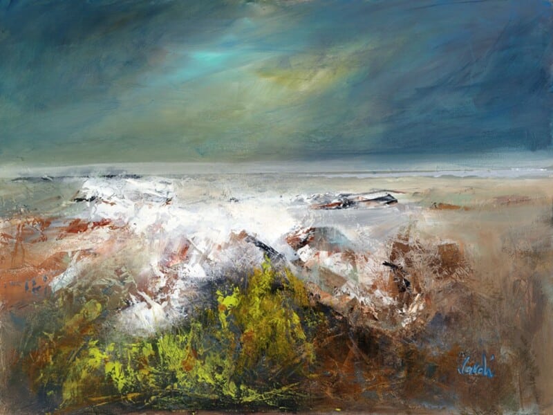
Choosing conservatory wall art is often less about filling a sunny wall and more about controlling the mood of the room. In a space with strong daylight, too much contrast can feel harsh surprisingly quickly. First Light 2 works beautifully because it brings the gentler atmosphere of early light, helping a conservatory feel bright but not overexposed.
Why First Light 2 suits conservatory wall art so well
First Light 2 has exactly the kind of colour transition that helps a glass-heavy room feel balanced. Instead of fighting the natural light already pouring in, it works with it. The piece adds warmth, movement, and a sense of horizon, which is especially useful in conservatories that can otherwise feel visually flat once the sun shifts through the day.
- It keeps a bright room calm rather than glaring.
- It adds warmth without becoming visually heavy.
- It gives a conservatory a proper focal point instead of a blank end wall.
The framed finish matters here too. In a room full of windows, the artwork needs enough presence to hold its own. First 4 Frames completes the bespoke framing and colour-managed Giclée printing in-house in Falkirk, giving the final piece the superior quality and edge definition that help it sit confidently within a lighter, more open room.
If you are also thinking about how a conservatory should feel as a finished space, House Beautiful’s conservatory ideas offers useful decorating context. You can browse more work by Arie Vardi and view the exact framed print here.
For anyone comparing conservatory wall art, First Light 2 is a good reminder that the most effective choice often adds softness and atmosphere, not simply more brightness.