


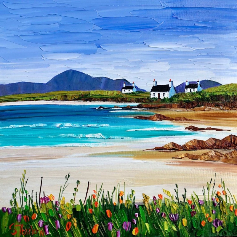
island art for a room with painted floorboards can make a relaxed interior feel connected without turning it into a coastal theme. Summer Machair and Cottages, Harris by Sheila Fowler brings together pale sand, turquoise water, white cottages, dark hills and lively machair flowers. Those layers offer several ways to relate the picture to painted timber underfoot, whether the boards are white, soft grey, blue or a gently worn neutral.
How island art for a room with painted floorboards creates connection
Painted boards have visible joints, changing light and a practical character that is different from fitted carpet or a perfectly smooth floor. Artwork with texture and distinct horizontal layers can belong naturally beside them. In this scene, bands of flowers, beach, sea, shore and mountains move up the image. The marks remain expressive, so the room does not feel too polished or carefully matched.
The square composition also gives the landscape stability. A very wide coastal panorama could exaggerate the direction of the boards and make a narrow room feel longer. This format balances horizontal scenery with a compact shape, making it useful above a small sofa, painted chest or simple dining bench.
Let the floor choose one colour, not the whole scheme
Begin with the actual floor colour in daylight. White boards may lean warm beside cream walls or cool beside blue-grey paint. A faded blue floor might appear stronger on a sunny day and quieter in evening light. The artwork only needs one convincing connection to feel settled.
For white or chalky boards, use the sand and cottage walls as the bridge. For blue-grey boards, look to the sky and distant hills. A deeper coastal blue can connect with the water, while softly painted green boards can relate to the machair. Do not repeat every colour elsewhere. The orange, pink, purple and yellow flowers work best as small sparks rather than a shopping list for cushions and accessories.
Read the Harris landscape from foreground to distance
The foreground is close and tactile. Individual flower marks rise from dense green grass. Beyond them, pale sand creates a broad quiet interval before turquoise water and low waves. Rocks lead towards the white cottages, and the dark mountain silhouettes give the bright coast a firm horizon.
That sequence can help a smaller room feel deeper. Hang the picture where its pale middle section is visible across the space. Avoid covering the lower flowers with a tall lamp or vase. The contrast between busy foreground and open beach is what makes the view feel generous rather than merely colourful.
A useful room does not need to copy the coast. It only needs enough shared colour, texture and breathing space for the artwork and the floor to feel part of the same conversation.
Choose placement for a floor with visible rhythm
Board lines pull the eye through a room. Use the artwork to provide a destination at the end of that movement. A wall seen from the doorway, the far end of a kitchen or the area above a low piece of furniture can work well. Centre the frame on the furniture or sightline rather than automatically centring it on the entire wall.
Make a square paper template using the finished framed size. Place it on the wall, then view it while standing and sitting. Check whether the image still feels connected to the floor when a rug, table or chair interrupts the direct view. If not, a slightly higher or more open position may restore that relationship.
Keep the coastal mood relaxed, not themed
The cottages, beach and water already establish a strong island setting. Rope accessories, shell collections and multiple nautical signs are unnecessary. Natural linen, simple ceramics and one textured wool throw can support the atmosphere without competing with the place itself. A small vase of seasonal garden flowers can echo the machair more subtly than permanent floral patterns.
Painted boards often show wear, which can be part of their appeal. The artwork’s palette-knife texture and broken colour suit that lived-in quality. Keep other wall decoration restrained so the detailed foreground and open beach retain a clear visual pause.
Frame colour and texture with a quiet edge
A light timber frame can warm a room with cool boards, while a restrained white or pale grey option may preserve the airy quality of the sand and cottages. A darker slim moulding can refer to the mountain line and black roofs. The frame should define the square without pulling attention away from the saturated turquoise water.
First 4 Frames uses colour-managed Giclée production and completes bespoke framing in-house at its Falkirk workshop. That care is valuable in a picture built from small shifts of blue, white and green, as well as bright individual flower marks. It helps retain the contrast between tactile paint effects and the calm distance of the Harris landscape.
Sheila Fowler paints Scottish landscapes, coastlines and wildflowers with expressive brushwork, palette knife and strong colour. Explore her wider work at Sheila Fowler’s official website, or compare the Sheila Fowler collection at First 4 Frames.
Thoughtfully placed island art for a room with painted floorboards can connect painted timber to the view beyond without making the room feel staged. View the framed Summer Machair and Cottages, Harris print for a layered island scene with enough colour, openness and texture to reward everyday living.