
Posted on

Abstract Landscape Art With Atmosphere, Why Crimson Night Works

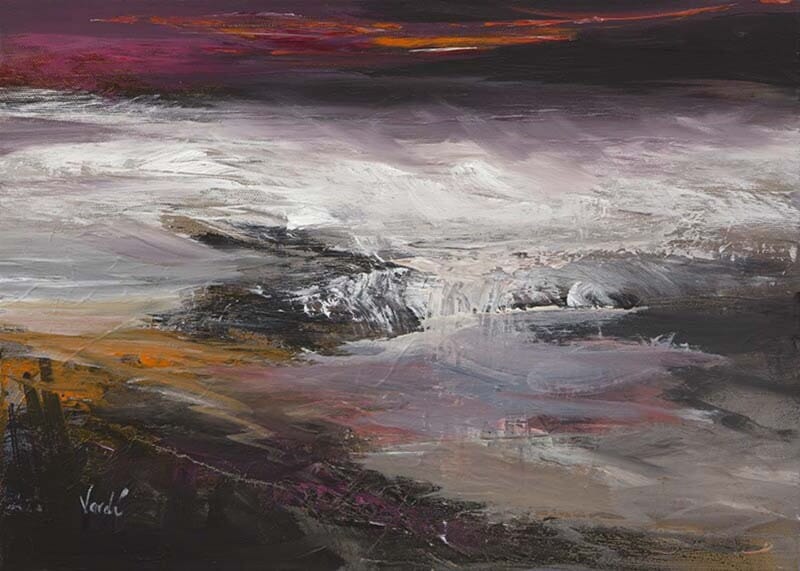
Image of Crimson Night by Arie Vardi

The best abstract landscape art still gives the eye something to hold onto. Crimson Night works so well because it uses colour and mood freely, but still feels connected to land, distance, and atmosphere rather than drifting into something vague.

That balance makes it useful in real rooms. You get the emotional pull of abstraction, but also the calmer grounding that often helps landscape art feel easier to place.

Why The Colour Feels So Effective

A colour-led landscape succeeds when the mood feels intentional rather than decorative. Crimson Night has that stronger sense of purpose, which gives the wall depth and drama without losing elegance.

  • It adds atmosphere without becoming visually muddy.
  • It feels expressive while still grounded in a landscape language.
  • It suits interiors that need mood rather than obvious subject matter.

Where It Can Work Best

This kind of piece works beautifully in a living room, dining space, hallway, or quieter bedroom where colour can set the tone. It pairs especially well with charcoal, stone, warm neutrals, walnut, and softer textiles because the artwork already carries a layered emotional range.

Why Presentation Matters Here

Abstract work can lose conviction if the print and finish feel thin. First 4 Frames handles the bespoke framing and colour-managed Giclee production in-house, helping the tonal depth and surface clarity stay persuasive once the piece is framed.

You can view the exact framed product here, and browse more from Arie Vardi if you enjoy landscape work with the same atmospheric freedom.

If you want abstract landscape art that feels atmospheric, substantial, and still connected to place, Crimson Night is a compelling option.

Posted on

Choosing Art for Maple Furniture, Why Crimson Night Feels So Well Judged

Choosing art for maple furniture often comes down to balance. Maple has a clean, lighter look that keeps a room fresh, but it can also leave the overall scheme feeling a little weightless if the artwork is too faint. Crimson Night works especially well because it introduces depth and atmosphere without fighting the calm character of the timber.

Why lighter timber rooms need a little grounding

Maple furniture tends to suit people who like a room to feel bright, modern, and uncluttered. The challenge is making sure the space still feels layered rather than slightly bare. This piece helps by giving the eye somewhere more substantial to rest, while still keeping the scheme refined.

  • It sits comfortably with pale timber, warm neutrals, and soft grey tones.
  • It adds visual depth without making the room feel heavy.
  • It suits living rooms, bedrooms, and quieter dining spaces alike.

Where this piece tends to look strongest

Crimson Night works beautifully above a sideboard, on the wall opposite a bed, or behind a sofa in a lighter sitting room. In each case, the framed presentation helps the space feel more finished and less dependent on furniture alone for character.

Why the framed finish matters

First 4 Frames completes every piece in-house in Falkirk using bespoke framing, colour-managed Giclée printing, and hand-finished craftsmanship. In a room built around lighter materials, that superior finish matters because the artwork needs enough presence to anchor the space properly.

This artwork is by Arie Vardi, and you can view the exact framed product here.

If you need art for maple furniture that feels warm, balanced, and easy to live with, Crimson Night is a very confident choice.