Posted on

A Picture Framing Service Shows Its Value With Ardnamurchan Reflections

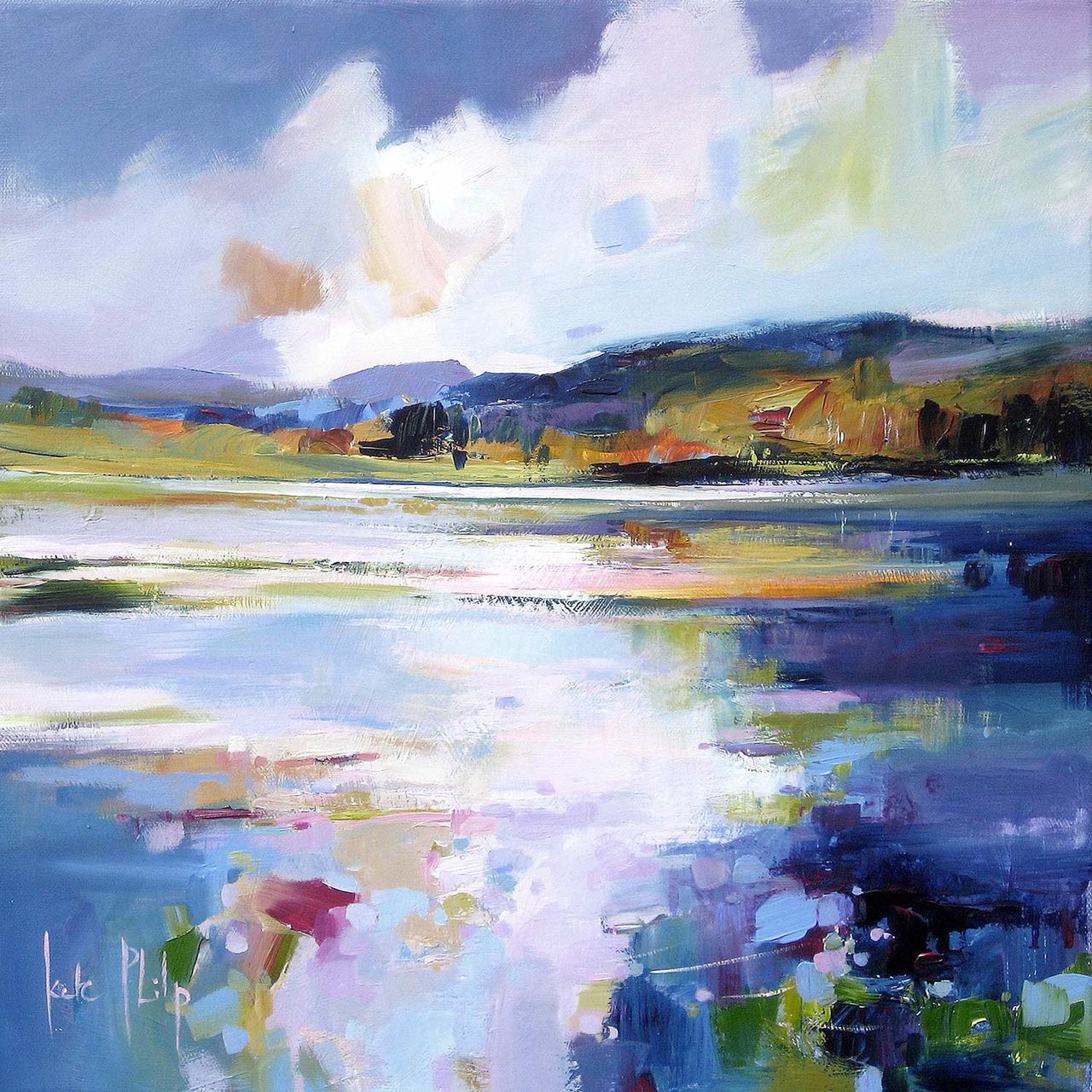
Ardnamurchan Reflections depicts a serene lake mirroring a bright, cloudy sky and distant hills, in calming blues with touches of white, green, and gold—capturing tranquility on canvas.

A good picture framing service should do more than put a border around a print. Ardnamurchan Reflections shows why that matters. The image depends on reflection, horizon, and quiet shifts of light, so the framed result needs enough care to preserve the mood that makes the artwork worth choosing.

picture framing service - Ardnamurchan Reflections

Why a picture framing service changes how quieter art is experienced

With calmer coastal work, the presentation affects how spacious or compressed the print feels once it reaches the wall. The wrong finish can make a subtle image disappear. The right one helps the composition breathe and gives the piece enough presence to hold its own in the room.

That is especially useful in bedrooms, hallways, sitting rooms, and studies where quieter art often needs craftsmanship behind it to feel intentional rather than faint.

Why Ardnamurchan Reflections rewards that extra care

Ardnamurchan Reflections already has softness and balance built into the image, so the framing needs to support that rather than interrupt it. First 4 Frames handles the work in-house with bespoke framing and colour-managed fine art printing, helping the final piece feel hand-finished, superior quality, and genuinely room-ready.

You can browse more work by Kate Philp, learn more about the artist at Kate Philp, and view the exact framed product here.

If you are weighing up a picture framing service and want a piece that shows the benefit clearly, Ardnamurchan Reflections makes a persuasive case.

Posted on

Why St Andrews Works Beautifully as Wall Art for a Room With Window Seats

St Andrews features a coastal landscape painting with a wide, reflective beach, gentle waves, distant shoreline, and a dramatic blue, white, and green sky. Signed by Kate Philp in the corner.

Choosing wall art for a room with window seats is often about balance. A seat by the window already gives the room a natural place to pause, so the artwork nearby needs to add atmosphere without making that brighter corner feel busy. St Andrews works especially well because it brings openness, coastal calm, and enough colour to anchor the view indoors.

wall art for a room with window seats featuring St Andrews

Why wall art for a room with window seats needs calm structure

Window seats tend to become quiet everyday spaces for reading, morning coffee, or simply taking in the light. That means the wall art has to do more than fill a blank area. St Andrews helps the seat feel connected to the wider room, rather than like a separate corner that never quite settles into the scheme.

  • It keeps a bright seating area feeling grounded rather than washed out.
  • It suits interiors where natural light already does a lot of the visual work.
  • It gives a built-in seat or alcove a more considered focal point.

Where it works best

This piece is particularly effective beside a painted window bench, above a lower side table, or on the return wall that frames the seating area. Because the scene has space and movement, it complements the openness that makes a window seat appealing in the first place.

Why the framed finish matters

At First 4 Frames, St Andrews is produced in-house with bespoke framing, colour-managed Giclee printing, and hand-finished craftsmanship. In a room where daylight catches every detail, that superior quality helps the finished piece feel polished and intentional rather than like an afterthought.

The artwork is by Kate Philp, and you can view the exact framed product here.

If you are choosing wall art for a room with window seats and want something calm, coastal, and easy to live with, St Andrews is a very strong option.

Posted on

Choosing Art for Oatmeal Walls, Why By the Tweed Feels So Settled

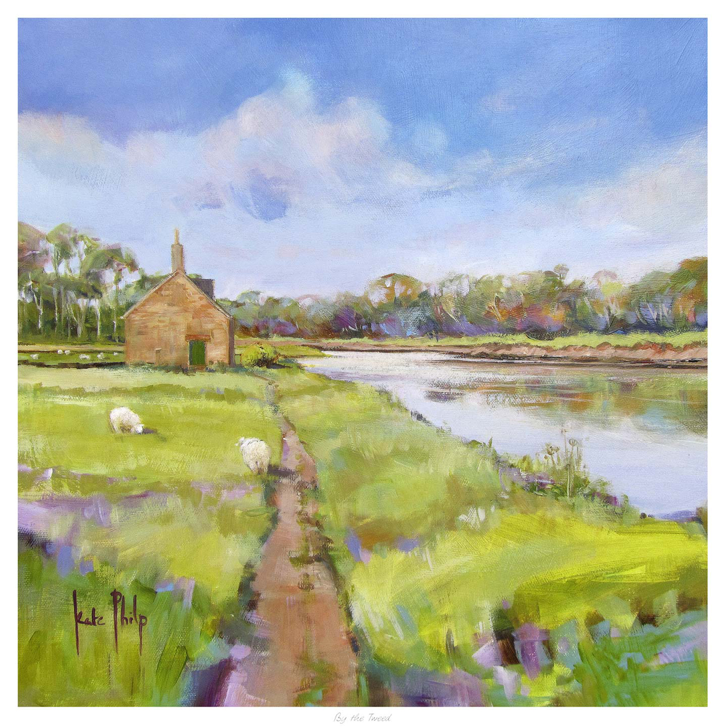
By the Tweed" depicts a small stone house beside the river, reached by a grassy path. Two sheep graze on a green field under a blue sky with clouds, while trees line the distant horizon.

Finding the right art for oatmeal walls is often about keeping a room warm and calm while still giving it enough definition. Oatmeal tones are wonderfully easy to live with, but they can leave a space feeling slightly flat if the artwork does not bring enough movement or atmosphere. By the Tweed works especially well because it adds depth and flow without breaking the softer mood of the room.

art for oatmeal walls featuring By the Tweed

Why art for oatmeal walls needs atmosphere as well as softness

Oatmeal is a useful neutral because it feels warmer than cooler greys and less stark than off-white. The challenge is that a room built around it can drift toward looking too safe unless the wall art introduces more shape, tonal variation, and a stronger sense of place. The best pieces keep the room restful while making the whole scheme feel more complete.

That is where By the Tweed stands out. Kate Philp’s landscape handling brings a gentle rhythm to the wall, which helps a neutral room feel more layered rather than merely coordinated. It suits living rooms, bedrooms, and quieter corners where warm paint colours and natural textures already do most of the work.

  • It keeps a neutral room calm while adding more visual depth.
  • It works with warm paint tones without feeling too matched.
  • It gives a softer interior a clearer hand-finished focal point.

A river landscape that feels grounded and easy to live with

The character of the River Tweed helps explain why the image feels so grounded and flowing at the same time. If this quieter landscape style appeals, you can also explore more work by Kate Philp. It is decorative in a useful way, adding beauty while also helping the room feel more joined up.

First 4 Frames completes each piece in-house in Falkirk using bespoke framing, colour-managed Giclee printing, and hand-finished craftsmanship. In a warm neutral room, that superior quality matters. The print feels properly made and properly considered, not like an afterthought added once the decorating is finished.

You can view the exact framed print here. If you are looking for art for oatmeal walls that keeps a room soft but gives it more atmosphere and finish, By the Tweed is well worth considering.

Posted on

Why Dunes at Dusk Works Beautifully as Art for Bedroom Spaces

Dunes at Dusk" is a vibrant painting featuring sand dunes, beach grass, and a calm sea under a dramatic sky with blue, pink, and orange tones.

The best art for restful bedrooms spaces should help the room slow down rather than compete for attention. Dunes at Dusk does that beautifully, using a softer coastal palette and a gentler horizon to make the wall feel calmer from the moment you walk in.

That matters in a bedroom because the artwork is part of the room’s rhythm. A piece with too much visual pressure can keep the space feeling active when it should feel settled.

Why Art for Restful Bedrooms Styling Benefits From Restraint

This print has enough colour and movement to keep the wall interesting, but the overall mood stays composed. That balance is what makes it easy to live with over time.

  • It softens the room without making it feel bland.
  • It adds atmosphere without turning the bedroom into a theme.
  • It works especially well where rest matters more than statement.

Where This Piece Can Sit Best

Dunes at Dusk would work especially well above a chest, opposite the bed, or on the quieter wall of a main bedroom or guest room. It pairs naturally with pale neutrals, sandy tones, textured bedding, and timber furniture because the image already carries that same easy warmth.

Why The Finish Makes The Mood More Convincing

First 4 Frames completes bespoke framing and colour-managed Giclee production in-house, which helps quieter tones stay clean and believable rather than flat. You can view the exact framed product here, and see more from Kate Philp if you enjoy coastal work with the same calm sense of space.

If you are comparing art for restful bedrooms spaces that feels restful, polished, and genuinely easy to live with, Dunes at Dusk is a lovely option.

Art for restful bedrooms should help the room unwind rather than push it into a louder decorative mood. This extra sense of ease is what makes the piece a good fit for spaces built around sleep, comfort, and slower evening light.

Posted on

Why Dunes at Dusk Works Beautifully as Art for Bedroom Spaces

Dunes at Dusk" is a vibrant painting featuring sand dunes, beach grass, and a calm sea under a dramatic sky with blue, pink, and orange tones.

The best art for bedroom spaces should help the room slow down rather than compete for attention. Dunes at Dusk does that beautifully, using a softer coastal palette and a gentler horizon to make the wall feel calmer from the moment you walk in.

art for bedroom featuring Dunes at Dusk

That matters in a bedroom because the artwork is part of the room’s rhythm. A piece with too much visual pressure can keep the space feeling active when it should feel settled.

Why Art for Bedroom Styling Benefits From Restraint

This print has enough colour and movement to keep the wall interesting, but the overall mood stays composed. That balance is what makes it easy to live with over time.

  • It softens the room without making it feel bland.
  • It adds atmosphere without turning the bedroom into a theme.
  • It works especially well where rest matters more than statement.

Where This Piece Can Sit Best

Dunes at Dusk would work especially well above a chest, opposite the bed, or on the quieter wall of a main bedroom or guest room. It pairs naturally with pale neutrals, sandy tones, textured bedding, and timber furniture because the image already carries that same easy warmth.

Why The Finish Makes The Mood More Convincing

First 4 Frames completes bespoke framing and colour-managed Giclee production in-house, which helps quieter tones stay clean and believable rather than flat. You can view the exact framed product here, and see more from Kate Philp if you enjoy coastal work with the same calm sense of space.

If you are comparing art for bedroom spaces that feels restful, polished, and genuinely easy to live with, Dunes at Dusk is a lovely option.

Posted on

Why Dunes at Dusk Works Beautifully as Art for Bedroom Spaces

Dunes at Dusk" is a vibrant painting featuring sand dunes, beach grass, and a calm sea under a dramatic sky with blue, pink, and orange tones.

The best art for bedroom spaces should help the room slow down rather than compete for attention. Dunes at Dusk does that beautifully, using a softer coastal palette and a gentler horizon to make the wall feel calmer from the moment you walk in.

That matters in a bedroom because the artwork is part of the room’s rhythm. A piece with too much visual pressure can keep the space feeling active when it should feel settled.

Why Art for Bedroom Styling Benefits From Restraint

This print has enough colour and movement to keep the wall interesting, but the overall mood stays composed. That balance is what makes it easy to live with over time.

  • It softens the room without making it feel bland.
  • It adds atmosphere without turning the bedroom into a theme.
  • It works especially well where rest matters more than statement.

Where This Piece Can Sit Best

Dunes at Dusk would work especially well above a chest, opposite the bed, or on the quieter wall of a main bedroom or guest room. It pairs naturally with pale neutrals, sandy tones, textured bedding, and timber furniture because the image already carries that same easy warmth.

Why The Finish Makes The Mood More Convincing

First 4 Frames completes bespoke framing and colour-managed Giclee production in-house, which helps quieter tones stay clean and believable rather than flat. You can view the exact framed product here, and see more from Kate Philp if you enjoy coastal work with the same calm sense of space.

If you are comparing art for bedroom spaces that feels restful, polished, and genuinely easy to live with, Dunes at Dusk is a lovely option.

Good art for bedroom walls should keep the room feeling easy to live with after the first few days. That is why this piece works so well in quieter interiors that need softness, focus, and a more settled finishing touch.

Posted on

Art for Offices or Reception Spaces Needs Calm Authority, Why Bass Rock Works

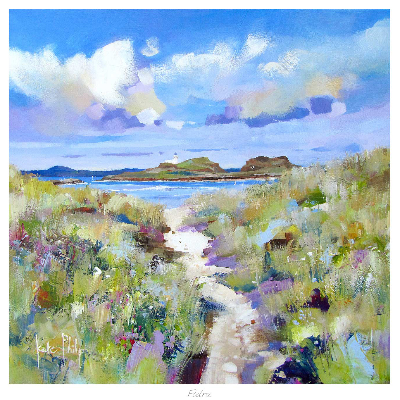
Bass Rock: A vibrant painting of a sandy beach with grassy dunes, calm blue sea, rocky cliffs, and Bass Rock island under a bright, partly cloudy sky.

The best art for offices or reception spaces helps a room feel professional without becoming cold. Bass Rock works especially well because it brings a sense of place and permanence while keeping the mood calm enough for everyday working environments.

That is valuable in professional settings where artwork should support confidence and welcome at the same time.

Why This Kind Of Piece Reads Well In Business Interiors

A landmark coastal scene gives the wall more authority than something purely decorative. It feels considered, but it still remains approachable for clients, visitors, and staff.

  • It creates presence without visual noise.
  • It adds local character in a polished way.
  • It helps reception and meeting areas feel more settled.

Where It Can Be Most Effective

Bass Rock would work well in a reception area, meeting room, private office, or client waiting space where neutral paint, timber finishes, and cleaner lines already establish a professional setting. The artwork adds depth without undermining that clarity.

Why The Framed Finish Supports The Message

Commercial spaces benefit from work that looks finished from every angle. First 4 Frames completes bespoke framing and colour-managed Giclee production in-house, giving the final piece the sort of dependable quality that suits business environments especially well.

You can view the exact framed product here, and browse more from Kate Philp if you enjoy Scottish coastal subjects with the same calm, assured appeal.

If you are comparing art for offices or reception spaces that should feel credible, calm, and lasting, Bass Rock is a very dependable choice.

Posted on

How Molly's Mill Helps You Choose Framed Wall Art That Feels Right Long Term

Molly's Mill is a colorful painting of a rural landscape with a white house and blue roof among pink and orange trees, golden fields, a pond, scattered chickens, and bright skies with soft clouds.

Anyone asking how to choose framed wall art is usually making a bigger decision than they first realised. The image matters, of course, but so do the scale, the finish, and how the framed piece will sit within the room once the initial excitement of buying has passed. Molly’s Mill is a good example of how those elements come together.

Start with the mood you want the room to hold

Many art choices go wrong because the image is chosen in isolation. A better approach is to ask what the room needs. Should it feel calmer, more grounded, more welcoming, or more atmospheric? Molly’s Mill works when you want a space to feel settled and characterful, which makes it easier to judge whether it belongs in your home.

Then consider what the framing adds

The frame is not just a border. It changes the authority of the piece, the way it reads against the wall, and whether it feels temporary or resolved. That is why a piece may look promising as an image online, yet only feel truly convincing once the final presentation has been thought through properly.

  • Choose a subject that supports the room's mood.
  • Make sure the framing gives the piece enough presence.
  • Think about how the finished work will relate to furniture, light, and wall colour.

First 4 Frames completes each piece in-house in Falkirk with bespoke framing, colour-managed Giclee printing, and hand-finished craftsmanship. That means the final result is built as a full presentation, not treated as a print with an afterthought around it.

You can explore more from Kate Philp and see the exact framed piece here.

If you are thinking about how to choose framed wall art, Molly’s Mill is a very useful reminder that the best choice comes from judging subject, scale, and craftsmanship together.

Posted on

Why By the Tweed Works Beautifully as Landscape Wall Art in an Everyday Home

By the Tweed" depicts a small stone house beside the river, reached by a grassy path. Two sheep graze on a green field under a blue sky with clouds, while trees line the distant horizon.

Well chosen landscape wall art can steady a room in a way few other subjects manage. It brings space, atmosphere, and a gentler focal point without feeling empty. By the Tweed is especially effective because it offers calm depth and a clear sense of place while still feeling easy to live with day after day.

Why landscape artwork remains such a useful decorating choice

Landscape pieces often succeed because they expand the mood of a room rather than narrowing it. They can make a wall feel more open, but the stronger examples also add enough structure to stop the space feeling vague. By the Tweed strikes that balance very well, which makes it suitable for quieter living rooms, bedrooms, and studies.

  • It gives the eye somewhere calm to settle without becoming bland.
  • It works across both traditional and more contemporary interiors.
  • It adds a stronger sense of place without dominating the wider scheme.

This is often exactly what people want when the room already functions well but still lacks one unifying visual element.

Why a superior framed finish keeps the effect refined

First 4 Frames completes each piece in-house in Falkirk with bespoke framing, colour-managed Giclee printing, and hand-finished craftsmanship. That quality matters because quieter artwork depends on finish and balance just as much as louder statement pieces do.

You can explore more from Kate Philp and view the exact framed print here.

If you want landscape wall art that feels calm, lasting, and room-ready, By the Tweed is well worth considering.

Posted on

Why Coldingham Works So Well as Bathroom Wall Art That Still Feels Grown Up

Coldingham: This painting depicts a coastal landscape with sandy shores, gentle waves, rocky cliffs, and a cloudy sky. White houses appear on the hillside, and the artist's signature is visible in the corner.

Good bathroom wall art should help a practical room feel lighter and more considered, not simply more decorated. Bathrooms often benefit from artwork that brings freshness and place, but still feels restrained enough to live with every day. Coldingham does that especially well, giving the wall a calm coastal note without pushing the room into obvious seaside theming.

Why a bathroom benefits from art with some breathing space

Bathrooms usually look best when the artwork keeps the mood clean and settled. A piece that is too busy can make a smaller room feel crowded, while something too plain can disappear altogether. Coldingham sits comfortably between those extremes, adding atmosphere and movement while still feeling easy on the eye.

  • It keeps a bathroom feeling airy rather than visually packed.
  • Its coastal character feels calm instead of novelty led.
  • It works especially well with pale tiles, painted panelling, or softer natural finishes.

A framed finish helps a practical room feel more complete

First 4 Frames produces each piece in-house in Falkirk with bespoke framing, colour-managed Giclee printing, and hand-finished craftsmanship. That matters in a room where details can otherwise feel purely functional. The artwork becomes a proper finishing touch rather than something quickly added at the end.

You can explore more from Kate Philp and view the exact framed print here.

If you want bathroom wall art that feels fresh, polished, and easy to live with, Coldingham is a very appealing option.