Posted on

Scottish Thistle Wall Art Can Define a Compact Entrance

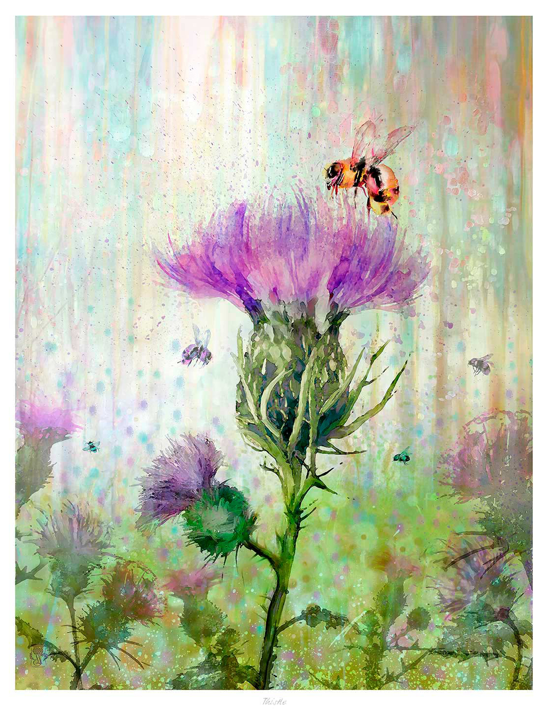
Thistle features a vibrant illustration of a bee hovering over blooming thistles, framed by soft green foliage and pastel hues, all set against a dreamy, watercolor-inspired background.

Scottish thistle wall art for a compact entrance can establish identity without taking up practical floor or shelf space. Thistle by Lee Scammacca concentrates that identity in one framed image. It lets coats, shoes, and keys remain functional instead of turning every available surface into a Scottish display.

Give Scottish thistle wall art for a compact entrance breathing room

Choose the first clear wall

Open the door fully and identify the wall that remains visible without blocking the route. The framed work should greet the eye while staying beyond hinges, shoulders, wet coats, and bag straps.

In a small entrance, one purposeful image usually works better than a cluster. Keep a plain margin around the frame. Align it with a narrow console or bench only if that furniture already belongs there. Do not add a table simply to support the composition.

Entrance pressurePractical response
Door swingMark its full arc before choosing the fixing point.
Coat storageKeep fabric and hooks clear of the frame edge.
Limited lightUse a soft wall wash and check glare on the glass.
Too many motifsLet the thistle carry the Scottish identity alone.

Use precise framing where the picture is seen close up

Entrance artwork is often viewed at arm’s length, so small weaknesses become obvious. Colour-managed Giclée production keeps the design and colour clean. A bespoke, hand-finished frame gives the piece protection and definition. Its graphic character can remain direct and uncluttered.

For cultural background on the national emblem, read the National Trust for Scotland’s story of the thistle. Browse more work by Lee Scammacca, or view the exact Thistle framed print.

As Scottish thistle wall art for a compact entrance, Thistle supplies a confident local welcome while leaving the narrow space easy to use.

Posted on

Botanical Wall Art Can Make a Creative Workspace Feel More Restorative

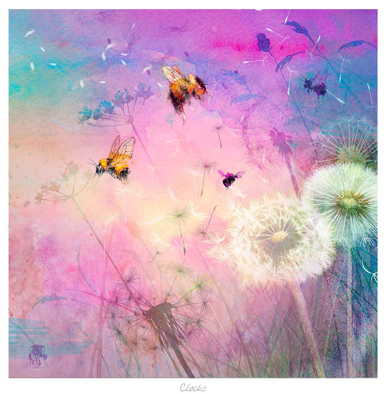
Botanical wall art for a creative workspace can provide a useful visual pause without telling anyone to work harder. Clocks by Lee Scammacca combines dandelions, wildflowers, bees, and dreamlike clocks against soft pink and purple colour. Its subject acknowledges time while offering something gentler than a deadline chart or motivational slogan.

Position botanical wall art for a creative workspace beyond the screen

Create a distance change for the eyes

Hang the picture where it can be seen by looking up and beyond the monitor, not directly behind it. That position encourages a brief shift in focus during concentrated work. If the desk faces a wall, place the image slightly above normal screen height and keep the area around it clear.


Let imagination replace instruction

The floating timepieces and natural details suggest ideas rather than spelling out a message. That ambiguity suits designers, writers, makers, and anyone whose work benefits from association. It can stimulate thought without becoming a visual task list.

  • Use soft task lighting that does not reflect in the glazing.
  • Repeat one mauve, green, or warm neutral note in a practical desk object.
  • Keep cables and pinboards from crossing the framed outline.
  • Allow enough blank wall for the delicate forms to register.

Protect the softer colour and fine natural detail

Bees, seed heads, flowers, and translucent-looking colour need controlled reproduction. Colour-managed Giclée production keeps those details from becoming muddy, while bespoke framing gives the dreamlike composition a crisp place within a working room. Everything is completed in-house at the Falkirk workshop.

For real-world context on one of the image’s small but important subjects, see the RHS guide to gardening for bumblebees. Browse more work by Lee Scammacca, or view the exact Clocks framed print.

As botanical wall art for a creative workspace, Clocks makes room for attention, imagination, and a calmer relationship with the passing hours.

Posted on

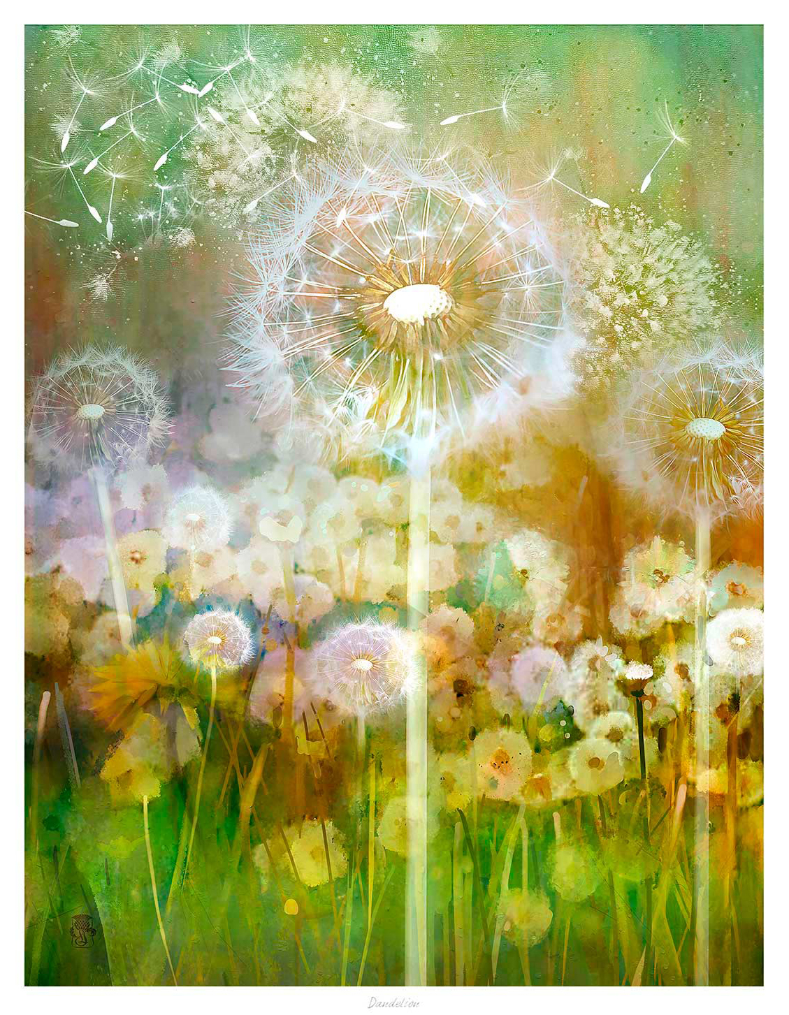
Botanical Wall Art for Willow Green Walls: Why Dandelion Works

Choosing botanical wall art for willow green walls is not simply a matter of finding another green object. Dandelion uses a soft green and gold ground, then lifts it with bright blooms and floating seed heads. The result builds a layered palette while preserving the gentle, airy quality that makes willow green appealing.

Layer botanical wall art for willow green walls instead of matching exactly

Keep the greens varied

Let the wall provide the quiet base. The print’s warmer green, yellow light, and darker stems create enough separation for the image to remain visible.

Repeat only one accent

Pick up one gold or floral note in a cushion, ceramic, or lampshade. Repeating every colour would make the room feel overly coordinated.

The drifting seed heads add movement without a hard outline, which suits soft furnishings and curved furniture. A pale mount can create a useful pause between the artwork and the painted wall. Natural oak keeps the scheme relaxed, while a narrow dark frame introduces definition beside lighter timber.

Tonal rooms feel richer when artwork varies the colour rather than copying the paint.

First 4 Frames produces the Giclée print and bespoke frame in-house in Falkirk. Colour-managed printing preserves the subtle green-gold background and finer seed heads. The hand-finished presentation gives the loose botanical detail a clean edge on the wall.

For useful background, visit the Royal Horticultural Society’s dandelion guide. You can also browse the Lee Scammacca collection and view the exact Dandelion framed print.

As botanical wall art for willow green walls, Dandelion adds brightness, motion, and tonal depth without disturbing the room’s natural calm.

Posted on

Wall Art for a Narrow Wall Between Windows Can Still Feel Generous

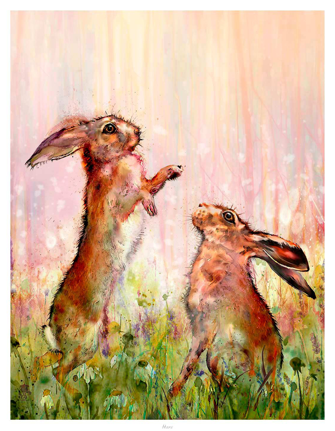
Choosing wall art for a narrow wall between windows is mainly a question of proportion. Hare uses a portrait format and an upward-moving subject, so it can give a slim section of wall purpose without making the windows feel hemmed in. The two alert hares also add energy while the meadow colours keep the effect soft.

Measure wall art for a narrow wall between windows carefully

Measure the solid wall rather than the distance from one curtain edge to the other. Then leave a visible margin on both sides of the frame. That breathing room prevents the artwork from looking trapped between architraves, blinds, or curtain folds. It also lets the vertical composition read clearly from across the room.

Check the width

A frame that uses roughly half to two-thirds of the solid wall often feels balanced. Mark its outline with removable tape before deciding.

Check the height

Align the picture with the room, not necessarily the window tops. Keep the visual centre comfortable at normal standing or seated eye level.

Hare is more useful here than a busy panoramic scene. Its vertical rhythm follows the shape of the available wall, while the paired animals create a clear focal point. Repeat one meadow colour in a cushion or nearby accessory if you want a connection, but avoid filling the sill with competing ornaments.

First 4 Frames produces the colour-managed Giclée print and bespoke frame in-house in Falkirk. A carefully judged frame can give the narrow space definition without adding unnecessary visual weight. The hand-finished presentation also means the solution feels deliberate rather than improvised.

Learn more about the subject through The Wildlife Trusts’ guide to the brown hare. You can also explore more work by Lee Scammacca or view the exact Hare print.

As wall art for a narrow wall between windows, Hare turns a difficult gap into a light, characterful pause between views.

Posted on

Animal Wall Art Feels More Refined With Freisions

Many people hear animal wall art and imagine something rustic or overly themed. Freisions offers a different route. The equine subject brings energy and poise, which makes it especially effective in a study, hallway, or more contemporary sitting space where you want movement without clutter.

Why Freisions changes how animal wall art can feel

Freisions works because the subject carries form as well as personality. That gives the print more than decorative charm. It adds rhythm, line, and a sense of intention, which helps the artwork sit confidently in rooms that already have cleaner furniture or stronger architectural details.

  • It brings movement without visual fuss.
  • It feels more grown up than obvious wildlife novelty.
  • It suits rooms where shape matters as much as subject.

A bespoke frame reinforces that confidence. First 4 Frames completes each piece in-house, combining hand-finished framing with colour-managed Giclée print quality so the final work feels composed and display ready from the start.

For a broader look at why equine movement has such lasting appeal, British Dressage and the elegance of equine movement is a useful reference. You can also browse more work by Lee Scammacca and view the exact framed print here.

If your shortlist for animal wall art leans toward calmer, more refined pieces, Freisions makes a strong case for that direction.

Posted on

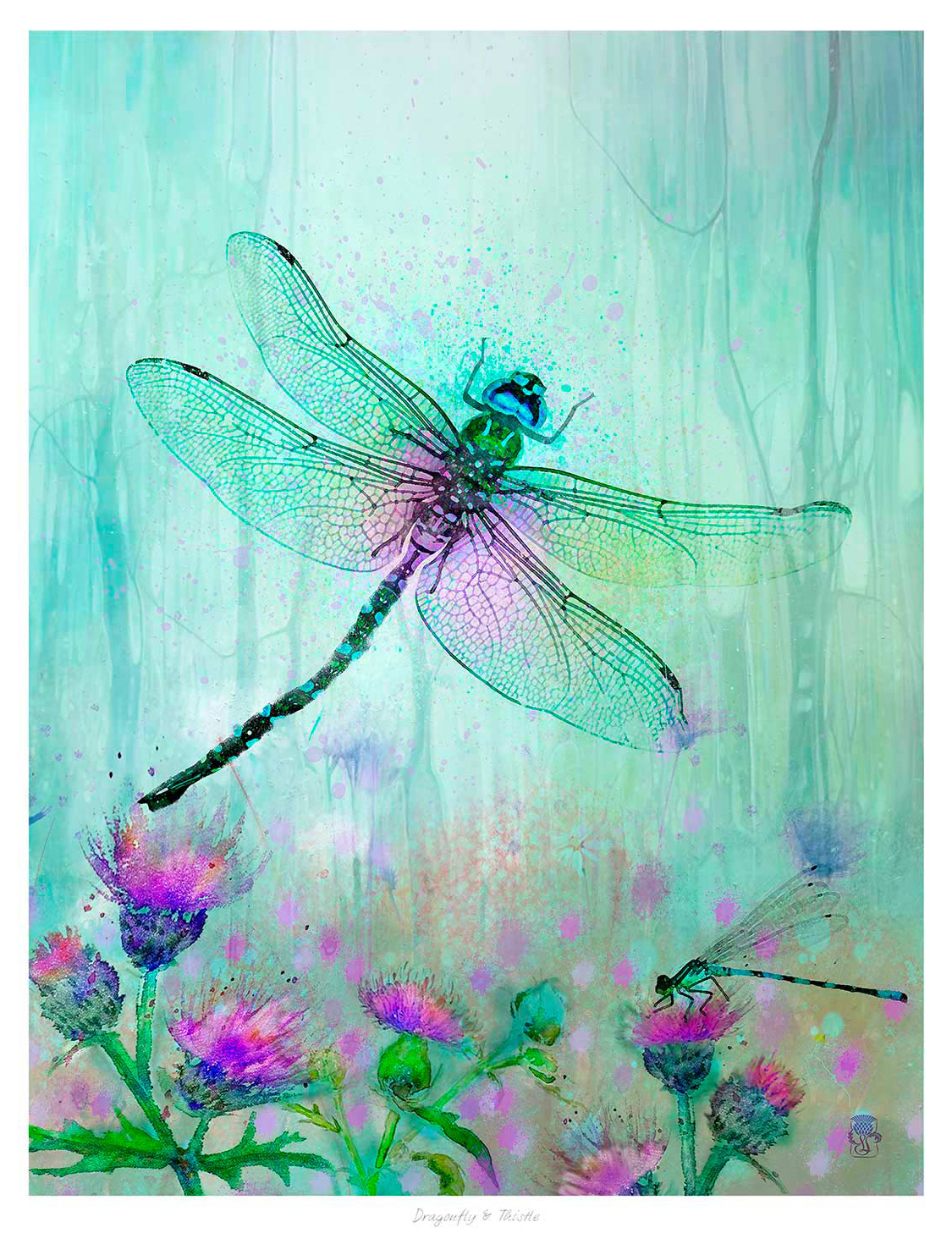
Purple Wall Art Feels More Grown Up With Dragonfly and Thistle

The best purple wall art should feel rich and expressive without becoming overly sweet. Dragonfly and Thistle manages that beautifully, using thistle detail and a natural palette to make purple feel refined, characterful, and easy to place.

Why Dragonfly and Thistle makes purple wall art feel more considered

Purple can be difficult to use well in a room if the artwork pushes too hard into novelty or brightness. Dragonfly and Thistle takes a more balanced route. The organic subject matter gives the colour somewhere natural to sit, which helps the finished piece work well in hallways, dressing spaces, reading corners, or rooms that already carry plum, lilac, or heather notes elsewhere in the scheme.

  • It brings colour while still feeling calm enough for everyday spaces.
  • It pairs well with brass, painted wood, and softer neutral backdrops.
  • It gives floral or botanical styling a more distinctive Scottish edge.

Because First 4 Frames produces and frames the work in-house, the result benefits from bespoke presentation, colour-managed Giclee quality, and hand-finished craftsmanship. Those details help richer tones stay controlled and prevent the final piece from feeling flat or overdone.

For more on the thistle as a Scottish emblem, National Museums Scotland on the Scottish thistle offers helpful background. You can also browse more work by Lee Scammacca and view the exact framed product here.

If you are comparing purple wall art, Dragonfly and Thistle is a very good choice for bringing richer colour into the room in a more polished way.

Posted on

Stag Wall Art Feels More Grounded With Stag

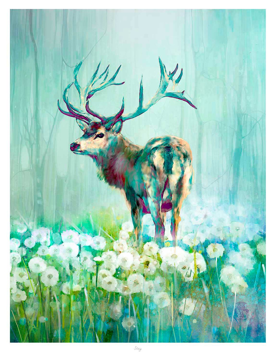
The best stag wall art should give a room character without turning it into a themed space. Stag does that especially well because the single stag subject feels composed, confident, and easy to place in a more considered interior.

Why stag wall art can feel refined rather than rustic

Wildlife artwork often works best when it has enough visual strength to anchor the wall, but not so much that it starts to dominate the whole room. That is where Stag stands out. The subject carries presence, yet the overall feel remains clean and balanced.

  • It adds Highland character without relying on novelty.
  • It suits timber, leather, wool, and painted joinery equally well.
  • It gives a hallway, study, snug, or sitting room a more grounded focal point.

Why Stag works so well in a more considered interior

Some wildlife prints feel busy once framed, but Stag keeps a stronger sense of shape and restraint. First 4 Frames completes the piece in-house with bespoke framing and colour-managed Giclee production, helping the final artwork feel polished, substantial, and properly resolved on the wall.

You can browse more work by Lee Scammacca, learn more about the artist at Lee Scammacca, and view the exact framed product here.

If you want stag wall art that feel calm, characterful, and easy to live with, Stag is a very strong option.

Posted on

Why Bee and Thistle Works Beautifully as Florist Shop Wall Art

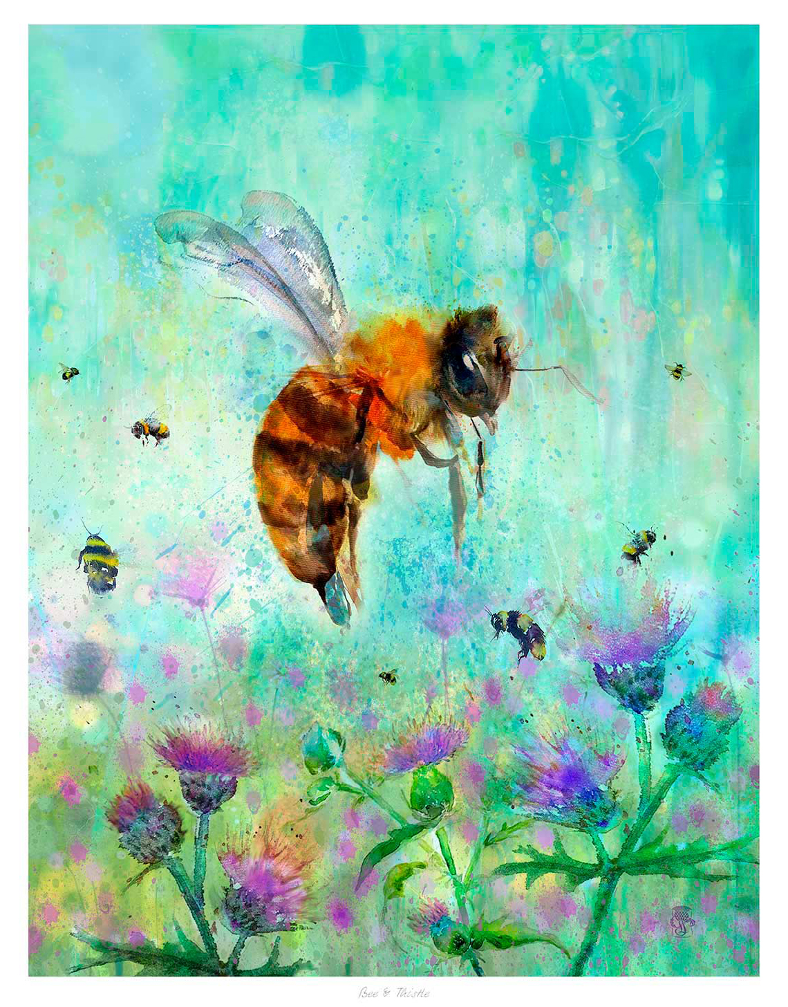
The best florist shop wall art should support the atmosphere of the space rather than competing with it. In a flower-led retail setting, that usually means choosing something with colour, life, and real character, but also enough restraint to sit comfortably beside changing displays. Bee and Thistle does that especially well, bringing warmth and detail without making the walls feel busy.

Why a florist shop benefits from art that feels considered rather than theme led

A florist already has plenty of natural beauty in the room. Bouquets, foliage, wrapped stems, and seasonal displays all create movement and colour. The artwork therefore needs to feel connected to that world without becoming overly obvious. Bee and Thistle works because it feels expressive and botanical, yet still properly framed and display worthy.

That makes it a good choice for areas such as the counter wall, a consultation corner, or a spot near the entrance where customers first get a sense of the business. It adds personality to the shop and helps the whole setting feel more established, especially when the aim is to look independent, quality led, and thoughtfully put together.

  • It echoes floral subject matter without feeling like predictable shop signage.
  • It helps the space feel warmer and more memorable for customers.
  • It suits a boutique retail setting where craftsmanship and presentation matter.

Why a hand-finished framed print strengthens the overall impression

At First 4 Frames, each piece is completed in-house in Falkirk using bespoke framing, colour-managed Giclee printing, and hand-finished craftsmanship. That matters in a shop where presentation is part of the customer experience. A carefully finished framed print helps the business feel polished and intentional, rather than decorated as an afterthought.

You can explore more work by Lee Scammacca and view the exact framed print here.

If you are looking for florist shop wall art that feels natural, distinctive, and professionally finished, Bee and Thistle is well worth considering.

Posted on

Why Blue Tits Works So Well as Wall Art for Bedroom Spaces That Need Soft Detail

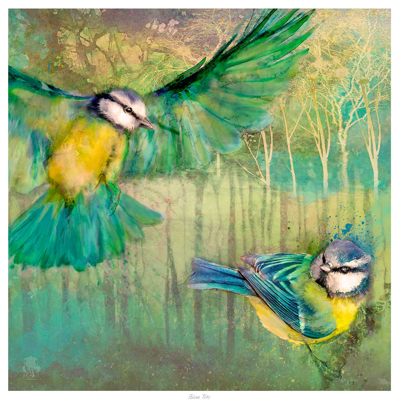
Good wall art for bedroom should help a room feel restful without fading into the background. That balance can be harder to get right than people expect. Blue Tits works beautifully because it adds interest and gentle detail while still supporting the calmer mood most bedrooms need.

Bedrooms benefit from detail that does not feel demanding

In a bedroom, artwork has a different job from the pieces used in busier shared spaces. It should give the room personality, but it should also feel easy to live with at quieter times of day. Blue Tits is especially effective because it brings lightness and charm without becoming visually noisy.

  • It suits softer colour palettes and layered bedding.
  • It adds a focal point without making the room feel overstimulating.
  • It works well in both main bedrooms and carefully styled guest rooms.

This kind of artwork can sit comfortably above a chest of drawers, beside a dressing area, or on a wall that would otherwise feel too bare. The subject matter adds warmth, while the framed finish gives the room a more complete and intentional look.

First 4 Frames produces each piece in-house in Falkirk with bespoke framing, colour-managed Giclee printing, and hand-finished craftsmanship. That superior quality is especially noticeable in quieter rooms where every detail matters more.

You can browse more from Lee Scammacca and view the exact framed product here.

If you want wall art for bedroom that feels calm, softly detailed, and properly finished, Blue Tits is a very appealing option.

Posted on

Why Blue Tits Works Beautifully as Garden Room Wall Art

Choosing garden room wall art is often about balance. A garden room already has plenty going on through the windows, so the artwork needs enough personality to hold its place without competing with the view. Blue Tits works beautifully because it adds natural detail and warmth while still feeling light, calm, and easy to live with.

Why this subject suits a garden-facing space

Bird artwork often feels especially right in a room that connects the house to the garden. It reflects the setting naturally, but it does so in a more refined way than obvious seasonal decor. That makes Blue Tits a strong choice for a room used for reading, coffee, quiet work, or simply slowing down for a while.

  • It echoes the outdoor setting without feeling literal or novelty led.
  • It suits rooms with plants, painted timber, wicker, or softer neutral upholstery.
  • It adds enough colour and detail to stop the wall from feeling underdressed.

How it helps a garden room feel finished

Bright rooms can sometimes feel slightly temporary if every surface is practical and every wall is left doing very little. A framed print gives the space more intention. It helps a garden room feel like a proper part of the home rather than an afterthought used only when the weather is good.

At First 4 Frames, each piece is completed in-house in Falkirk with bespoke framing, colour-managed Giclee printing, and hand-finished craftsmanship. That superior quality matters in a room where daylight picks up the detail of both the artwork and its presentation.

You can explore more from Lee Scammacca and view the exact framed print here.

If you are looking for garden room wall art that feels natural, uplifting, and properly resolved, Blue Tits is a very strong option.