Posted on

Minimalist Wall Art Above a Low Sideboard: Birch Trees II

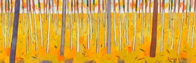
Image of Birch Trees II by Emily Little

minimalist wall art works best when the picture answers a practical question about the room. Birch Trees II is useful because its 900 × 310 mm or 560 × 180 mm format creates a long visual line with very little vertical weight.

Size minimalist wall art from the furniture below

Minimal does not mean undersized. Measure the usable sideboard width after allowing for a lamp, then mark the full framed outline rather than the print alone. The 900 mm option may suit a broad cabinet, while the 560 mm print gives smaller furniture more breathing room.

Keep one useful object

A lamp or bowl can remain. Keep its silhouette below the important tree forms and leave an intentional gap.

Remove visual filler

Several candles, stacked signs and small frames would break the calm horizontal route.

Check the composition from the doorway as well as straight on. A long picture can visually extend the furniture, but it should not run into a curtain, tall plant or door frame.

Frame minimalist wall art without losing subtle detail

The restrained subject depends on tonal separation and clean alignment. Colour-managed Giclée printing supports quieter marks, while precise mounting and hand-finished framing prevent the slim artwork from feeling slight.

For useful context, visit Forestry England’s introduction to birch trees. Browse the Emily Little collection, or inspect the exact product and framing choices.

Minimalist wall art succeeds when every dimension feels deliberate. Birch Trees II organises a sideboard wall, allowing one picture and a few useful objects to complete it.


Posted on

Minimalist Wall Art for a Quiet Pause: Give Isolation Enough Space

minimalist wall art becomes more useful when the picture solves a real placement question. Isolation offers a clear starting point because the compact square and evocative title can reward a close sightline when surrounding objects are edited rather than removed without purpose.

Use minimalist wall art to shape attention

Minimal does not mean placing a small picture in the centre of a large blank wall. Begin with the route and the moment of viewing. A short landing, reading-chair return or wall beside a bedroom dresser can provide the closeness that a 265 x 265 mm print needs.

Negative space works when it directs attention. Space without a viewing reason can simply make an artwork feel stranded.

  1. Stand where the picture will normally be noticed.
  2. Mark the complete framed square at eye level.
  3. Remove objects that interrupt the sightline, not every useful object.
  4. Check that a door, shade or plant does not cast a changing shadow.
  5. Use one nearby material connection, such as timber or a quiet textile.

The title can encourage reflection, but the room need not become severe. A comfortable chair, reading lamp and a few used books add life. Keep decorative objects from forming a tight halo around the frame, and let the square hold its own boundary.

Does minimalist artwork always need a white frame?

No. The frame should separate image from wall and relate to the room. A restrained timber, dark edge or soft painted finish may work better.

Use precise finishing at intimate scale

Compact art is often inspected from nearby, making clean mounting, accurate corners and controlled colour important. In-house Giclée production and bespoke framing give Isolation a resolved edge without adding visual noise around it.

For art-historical context on reduction, material and space, read Tate’s introduction to Minimalism. You can also browse the Rikki O’Neill collection or view the exact framed product.

Minimalist wall art succeeds through deliberate attention rather than emptiness. Isolation can make a quiet wall purposeful when the viewing point, clear space and frame are chosen with equal care.

Posted on

Minimalist Wall Art With Natural Rhythm: Birch Trees I

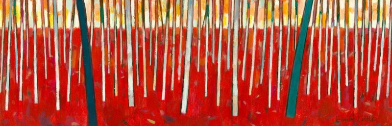
Minimalist wall art does not have to be blank or purely geometric. Birch Trees I brings the natural repetition of birch trunks into a pared-back interior. The subject offers rhythm and texture, while the woodland structure keeps the composition ordered enough for a room with few objects.

Let minimalist wall art organise a quiet wall

PlacementUseful relationship
Above a consoleAlign the artwork with the furniture centre, then keep objects low and sparse.
Beside a reading chairLeave a generous margin so the tree rhythm does not collide with the lamp.
In a calm bedroomPosition it where it can be seen on entry rather than directly above a busy headboard.

Repetition is the strength of the subject, so the rest of the arrangement should avoid competing stripes. Slatted furniture, strongly ribbed wall panels and several tall vases nearby may create too many vertical beats. A smooth wall and one grounded piece of furniture give the image more clarity.

Minimal does not mean featureless; it means every line has enough space to register.

Use framing to separate woodland texture from the room

Birch imagery often relies on fine tonal shifts and repeated light-dark edges. Colour-managed Giclée production protects that detail. A slim hand-finished frame can provide a deliberate boundary, while a wider mount can add breathing room if the surrounding wall already contains architectural lines.

For natural-history context on the tree behind the subject, read the Woodland Trust guide to silver birch. Browse the Emily Little collection, or view the exact Birch Trees I product.

Birch Trees I makes a useful case for minimalist wall art with substance: it offers natural texture, measured repetition and enough quiet structure to shape the wall without filling every inch.

Posted on

Minimalist Wall Art Feels Less Cold With Between Earth and Sky

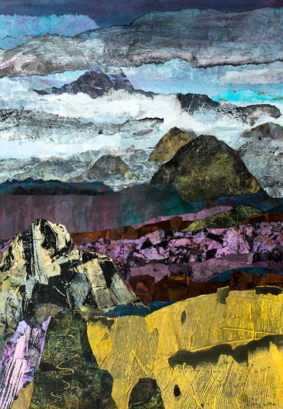
Many people like the idea of minimalist wall art but worry that it will leave the room feeling colder or less personal. Between Earth and Sky shows a better version of the idea. The composition is restrained, yet it still carries atmosphere, which helps the finished piece feel calm rather than blank.

Why Between Earth and Sky softens minimalist wall art

Between Earth and Sky succeeds because it leaves room for the eye to rest while still giving the wall emotional texture. That makes it useful in a bedroom, study, or modern sitting room where the goal is simplicity with warmth rather than a hard-edged gallery feel.

  • It keeps a pared-back room from feeling severe.
  • It adds atmosphere without introducing clutter.
  • It suits modern interiors that still need a human touch.

First 4 Frames completes the bespoke framing and colour-managed Giclée production in-house, which helps quieter work like this retain nuance. The frame becomes part of the calming effect rather than a separate afterthought.

If you enjoy the broader language of abstraction, Tate’s guide to abstract art offers useful background. You can also browse more work by Emily Little and see the exact framed print here.

For buyers who want minimalist wall art that feels softer, warmer, and easier to live with, Between Earth and Sky is a very strong example.

Posted on

Minimalist Wall Art With Warmth, Why Temple Works So Well

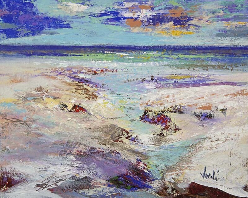
Good minimalist wall art is not really about doing as little as possible. It is about knowing what to leave in and what to leave out. Temple works beautifully on that basis because it feels spacious and restrained while still keeping enough warmth to make the room feel lived in.

That balance is important in interiors that want calm but do not want to tip into blankness or a slightly clinical feel.

Why Restraint Feels Better Here

Minimal artwork becomes more successful when it still offers atmosphere. Temple uses openness, soft transitions, and a clear horizon to create quiet without making the image disappear.

  • It gives a cleaner room a focal point without adding clutter.
  • It keeps the mood calm while still feeling human and warm.
  • It suits buyers who want simplicity without sterility.

Rooms That Suit This Kind of Piece

Temple would sit naturally in a bedroom, hallway, study, or living room with pale walls, natural fabrics, and simpler furniture lines. It is especially effective where the room already relies on light, space, and material texture rather than pattern or bold colour.

In that sort of scheme, the artwork does not need to shout. It needs to steady the room and make it feel finished.

Why the Finish Still Matters

Subtle work can be the first to suffer if the presentation is weak. First 4 Frames completes the bespoke framing and colour-managed Giclee printing in-house, helping quieter images like this hold their tone and presence once they are on the wall.

You can view the exact framed product here, and explore more by Arie Vardi if you enjoy pared-back coastal work with the same spacious character.

If you want minimalist wall art that feels calm, generous, and easy to live with, Temple is a very persuasive choice.

Posted on

Why Morning Rise Works So Well in a Minimalist Room

Good minimalist wall art should add something meaningful without upsetting the balance of the room. Morning Rise does that beautifully. It brings calm landscape colour and a sense of atmosphere to a pared-back interior while still keeping the space light, quiet, and uncluttered.

Why restrained rooms still need a focal point

A minimalist space is not meant to feel empty. The best ones still have warmth and intention. Morning Rise works well because it gives the eye somewhere to settle, yet it does not dominate the room with heavy contrast or fussy detail.

Minimal rooms often feel their best when one carefully chosen piece does the quiet work of bringing everything together.

Where it suits the décor best

This piece would work especially well in a living room with clean lines, a bedroom built around soft neutrals, or a hallway where you want calm rather than noise. If the interior already uses pale walls, natural textures, and simple furniture, the artwork can soften the scheme without breaking its discipline.

A more considered finish than a standard print

Because First 4 Frames completes the work in-house in Falkirk, the final result has the bespoke presentation and superior quality that minimalist rooms tend to reward. A hand-finished framed Giclée print feels far more resolved than a loose poster, especially in interiors where every element has been chosen carefully.

This artwork is by Arie Vardi, and you can view the exact framed product here.

If you are choosing minimalist wall art that still feels warm, thoughtful, and complete, Morning Rise is a very appealing option.